Chosen Young 萃生颜
Industry: Beauty & Healthcare, Retail
Practices: Brand Positioning, Brand Naming, Brand Concept Direction, Visual Identity System, Packaging Design
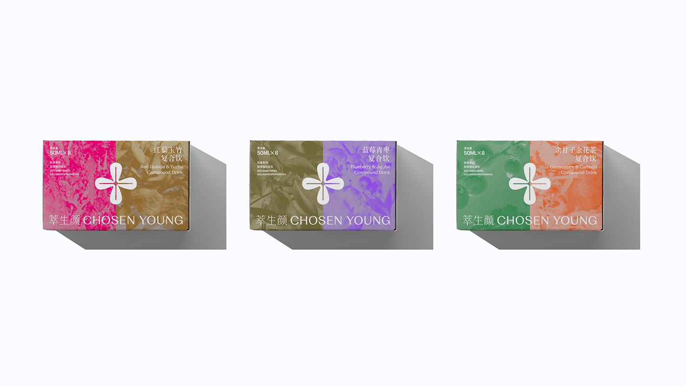
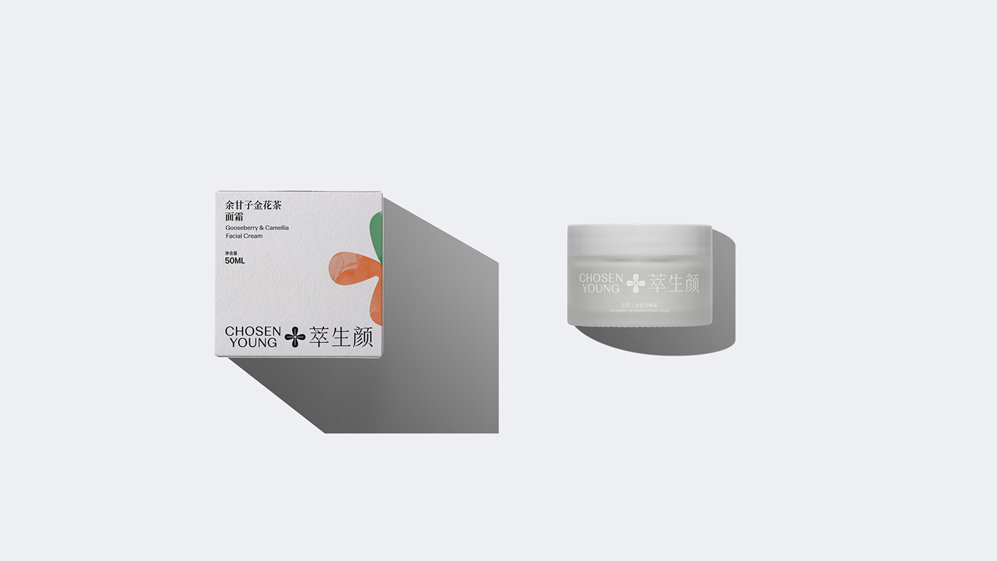
Chosen Young is a sub-brand of AIYISHENG that focuses on the development of health and beauty products with herbal extracts as the main ingredients. Through the careful research and development of its own technology, the natural herbal essence and ingredients are integrated by science and technology, presenting the healthy beauty to everyone who enjoys, and opening the internal and external cultivation of health with the ways of oriental practice. Pocca was commissioned by Chosen Young to sort out and optimize the brand concept, define the brand value of “The Fusion of Nature and Technology” and “Ancient Method and New Recipe” for the brand, and through the dialogue and research within the company, we help the brand gradually clear its narrative attitude: Nature, Humanity, and Future.


On the basis of the real core nature of the brand taking shape, we created the English name Chosen Young for the brand, which is similar to the pronunciation of the Chinese name, but also symbolizes the health and vitality of youth.
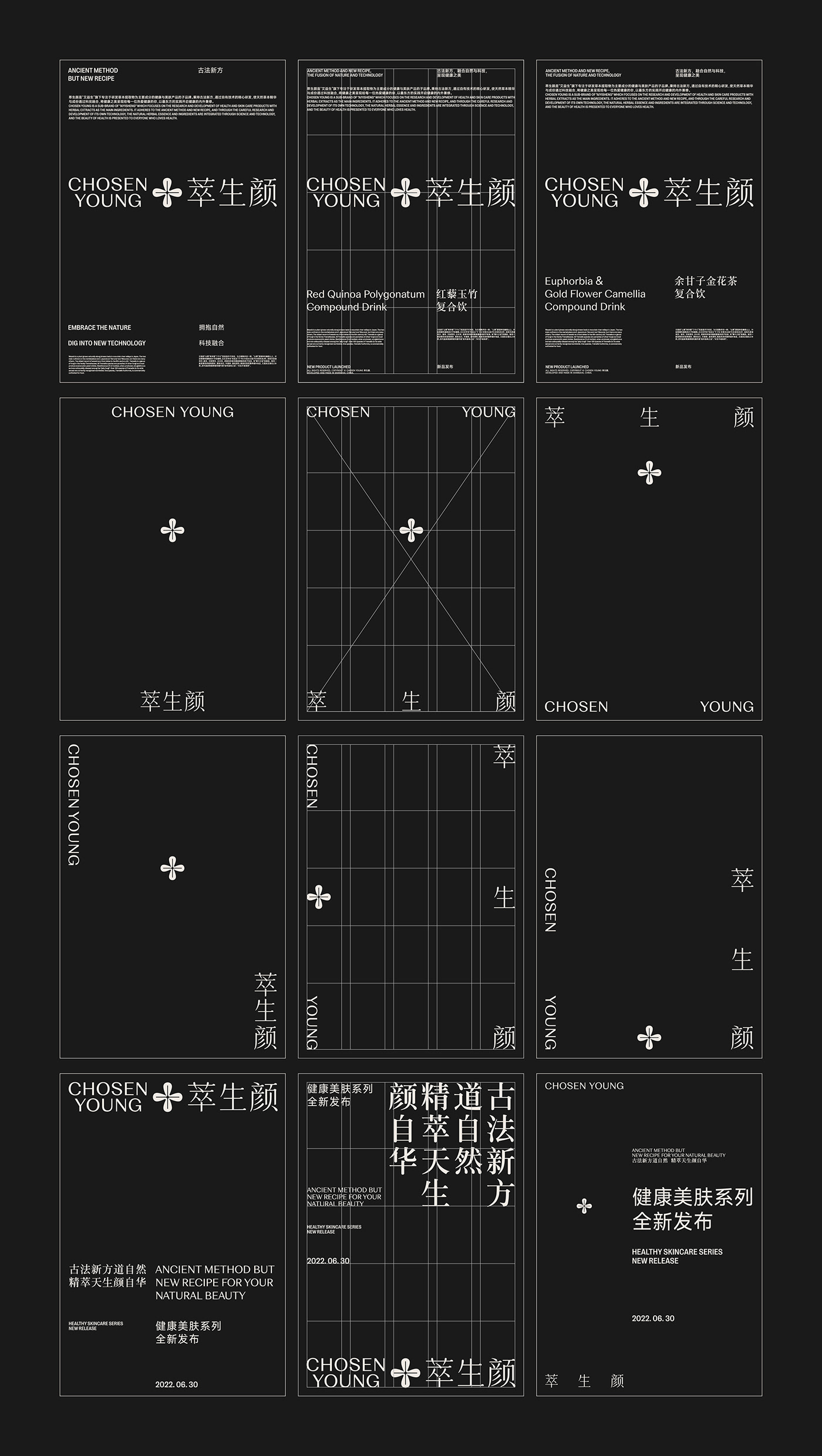
As for the visual identity, we focus the value and attitude of the brand on the word “萃 (Cui, means extract)” in the Chinese name of the brand. As a source, we designed a graphic symbol that makes “herbal” and “science and technology” harmoniously blend. Through the “round” details, we present the intimacy of nature and herbs, and through the “sharp” details, we present the precision of science and technology. This desire to balance “herbal” and “science and technology” styling logic is also presented in the logotype of the Chinese name that we customized for the brand.


During the process, we learned that the character “萃 (Cui, means extract)” in the brand name originates from the “Cui” in the traditional Chinese eight trigrams, and the hexagram symbol composed of horizontal drawings of different length and length coincides with the grid system commonly used in graphic design. Therefore, the graphical shape of “Cui” has become the basis of the grid system design in the visual identity system. It not only absorbs the traditional Chinese cultural temperament of the brand itself, but also helps to effectively present the bilingual arrangement of Chinese and English. In the design of information layout, the combination of traditional symbols and graphical grids has also become a visual interpretation of “Ancient Method and New Recipe” which is practiced by Chosen Young.