


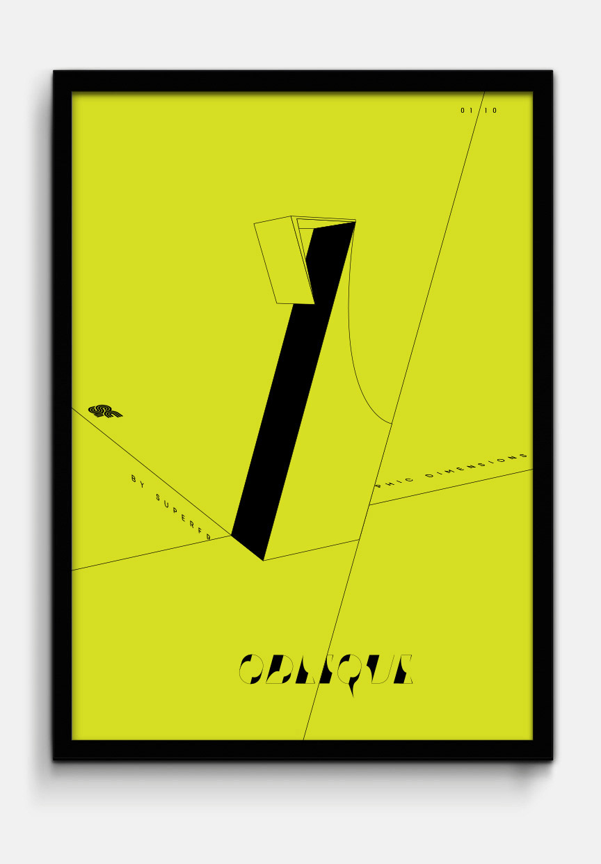
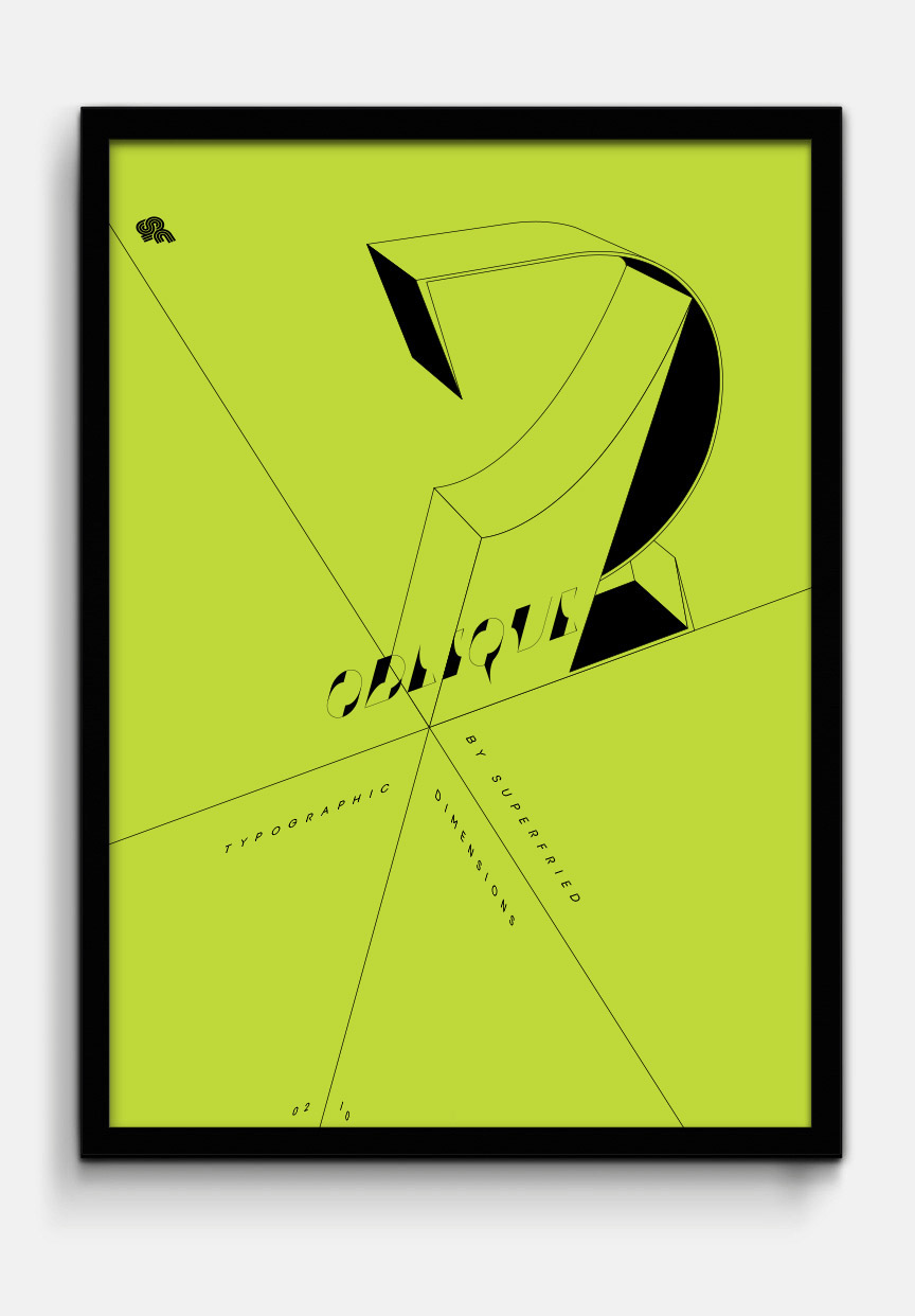
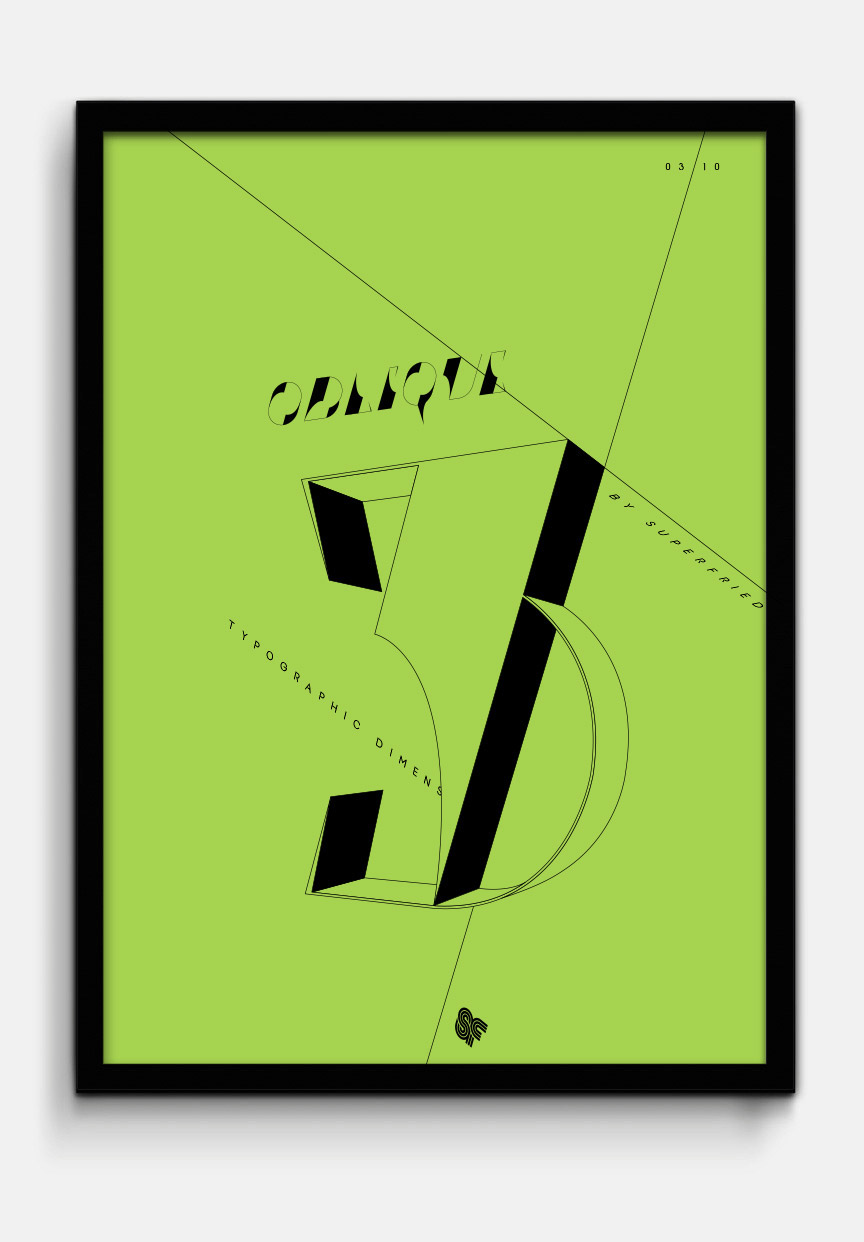


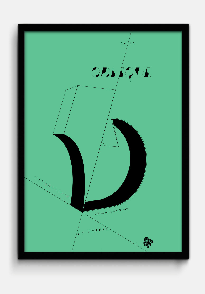


Oblique
Typographic experiment
Typographic experiment
–
Whilst developing my last numeral set, Klaws, an experimental number two emerged that I was rather fond of. Unfortunately it did not fit with the Klaws style, but was strong enough to become the basis of a new personal project. Ironically the number two did not make the cut for Oblique either.
Whilst developing my last numeral set, Klaws, an experimental number two emerged that I was rather fond of. Unfortunately it did not fit with the Klaws style, but was strong enough to become the basis of a new personal project. Ironically the number two did not make the cut for Oblique either.
Once the 2D letterforms were complete I was intrigued to see how they would work in 3D. However, this time I wanted to go for a completely different, lo-fi aesthetic. I quickly extruded the numerals by the same value in C4D and screen grabbed each at their best angle. I then re-traced the 3D versions using the screen shots in Illustrator. Continuing the Oblique theme, use of simple lines combined with plane orientated type led to challenging 3D ambiguities.


