

InVive Nutrition is the American supplement company that uses cricket powder as the main ingredient. They are adding various plant proteins and blending it together to create a delicious powder and supplements.
The name stands for the insect revival – In Vive. A definition of reviving is “to give a new strength/energy to” and that’s exactly what they are striving for their customers. But not only that, also giving a new strength to the idea of eating bugs in America – all that in delicious shakes, bars and other supplements they offer.
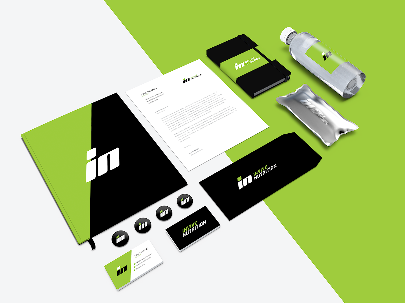


The objective was to create something bold and tough – something that is going to connect with the fitness enthusiasts and make them a customer. However, they wanted to avoid using (giant) cricket for the logo as it could be a potential turn-off for the customers.


That’s why we created a simple visual identity based on company initials (IN) with the additional wordmark that can work standalone as well. The black-green color scheme is chosen to go along with the brand values – strong, bold, energetic and eco-friendly. The logo and whole visual identity are done in a slight uprising style, to resemble that revival, energy and movement story.


Thank you for watching!
Are you ready to make your brand awesome?
Are you ready to make your brand awesome?
If you are interested in a cooperation with us, drop us an email and we'll get to you as soon as possible.
www.insigniada.com | hello@insigniada.com
Skype: Insigniada | © 2017 Insigniada
www.insigniada.com | hello@insigniada.com
Skype: Insigniada | © 2017 Insigniada


