
We are doing an iterative redesign of our ITS-internal wiki space. At the top you will see what we are going for -- an easy to search space followed by grouped-information links.
The idea is to reduce the amount of list-link clutter on the page. Make search front-and-center (with an emphasis on our team members). We also wanted to group information for specific tasks people might need to perform or the most commonly requested resources.
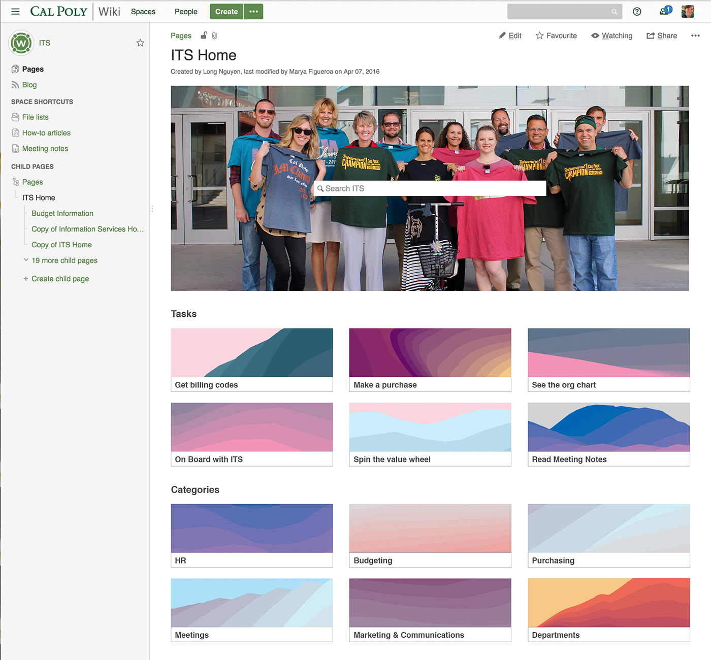
The first mock-up shows this concept. We haven't done the Content Audit or User Research needed to implement this step yet. We will do it in future design-and-development sprints.
The second screenshot shows you our intermediary phase – our current wiki space. This phase included features we could implement immediately: namely, bringing search to the forefront of the page. The search bar is underneath a photo of SLO instead of on top of it; we need the lead-Wiki developer's time to implement this non-standard feature.
The final screenshot shows you where we started: our original wiki home space. The page is chalk full of content, but it is overwhelmed with too many links and lack of content hierarchy.

This shows the concept we have in mind. Search up top, featuring a photo of our team members. The grouped images (under Tasks and Categories) are placeholders. These will eventually be images that match the grouping.

This screenshot shows you are current home space. We didn't have time to do the audit and research required to better group content yet. We also need a developer's time to situate the search box on top of the image. Note: we brought in our Twitter feed.

This is where we started, before any design happened. This was an organically produced home-space page created by our admins who wanted to give the most needed information to team members. They also had a team members' photos up.
For contrast, I respost our concept -- where we want to go.


