BRIEFING AND OBJECTIVES
Hammam Al-Ándalus opened in 1998 in Granada as an updated version of the traditional Spanish-Arab baths, and a singular and pioneering business. Today, the company has various establishments located in enclaves that are rich in historical tradition and extraordinarily beautiful architecture, the cultural legacy of Andalusí, into which the latest technology has been incorporated.
The rebranding project undertaken by Erretres had three main objectives: to solve some issues with the brand’s visual identity, to transmit the brand’s real and perceived value, and to exploit the full potential of the user experience (beyond the historical and cultural legacy that, despite its irrefutable value, could not serve as the keystone for its communications).
To do so, we carried out an Analysis project that in turn made it possible to define the new Strategy and Verbal Communication of the brand, as well as develop its new visual identity.

STRATEGY
The Strategy phase of the project centered on a series of strategic coordinates around which the new brand would revolve: a modern brand, offering a subtle reinterpretation of the hedonism and refinement of the Andalusí culture, and transmitting the exceptional value of the “Hammam experience” and the emotion of the user experience, conscious of the almost spiritual nature of the proffered service.
Therefore, the new positioning for the Hammam is the “Culture of Water” and the brand concept, which acts as a guide, is “emotional sensitivity”.
The reference images for the new brand reflect the positioning of the “Culture of water, the body and hospitality”, interpreted in a modern way from the historical legacy of Andalusí refinement. Likewise, these images inspire the concept of “emotional sensitivity” that guides the action and communication of the new brand.


SYMBOL
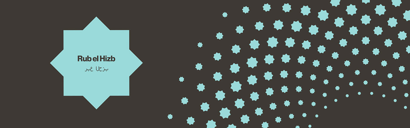
The symbol designed for Hammam Al-Ándalus seeks to encompass the wide spectrum of what the brand should represent on a cultural and spiritual level, albeit with a modern interpretation. To this end, the symbol is based on the “flower of life”, a circular geometry comprised of other small circles that create radial patterns that look like flowers, which has been used since antiquity by numerous cultures in a multitude of ways that range from purely ornamental to mystical.
For Hammam Al-Ándalus, we designed a geometric pattern created out of the ordered repetition of the Rub el hiz, the eight-pointed star that is used in Islamic culture as a symbol for paradise, which appears repeatedly in the extraordinary architectures of the Hammam Al-Ándalus baths. This element also serves as a nod to Hammam’s previous visual identity.


LOGOTYPE
For the word “Hammam” in the logotype, we retouched the Havenbrook (with its elegant finishes) typography, in order to obtain a symmetrical and balanced logotype that would subtly reference the sacred geometry of Islamic art. The logo is completed by a second line that reads “Al-Ándalus”, in a smaller size, formed using the typography Engravers’ Gothic in contrast with the Havenbrook.
The logotype’s resulting morphology is very horizontal, clean and symmetrical, thereby transmitting the almost spiritual serenity of the brand experience.


COLOR RANGE
The selection of the corporate color implied a big leap from the previous brand, which employed colors that are typically associated with the architectural tradition of Arab baths and, for that reason, failed to achieve the desired effect of differentiating the brand from its competitors.
For the new brand, we opted to use blue as the main corporate color, inspired by Larimer, a semi-precious stone that is believed to come from the depths of the sea, and that therefore supports the primordial element of the “Hammam experience”: water.
The rest of the color palate is comprised of colors that relate to the earth tones and stone colors of the architecture of the Arab baths.

TYPOGRAPHY
For titles, we opted for the typography Chap, whose strokes have strongly contrasting widths in some instances, and in others are very geometric, somewhat reminiscent of Arab calligraphy.
For the main text we chose Antwerp for the corporate typography.


VERBAL COMMUNICATION
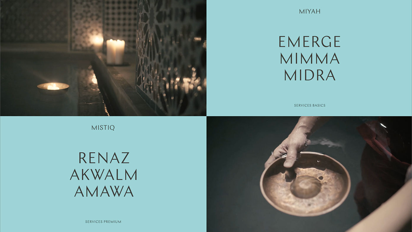
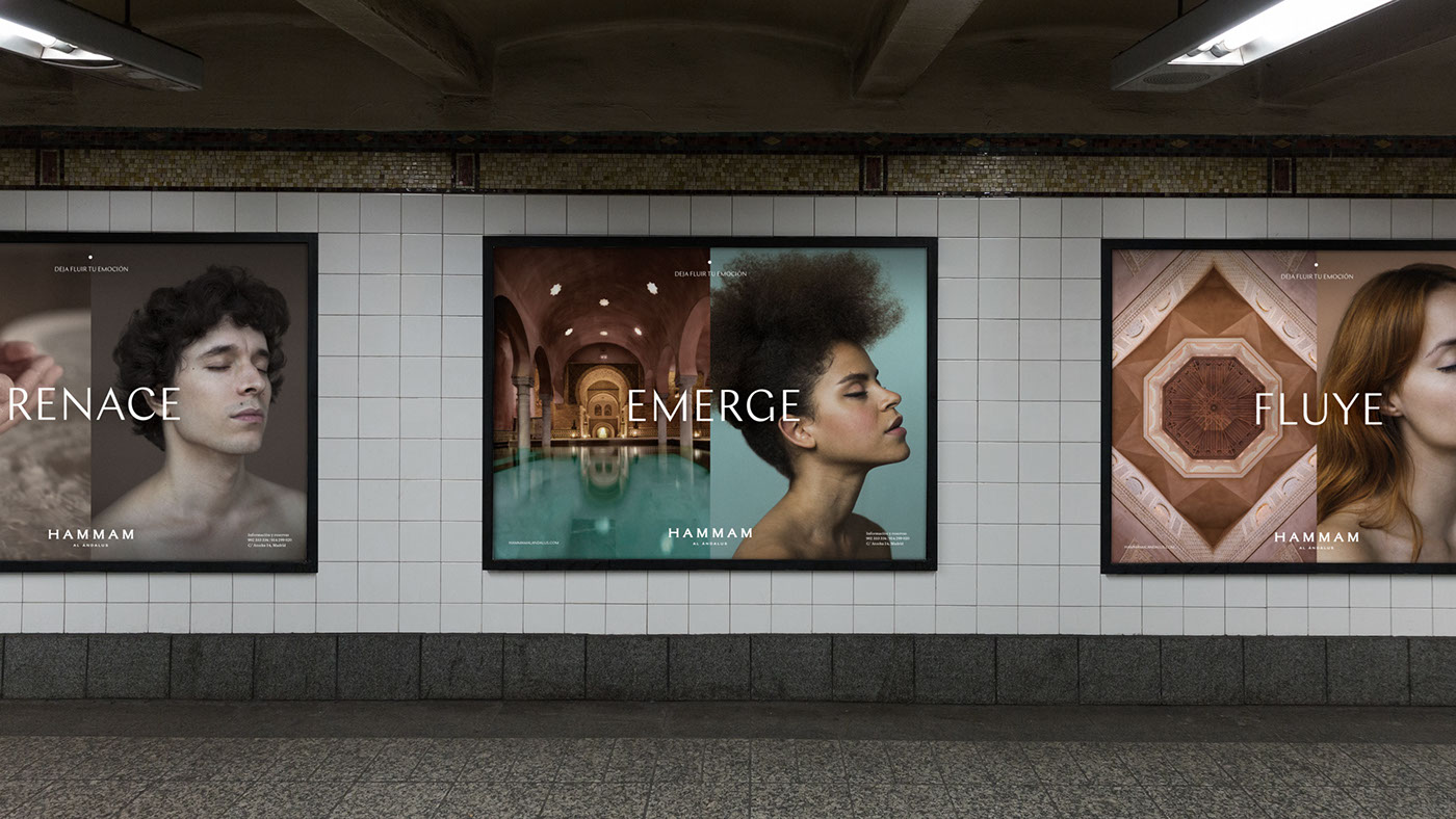
The project included the complete development of the brand’s verbal communication: from the brand message (“Culture of Water”), to its central claim (“Let your emotion flow”). It also included the organization of the services architecture and their identification, for which a series of names were created –reminiscent of the concept of water and the Arab language, two of the brand’s essential, differentiating aspects – to add value to the services. Additionally, a communications manual was created to define the language, style and tone of the brand in a way that is coherent with its strategic positioning and visual identity.
PHOTOGRAPHIC PRODUCTION
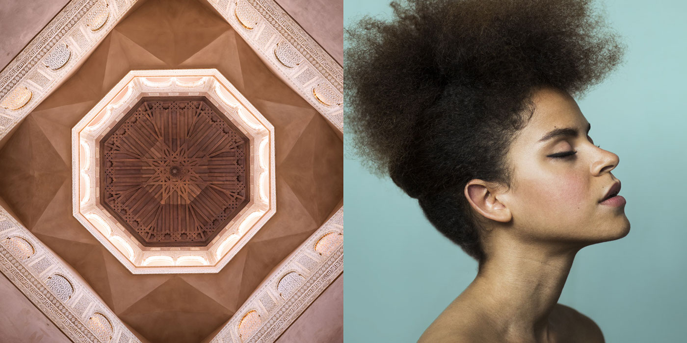
With the goal of suggesting the singular experience and emotions that Hammam Al-Ándalus provokes, we directed a photography shoot for which photographer Berta Vicente captured a series of models with a special type of beauty, who posed with their eyes closed and expressions on their faces intended to transmit the emotions and sensations evoked by the memory of a unique moment spent at the Hammam: the relaxing sound of water, the light of a candle reflected on the tiles, the feeling of oil sliding over one’s body, the aromas of a natural essence…
On communications pieces, each of these portraits faces an image of the Hammam’s architectural space: a cupola, a candle, a foot skimming the water…, as if this were the image that endures in the emotional subconscious of the subject of the portrait.

AUDIOVISUAL PRODUCTION
A series of videos were recorded at real Hammams for the purpose of – beyond describing the available services – subtly evoking the emotional and sensory experiences they offer.
OTHER APPLICATIONS
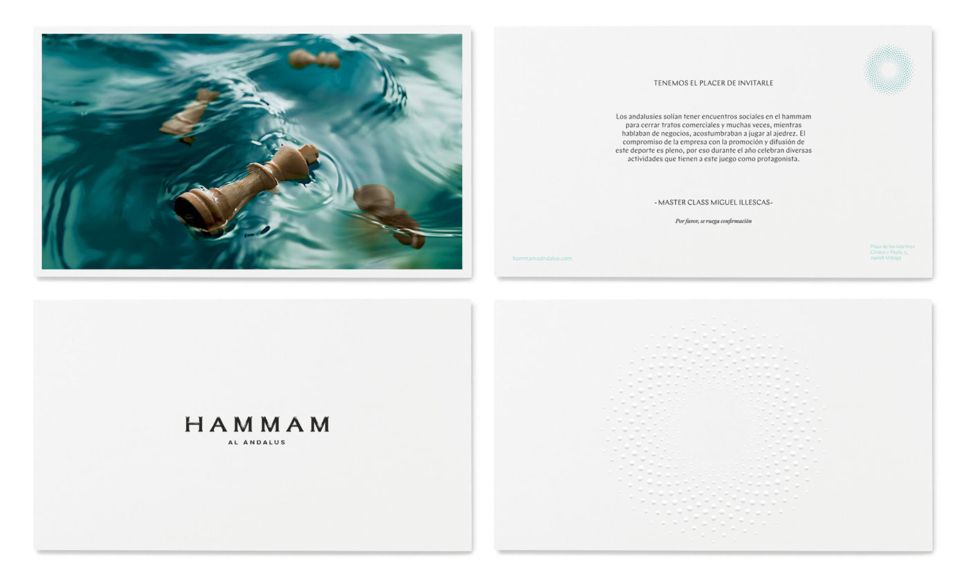
For the launch of the new brand, we designed numerous applications that included everything from the corporate stationery to informative brochures, flyers, bags, bracelets to identify which services people have purchased, the application of the brand on towels, the outside signage, etc., as well as other pieces that can be used for the incorporation of future services, such as a cosmetics line.


WEBSITE
The main challenge of the new website was to make it transmit the essence of the Hammam Al-Ándalus experience. This was achieved through a much more visual design (that incorporates the images and videos produced specifically for the new brand) and optimum navigation from any type of device.


