
Accessibility Responsive Design
Why care about accessibility?
What do huge buttons, simple layouts and strong contrasts have in common?
They are all great when designing for accessibility, and in the rather uniform tech industry, it can be difficult to remember that not all users perceive and interact the same way you do. While most UX designers today do consider the color blind, there are still a lot of other disabilities that almost no one focuses on.
By 2030, around 19% of people in the US will be over 65. Like it or not, this means that more and more people will eventually have trouble reading small text, distinguish between contrasts, and some might even develop arthritis or similar conditions that will complicate the physical use of the devices.
As our motor skills decline with age, touch functionality has actually proven to be a better way to navigate than with a mouse. Finger tapping simply seems to decline later than other motor skills.
Another important aspect of accessibility that most people seem to neglect is those revolved around mental disabilities. Users struggling with brain damage, alzheimers, or any other dysfunction, might physically be able to interact with apps, but the cognitive load that some apps (especially those with almost no text to guide (looking at you Snapchat!)), put on their users can be troublesome. Prospective memory (that helps you remember something in the future) is what we use when we remember what a certain icon represents.
What is responsive accessibility?
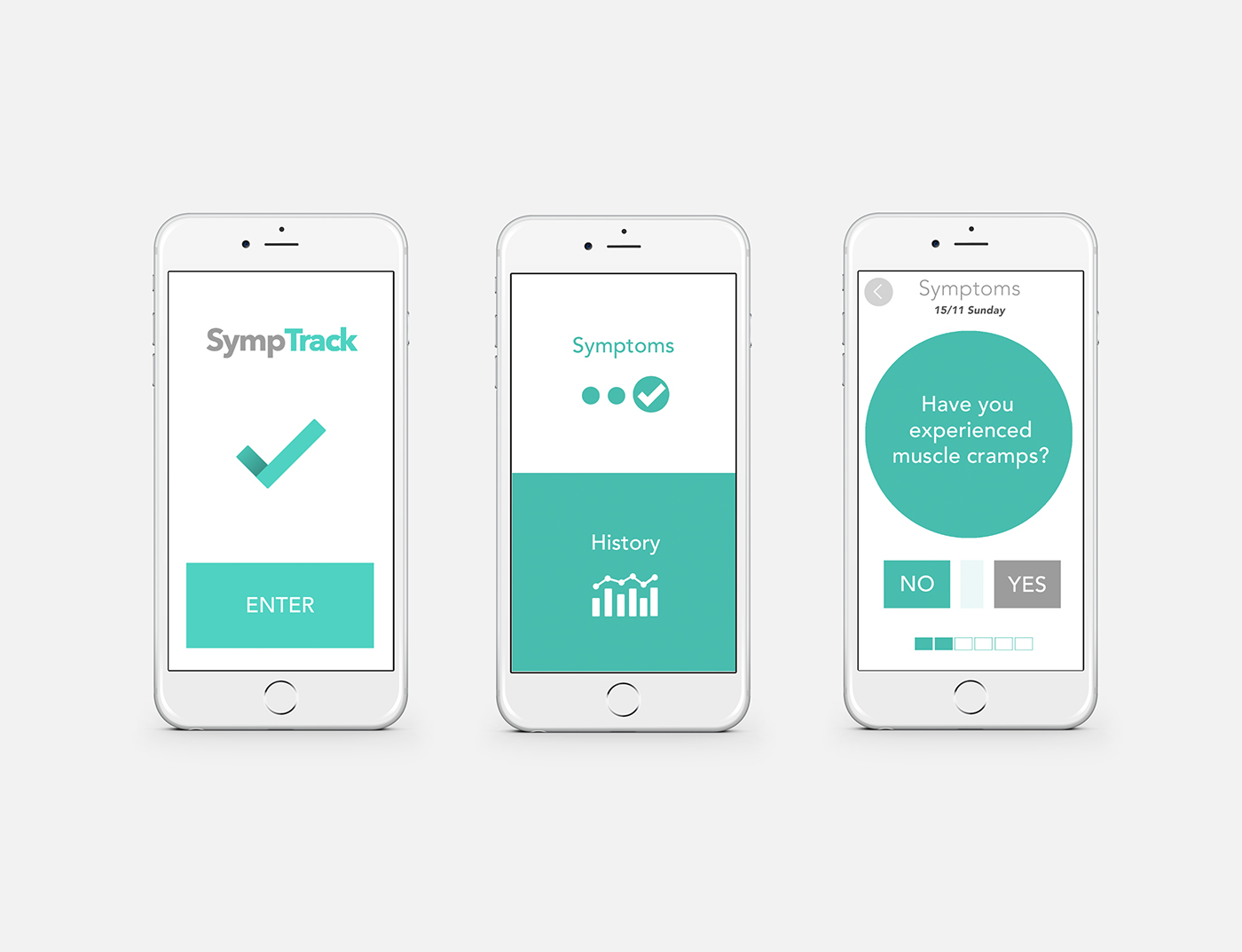
With an accessibility responsive design, you need to build multiple versions of the same app that the users can toggle between. In my example there are three versions. There is the default app, that should follow contemporary design guidelines such as material for Android, iOS guidelines for iPhone etc. On top of that there should be one or more versions added that cater for extra accessibility to the users in need of it. I have attached my two accessibility versions below. One is for users with a cognitive handicap, and the other for those with a physical one.

...Alright, but why make accessibility responsive then?
This is an image of the app SympTrack, designed with extra big buttons and a very simple interface to help patients remember to take their medication and track their symptoms.
The short answer is that not everyone needs it, and as a core principle in UX, you should hide or remove the elements that a user won't need. The longer answer is that some tasks might actually need to be more difficult to do, in order to ensure that misclicks (mis-taps?) won't happen. As an example, deleting your medication should be easy to access for some users, like the care takers, while making sure that patients don't mistakenly do it. One way to do this, could be adding a drag-to-confirm interaction, that requires some extra effort. This way it would pretty much eliminate misclicks from accidentally deleting the meds. Check out the low-fidelity wireframe animation below to get an idea of how this could be implemented.
It should be the very screen when you open up the app for the first time, that allows the user to choose the design that is best suited for his or her needs.
How about font sizes?
Don't worry too much about font sizes as these can change automatically if you go to your phone's settings and choose larger letters. Instead, make sure that doing so won't break the design, and that buttons and other design elements will enlarge as well.
Especially buttons and any interactive element should be scalable. Lastly. remember to name elements properly in the code, in order for screen readers to function optimally.

Can you add extra accessibility to navigation?
As a general rule: avoid splitting tasks across multiple screens if they require memory of previous actions. If you for some reason can't fit everything into one screen, then go out of your way to make it obvious that the next step is directly related to the previous. One way to do it could be, as in this example, to visually add an element that shows the continuation of the form or information that you are filling out or reading.
Thanks for reading. Please let me know in the comments what you think, and any areas that could benefit from the implementation of accessibility responsive design.
Shoutout to O. Campbell for inspiring me to write this piece.


