Keywords
Field Research, Service Design, Customer Journey, Service Ecology Map, Blueprint & Threshold map
In collaboration with
Helga Lunder, Jeppe Dahl-Østergaard, Michael Schou Larsen & Siv Tværmose

If you have heard about Service Design but have no idea how to use it, this is for you.
Check out some of the tools below and try to apply them to your own cases. When done right, Service Design can be a quick and effective way to find out how to improve and optimize your customers' experience, to ensure your users will return.
Donkey Republic is an online bike rental platform.
We used personas to get a sense of how the company's target customers might use the service and mapped out the touch points of renting a bike.
This enabled us to analyze the platform with the following
Service Design tools:
· Service Ecology Map
· Customer Journey Map
· Service Blueprint
· Threshold Map
The main objective was to enhance the quality of the user experience and our findings showed that the biggest customer pain was to shift between the app and website in order to book a bike.

What is Service Design?
Services can be divided into three groups.
Care services provide care for either people or products.
It is a pretty broad category -
a bank can be said to provide care for your money, a therapist can provide care for your happiness, and a lawyer can provide care for your freedom.
Access services provide will allow you access any kind of object or information that you couldn't get without them. This is typically software like Google Adwords or platforms like Amazon and Netflix.
Response services responds to people's needs in the moment. This could be an ambulance rushing to an accident, a store clerk helping a customer make a decision or any type of tech support.

Making a Service Ecology Map
To show Donkey Republic's environment and service ecosystem we designed a Service Ecology map. At the heart of it is their core value proposition, and in the circles surrounding it, the how, why, who, when, where and what of their business. These are again divided into areas relating to different aspects of the company: It's customers, booking, community and system.

Creating a Persona
To help us gather insights and perspectives differentiated from our own, we created a persona. "A persona is an artificial person, invented for the purpose of helping a designer understand the people who will be using their product" (Norman, as cited in: Grudin & Pruitt, 2002). Donkey Republic has tourists visiting Copenhagen for a weekend as their target group and we therefore had this in mind while developing the persona. A persona can be created in numerous ways, but we chose the fiction-based approach, meaning that our persona is not based on actual data, but rather intuitions and assumptions. Fiction-based personas are useful to explore design and generate discussions and insights in the field.
Our persona is a 22 year old girl named Lisa, who is a History student from Amsterdam. She is visiting Copenhagen for a week on a holiday with her boyfriend Marc who is 25 years old. While staying in Copenhagen they have decided to live at a cheap hostel in order to save money, and because Lisa would rather spend money on experiences around the city than on a fancy hotel, as she will be out and explore the city most of the time anyway.

How to Perform a Customer Journey
First and foremost it is important to understand the Customer Journey from the users' own perspective. We therefore conducted our journey first hand, as seen through the eyes of our persona, but experienced through our own bodies. Our experience of each touchpoint was documented through an app called Experience Fellow. This app allowed us to write an evaluation of our experience of the service in real-time and rate each touchpoint with five smileys from unsatisfied to satisfied. The concept of using the app while on the journey is to avoid any memory bias, that could influence the results if you wait too long to document the experience. It is important to bear in mind that each Customer journey is unique, as each individual forms his or her own unique use environment depending on previous activities and thinking in that setting (Gupta & Vajic, 2000). Some findings will naturally overlap and appear in other users' journeys as well.

Blueprint
A good comparison to a blueprint is the Business Model Canvas, a visual representation of a business model divided into nine building blocks, which illustrates how all the different aspects of a business model is connected and how changes in one block will affect the
other blocks.
A blueprint can be visualised in many various ways. Our visualisation is inspired by how Bitner et al (2008) have crafted theirs. The classic blueprint consists of five components aligned horizontally on top of each other. The components consists of customer actions, onstage/visible contact employee actions, backstage/invisible contact employee actions, support processes & physical evidence.
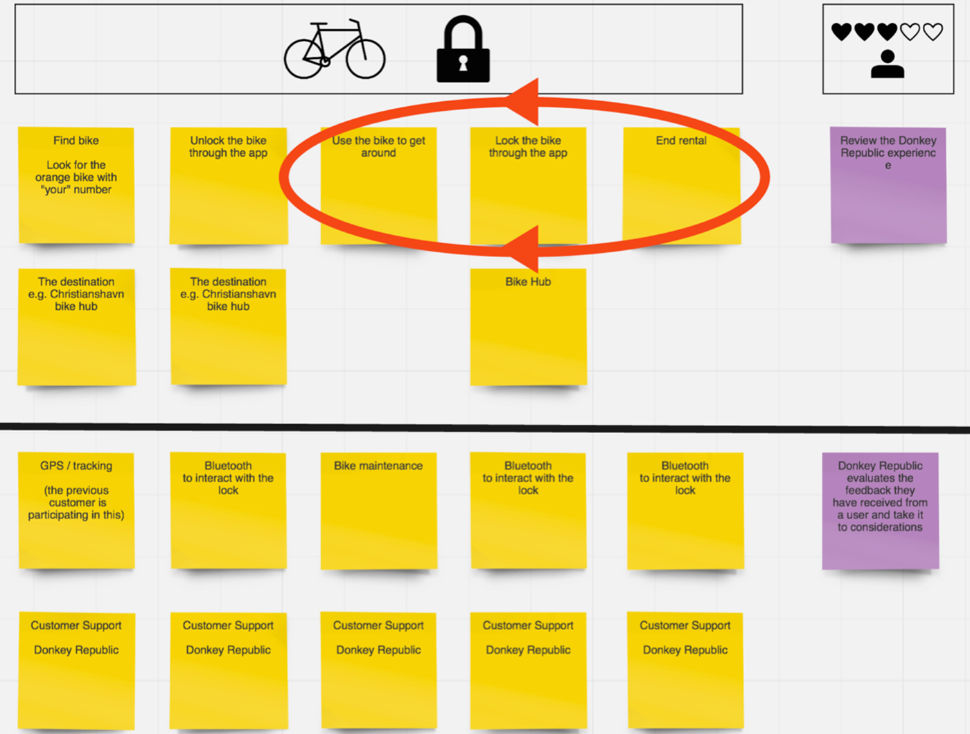
On-stage and Backstage Actions
The flow of the blueprint depicts a customers actions chronologically. In our case a customer action could be renting the bike. This is the goal of the customer. In order to achieve it, the customer will have to interact with the service. This happens in so-called on-stage actions. If the customer is to rent a bike, the onstage action would in our case be to visit the website or app to book it. Whenever the customer performs these actions, processes will be carried out in the backend, or the backstage of the service. An example could be that the system will check whether there are any available bikes as soon as the customer tries to book one. The line of visibility determines what the customer can and cannot see. That the system is checking the databases to check if there are any available bikes is on the backstage because the customer can't see that happening. In some services there are support processes that operate in between the two, such as IT-support of the service. Finally the devices or platforms that you can interact with the service through, in our case either a mobile or a computer, is titled physical evidence in the blueprint model.

How we used Threshold Mapping
A threshold map is a graphical representation showing a user's comfort zone in relation to a given phenomena over time. Design studios, workshops and labs are good at testing and exploring what their products are capable of and what they can withstand when users put them through their everyday life, but when it is service and behavior related it's more complex because the surrounding situation or environment can have almost infinite circumstances (Chipchase, 2013). The foundation of the threshold map is simply that people can be comfortable (inside their comfort zone) or uncomfortable (outside their comfort zone).

We created a threshold map based on the booking and sign-up process from our customer journey to identify and visualize the most critical touchpoints. Threshold Mapping can either be based on a customer journey, which in its nature is a qualitative experience. It can be useful to map different threshold diagrams for different types of people or user groups and it can deliver a large payoff, revealing both a richer understanding of what people are and are not doing, what triggers them to go outside of their zone of comfort, and most importantly why. The X-axis is showing the touchpoints from the customer journey of the signup and booking process, and the Y-axis is showing the expectations and experience of the service. The green area is illustrating our comfort zone defined by when our expectations were met by the actual experience of the service. The threshold map is showing that the touchpoints T6, T8, T10 and T12 are the outside of the comfort zone and should be improved.

Synergy Between Tools
The Blueprint and Threshold Map which is essentially the core of the analysis, would not be viable without the data that the customer journey provided and in this way they build upon each other in order to give a more in depth view of the service. The blueprint provides the overview that enabled us to zoom in on the signup and booking process which we used the threshold map to analyse.
These models will never be better than the data they are conceived of, and that realization sums up why the shaping of the data and by that, the relationship between the tools is essential to the final outcome. When the data set is as narrow as ours it can be risky to conclude anything on a large scale, but it can indeed give some indications to explore further.
There is no need to ask a customer to supply location, time or
other contextual information that the provider can obtain by
a backstage service or sensor (Glushko, 2012).
Customer Expectations
In order to keep a customer satisfied it is important to meet their expectations and prevent service failures. There are two ways to respond to service failures; reactive service recovery (RSR) and proactive service recovery (PSR). A service recovery happens when the manager of the service responds to an established or possible problem. RSR means to respond to customers' feedback and improve errors after they have been addressed. Research by Tax & Brown (2012) shows that only 5-10 percent of customers who have a bad experience actually end up complaining afterwards. This leads to service providers not being aware of existing problems and makes it difficult to fix the failures. It is therefore important to conduct PSR, which means to discover service failures before they actually happen. This will minimize the chance of a negative experience overall and hopefully prevent errors and complaints. It is necessary to have a comprehensive understanding of the users needs, ability and expectations in order to be proactive.

Recommendations
We have come up with some opportunities for innovation of the customer experience across the service based on our insights. The booking-phase has the biggest negative impact and should be the main concern. The blueprint showed that the booking process covers a big chunk of the journey without actually being the part of Donkey Republic that brings value to the users. The threshold map shows how switching forth and back between website and app makes the users bounce out of their comfort zone. Overall the service does provide value to the target group, but the booking phase needs to be much faster and simpler. The user should be able to book the bike entirely through either the app or website, instead of needing to access both. The app should be battery efficient, as it is required to both lock and unlock the bike. As a tourist you might not be willing to spend that much data either, and the app should either use very little data, or the booking flow should be made accessible from the hostels computers.

An alternative way to verify the user could be to just send a text. That way the user would be able to sign up without having to login to the website, check their mail, find the the verification code and paste it into the app, and as a result would make the on-boarding process easier.

Thank you for reading. Happy biking!


