
PROJECT OVERVIEW:
I had an amazing opportunity to rebrand an identity for British Film Institute (BFI) for a class at Art Center College of Design under the guidance of Simon Johnston. British Film Institute exists to promote greater understanding and appreciation of, and access to, film and moving image culture in the UK.
The identity designed for British Film Institute is based on four core principles:
1) Repetition
2) Narrative and story plot chart
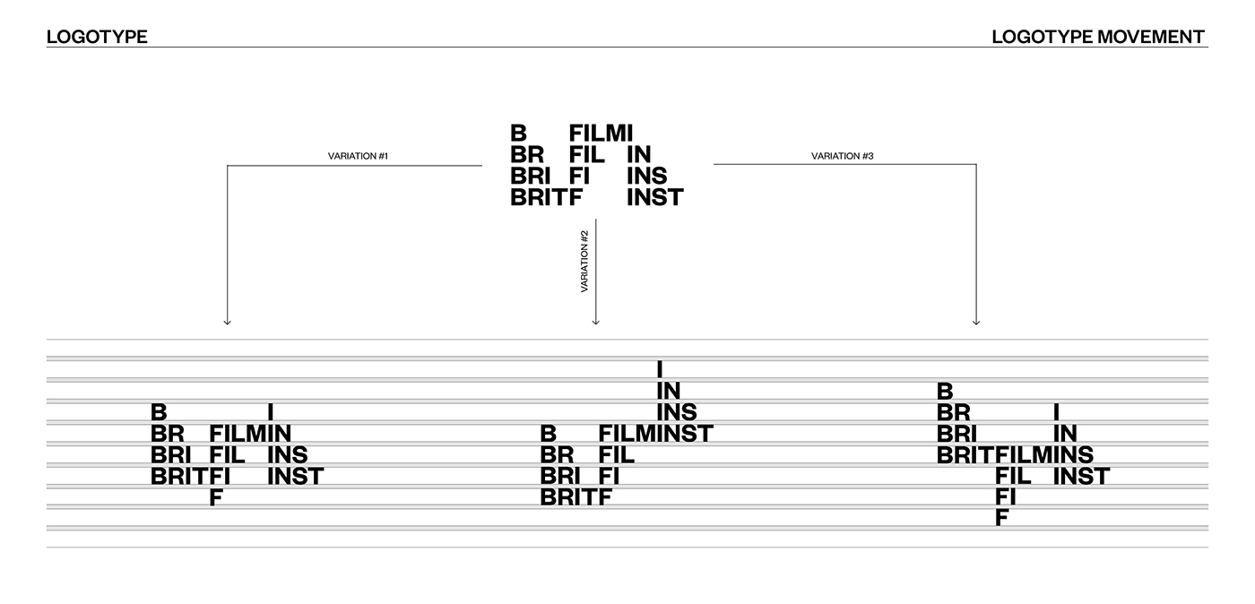
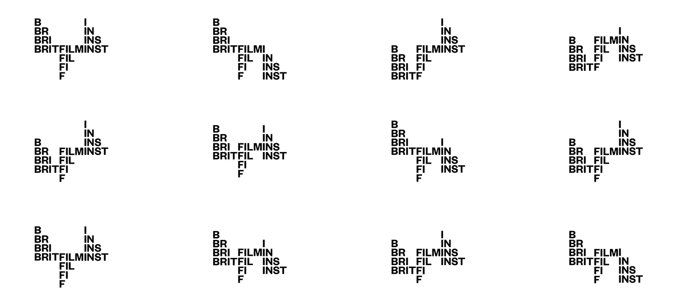
3) Movement
4) Versatility and flexibility
IDEA/CONCEPT:
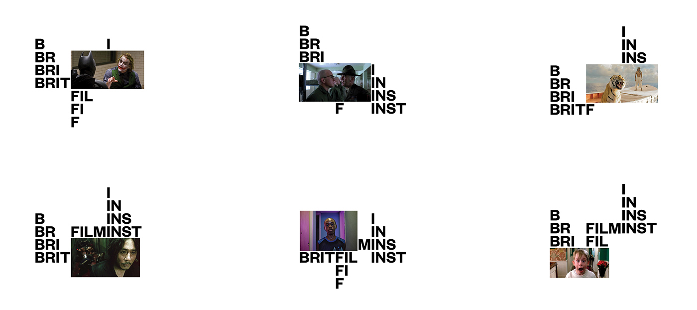
I extensively researched the history and the origin of cinematography and was heavily inspired by the concept of "Pure Cinema"-- the assembly of film, and how different orientations of films can create different ideas. One great example of it is a technique called The Kuleshov Effect. I was fascinated how simply juxtaposing images with different & repetitive images could directly and easily manipulate the audience's emotional experience. The legendary British filmmaker, Alfred Hitchcock referred this specific technique as filmmaker's essential tool during his 1964 CBC documentary A Talk with Hitchcock while discussing the most fundamental tools at a filmmaker's disposal.
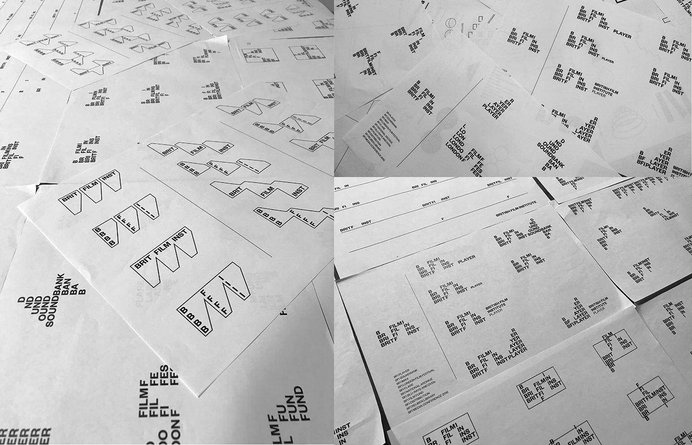
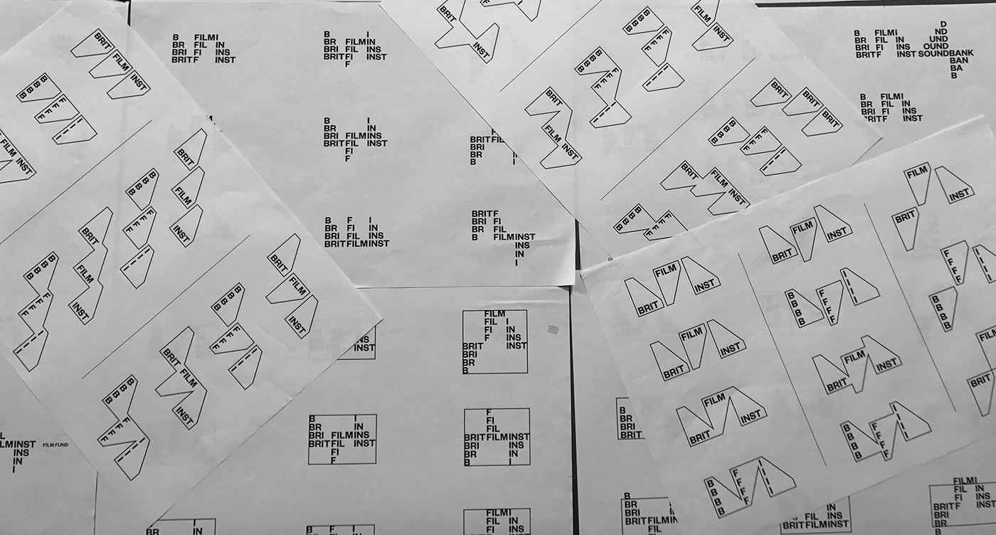
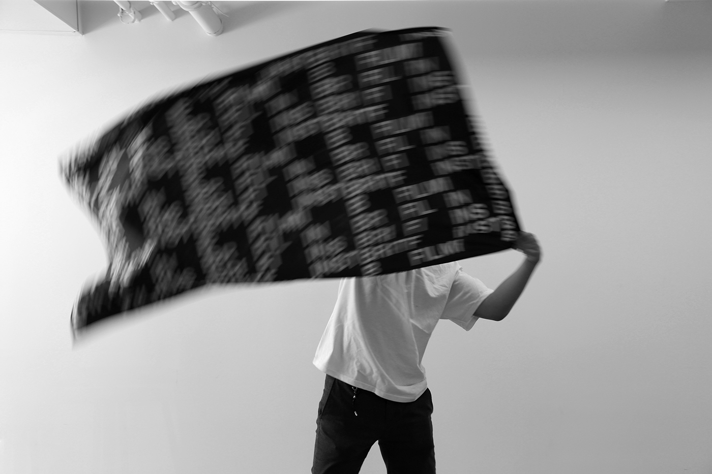
What differs from cinematography and photography is that cinematography incorporates and utilizes movement rather than a still image. Movement is an essential element in cinematography which creates flow and dynamics in film. I was also fascinated at the fact that every movie/film has its own unique storyline and narrative. Based on that information, after researching, I was inspired by the various flow of story maps and how dynamic, flexible, and different they are.
APPROACH:
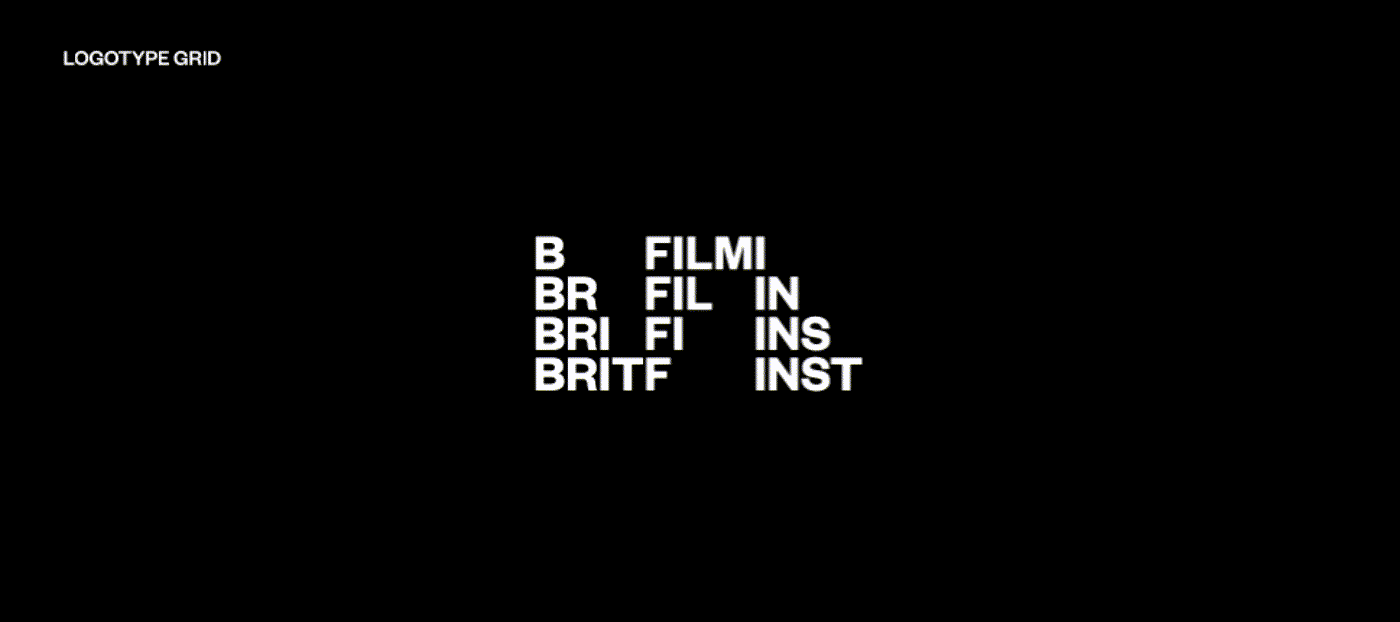
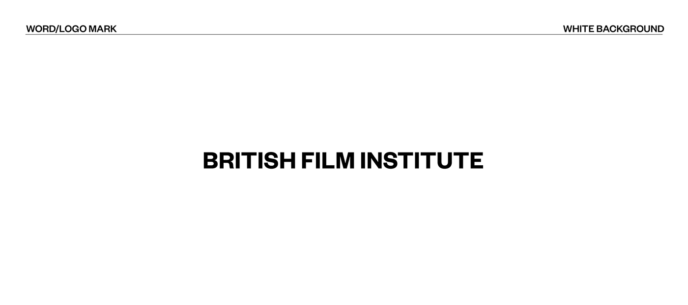
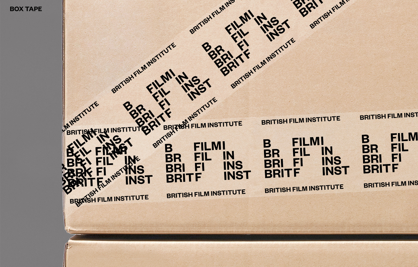
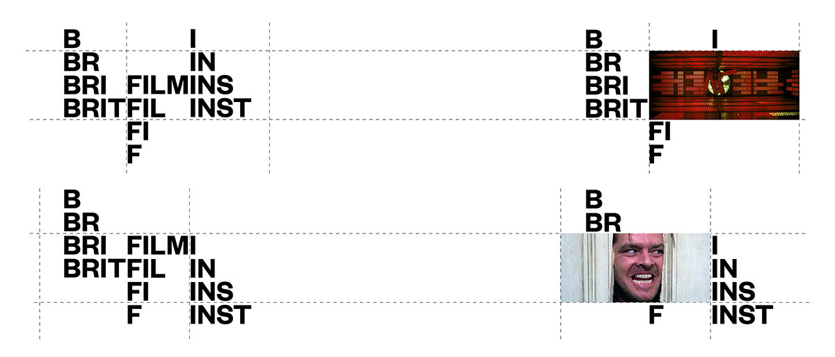
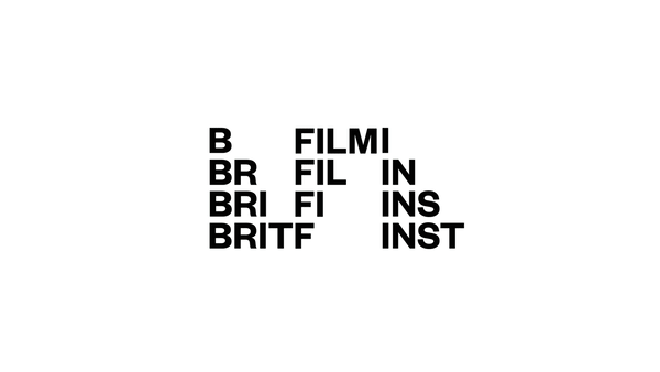
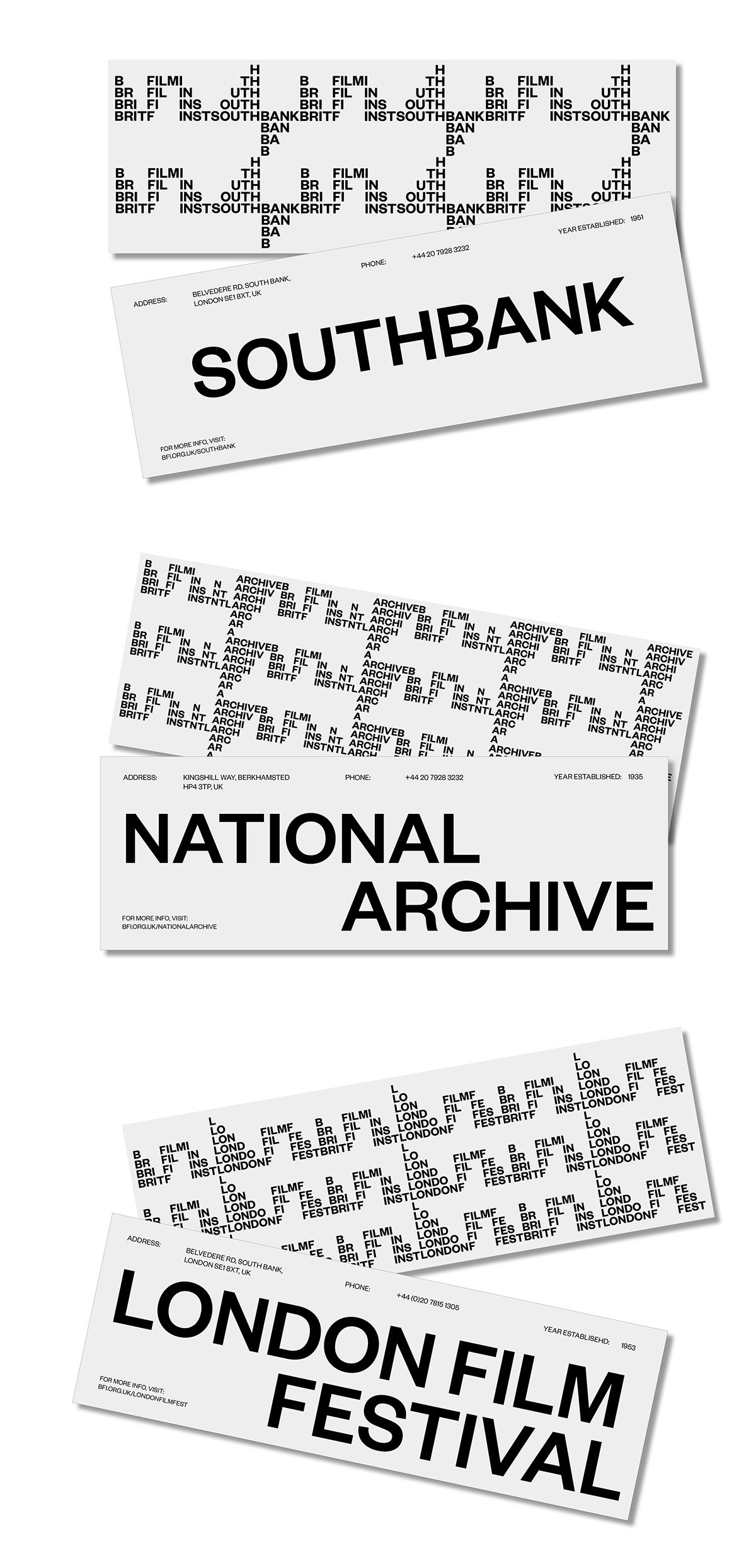
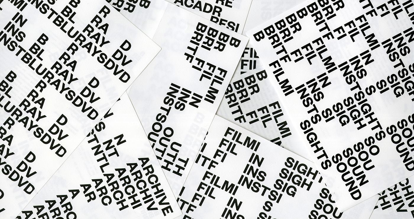
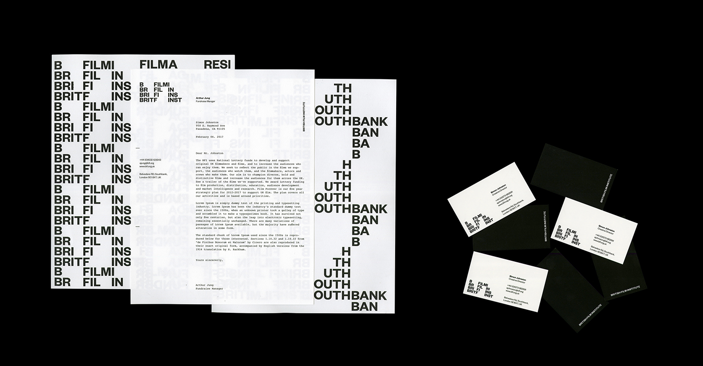
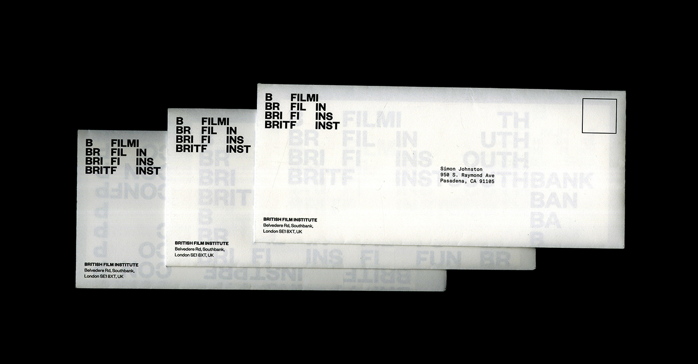
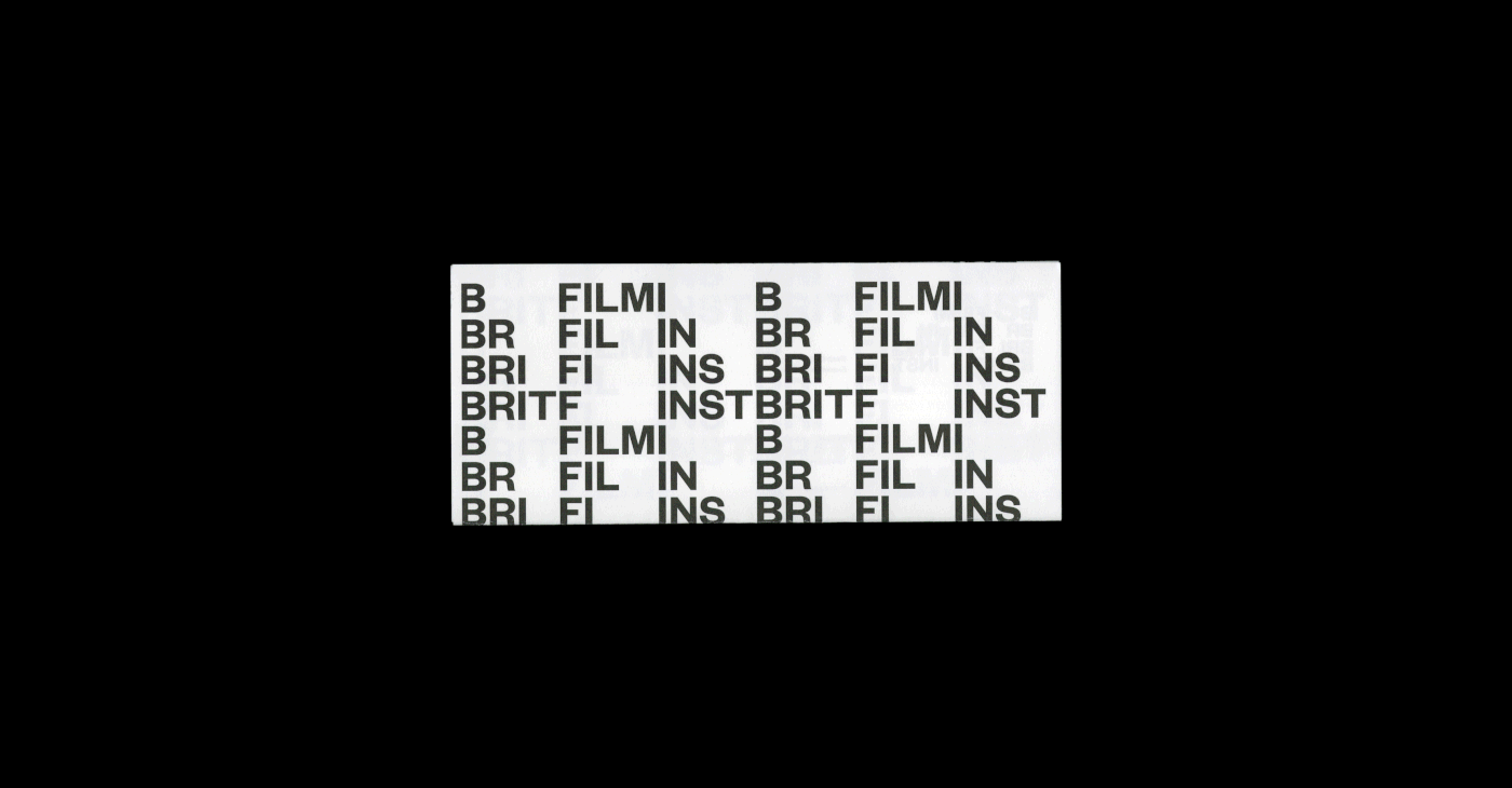
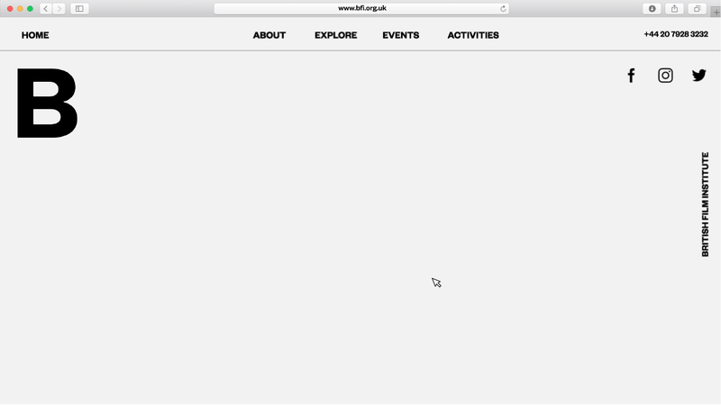
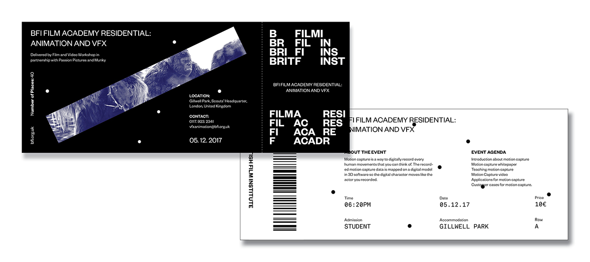
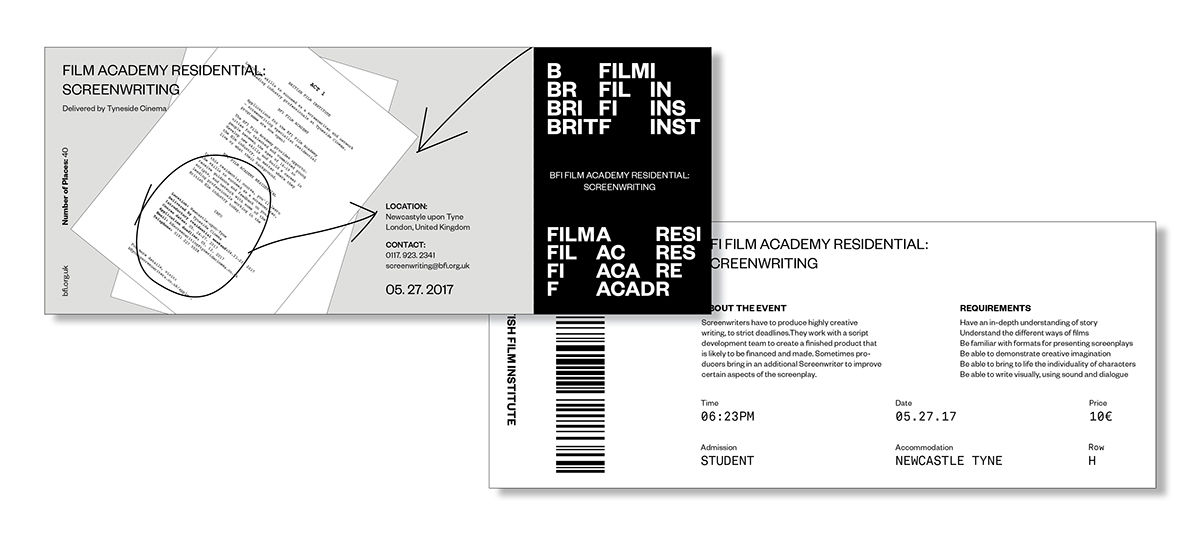
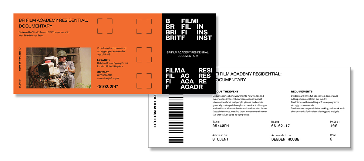
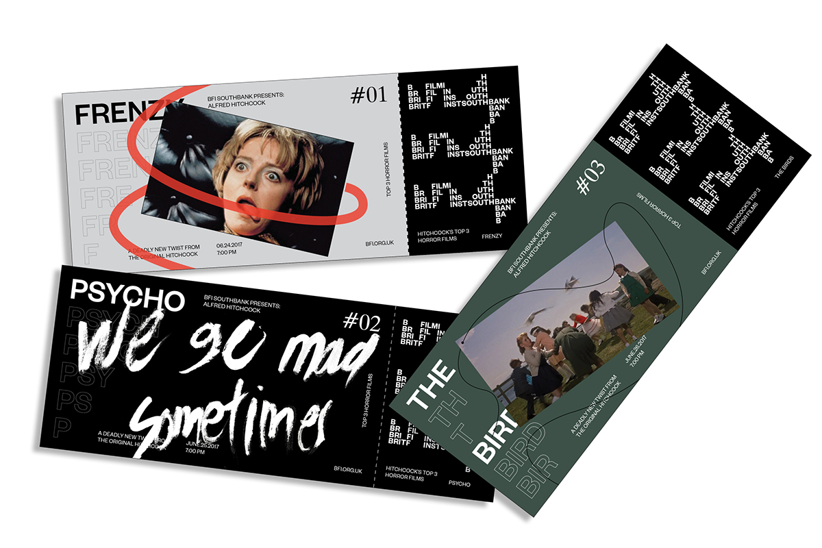
I've created a visual identity that embraces adaptability over corporate consistency. This typographic identity mainly utilizes the idea of repetition, movement, and flexibility. Although there is a primary logo/word mark, it isn't static due to its advantage of versatility. There is a system in which each character of the word "BRIT", "FILM", "INST" move to a different position according to the specific grid, format, and media it is placed at, and each movement ultimately creates an interesting and unique form which reflects the overall idea of flow of the plot charts. I did not want the identity to be static but also not chaotic, therefore, I restricted the identity with a specific grid system. This same approach could be applied into different departments such as National Archive, Southbank, Film Fund and many more. It is also applied and used for apps, posters, and other mediums managed by British Film Institute. The institutional posters and other applications are interactive and informative in which people can interact and have new emotional experience yet also be informed about the core value of the institution.
BRAND GUIDELINE:
The brand manual consists of four chapters (88 pg):
Ch.1) Logo Mark
Ch.2) Applications
Ch.3) Usage of Variations
Ch.4) Stationaries
This guideline informs the specific grids and general rules that need to be strictly followed when using this identity. This book also contains the usage of the identity in different applications and environmental space for readers to visually see the advantage of this identity in real life.
*PDF of the guideline is available upon request
Featured:
Image Publishing: Flexible Identity