


THE BRAND
The Damn Fools are a Vancouver based rock and band, heavily influenced by classic rock, blues, soul and southern groove. Following their formation in 2012, the Damn Fools found that they were in need of a personal brand after quickly making an impression within the industry and with fans.


BRAND GUIDELINES EXCERPT
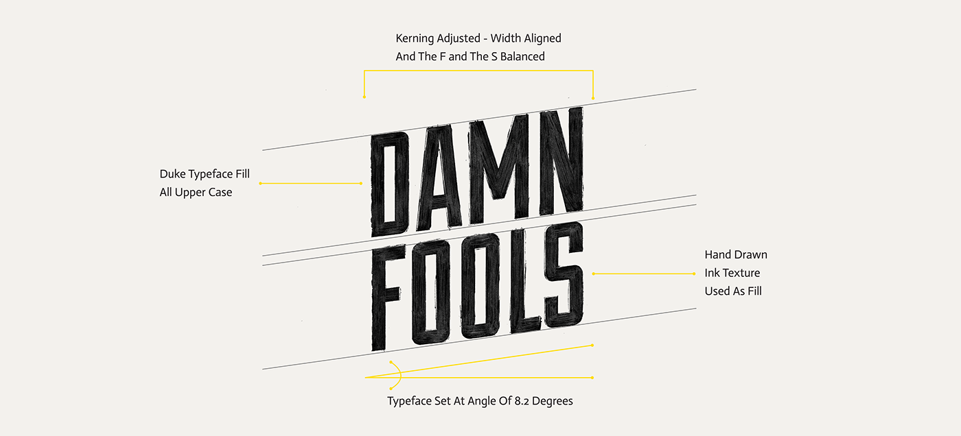
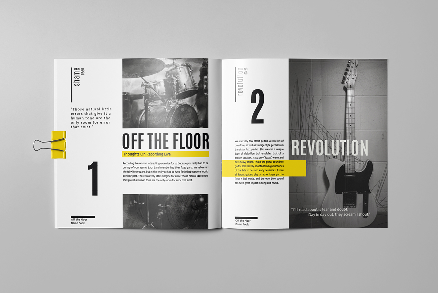
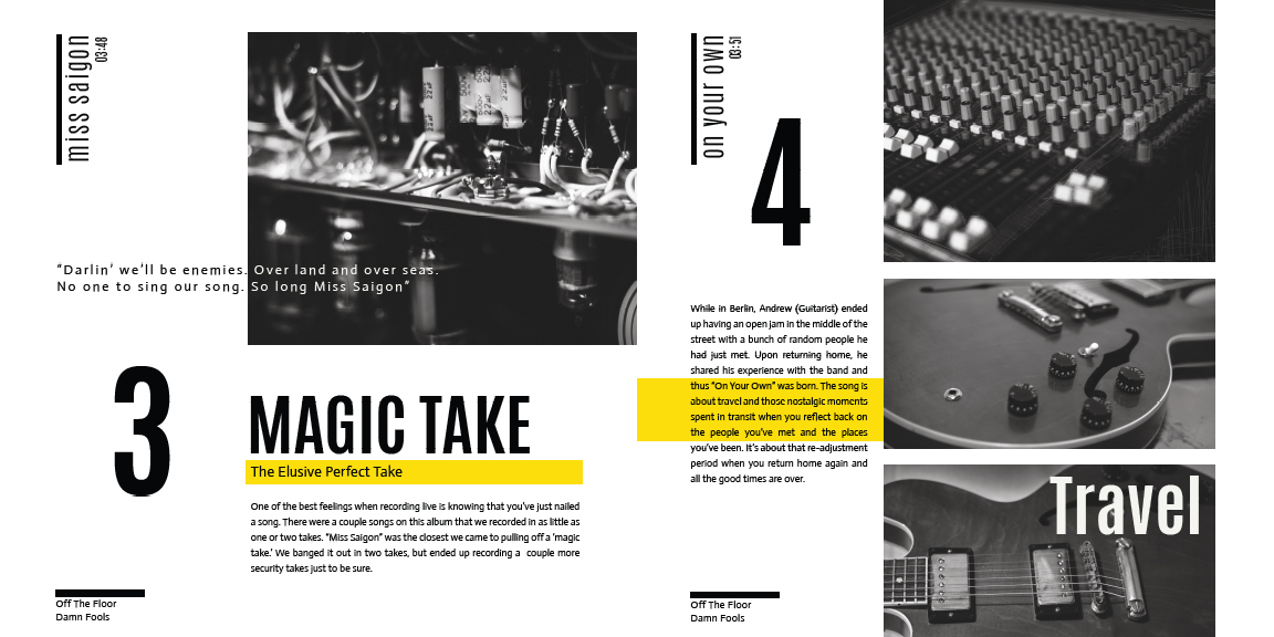
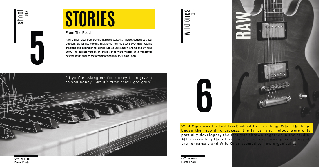
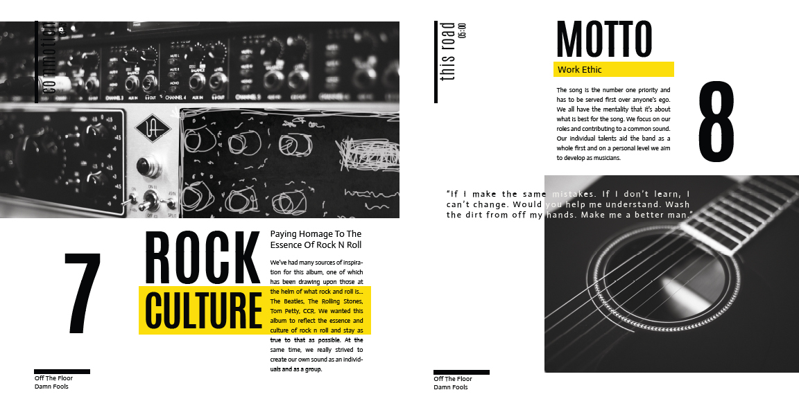
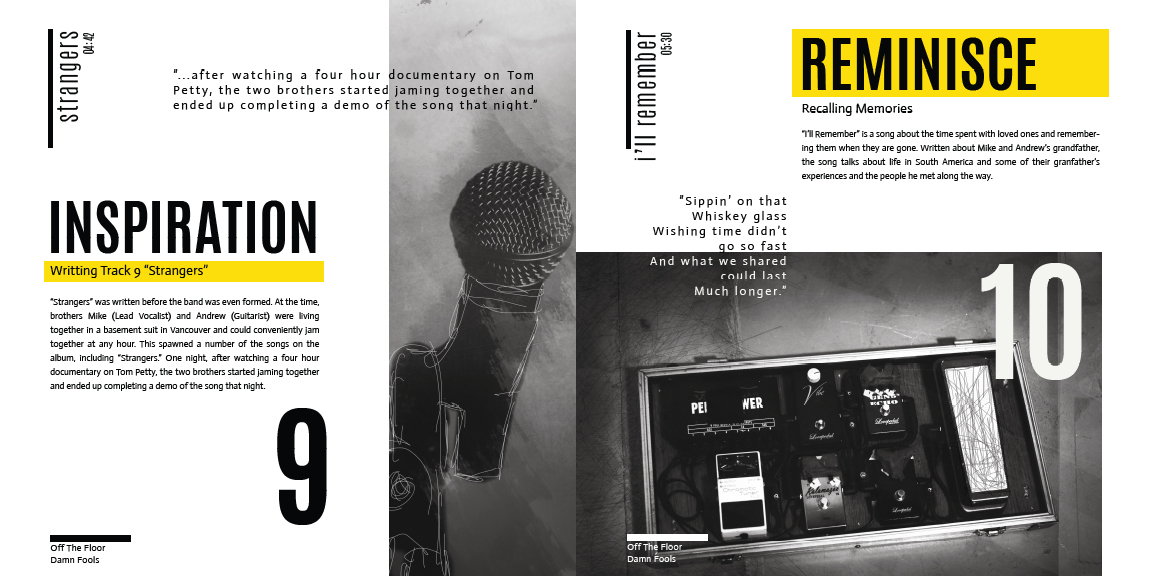
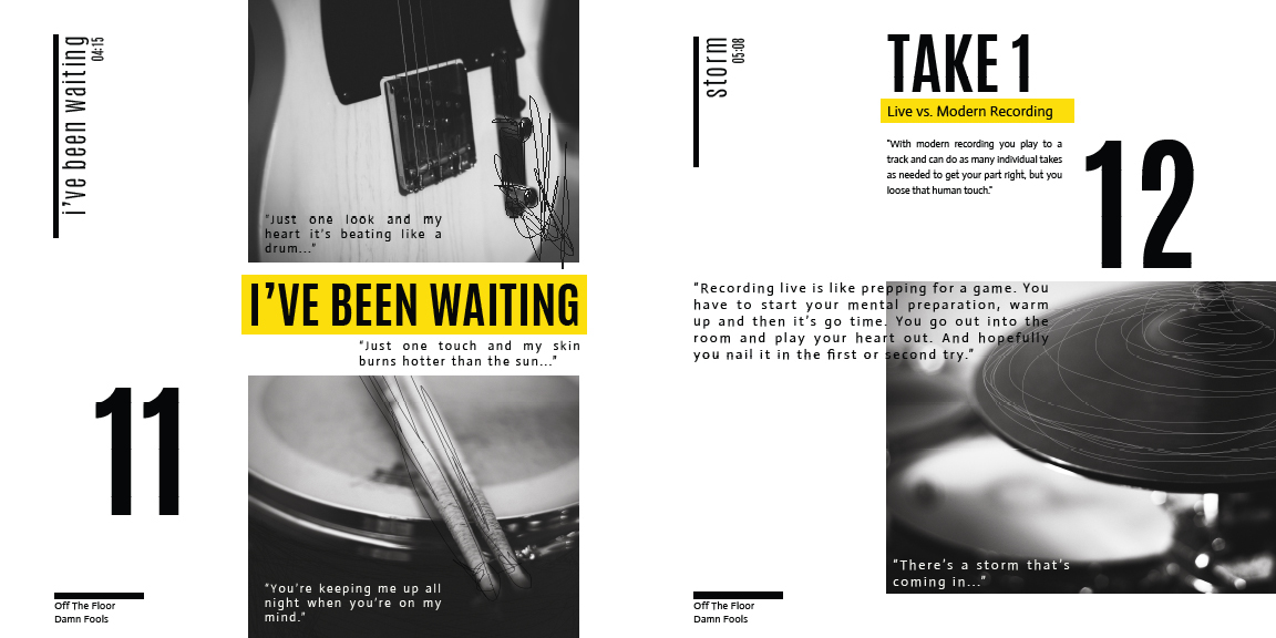
Defining the Damn Fools visual identity was heavily inspired by the band’s musical roots, ideologies and inspirations. I decided to hone in on their process of recording live, which lends a raw tone and human element to their music by capturing specific moments in time. This was translated visually through photography and gestural drawing, which is used as a metaphor for capturing moments and representing the analogue process of recording live.


DEVELOPING KEY VISUALS
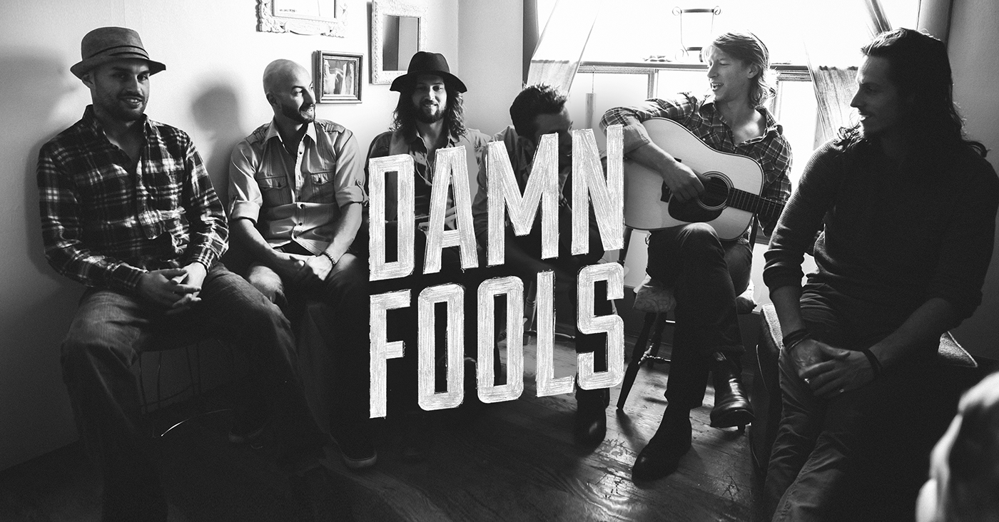
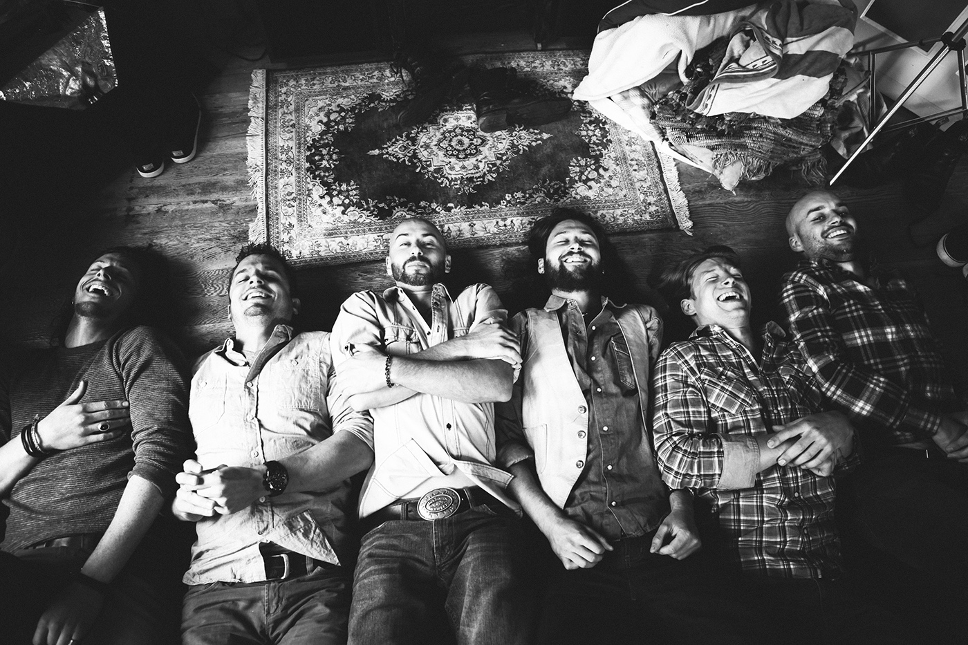
In order to really showcase the band members individual personalities, as well as their collective dynamic, we decided a photo shoot was required. I worked with professional photographer, Christian Arias-Carrasco and together we set up a make shift studio and found creative solutions with sets, props and lighting. Creating a fun set environment helped bring the photos to life and the final portraits perfectly capture the band's identity and support the overall branding.


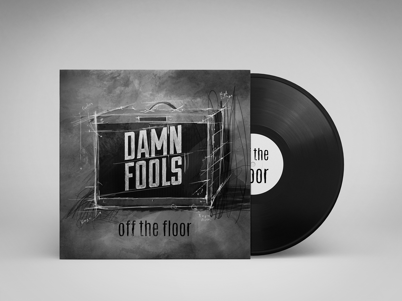
ALBUM BOOKLET & LP COVER
An informal interview with the band during one of their jam sessions was the source of inspiration not only the final brand identity, but also the album booklet. The band was describing the process of recording live and they said something that really stuck with me: "Recording live is like a snap shot in time. It retains a human element and it’s not always perfect. When you are live, you only get one take and if you mess up you have to do it again."
The whole concept for the brand became “Capturing The Moment.” I tried to incorporate an analogue approach to design elements. This one-take philosophy that the band brings to their music was explored through different techniques, such as hand drawn textures blended with digital elements, as well as photography and composited gestural drawing overlays.
LP MOCKUP
THANKS FOR VIEWING
You can check out the Damn Fools music here.
CREDITS: Portrait Photography by Christian Arias-Carrasco
SPECIAL THANKS: To Cesar Martinez for all his invaluable suggestions & help!


