
EN:
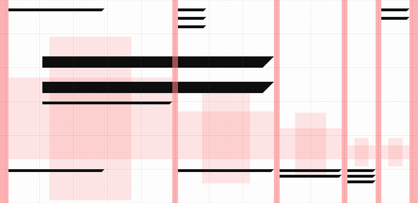
Experiment with a modular grid based on Fibonacci sequence. I wanted to show that classic mathematical proportions can serve as a basis for flexible mechanism for displaying content on the web. The sum of the first numbers of this sequence happened to be 12 (1+1+2+3+5=12), a common number of columns in most popular frameworks. Using this as a starting point for the grid, I've decided to show how text and images can be placed on the page. I've selected a gallery website structure with several authors, a Catalog and some other pages like Sign up and About.
*All images from Coup agency, Oslo are used for project dummy content only.
RU:
Эксперимент с модульными сетками на основе ряда Фибоначчи. Мне хотелось показать, что классические математические зависимости и пропорции способны дать основу гибкому механизму отображения контента в вебе. Сумма первых пяти чисел ряда равна двенадцати (1+1+2+3+5=12) — это как раз привычное количество колонок в большинстве фреймворков. На этой основе я решил показать, как можно распределять текстовый и визуальный контент на странице. Для примера я взял структуру сайта-галереи, где представлены работы нескольких авторов, есть каталог работ и портфолио каждого автора, несколько других страниц типа регистрации и о проекте.
*Фотографии агентства Coup, Осло, использованы исключительно в целях макетирования.


Modular grid, based on Fibonacci sequence:
Typography:

Color scheme based on the "Blush" color, generated from basic RGB and CMYK colors:


Projects page shows personal projects by all agency photographers:

Photographers index:

Full screen slideshow:

Search results:

How 2x1 images fit the grid:

Agency Manifesto:

On mobile Fibonacci grid shrinks in just one column:

Main page:

April 2017 . . . . . . .. . . . . . . . . . . . . . . . . . . . . . . . . . . . . . . . . . . . . . . . . . . . Thanks for watching. Contact — hello@niketo.ru


