EVEREST TELECOMS
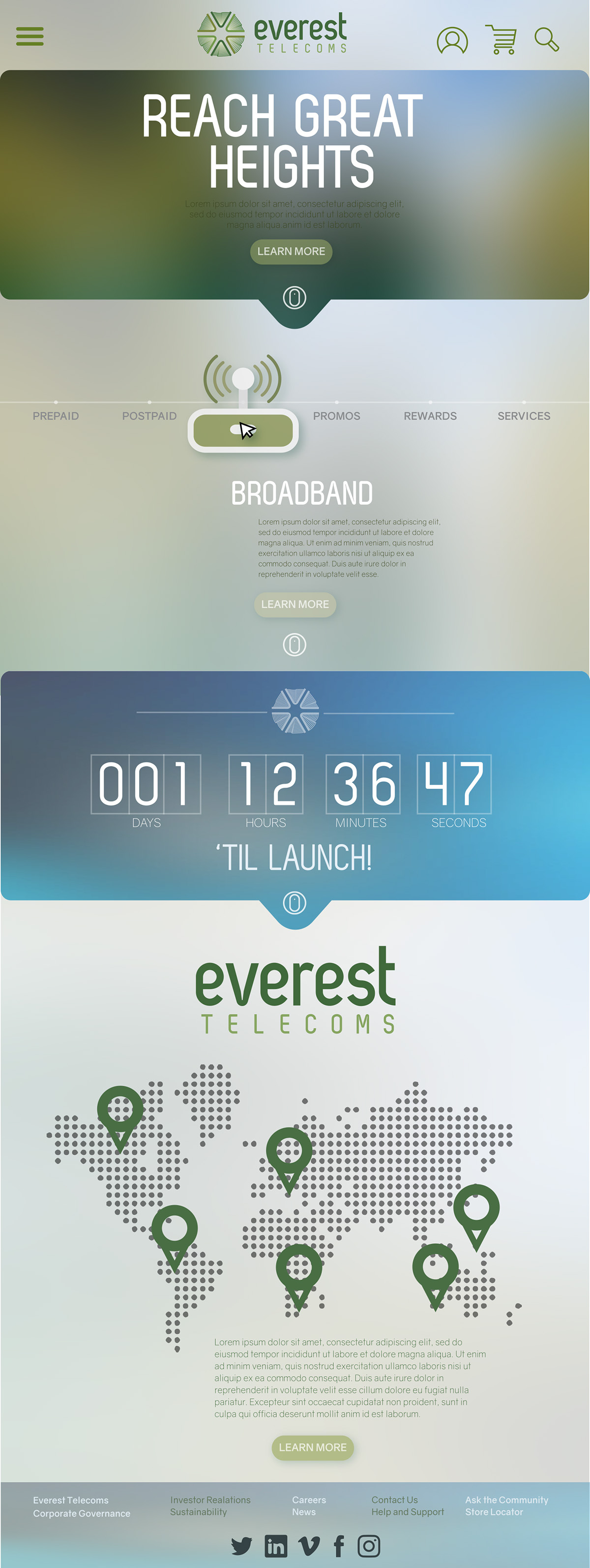
Everest Telecoms is a newest telecom challenger in the market. It's goal: to break-in to the Philippine market with a promise of quality service for both calls and data with premium plans using the most advanced technology available. No wire, no towers, only satellite technology. Call anyone in the world with an infrastructure that knows no boundaries. Keeping in touch is just the tip of the iceberg.
To support the launch of this new company, I've created logo designs, hard and digital invites, a stage design, ads and website.

The use of satellite is highly emphasized in the company’s brief, “No wire, no towers, only satellite technology. In this Everest Telecoms logo, the satellite is represented by the chunkier curve; it is emitting information symbolized by the two thinner curves. The small blue ball in the middle signifies the Earth and how the company is able to lessen the overwhelming feeling that the earth is too big by means of communication. The satellite and the Earth also depict an abstracted letter “E”.
The logo is rounded and flowy as highlighted by the curves inside and along the elements. This showcases the smooth flow of communication. Blue is the overall color because it represents the trust that this new company would like to establish with its market.
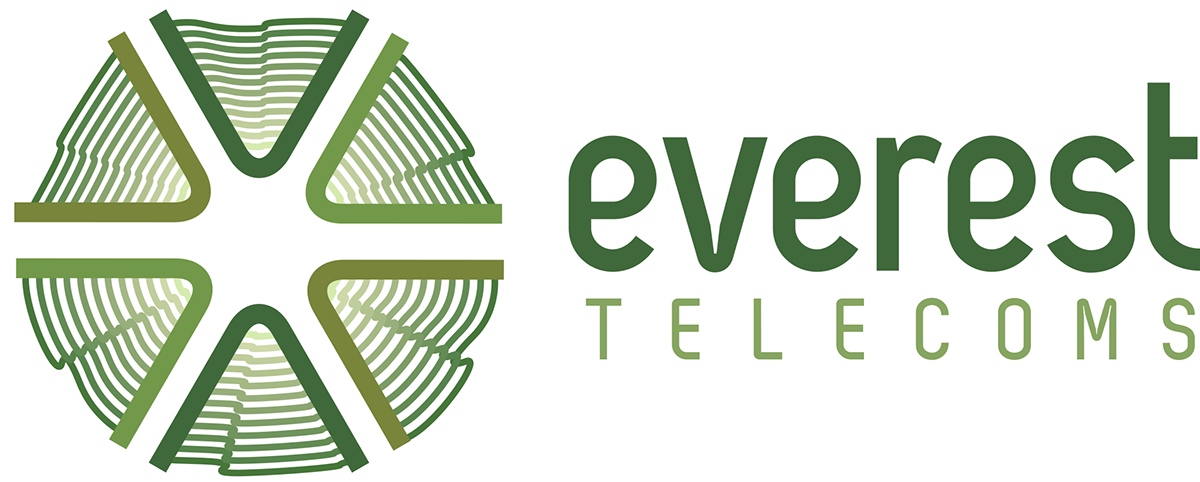
This is a very symmetric design for the reason that the satellite unlike cell towers and wires is a more convenient way of delivering information. A satellite acts like a mirror, receiving information and reflecting it to any part of the world, like the triangles that are symmetrical of each other. To make an ideal hexagon, it is crucial to recognize the center. Like communication being, somewhat, the center of society, without which, we will crumble. The waves inside each triangle represent the data we bounce off of the satellites.
“Everest” is written in lowercase to seem friendlier and more accessible to people, this can create an emotional bond towards the company. Green is the color of family, emphasizing once more, the interconnectedness of everyone and how much easier it will be through the services offered by the company.

In this logo, the mountain’s peak emphasizes the company’s tagline “Reaching Greater Heights”. Again, it illustrates the importance of being connected with other people and how advanced communication technologies help us to do so. This is depicted through the continuous loop used to complete the logo. Shades of orange and yellow are used to emphasize warmth hand happiness, results of a good means of communication. The fonts utilized are rounded and depicted with the same ribbon-like effect; again, this suggests satisfaction and approachability, values that can influence a quick rise from the market’s newest challenger.
Stage Design*

*The green mountains change color for effect.
Hard Invite & EDM (Digital Invite)


Ads


Website