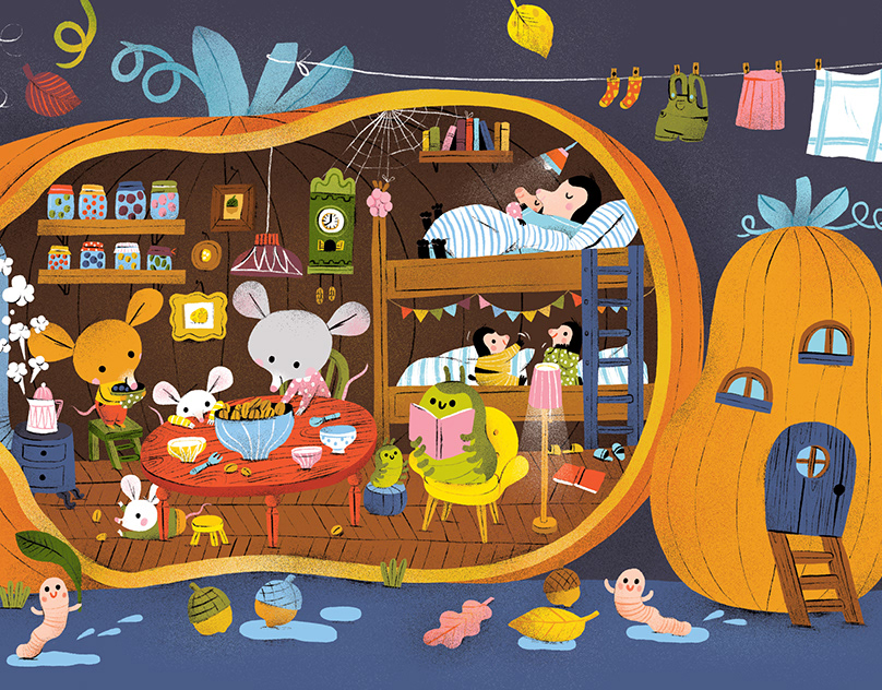
Another illustration for a series of style that I am going for.
Whenever I design something, I usually do it crazy and complicated.
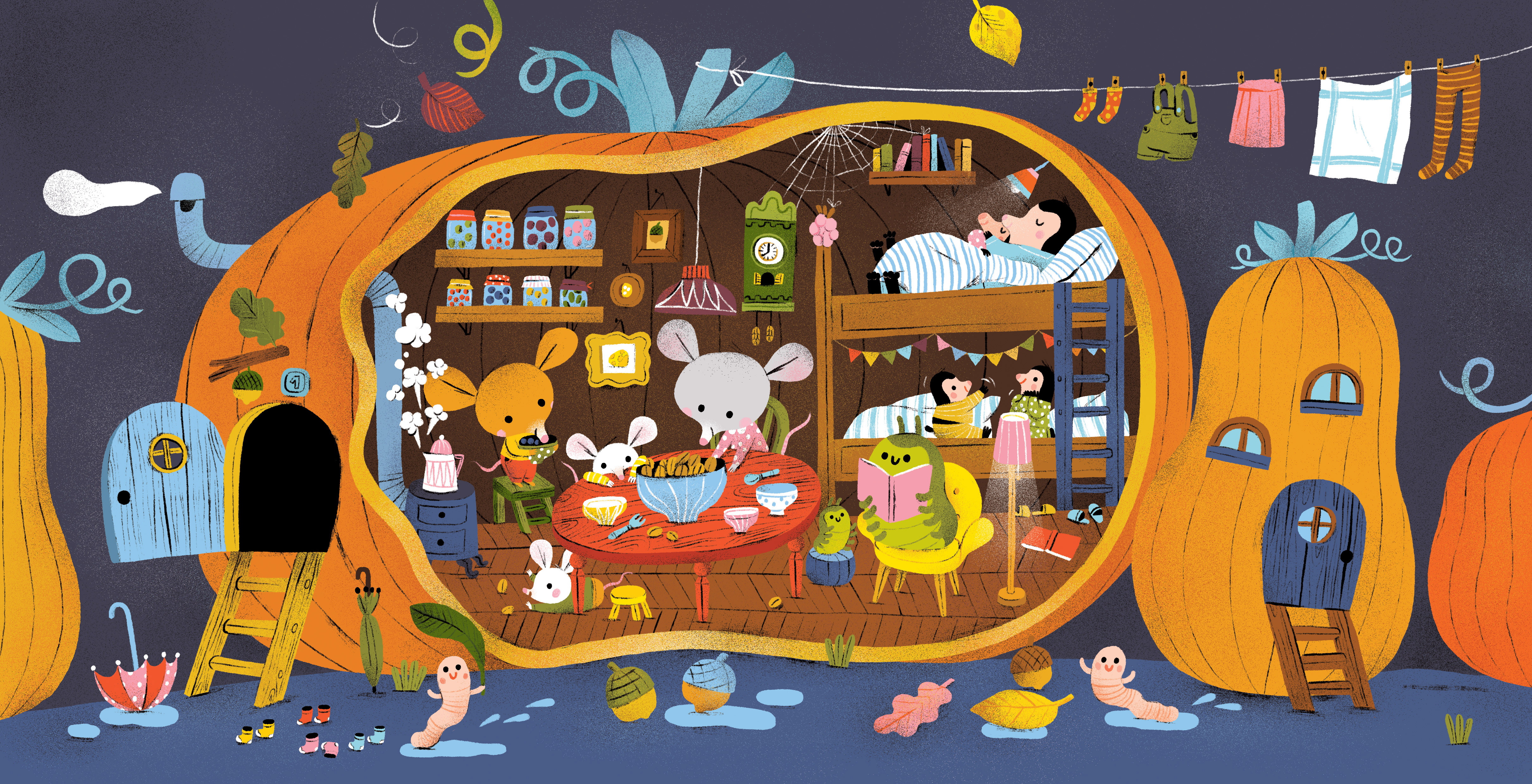
On this one I tried to cut it back and balance it together with the use of the graphic. Since we’re using it with our monthly cover photo, I figured to let it breath a little.
Usually these designs, we pair it with the seasons, but this time we figured to have it open format. I think it serves its purpose and the colors play harmoniously. It also flows great with the text.
Here's my process and closer look per image:


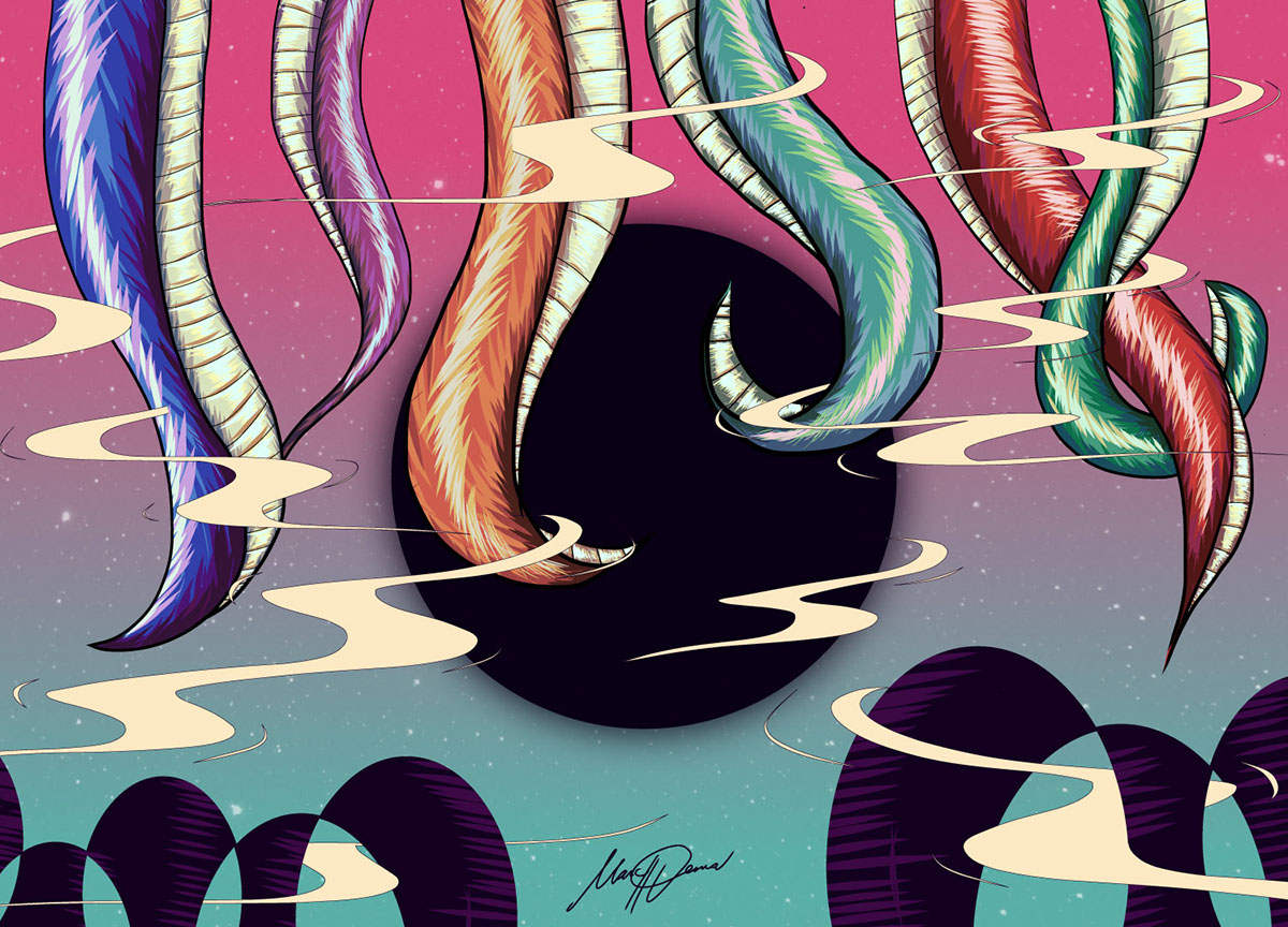
And here's the implementation:

Thank you so much!