Hall of Fame and Shame 2
Piazza mobile app critique
Piazza has become a platform that I have begun using in many of my classes since coming to Cornell. It is a site that allows for both instructors and students to post announcements, assignments, questions, and solutions. The web interface's design organizes posts by factors such as importance and date logically and does not clutter the page with irrelevant information such as tasks, organizations, and rosters. These features are reasons to choose Piazza over alternative instructor-student interaction software.
In 2011, Piazza launched a mobile application so that students and instructors could post and read messages on the go. The reviews of the application have not been too impressive and I would like to explore why that might be so.
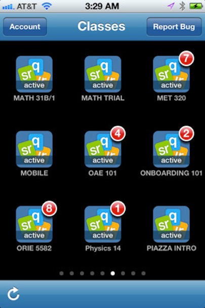
As I open the app, the home screen is very clean and easy on the eyes. It consists of blueish icons on a black screen, each which stand for an individual class in which the user is currently enrolled. The bottom corner of the icon has a red circle with a number in it indicating the number of posts which may require some sort of attention on that class's page. I believe this was a wise design choice because red is a color which catch people's eye and would understand it indicating some sort of action required. It is similar to the notification system on popular sites such as Facebook and on the iOS interface, too. The black background also lowers the intensity and brightness of the screen, making it less harsh on the eyes of the user.
Piazza mobile app critique
Piazza has become a platform that I have begun using in many of my classes since coming to Cornell. It is a site that allows for both instructors and students to post announcements, assignments, questions, and solutions. The web interface's design organizes posts by factors such as importance and date logically and does not clutter the page with irrelevant information such as tasks, organizations, and rosters. These features are reasons to choose Piazza over alternative instructor-student interaction software.
In 2011, Piazza launched a mobile application so that students and instructors could post and read messages on the go. The reviews of the application have not been too impressive and I would like to explore why that might be so.
As I open the app, the home screen is very clean and easy on the eyes. It consists of blueish icons on a black screen, each which stand for an individual class in which the user is currently enrolled. The bottom corner of the icon has a red circle with a number in it indicating the number of posts which may require some sort of attention on that class's page. I believe this was a wise design choice because red is a color which catch people's eye and would understand it indicating some sort of action required. It is similar to the notification system on popular sites such as Facebook and on the iOS interface, too. The black background also lowers the intensity and brightness of the screen, making it less harsh on the eyes of the user.
When downloading the application, a person can read the reviews of this app. One user wrote, "The design looks bad" without any suggestions, but a second user did propose that, "they could probably get rid of much of the white padding around everything, and make the UI that much shinier." Below is a screen shot of the app once you have tapped one of the icons on the home screen.
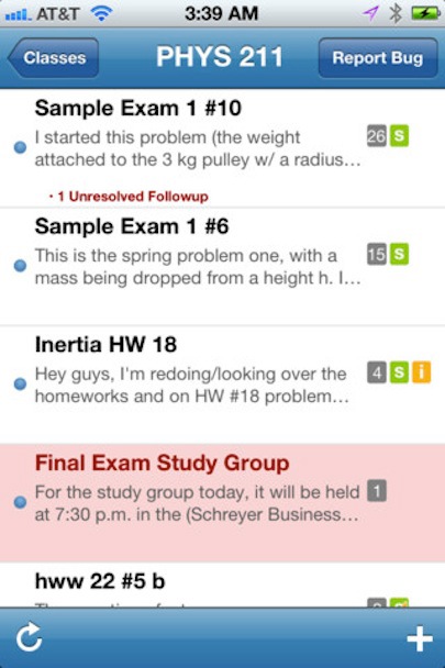
Even at first glace, I agree to a degree with the reviews given at the AppStore. It is a pretty harsh change from the black background on the home screen to the white background on the class page. There is also a good deal of white space, although, unlike the reviewer, I tend to think this helps make the screen that is displaying a good deal of information appear a lot less cluttered.
The other note I'd make with regards to design is something I realized upon reading another review. The designers of the application did not take into consideration the different types of people who would use the technology. For example, one review reads, "I'm excited at the prospect of being able to access Piazza through an iPhone app. But, unfortunately, the app isn't quite there yet. It's probably fine for students with young eyesand excellent eyesight - but for us professors wearing bifocals, the app's font size is too small to be readable, and the app provides no way to enlarge it." I think this is a very important observation. As a student with "young eyes," I may be more accustomed to reading small print on small screens, than many users of this application. The site is designed to be a tool for instructors and students to better communicate. If some instructors areunable to use it, than its ability to be effective and useful for students diminishes greatly. In regards to functionality, there are a handful of things to be said, both positively and negatively. The postsmade by instructors and students are organized in similar ways on the website and on the mobile application. I have provided images of both below to highlight this fact.
The other note I'd make with regards to design is something I realized upon reading another review. The designers of the application did not take into consideration the different types of people who would use the technology. For example, one review reads, "I'm excited at the prospect of being able to access Piazza through an iPhone app. But, unfortunately, the app isn't quite there yet. It's probably fine for students with young eyesand excellent eyesight - but for us professors wearing bifocals, the app's font size is too small to be readable, and the app provides no way to enlarge it." I think this is a very important observation. As a student with "young eyes," I may be more accustomed to reading small print on small screens, than many users of this application. The site is designed to be a tool for instructors and students to better communicate. If some instructors areunable to use it, than its ability to be effective and useful for students diminishes greatly. In regards to functionality, there are a handful of things to be said, both positively and negatively. The postsmade by instructors and students are organized in similar ways on the website and on the mobile application. I have provided images of both below to highlight this fact.
How the mobile application displays the categories of posts.
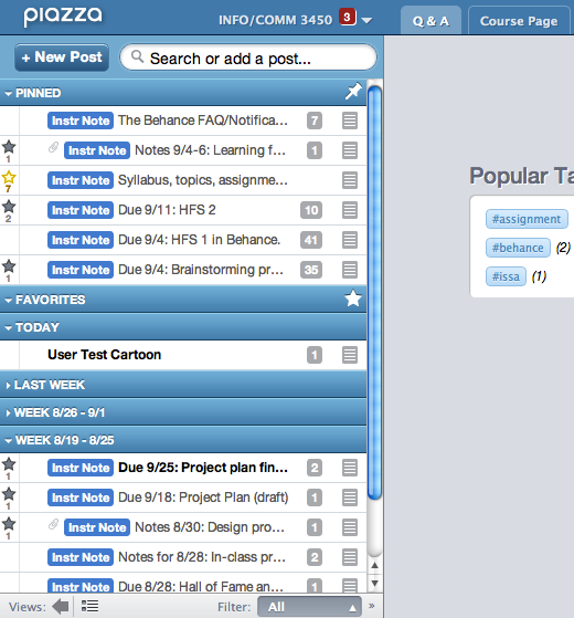
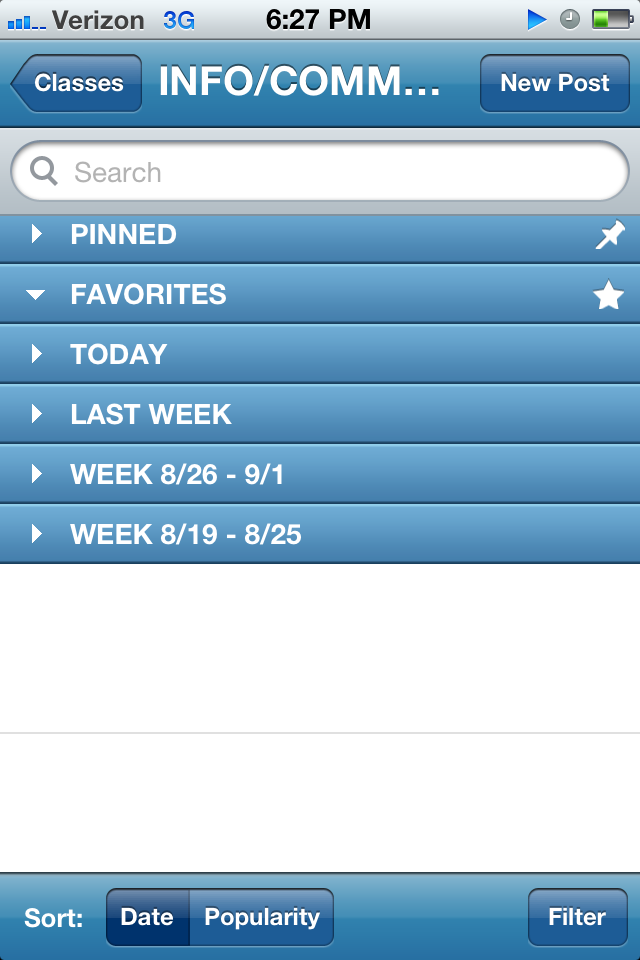
How the website displays the same information.
Unlike the website, however, the size of the screen displaying the posts is much smaller. As soon as you drop down a list like "pinned" the pinned posts drop down and the rest of the list headers drop out of sight. If I didn't know when a certain post was posted and needed to find it, I'd have to scroll down the page and open every list individually. This is much more cluttered and harder to navigate than the webpage which can display much more at once and make it easier to locate specific posts. The mobile application truly does become a game of "I spy" as you search for posts. Fortunately, the close resemblance to the actually website, does allow for a regular user to be better equipped to navigate.
It is truly a tough tradeoff, making an application for a mobile phone means giving up some display space and having to use a smaller space more efficiently. Often certain features have to be scrapped in order to accomodate the smaller sized screen.
Another major difference between the website and the mobile application is the physical means by which a user navigates. The mobile phone is touch screen operated, but the website allows the use of a mouse pointer. The issue with using a very similar design for the website AND app is that the computer mouse pointer allows for much greater precision than a fatter index finger. As a user attempts to select a menu and view the posts, it is very easy for the user to click the wrong menu and have all the relative icons shift in response. I can imagine this being another issue for users with poor motor skills or simply the lack of patience to be careful when navigating the application.
Possible alterations and improvements:
I believe some simple changes that would go a long way with improving user reviews would be style related. If the app maintained the same color background, it wouldn't be so jarring. I would probably suggest white, even though the black is a little less harsh on a mobile phone, because it is easier to read text on a white screen. This would aesthetically improve the experience for the individual users and it would be a change that few would even notice. My experience has simply led me to believe that consistency sits better in people's stomachs.
Another simple change would be to eliminate a little bit of the white space on the page displaying posts by enlarging the text. That would allow users with poorer vision to better navigate the posts and use the small screen more efficiently. The tradeoffs to these design suggestions may be pages on the app which appear a little more tightly packed, though a little easier to read. It may also mean that the icons on the home page would have to be a little darker to improve the contrast against a white background as opposed to a black background. I do, however, believe that since styling changes tend to not be to labor intensive, the benefits of improved userexperience and widening the potential user pool would far out weigh the costs. One more substantial design alteration involved somehow reconfiguring the organization of the posts tomake them easier to find.
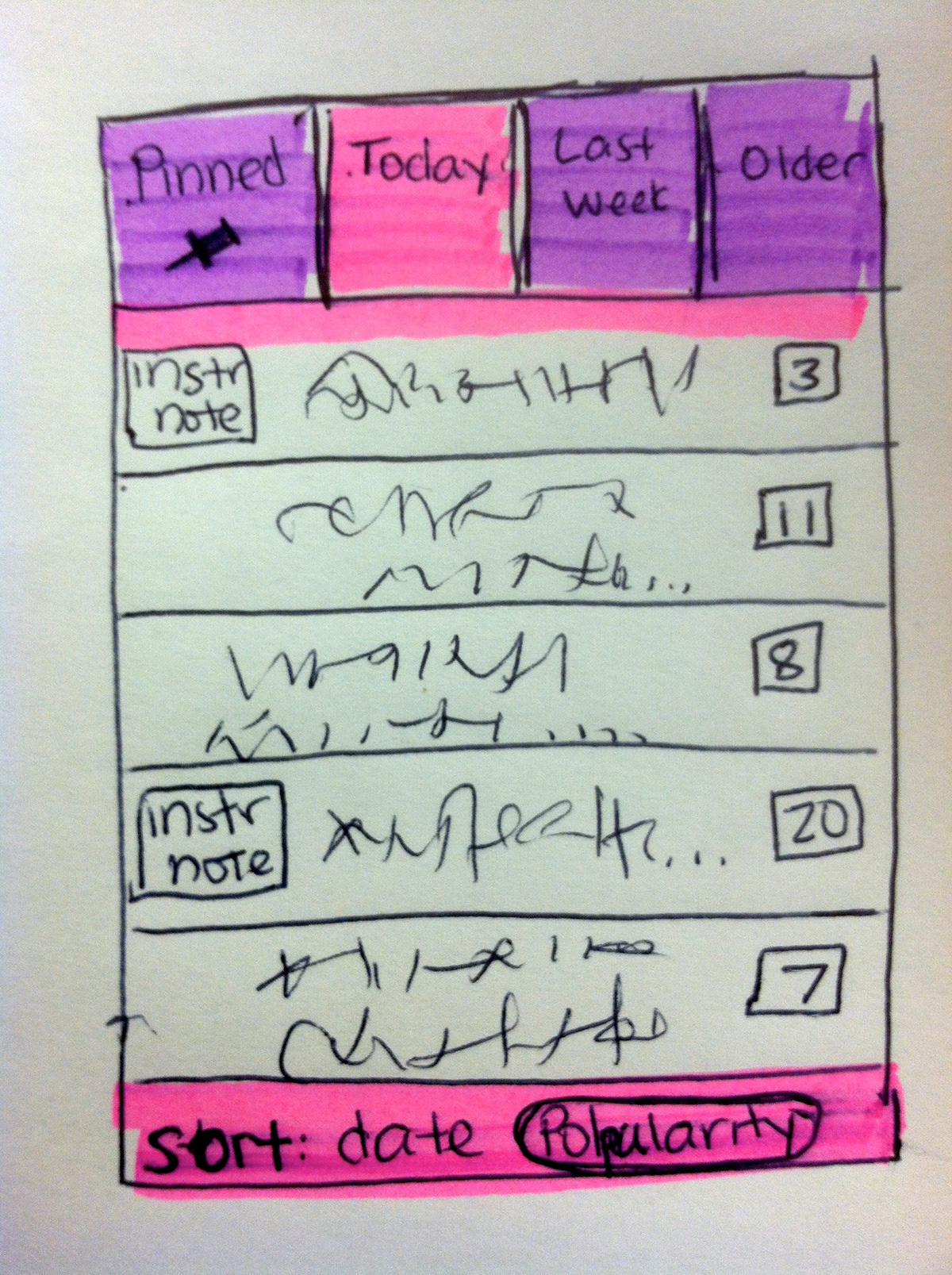
This sketched design is not trying to make any statements about colors, but just hoping to suggest a different way to organize the posts to make them easier to navigate, especially for the lazy finger or less dexterous hand. The buttons at the top almost work as tabs on file folders. This will minimize the scrolling compared to the collapsing lists. Since it minimizes scrolling, you could even afford to add some scrolling and make the text on the posts listed larger and easier to take in at a glace. The older users would appreciate being able to read it and the busy students will appreciate being able to find the posts they want quicker.
One major tradeoff, however, may be the inability of the Piazza app designers to have as many headings on the app as on the website for categories of posts. Currently, my proposed design has 4, though the current live design has at least 6. If the designers wanted to keep all 6 lists, then the tabs at the top would probably still have to be so skinny that they would still be hard to choose quickly with clumsy fingers. I grouped a couple of tabs by creating a tab called "older" posts because it has been my experience that once a post is more than a week old, the information tends to be less relavent to a student. Therefore, it wouldn't hinder a student as much to group the older posts, since they don't often view older posts. There may be some sort of user testing or research that should be done before my suggestion is taken too seriously, however.
Reorganizing the information may also not be a small task. It may require some sort of database reconfiguration and it may be the same database that runs the website which would cause problems on the more frequently used site. This may be another tradeoff that Piazza would be less willing to make. Nonetheless, at first glance, I believe this interface would better display the posts so that they could be navigated and read easier.
In conclusion, I do believe that the reviews may be a little extreme and that the app is truly a handy tool for a Piazza user on the go. But, before I begin recommending it to my peers and instructors, I may suggest these changes to the designers so that they may be able to improve the overall experience even more.
