


Select panels to learn more about the soldiers pictured in the infographic.


Project Planning
I found that an effective infographic requires organization and planning, beginning with a wireframe and labeled sections to unify the story. Images were manipulated using Photoshop. Typeface design and formatting were best handled using InDesign. In the end, everything was brought together and placed inside of the Illustrator wireframe.


Research and Data Collection
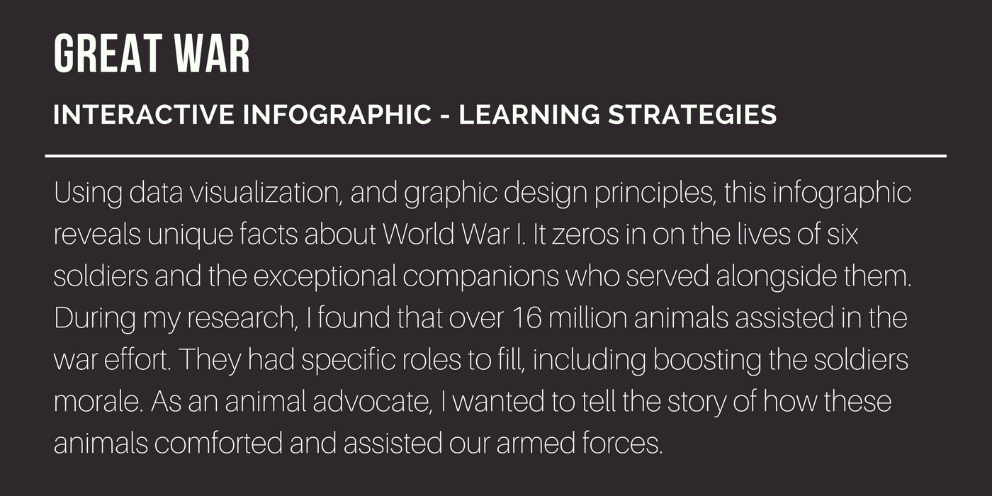
With a plan in place, the heavy lifting could begin - research and data collection! To maintain the integrity of the infographic, accurate facts and figures are non-negotiables. This part of the design was never ending; even in using undeniably credible resources, it still felt as though new data would reveal itself in the final moments of this phase. Eventually, it did come to a close.


Visual Design
Inspired by this vintage postcard, muted colors were used to make visual encoding easily recognizable and relevant to the overall theme.

Information Panels
Informational panels were added in the final week, and made interactive using Acrobat Pro. The greatest challenge was finding high resolution images of the animal and handler together. With varying image sizes, and story lengths, it was a struggle balancing the panel symmetry. I’d like to re-explore this project in the future to resolve this imbalance.


_____________________________________________________________________


