

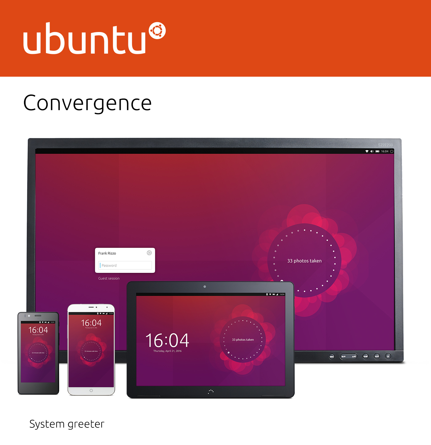
What is convergence?
Convergence is a single user experience that spans to all form factors and adapts to the different contexts of use. It means exactly the same operating system and applications run on phones, tablets and desktops. This is done by using responsive layouts that adapt to the different screen or window sizes.
Convergence supports all input types equally and simultaneously to allow users to interact using a pointer, touch or keyboard; whenever and however they choose.
Over the last twenty years computing has become exponentially faster, cheaper and more power efficient. As a result, phones and tablets today have the processing power to undertake tasks that only a few years ago required PC hardware. The boundaries between form factors are becoming blurred; there is very little difference in terms of hardware between an ultrabook with a touchscreen and a 12in tablet with a keyboard attached.
By using convergence we breakdown the last barrier between form factors with a single operating system and app ecosystem for all different types of hardware. This enables new forms of interaction. For example, drafting an email on your phone during your journey to work, and then when you arrive at your desk you can plug the phone into a monitor and continue composing the same email in a desktop environment.
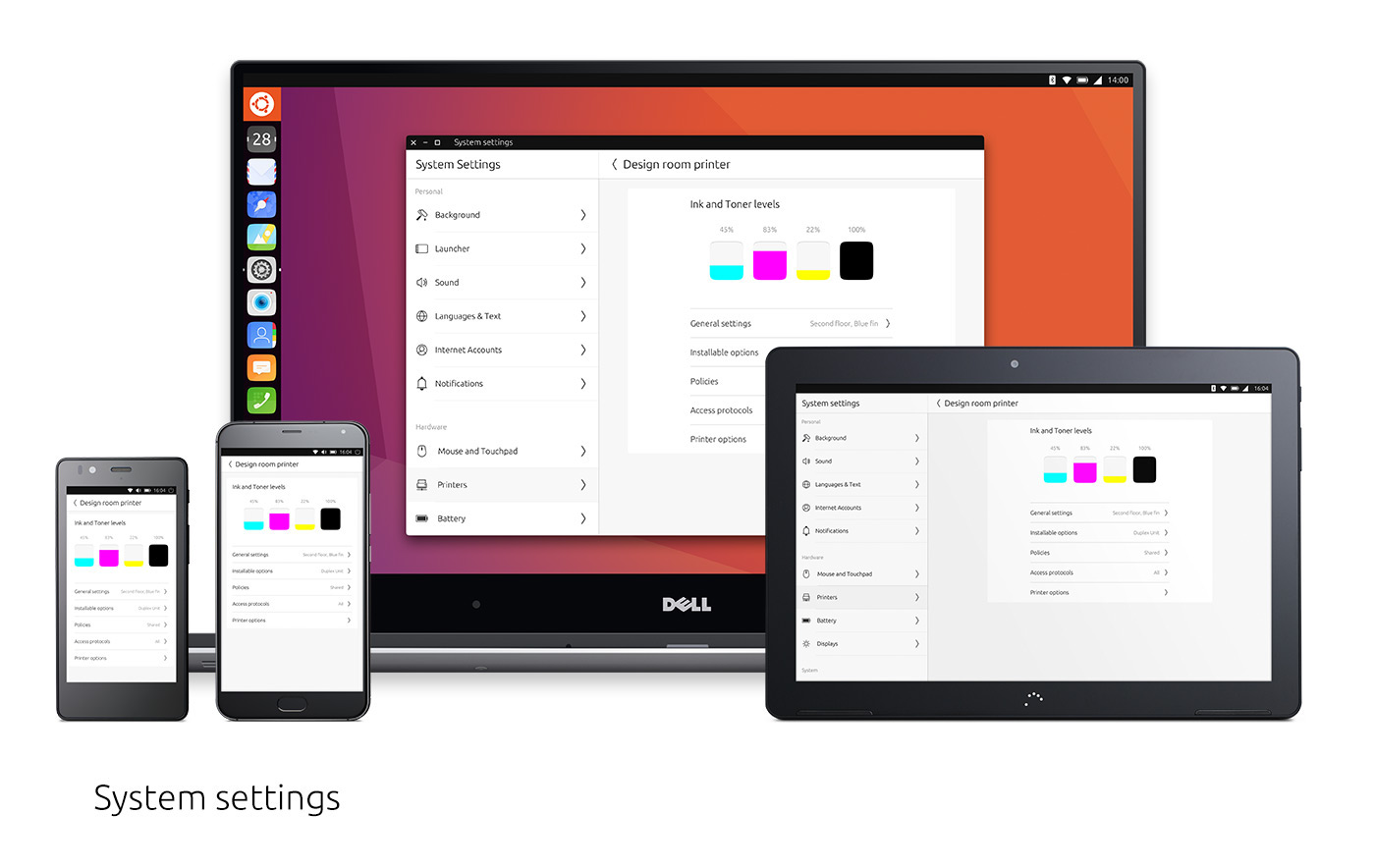
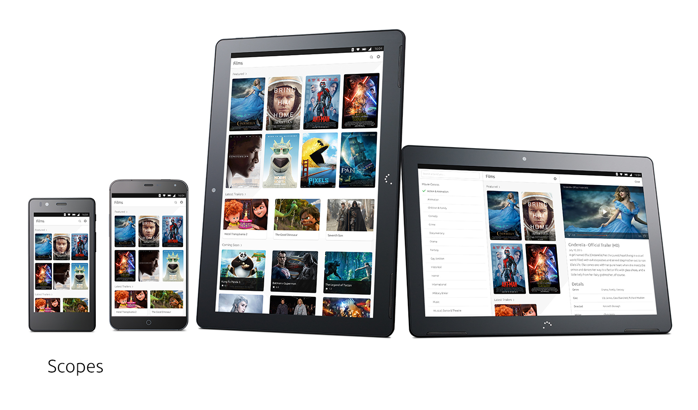
Adaptive layouts
Applications live in windows (in a windowed environment) or surfaces (in a non-windowed environment). Application layouts change in a responsive manner depending on the size of their window or surface. One common method of creating a responsive layout is to use panels. In a small window or surface, only a single panel needs to be displayed. The user can navigate through the panels by tapping on items or going back. When the window or surface size gets larger, the application can switch to displaying two or more surfaces side by side. Thus reducing the amount of navigational actions the user needs to undertake.
Typical examples of this are applications like contacts, messages, and email. Of course, there can be any number of combinations of panels depending on the specific app’s needs. The AdaptivePageLayout API component eliminates guesswork for developers when adapting from one form factor to another. It works by tracking an infinite number of virtual columns that may be displayed on a screen at once. For example, an app will automatically switch between a 1-panel and 2-panel layout when the user changes the size of the window or surface, by dragging the app from the main stage to the side stage.
Changing the size of the window or surface resizes one or more joined panels. Typically, the right-most panel resizes and the left-most panel maintains its original dimensions. The dimensions of the right-most panel will normally be 40 grid units or 50 grid units, though this panel may itself be resizable depending on the developer’s requirements.


