

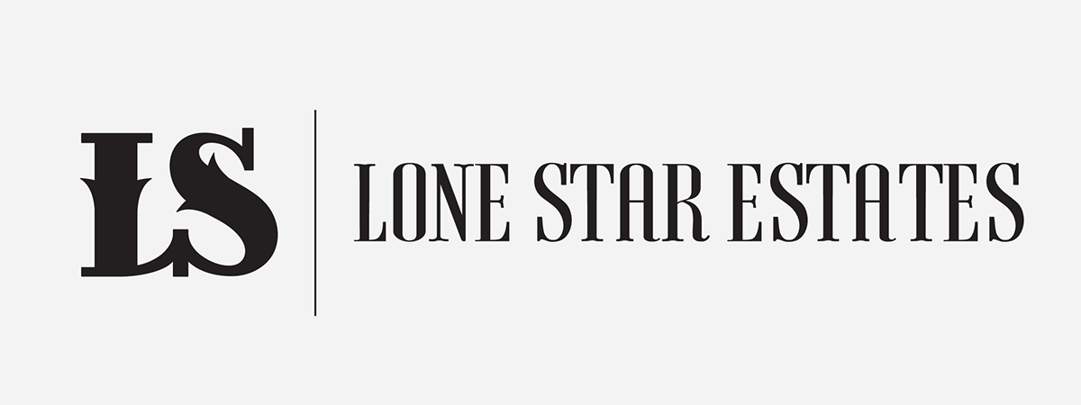
Lonestar Estates aims to unite connoisseurs of life with their aspirations through a deeply connected global network of exceptional people. The design of the luxurious properties is influenced by the American cowboy lifestyle. The concept for such a lavish brand stems from leaving a great first impression on the high expectations of the target market.
The process for creating this logo was inspired by the culture of the American cowboy lifestyle and the qualities of up-scale living.


This monogram represents elegance with its decorative yet firm serif typeface. It emits a graceful sense of refinement that appeals to a target market with financial prosperity.
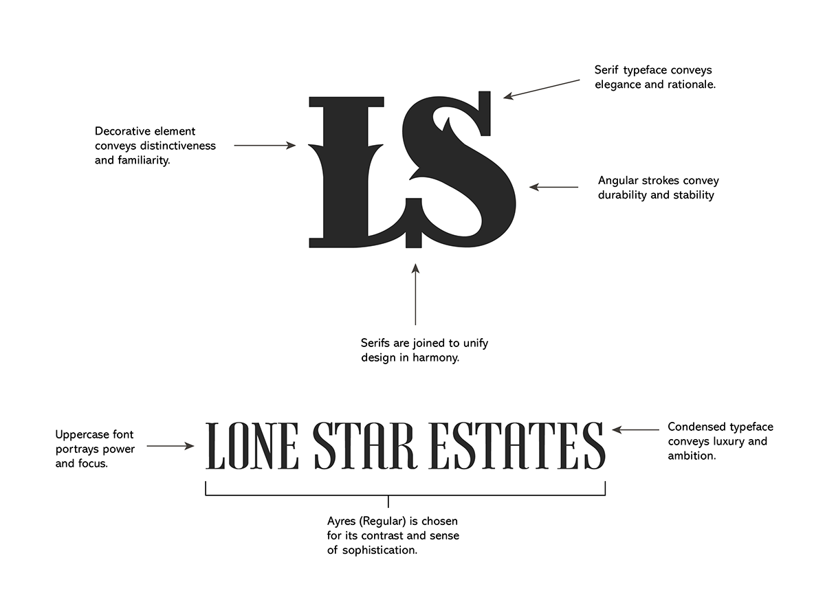
The font chosen for the Lone Star Estates type treatment is called Ayress Regular. It compliments the monogram in that they are both condensed serif typefaces with contrasting strokes. This consistency is critical for the overall brand image that the logo portrays; Elegant and high-end western living.


*Mock-Up Assets edited but not owned by me.

Poster Design
After the brand identity was established, two advertisements were requested. Each one had to be organized with a theme, effective headline, body copy, and focused direction.


