Aloha Gaia
Visual Identity
Aloha Gaia is a jewelry brand incepted in Russia, but operating from Thailand. From day one it's main mission was to investigate into relations of humans and nature. As the brand states it on the official website "the most interesting thing in the creation of jewelry is to understand its usefulness and the problems it helps to solve, and, of course, the way in which it inspires everyone". Rivers, mountains, oceans, trees and plants and their symbolic representation play the central role in brand's creative process.
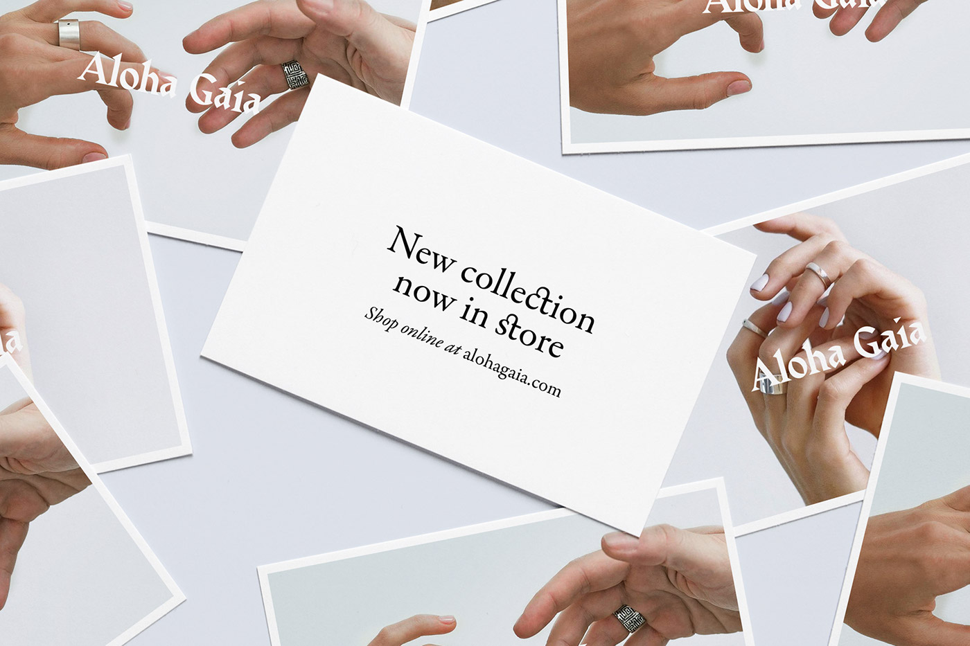
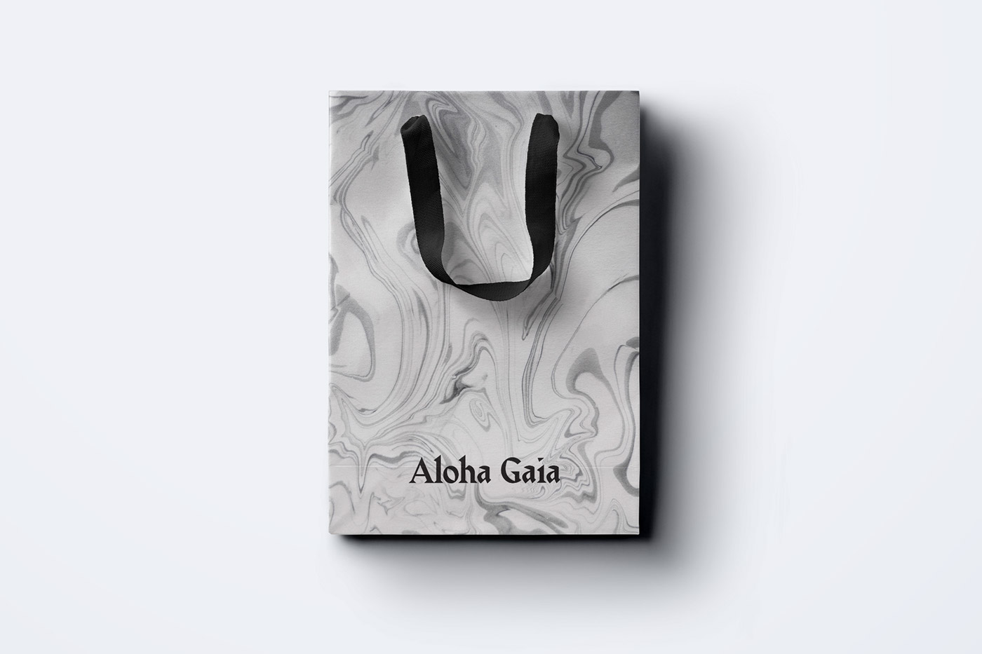
Older identity was portraying the brand as very niche and appealing to a specific demographic, but the brand had grown over the years and needed to establish a more mature image. We designed a new logotype that retained a certain runic/pagan atmosphere, but looked more sophisticated. Using a traditional marbling technique known as "suminagashi" we manually printed Conqueror cotton paper from Arjowiggins to reference gems and stones used across all the Aloha Gaia products.


Case photography by Nastya Chamkina


