In anticipation of a major yet unforeseeable structural change within the non-profit housing sector, The Ontario Non-Profit Housing Association (ONPHA) wanted to rebrand themselves to establish leadership within this shift. ONPHA is an independent association funded and directed by its members. It runs on the belief that secure, decent and affordable housing is a human right and fundamental social determinant of health – it has the power to change lives and is the foundation of vibrant and successful communities. As advocates, they raise awareness of the critical role that affordable rental housing plays in Ontario. As capacity builders, they educate their members and offer them the training and resources they need to develop their skills and offer their tenants high-quality homes. As an association, they bring their members together and recognize and celebrate their diversity and the incredible work they do every day. So it was necessary to create a brand that positioned ONPHA to its members as the one to lead, empower and champion them through the transformation happening in the non-profit housing sector.
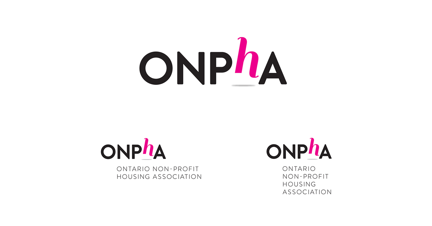
The creative idea came from their core belief that when people are housed, it gives them access to everything else they need in life, and it transforms them and the community. By visually elevating the “h” that represents housing in their name, the new brand shows how housing elevates.
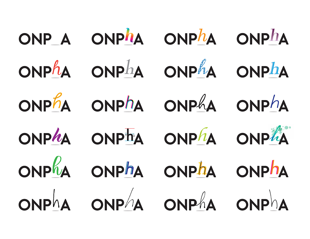
A colour palette was established to reflect diversity and applied to the Master Logo to create a subset of Master Logos.
A colour palette was established to reflect diversity and applied to the Master Logo to create a subset of Master Logos.

A secondary set of logos was also created that reflects other issues housing addresses. When someone is housed they gain access to employment, education, safety and security, healthy living and more. These various logos also reflect diversity and inclusion present in ONPHA members' communities.
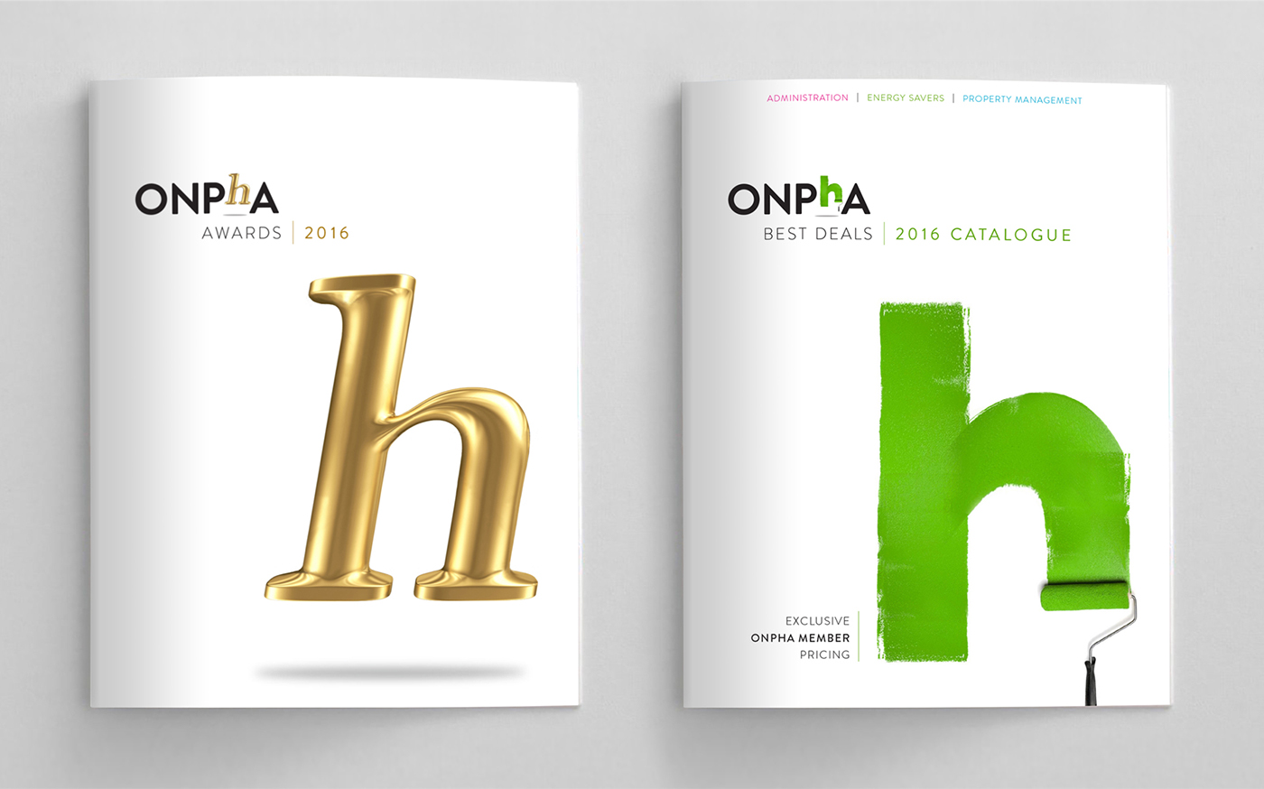
There are 2 sub-brands within the ONPHA brand, the Awards Program that celebrates outstanding care and work within member communities, and the Best Deals Program that helps members access affordable resources, materials and supplies, and contractors.


Stationary included a business card with a space where the 'h' should be, inviting the ONPHA staff to personalize their business card by writing in their own 'h'.

A brand standards manual was created to help guide and inform the brand moving forward. A section of the manual even showed how personalizing the Member Renewal Brochure by featuring a member every year could help all its members see themselves as part of the organization, while celebrating those doing great work and inspire other members too.

The rebrand was very well received by the members of ONPHA and its member organizations – many have commented on its fresh look, diversity and inclusiveness, reflecting the communities they all work in.
Credits:
Created with Grassriots, Toronto
Creative Director: Paul Bonsell
Art Directors: Deborah Caprara, Paul Bonsell
Created with Grassriots, Toronto
Creative Director: Paul Bonsell
Art Directors: Deborah Caprara, Paul Bonsell
