

Title: Web Design for Tinto Carme - Vitivinícola de Valbuena.
Date: Jan 2016.
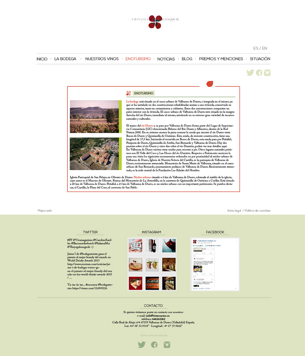
Client: Vitivinícola de Valbuena.
Date: Jan 2016.
Client: Vitivinícola de Valbuena.
The client a Spanish winery needed a new website. We worked together to define their strengths and what they wanted to transmit. As a young awarded winery focused on excellency I looked forward to cleaning lines toward minimalism, limiting the colour palette to red and green. The red represents the wine as is present in their logotype, something we wanted the visitors to have on their minds all the time; and the green as a distant reference to the colours of the vineyard. I focused on design a clear and easy to use, looking forward to making the experience as pleasant as it could be.

Title: Web Design for Go Relaxing.
Date: Nov 2015.
Client: Go Relaxing (startup).
Date: Nov 2015.
Client: Go Relaxing (startup).
The client a Spanish startup needed a website for their launch. We worked together on their branding. They are focused on vacation residencies, so we need to transmit calm to make you feel at home, even before left yours. The purple and the wooden touches help us to transmit those values. I focused on an easy to use design for the website, looking forward to making the experience fast and pleasant as it could be for the user.


