

I was approached by Diageo / LOVE to create a Limited Artist Edition of Johnnie Walker whisky,
which is number 1 Scotch whisky in the World.
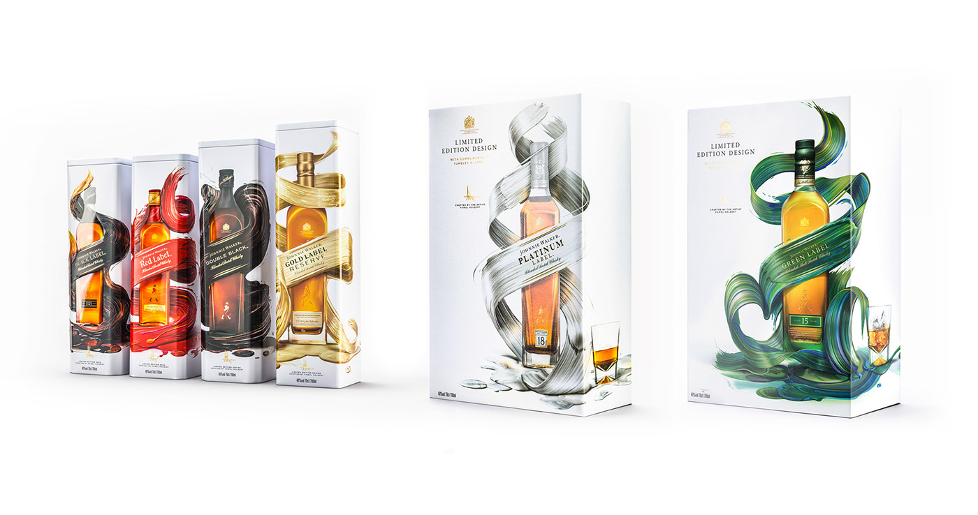
The idea was to create 6 designs to be applied across the range of Johnnie Walker variants:
Red Label, Black Label, Double Black Label, Gold Label, Green Label and Platinum Label.
The result of the collaboration is a selection of limited edition gift packs available around the globe.
Visuals
The designs needed to evoke the flavour of each blend, in a progressive and pioneering manner that runs parallel to the brands values.
We went for a clean but striking look, with expressive graphics against a clean white background - a look that stands out from the typical offerings of whisky packs.
The creative was to blend two crafts together, just like Johnnie Walker whisky is about blending flavours, and my work is about blending paint, and mixing colors.

The artworks were meant to show diversity of the whole line and illustrate the progression and refinement, as we go throughout the labels and their price points - going from Red Label - more expressive and energetic, and up to
the more premium and refined Platinum Label.
6 different master visuals were created, and other complimentary graphic assets, to be used on exclusive packaging and in marketing materials.
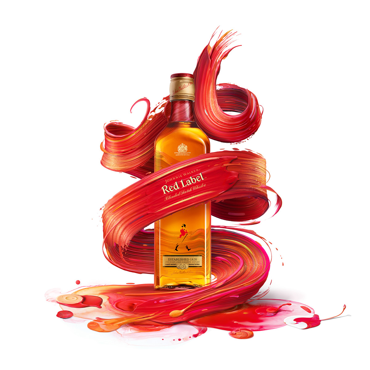
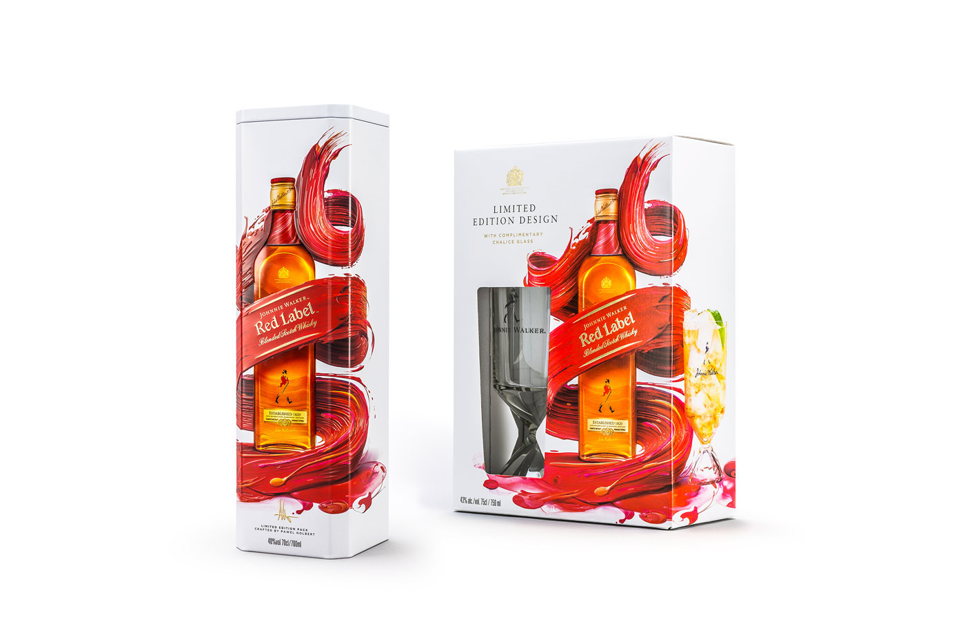
Red Label
BOLD, ENERGETIC, VIBRANT, SPICY
Flavours:
• A sophisticated, smoky finish • Fruity sweetness, cinnamon and pepper • Hints of fresh apple, pear and zest from the elegant Speyside malts
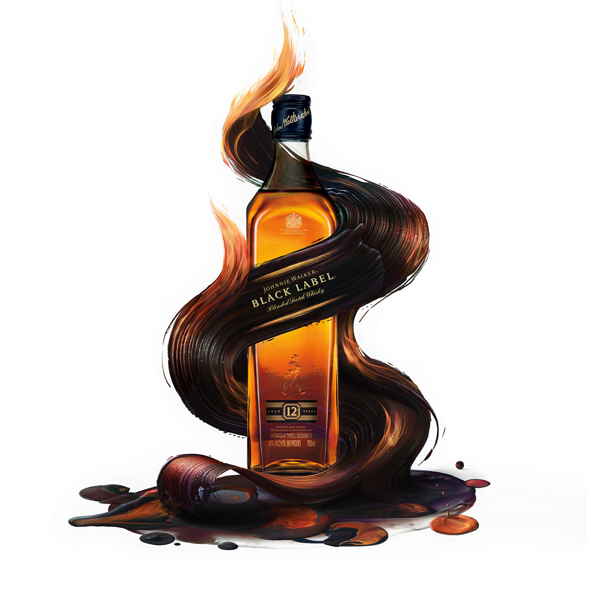
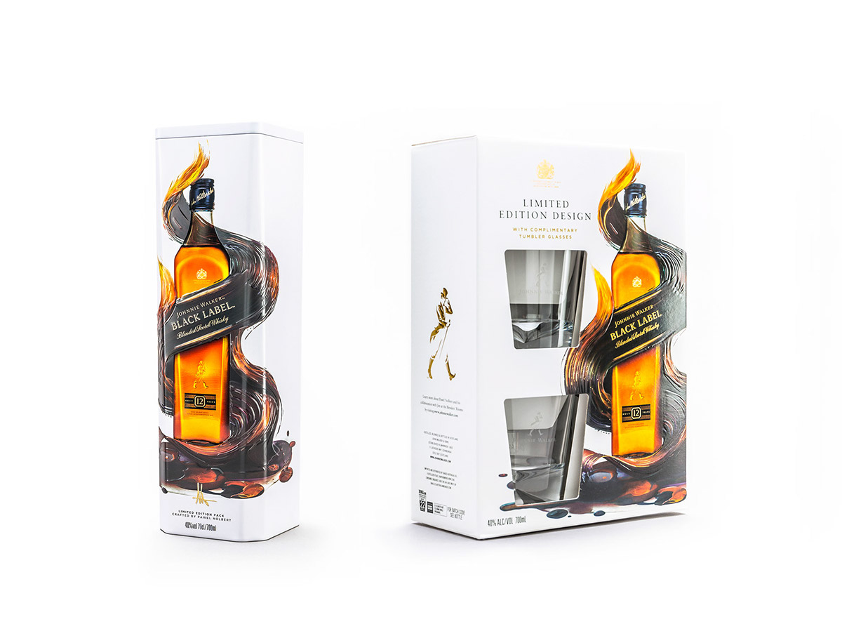
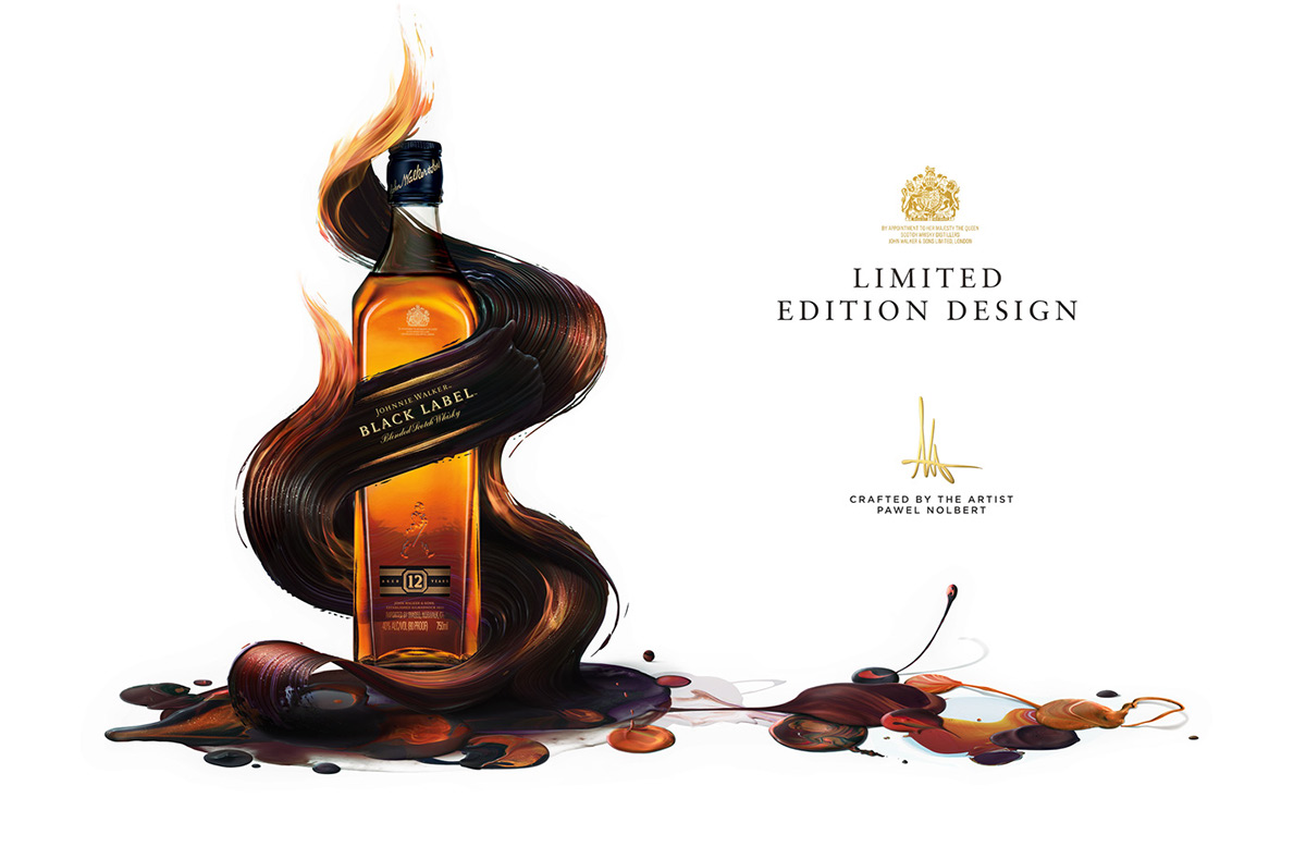
Black Label
BLACK, ENERGETIC, FIERY, WOODY
Flavours:
• Rich dried fruits from the European oak sherry casks • Hints of smooth creamy toffee • A sophisticated, smoky finish

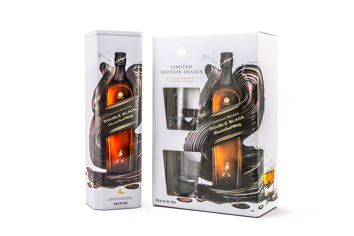
Double Black Label
Dark, Intense, Smoky, Oily
Flavours:
• Signature peat smoke • Rich raisins and sultanas • Apples, pears and orange zest • Creamy vanilla and spice • Spicy oak tannins

Green Label
Rich, Layered, Distinctive
Flavours:
• Grass and light garden fruits • Flowers with cedar wood notes • Sweet wood smoke and sandalwood • Rich fruit, sea salt and peat smoke


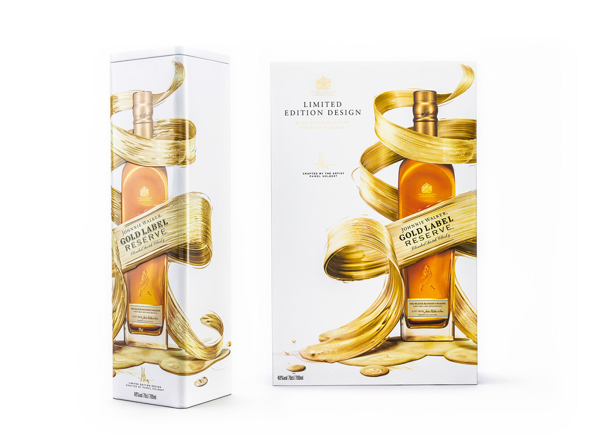
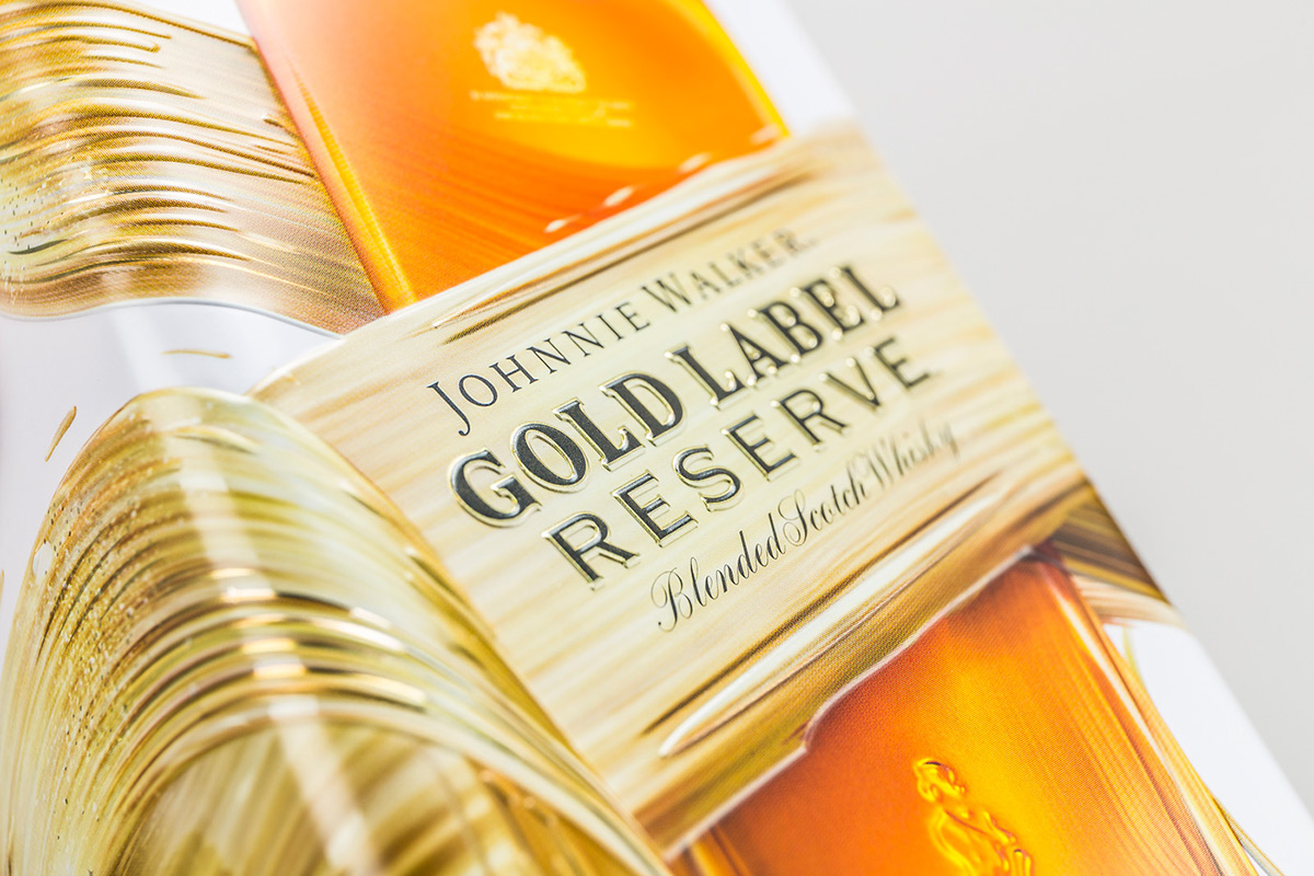
Gold Label
Vibrant, Luxurious, Deep, Celebratory
Flavours:
• A creaminess that evolves into deep honey tones • A long finish with lingering waves of fruit and wood

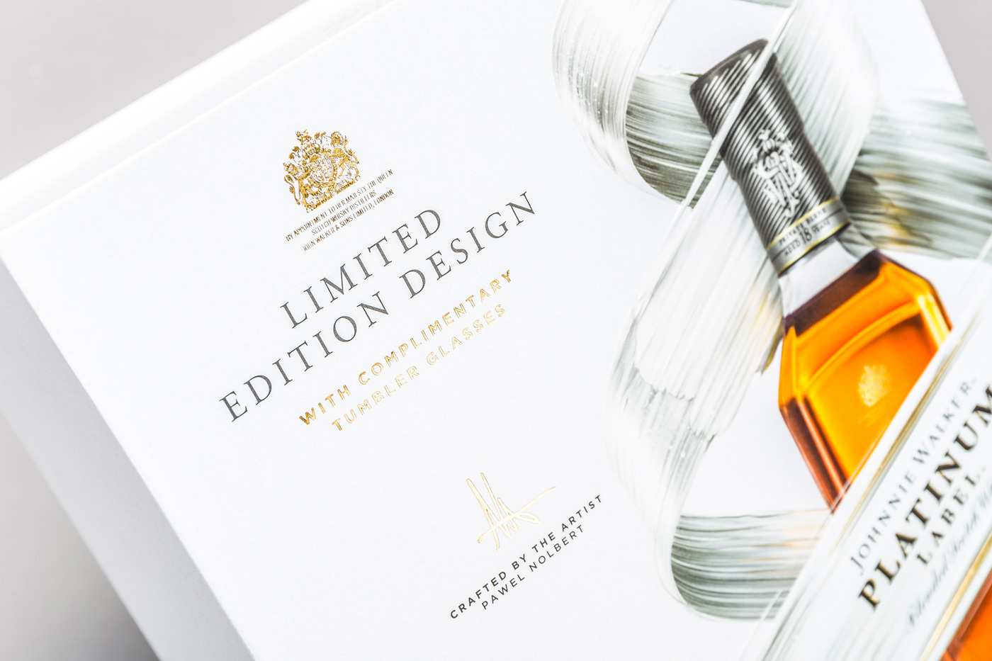
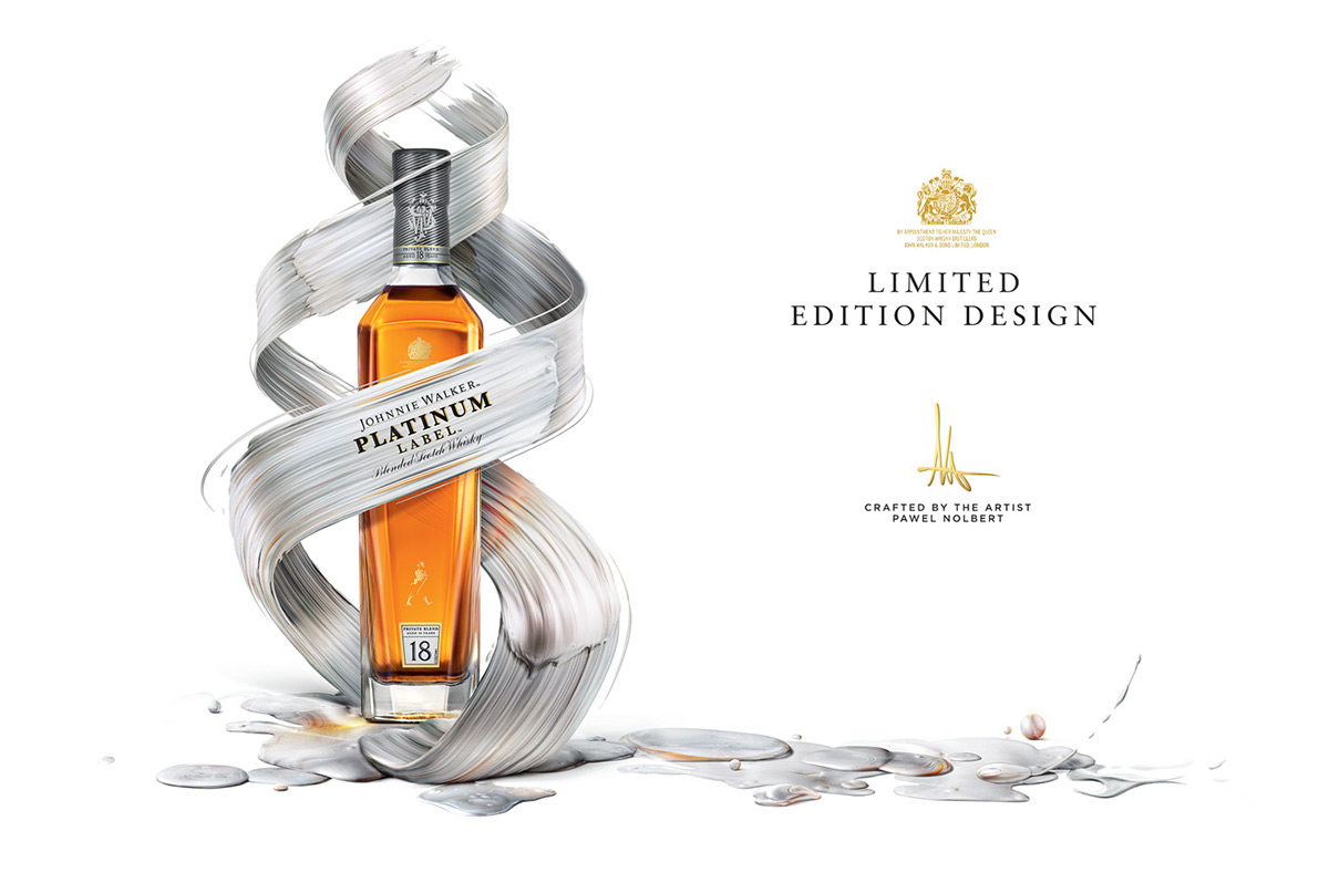
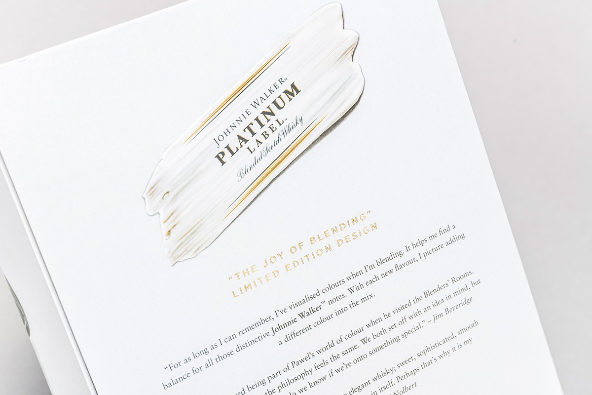
Platinum Label
Elegant Luxury, Sophisticated, Aged
Flavours:
• A subtle hint of almond • Rich dried fruits with the hint of tangerine • Smooth creamy vanilla

In the end, I produced artworks that extend more to the right so that it can wrap around the pack and provide more graphic assets for collateral materials.


Process
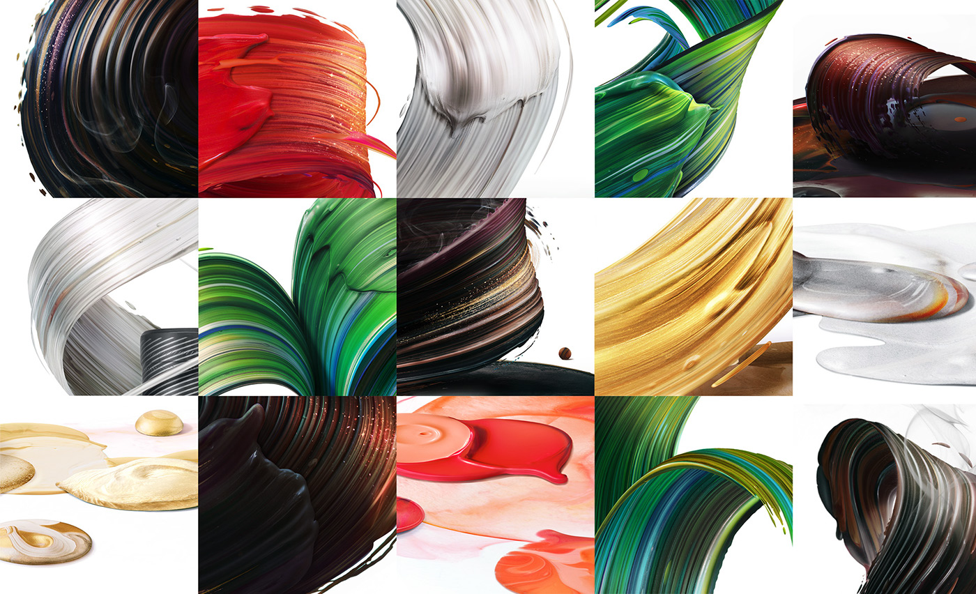
A lot of effort was put into the development of artwork concepts and compositions. Composition was a key element that helped convey the characteristics of blends, create distinction between them and help market the labels respectively.
We made a bold move, to replace the original label, angled at 24 degrees* with a brushstroke, which is the central part of the paint composition. The challenge was to build 6 unique brushstroke compositions, while the central part remained pretty much consistent across all variants.
We wanted the movement of the brush itself to represent the key words associated with different blends, then develop the artworks based on that. Many different concepts were created.
*Historically, Johnnie Walker labels are tilted at 24 degrees to increase the amount of text that could be fit within a label.

Base paint assets library was created, according to the coloration and flavour profiles of all labels. Then artwork compositions were developed using these assets and incorporated with pack shots of bottles.


Produced on tin boxes and bigger cardboard sets, that included tumblers and glasses, the packaging was given a premium, tactile finish: embossing, metallic and foil surfaces etc, to correspond with paint strokes texture and feel.


An essential part of the process was also traveling to Scotland couple times as part of the Johnnie Walker experience, to learn about the process and skill of making and blending whisky, about the company and Johnnie Walker brand legacy, meet the master blender Jim Beveridge and shoot marketing materials.

Visiting the Johnnie Walker Archive in Kilmarnock, Scotland.
The experience of Scotland and its distilleries was a great inspiration. I took a lot of pictures and the Scottish impression definitely had its part in developing the artworks, as I believe the taste of Scotch whisky itself perfectly represents the region from which it originates.
– You can literally taste that soil, history and culture in a Scotch –
As an artist I tried to consider those qualities and inspirations, when creating the visuals, especially when working for a brand with such rich Scottish legacy.
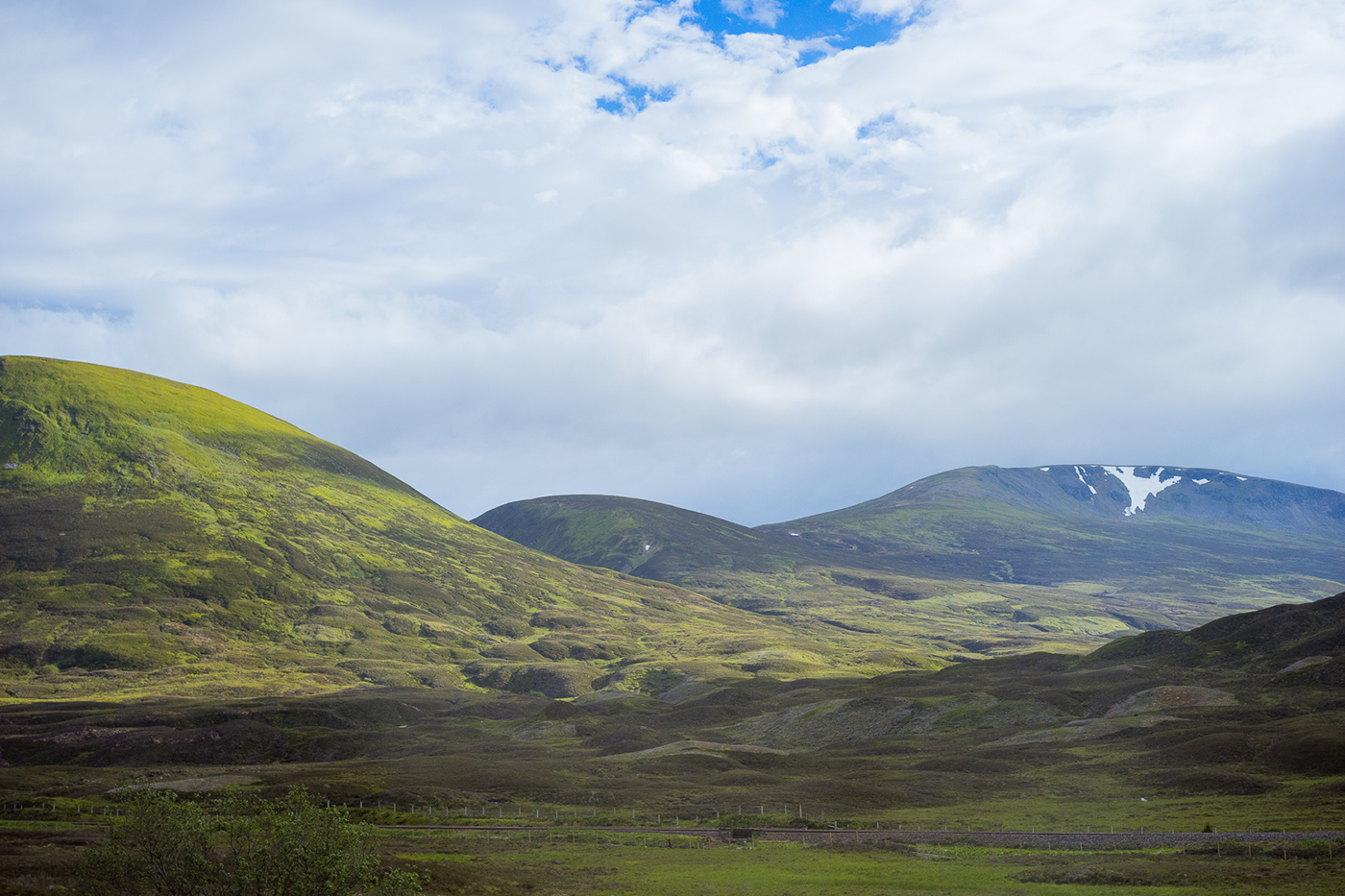
Scottish Highlands, shot while on my way to Cardhu distillery.


Credits
Diageo
Global Brand Team: Julie Maclure
Global Brand Manager: Nicolas Paul
Master Blender: Jim Beveridge
LOVE
Creative Director: Chris Myers
Packaging Creative Director: Sam Wilkes
Designer: Tom Nicklin
Senior Account Manager: Tom Cleary
Senior Account Executive: Jess Davey
Artist: Pawel Nolbert


