
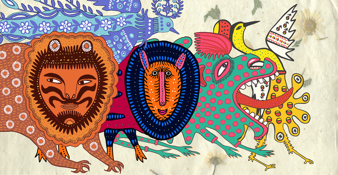
Art-brand Prima Maria is based on the art of Maria Prymachenko, a cultural phenomenon of Ukrainian naïve art. The most powerful and impressive beasts had been chosen for Style Guide.
The brand logo consists of the brand image and brand title, created with type imitating Maria’s signature.
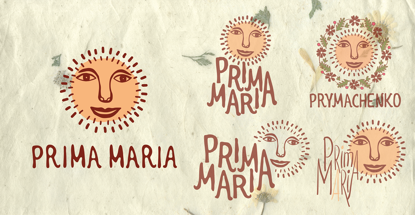
During the searches of the logo were also used other symbols like wreath and dandelion as well as the other typography. However, as the best variant was considered the one with the most simplified brand image - the Sun.
One of the main elements of Style Guide is Maria Icon - recognizable semi-abstract portrait of the artist. In order to prevent unacceptable visual associations were added few details in Maria's national headdress.

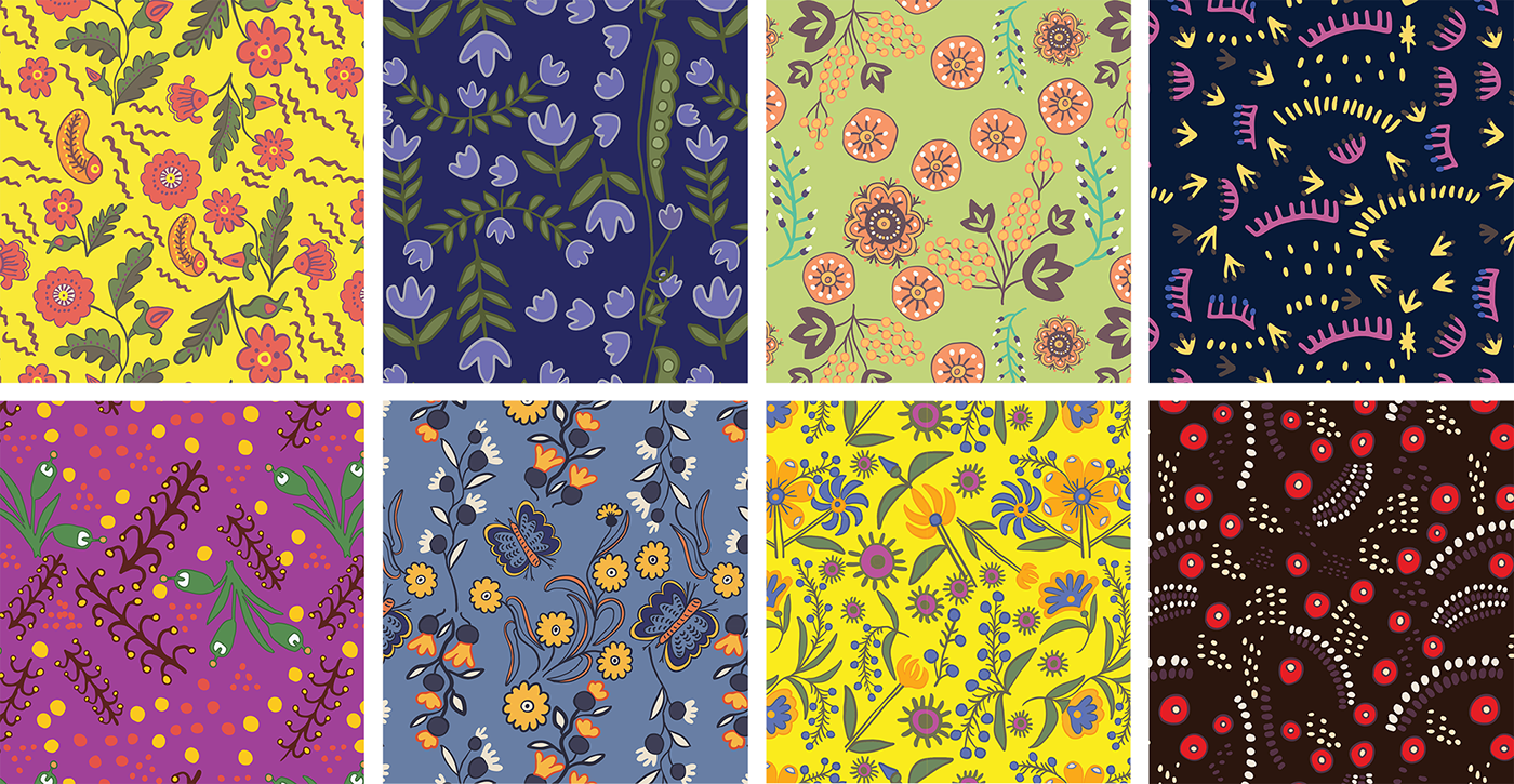
Art-object is the main graphical unit of the brand.

Seamless patterns and sacred circles are based on art-objects.

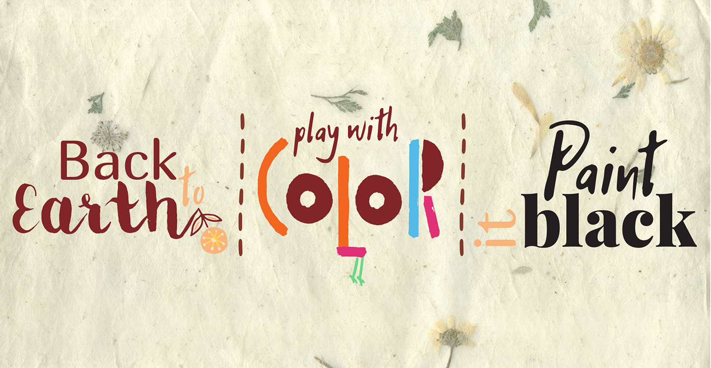
All objects in Style Guide are combined into 3 stylistics according to the principles of sense and style and unity.
⚊ Stylistic Back to Earth consists of the kind beasts living it the undisturbed forest. It conducts with basic archetypes and helps to find the connection with an inner child, talking to a consumer in simple and intuitive understandable language.
⚊ Stylistic Play with Color consists of the birds living in vibrant color schemes. It conducts with bright vibes and the feeling of cleanness.
⚊ Stylistic Paint it Black consists of the following the beasts living in the dark space. Due to the visual associations with deep black color stylistic conducts with force, primevalness, and void space.
During the work on Style Guide had been created the following iconic goods.

Thanks for watching!


