


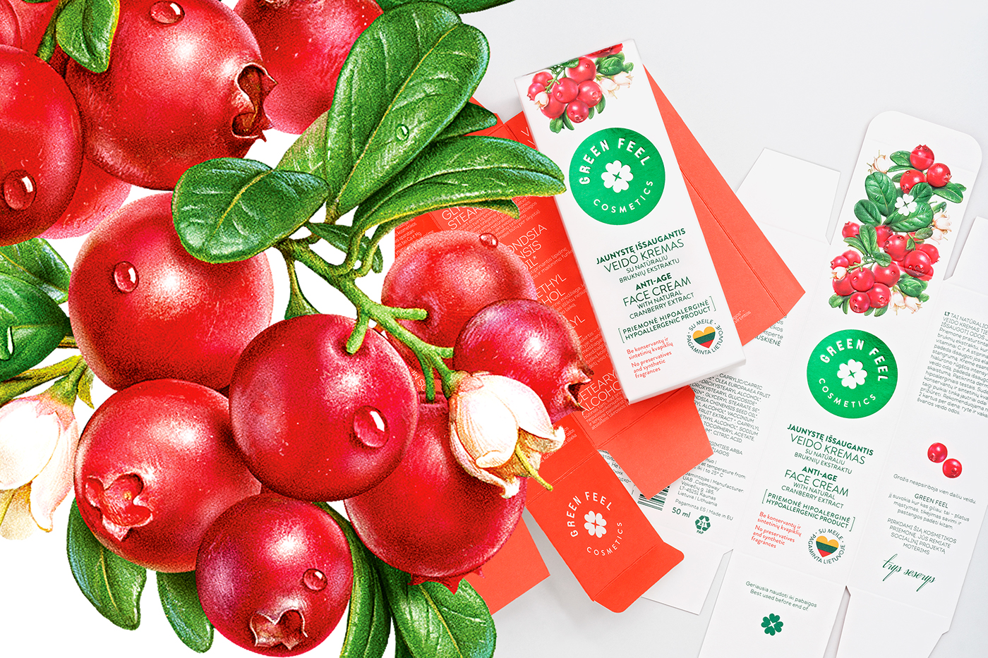
SITUATION
Despite having more natural ingredients and superior quality than most competitors, the product was not conveying these benefits effectively. Shelf impact was weak. The brand logo and ingredients were not stressed enough.
TASK
Create new packaging that highlights the brand's natural background, is easily distributed and better represents the valuable product inside.


SOLUTIONS
SHELF IMPACT
A new iconic logo that is positioned in the centre for better shelf visibility and brand recognition. Bold colours for ingredient illustrations were selected.
EMOTIONAL VALUE
Hand drawn illustrations combined with modern graphics represent professional approach to natural ingredients in cosmetics. A four leaf clover in the logo is associated with good luck.
INGREDIENTS
Minimal product information on the outside is followed by comprehensive description on the inside - representing an honest nature of the brand. The colour of main ingredient dominates when viewing from a distance. Inside of every box is colour coded according to the main ingredient.


Client: cosmoway
Art direction: Valerija Žilėnienė, Irmantas Savulionis
Graphic design: Gabija Platūkytė
Illustration: iNORAMA Studio
Product photoshoot: Benas Navanglauskas, Andrius Penkauskas
-
Awards: 3rd place in NAPA (National packaging award Lithuania)
-
© étiquette, 2016, Vilnius


