Parking Panda Site Redesign
Began August 2011
Began August 2011
I was extremely fortunate to join SiteSimon in their 2011 summer ER Accelerator program. Ten excellent companies used that opportunity to refine their services and vision through fantastic mentorship and workshops. One of those companies, Parking Panda, needed some help finishing their website. They had about a month before the ERA1 demo day to put into production a new site design. I had some downtime between teaching, full-time SiteSimon work and wedding planning to tackle a site template in my after hours.

I quickly interviewed the co-founders, understood their basic business objectives, an idea of user demographics and how they wanted their brand evolved a bit more. I then showed them some sample sites that I thought conveyed the same look a feel. After this quick initial meeting one of the co-founders produced the above wireframe and I began designing.

The original site's search page was one of the most important pages on the site so I considered its design and density of content carefully before designing the homepage.

Firstly, I am a HUGE fan of this "PandaCar Logo". But I didn't think the typeface expressed the originality that Parking Panda's core audience would expect and be attracted to. I also thought the color wasn't also intense enough-not as energetic as it could be.

I had worked on a project with with Elliot Jay Stocks where he introduced me to Bree, a really eclectic, fluid and especially readable font that could easily be called from Typekit. When I saw the chunky PandaCar's wheels, I almost immediately thought of Bree. I applied it to the logotype and increased the saturation on the orange to a darker reddish hue.

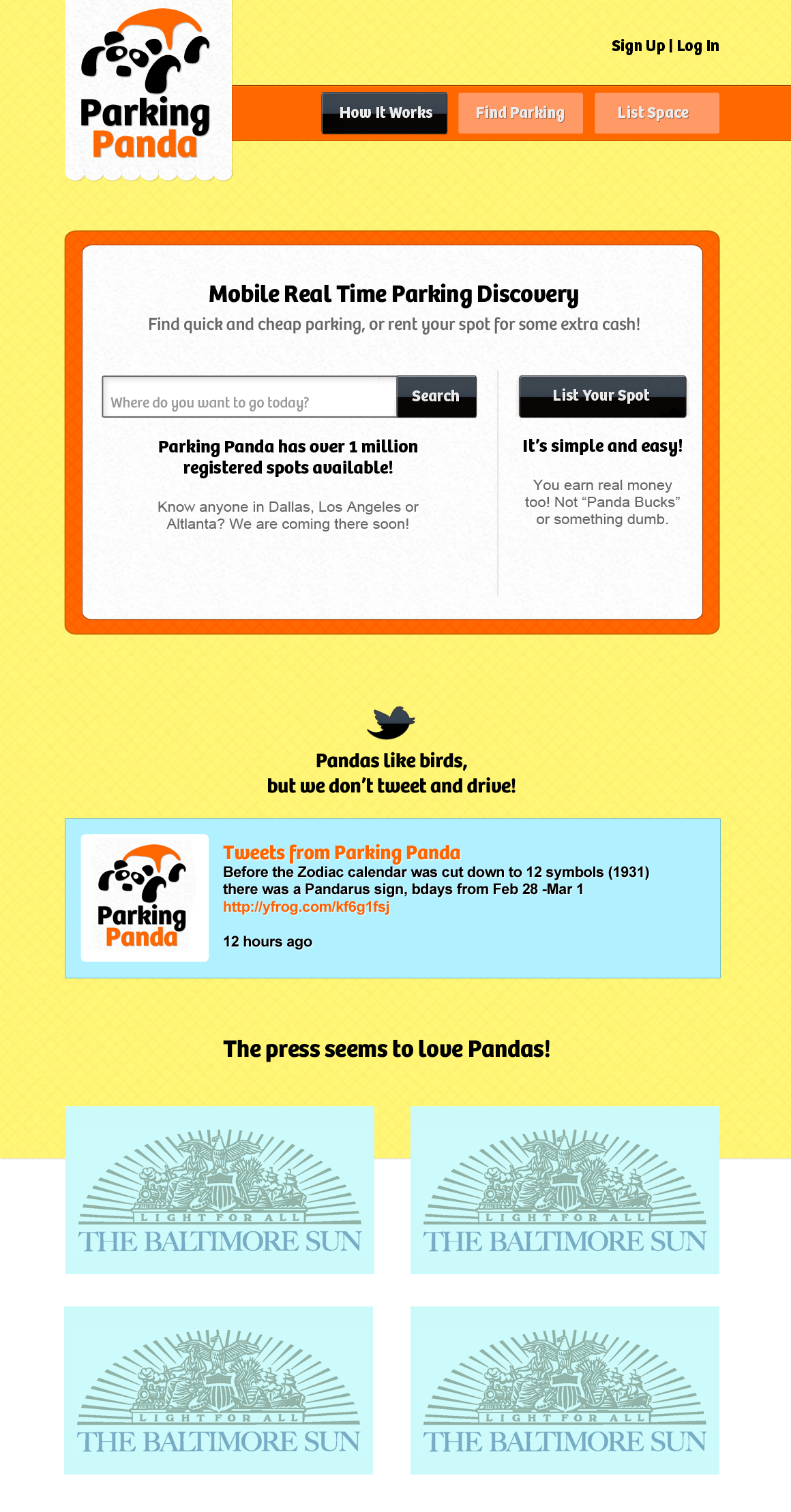
I took the buttons and applied a a black gloss-I was trying to inject some energy into a black and white theme. When combined with the black gloss the Bree Black Italic typeface really felt at home. The only feedback about this next quick version was that the background was very wrong using yellow. Again, I completely agreed!

My very next iteration was the version that was sent into production, small copy writing pieces and all. I was particularly proud of that considering the copy was simple place holder copy.

One of the details I especially want to point out is the footer. Parking Panda has a rich sense of humor to their tone and personality, that I thought it appropriate to accent nature in the footer. To really take some time and ground the site in Panda-ness.

The search page was the next and last piece to be designed. This basic format for two pages became the basis for the entire site's layout.


