Strop de Viu is a small family business promoting a healthier lifestyle and producing a big variety of natural, cold pressed juices, with no extra additives.
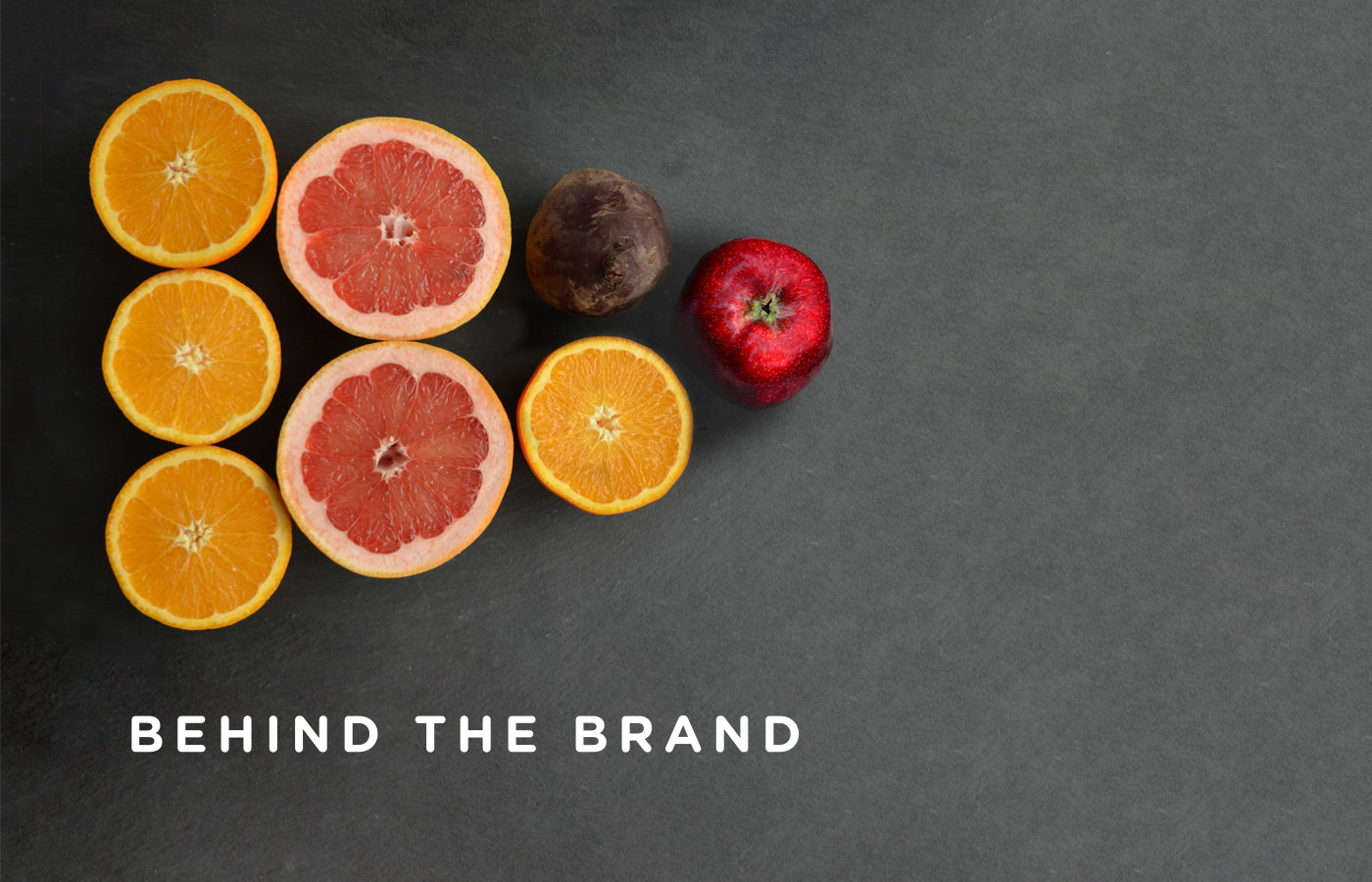
It all started from a need, a health problem in their family that needed to be treated with fresh fruits and vegetable juices. All the juices are cold-pressed using the best fruits and vegetables, everything is manually selected and individually washed.

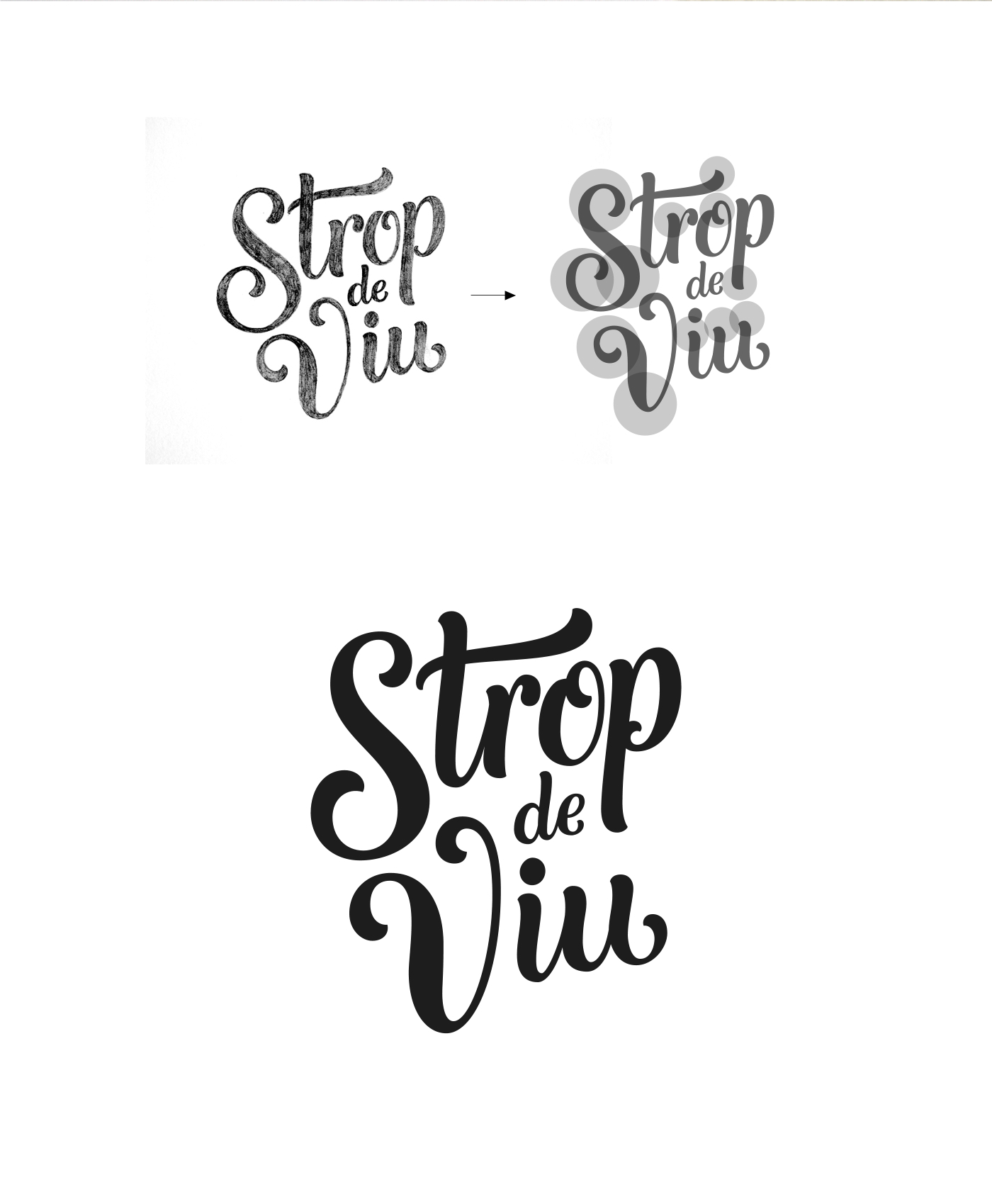
The business name is based on a pun and would somewhat translate in english to "Drop of life".
The initial research led to a few conclusions: the competition used mostly the same visual language - fruit photography, juice splashes, vibrant colors on the labels, and loaded with imagery.
The target audience is made up mostly from 25 to 45 years old people, that have a healthy lifestyle and a mid to high financial level.
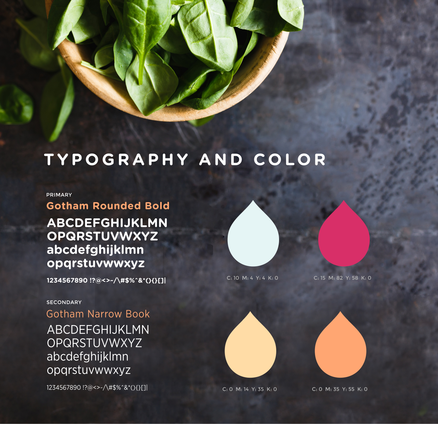
Among the most important identified brand attributes are: trust, natural, health, transparency, freshness, quality, care, friendly.
The initial directions drawn range from more elegant or modern sans to friendly script solutions.
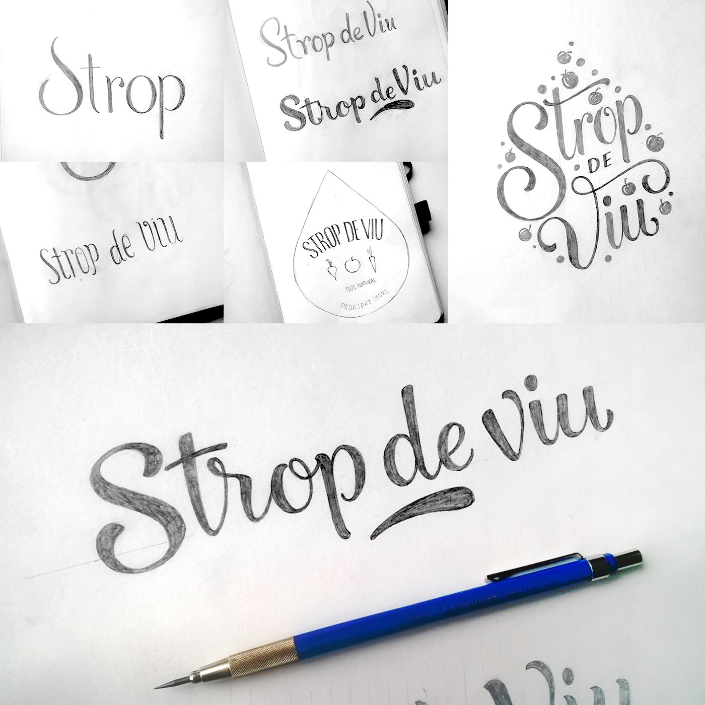
The final solution is this custom drawn stacked script. The bold, organic shapes, friendly but stylish at the same time will perfectly communicate the brand attributes.


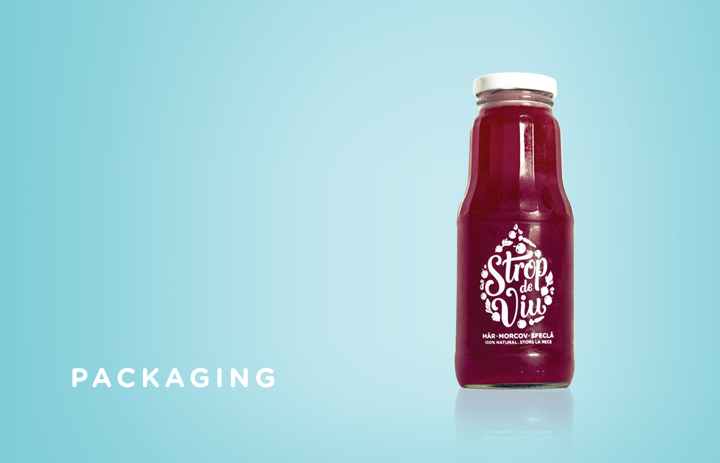
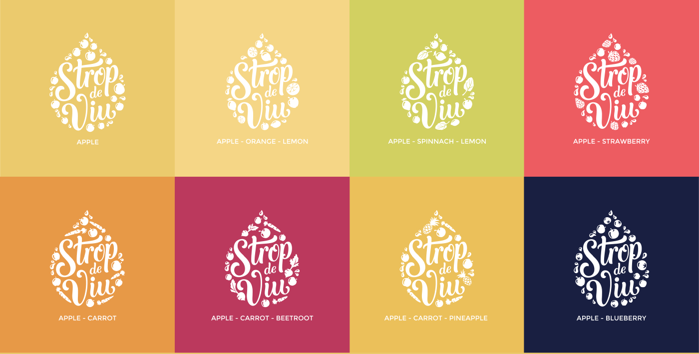
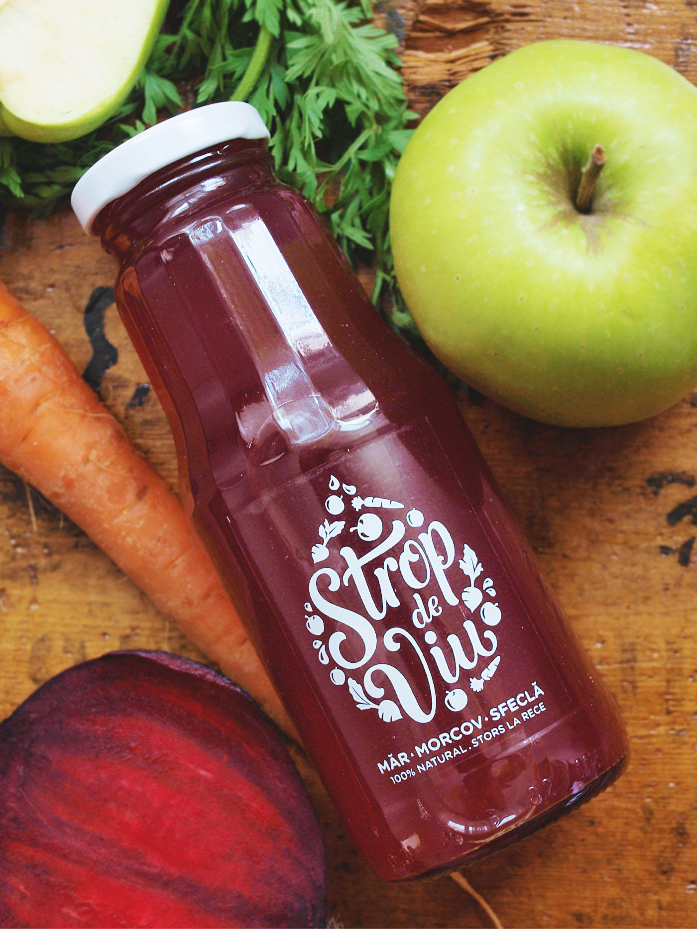
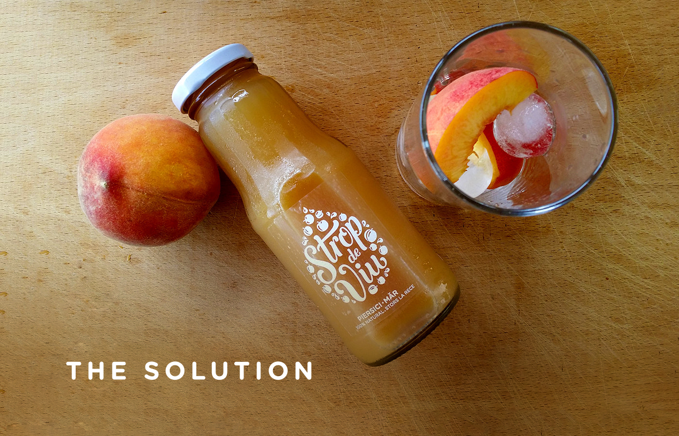
We decided to have transparent labels, printed in white, in order to emphasize the magnificent natural colors the juices have, and the make a further statement about the transparency of the brand. The shelf visibility becomes in this way a differentiating factor.
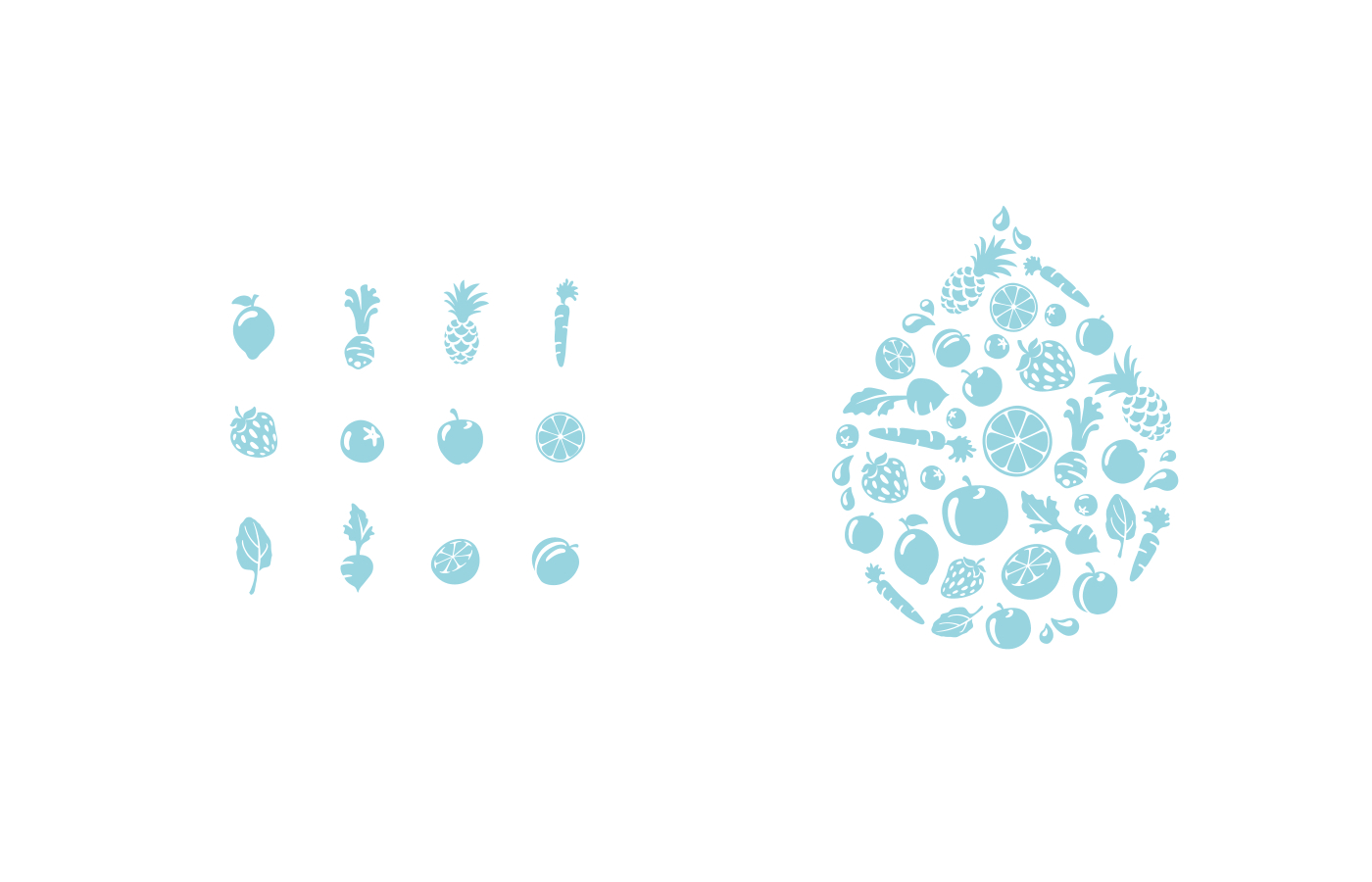
Each ingredient was illustrated in several positions and variations and each juice has received it's personalized label.