

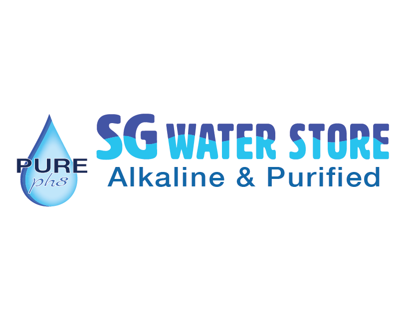
Rebranding and logo mix up assignment for Graphic Design Principal Class. We had to take a local business and come up with several different designs for the assignment. The first design is stacked.

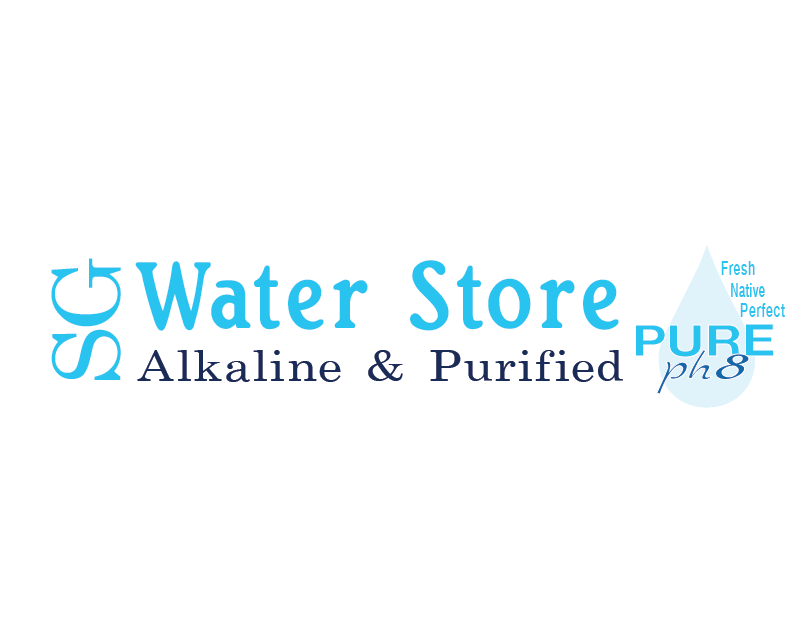
The second design is elongated.
Third design has water droplet instead if the water splat. The water droplet is the only graphic shape kept from the original brand logo.

The fourth design has the name of the business in one solid color. The water droplet has the gradient flipped as well to mix things up from the third design.

Above is the original logo on the business signage. Below is how the signage appears now. Sadly the weather has taken it's toll on the sign.

Above is a rough recreation of the stores original logo.

The water splat I started with.
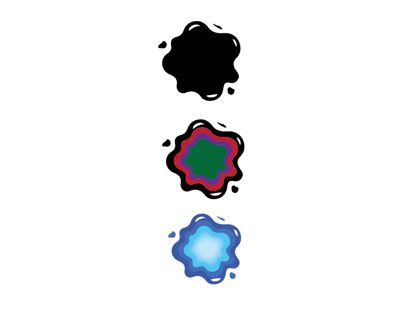
The evolution of the water splat.

The water droplet I started with.
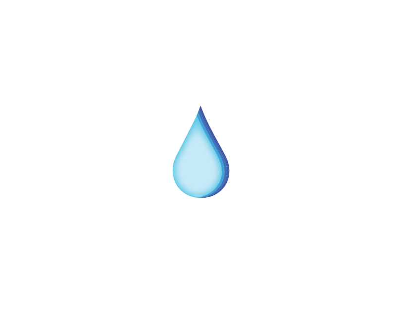
The final water droplet with the gradient on the right.


