CONCEPT | IMPLEMENTATION | DESIGN | TYPOGRAPHY | WRITING | EDITING


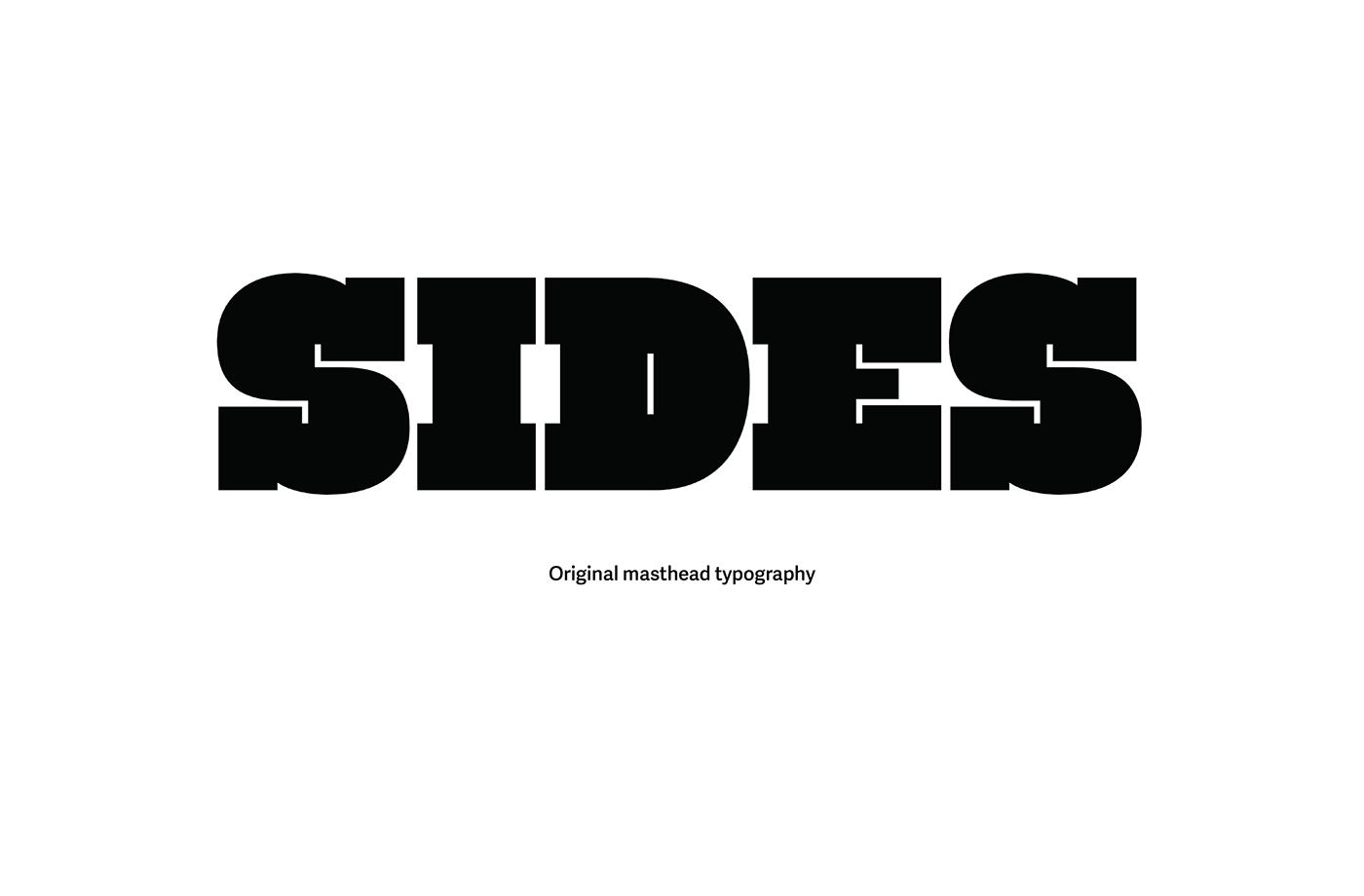
The masthead is a modified version of Silas Dilworth's Facebuster, an unapologetic and unavoidable slab serif.


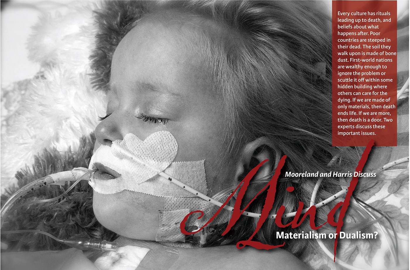
Nestled on a 3x6 grid, the large type encourages the reader to view each section as a two-page spread. Typefaces used are the newsy and proven serif Stag, the clear and comfortable Karmina Sans, and the flourishes of the script Olicana.
All images in the table of contents are tilted 15 degrees and blurred to reinforce curiosity and uncertainty at this point.
Advertisements are placed in only two sections of the magazine out of respect for the reader and their need to process the differing perspectives uninterrupted.