Abril Titling
A low contrast font family for trustworthy, impactful headlines.
The Abril font family debuted to great digital and print success, not to mention receiving numerous international awards and design accolades for creators José Scaglione and Veronika Burian. The Abril Titling font family was engineered three years later in response to a precise requirement from the editorial design community which had put Abril into heavy rotation: a low contrast typeface for headlines. Given its broad range of styles, though, Abril Titling deserves to be considered a separate type family on its own merits.

Bringing characters closer together without losing impact or appearance requires more than simply adjusting tracking. It requires modified terminals, a change in weight distribution, and retooling the glyph shape from the internal space outward. Based on the original approach to Abril Text, Abril Titling’s letter shapes are still sturdy, very legible, and carry a newsy and trustworthy feel. The accented editorial style of the Scotch Roman finds continuity in this new type family, but some of the details have been ironed out for improved performance in print and screen headlines.

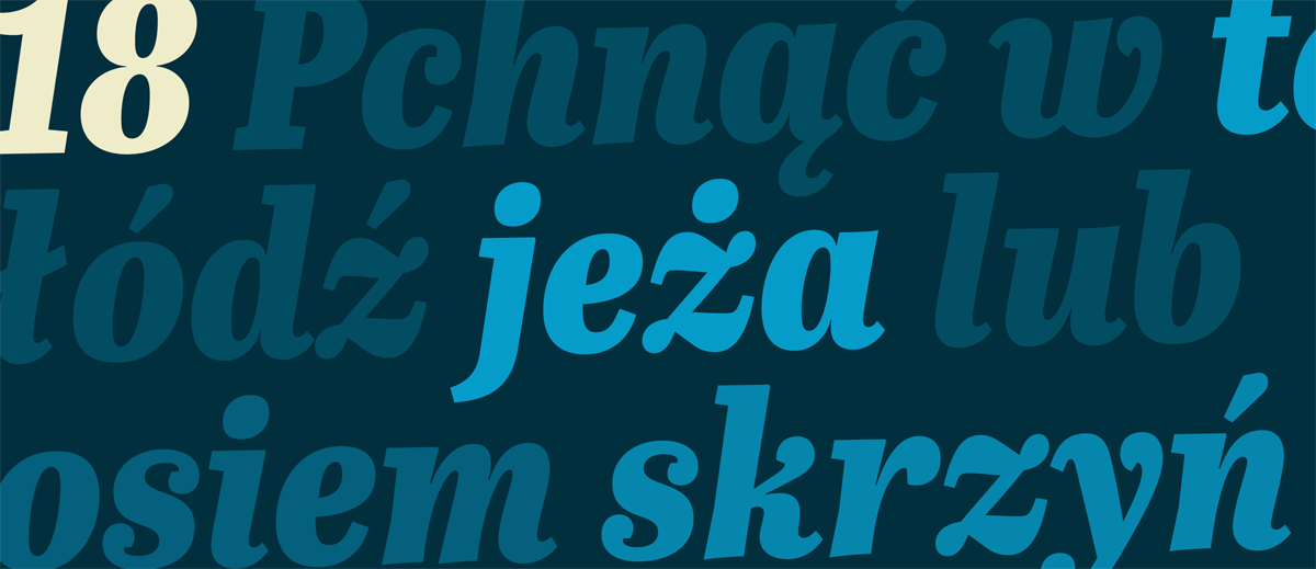
The Abril Titling fonts were conceived as a family of four different widths: normal, narrow, semi-condensed, and condensed. Each of the four widths has four weights (regular, semibold, bold, and extrabold) plus matching italics — a total of 32 fonts. This wide range of styles allows for setting titles and callouts at almost any size. The wider series is intended for smaller point sizes while the condensed widths deliver a striking and cohesive appearance as front cover headlines.

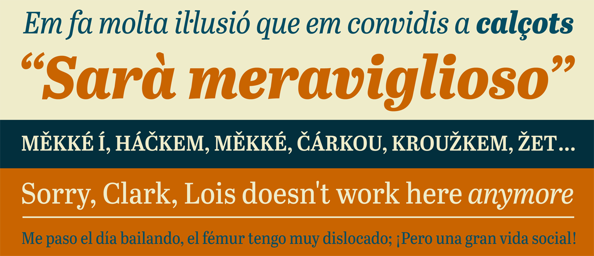
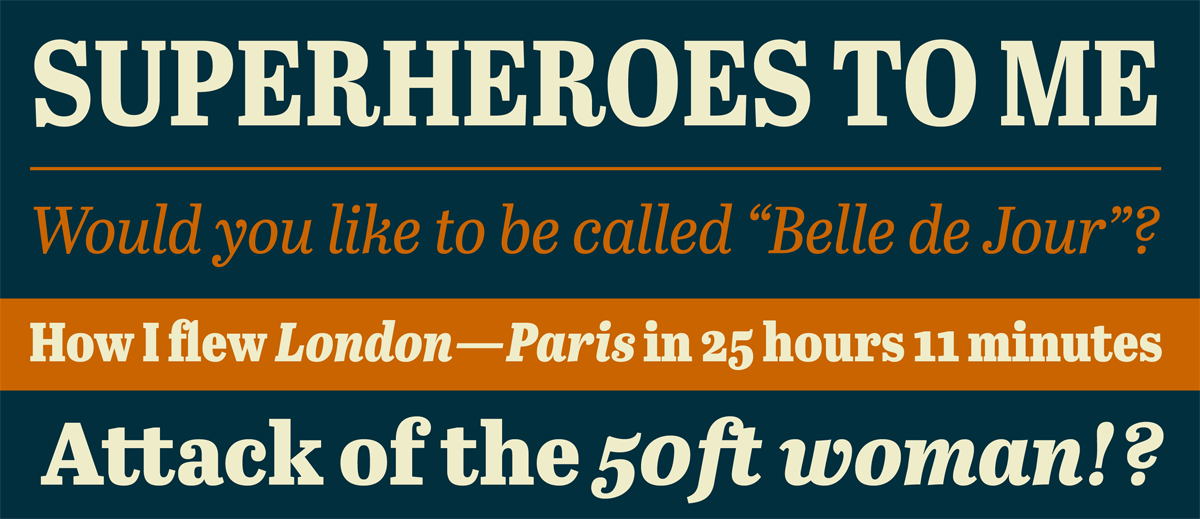
The Abril Titling fonts were designed as a versatile tool for web and graphic designers looking for a stylish workhorse that maintains high impact. Abril Titling, along with our entire catalogue, has therefore been optimised for today’s varied screen uses. Be sure to check out the rest of the Abril family, Abril Text and Abril Display, for a credible, contemporary interpretation of a classic newsface. Or pair Abril with its intended sans counterpart, Tablet Gothic, the pleasing, comprehensive 84-weight family for extensive editorial use.


Abril Titling Regular
Abril Titling Italic
Abril Titling Semibold
Abril Titling Semibold Italic
Abril Titling Bold
Abril Titling Bold Italic
Abril Titling Extrabold
Abril Titling Extrabold Italic
Abril Titling Narrow Regular
Abril Titling Narrow Italic
Abril Titling Narrow Semibold
Abril Titling Narrow Semibold Italic
Abril Titling Narrow Bold
Abril Titling Narrow Bold Italic
Abril Titling Narrow Extrabold
Abril Titling Narrow Extrabold Italic
Abril Titling SemiCondensed Regular
Abril Titling SemiCondensed Italic
Abril Titling SemiCondensed Semibold
Abril Titling SemiCondensed Semibold Italic
Abril Titling SemiCondensed Bold
Abril Titling SemiCondensed Bold Italic
Abril Titling SemiCondensed Extrabold
Abril Titling SemiCondensed Extrabold Italic
Abril Titling Condensed Regular
Abril Titling Condensed Italic
Abril Titling Condensed Semibold
Abril Titling Condensed Semibold Italic
Abril Titling Condensed Bold
Abril Titling Condensed Bold Italic
Abril Titling Condensed Extrabold
Abril Titling Condensed Extrabold Italic
