


During summer 2016 we designed the set-up of the first exhibition of Pisa Graphic Museum with an architectural theme. "Roberto Mariani architetto. Senza clamore e dissonanze" was inaugurated September 30th and is going to last until November 30th, featuring more than 200 prints, pictures, architectural drawing and quotes about Mariani's work.
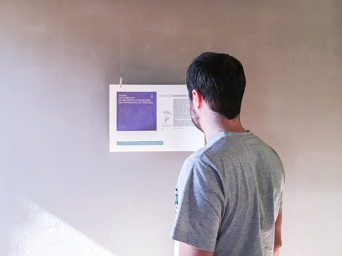
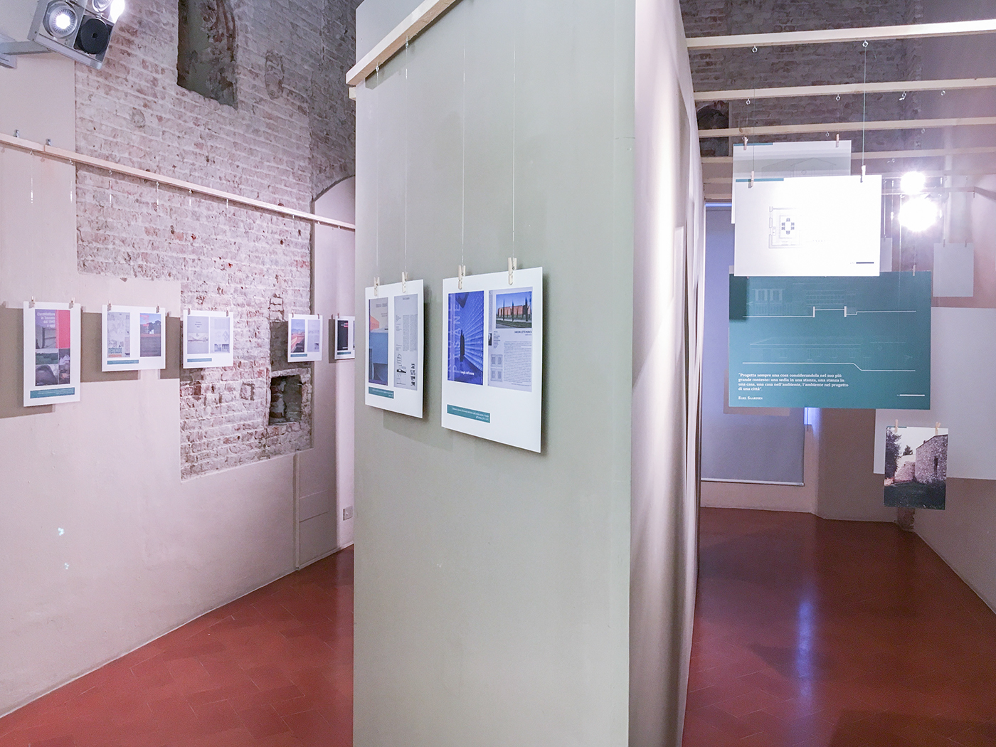
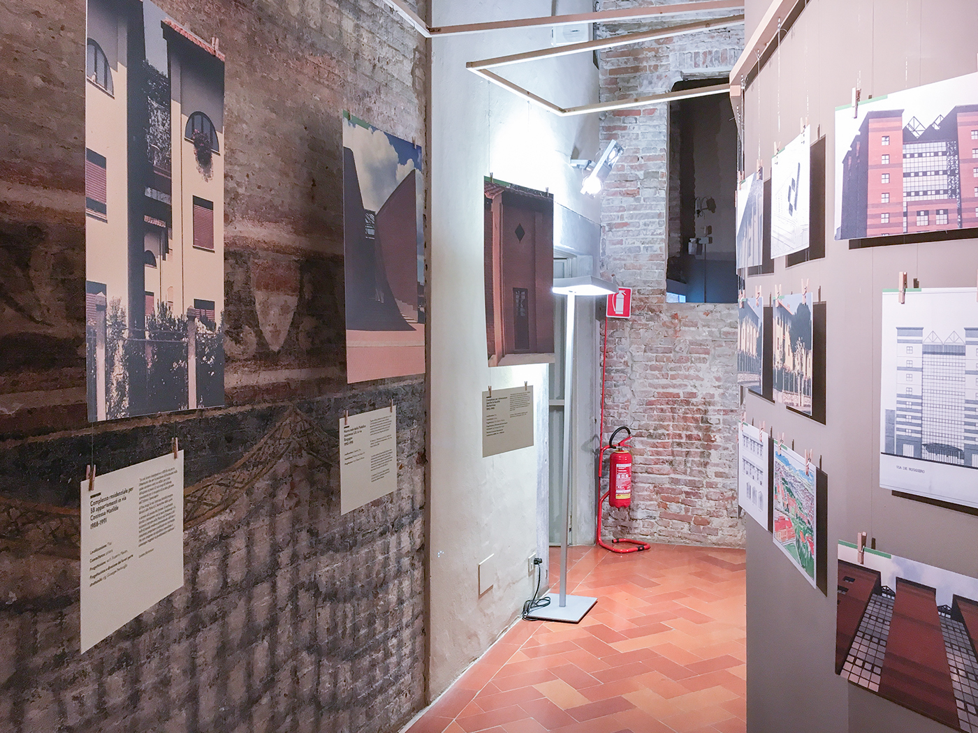
Pine wood elements were used throughout the exhibition as common material modulus. Pinned to these wooden strips — which run along the nine rooms of the Museum's first floor — the boards floats lightly detached from the walls.
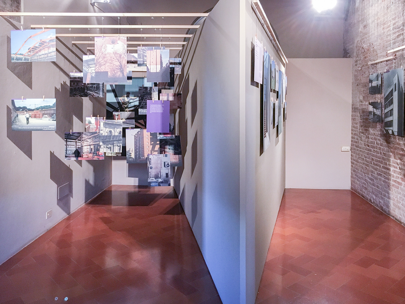
Every room has its specific color based on a consistent palette, guiding the visitor throughout the nine themes exposed.
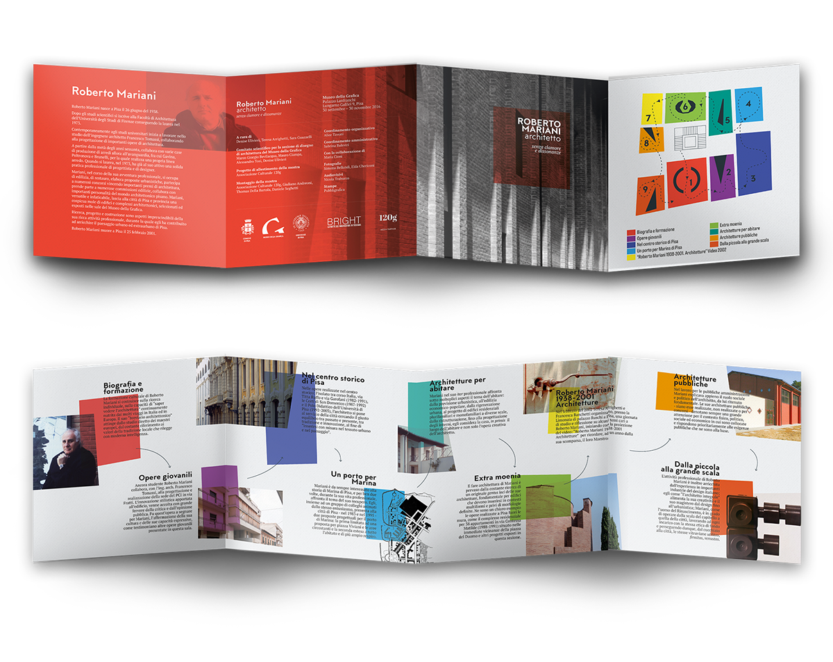
The whole graphic design of the exhibition is very consistent, playing with only two font families: MTT Milano and PT Serif. The color palette is inspired by pure and brilliant colors, keeping the prints vibrant and endearing.

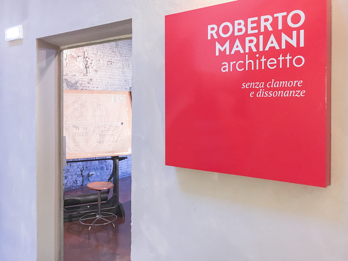
The exhibition has needed a brand as well: posters, flyers, brochures and the online identity have been designed carefully to cover all the communication quests, both online and on printed supports. Here you can check out the digital version of the exhibition field guide.
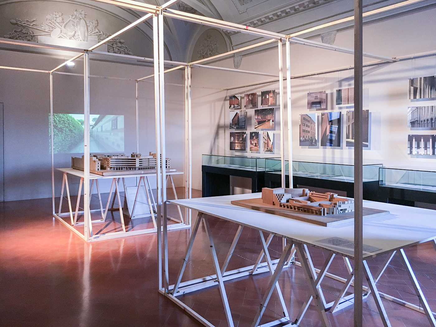
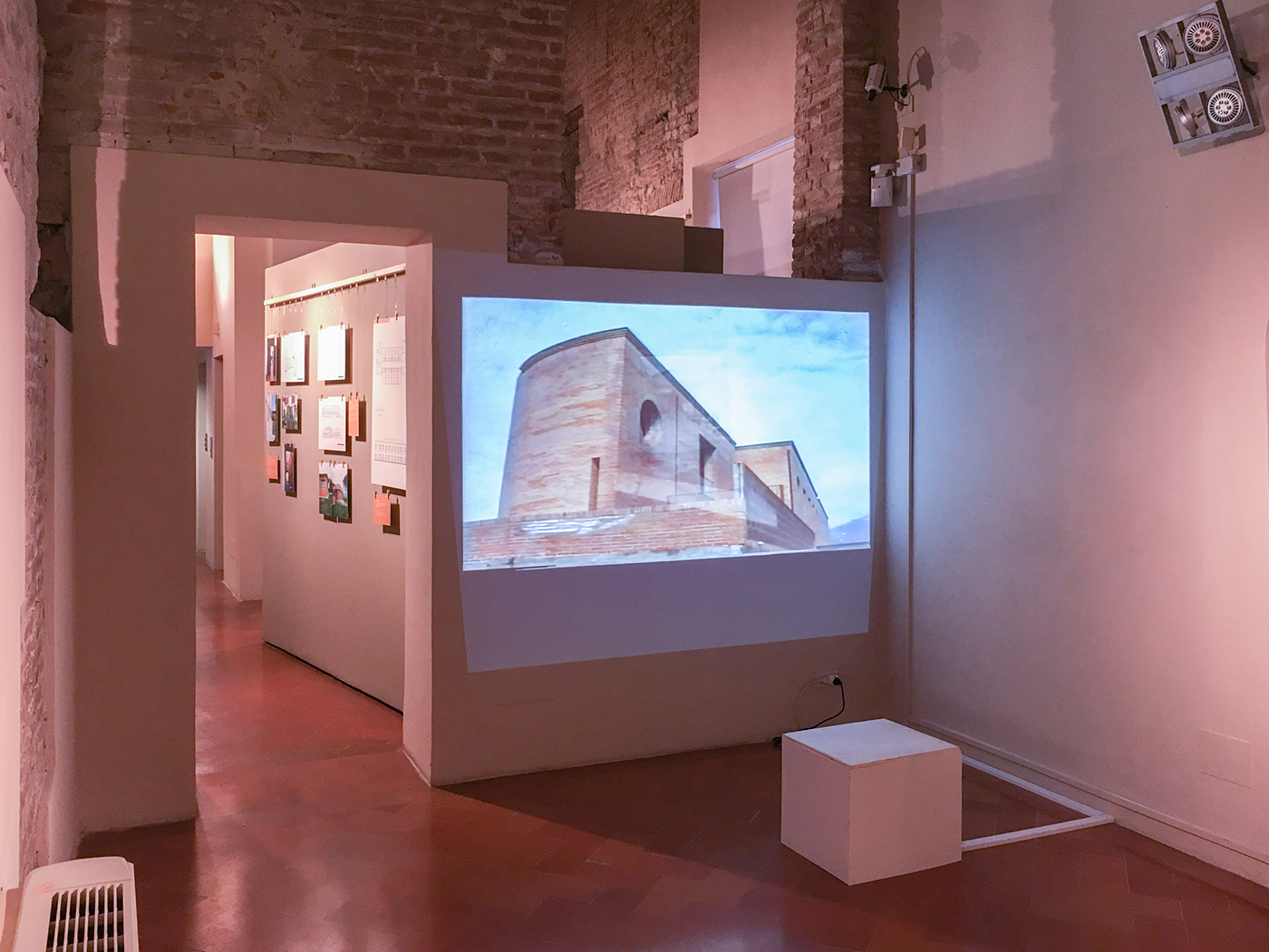
We produced a video as well: as part of the exhibition of the main room "Inside Pisa's Walls" the film displayed eight of the main Mariani's work in Pisa's territory.
Take a look inside the exhibition:
☝︎


