Go Outdoors
Visual Identity
Visual Identity
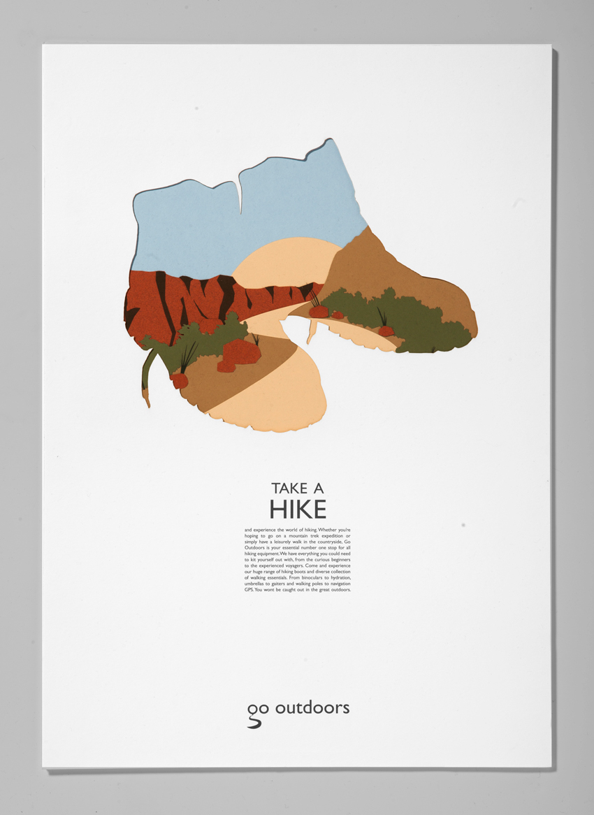
My Visual Identity project involved rebranding the mountaineering company Go Outdoors. The logo was created by transforming a lowercase letter 'g' into a navigation point and pathway. This was then applied onto a three part advertising campaign in which a lasercut landscape was presented through a product specific 'window' for three chosen areas that Go Outdoors caters for; Skiing, Hiking and Camping. The A2 posters were designed, cut and built layer upon layer to express a sense of depth.
As part of my Visual Identity I designed a range of bags to be used in store. These bags implemented an outdoors scene using products that would be found within the store. For a finishing touch, rope was used as the handle to reinforce the mountaineering aspect.