


For this branding project, I was introduced to Straight Biz. This corporate training company uses video game technology to train and develop employees for companies. Below is the proposed brand guide along with some examples of the brand guide I had created.

This cover image conveyed the brand message. Being an innovator in the professional business world sets Straight Biz apart. The imagery shows a sense of grandeur and success.
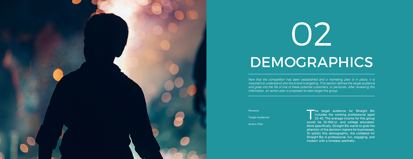
The chapters were marked with key imagery that evoked emotion. The imagery used here captures the nature of the chapter. I used a grid system in my spreads in order to provide structure, and a professional aesthetic.

One of the media mixes included a magazine that I designed as well. The grid system stays in place, so that the reader can get accustomed to knowing where to get the information they need.

I loooove type. Making the spreads for the typography was my favorite part of this project. I got to explore the rich history of the typefaces, and how they impact marketing. I had included a brief history of the font for the reader to get an appreciation, while also including rationale for the brand relevance.

I chose to create full spreads for color choices so that the audience could see how the color plays in context. This strengthens the brand message of success (reaching mountaintops), while offering a beautiful context to the color, and the type rests comfortably on the background.
For this project, I was in charge of research, design, editing, and copywriting. Images were provided by Pixabay.
To view my full Brand Guide in another window, click HERE


