

ABOUT
This project is a bold mobility statement and a massive undertake: the strategy, detailed location, content preparation, layout, artwork, fabrication, installation and post-installation audit of 500 sings (divided into 4 sign types). Notwithstanding the importance of all involved, a few people have made significant contributions:
From ICON Luiz Mello (Executive Director), Waldemar Oliveira (Project Manager), Monica Machado (Production Manager) and myself (Design and Wayfinding Manager).
From Applied Richard Simón (Partner, Director of Planning), Ben Acornley (Partner, Creative Director) and Andy Bolton (Designer).
Images by Eduardo Zappia and Gustavo Soares
—
STRATEGY
Rio's beautiful topography doesn't help in making a clear mental image of the city. There are quite a few mountains and tunnels, reversed traffic in rush hours and various routes to reach a destination. The main conclusions of research & analysis were that accessing many important landmarks (most notably the Christ and Sugar Loaf) was a mystery and that neighborhoods were grouped together according to proximity or shared landscape features. There was no encouragement (information) to cross these neighborhood groupings by foot.

—
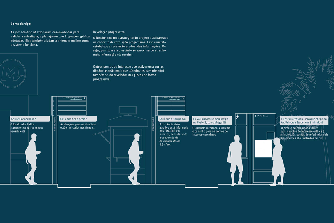
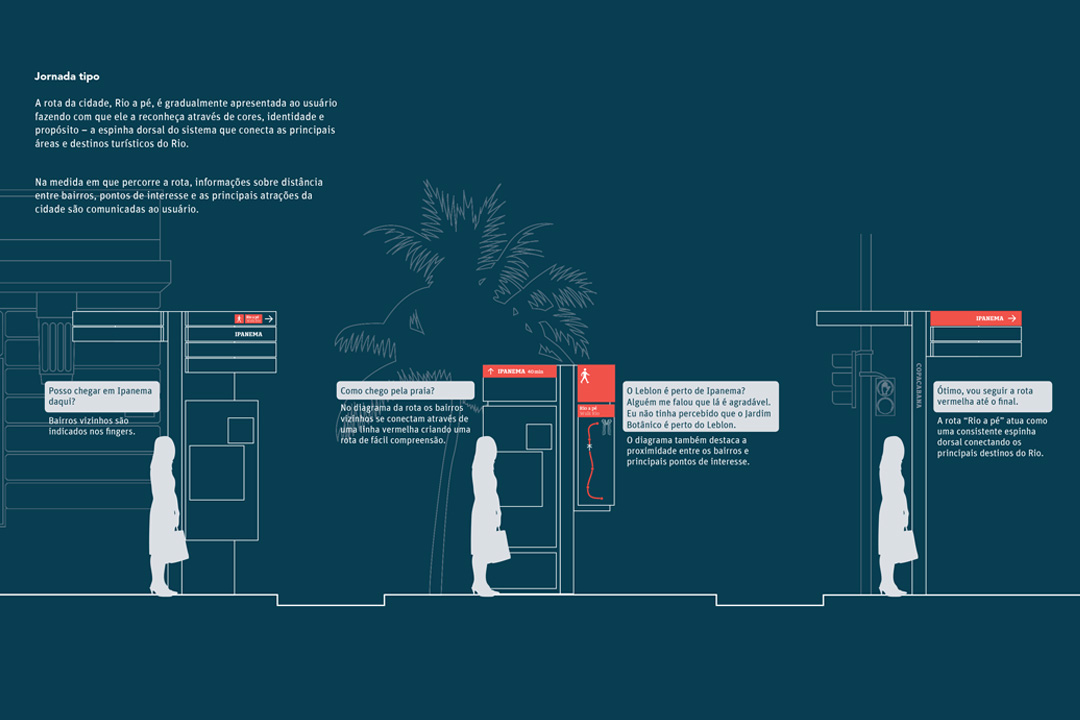
Based on those conclusions and other explorations a route hierarchy strategy was developed. A main route connects Leblon and Maracanã through the relevant neighborhoods within the project's scope. From this, secondary and tertiary routes lead to other important and parallel neighborhoods. They also take the visitors to the attractions and back to the main route – where more information about the city is available.
—
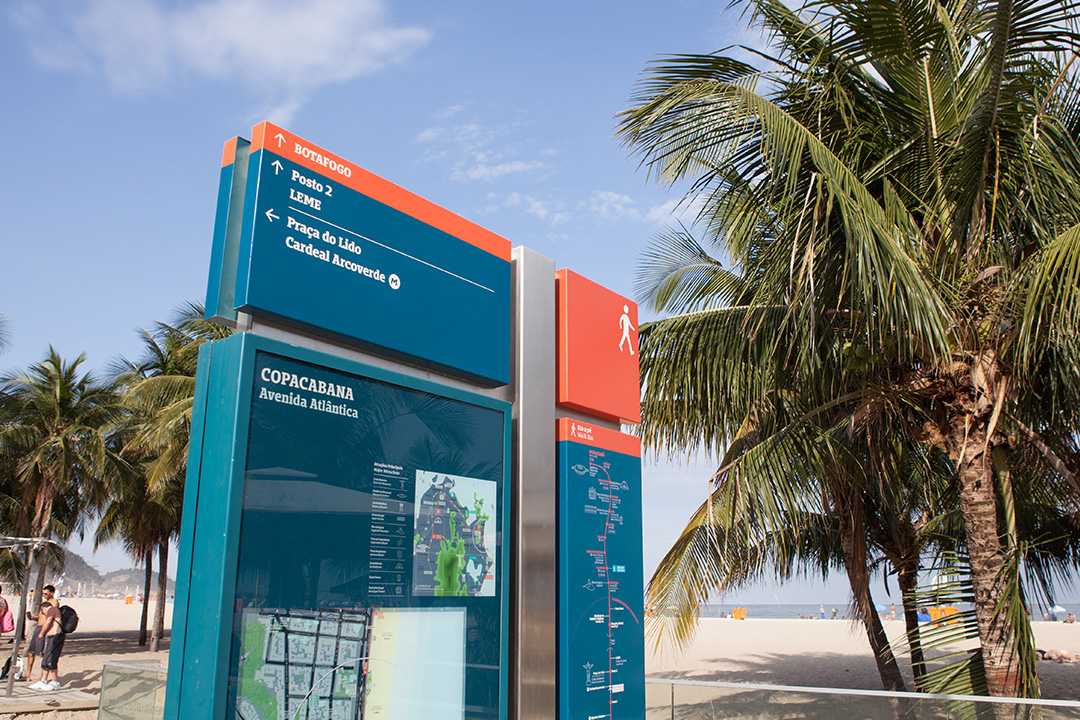
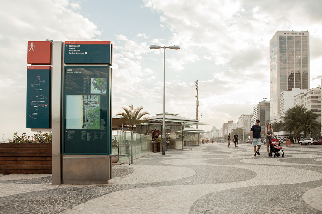
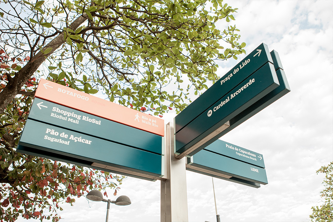
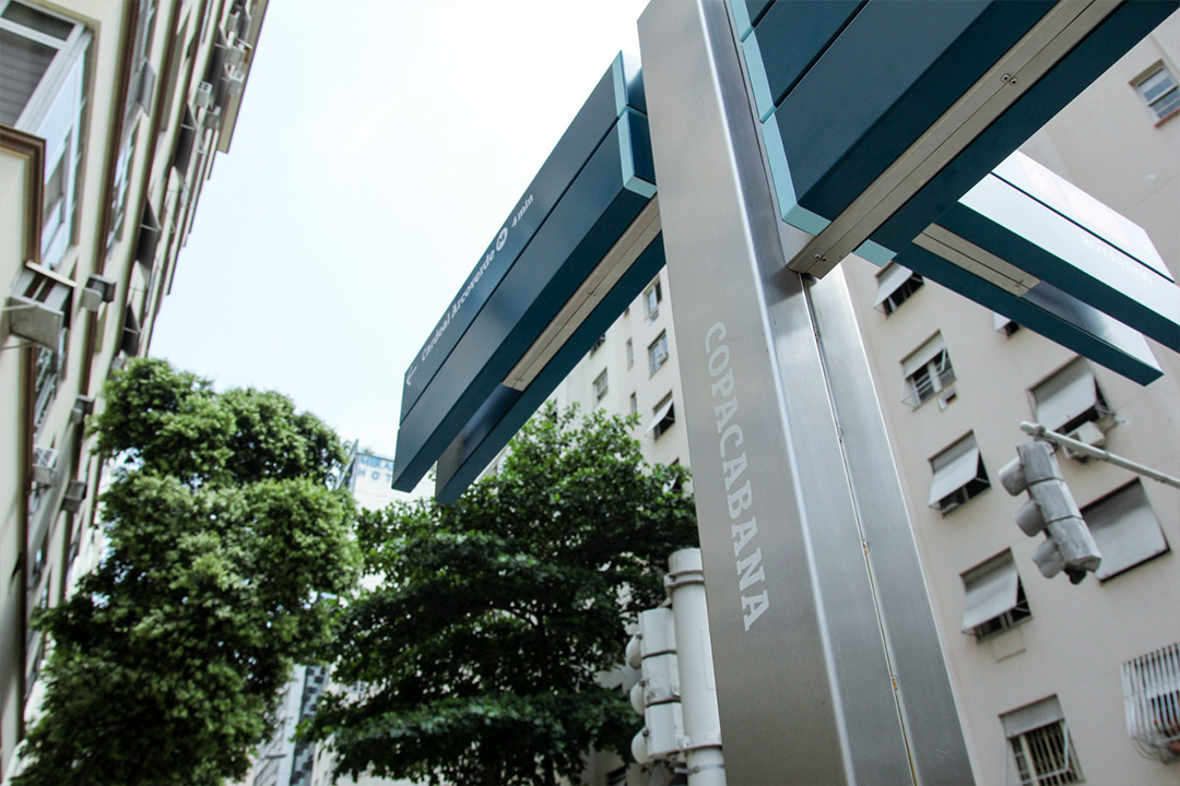
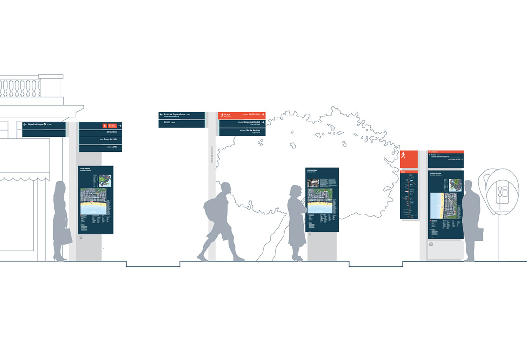
SIGN FAMILY
—
VISUAL LANGUAGE
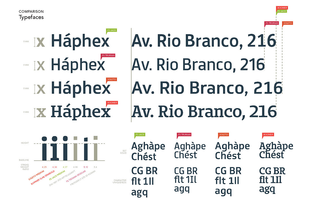
Due to the map-based nature of the solution we knew upfront that we would need two typefaces. One to perform in small sizes and one that could add more of the local flavor to the system. We narrowed our options to faces designed by Brazilian type designers and went forward with dooType's Bommer Slab, by Eduilson Coan, for the local flavor and Font Smith's Jack, by Fernando Mello, for the mapping and support.
—
We've used the technique of style tiles to involve the client in the visual language discussion and provide them with a concrete experience of how type, color, hierarchy and supporting elements would work according to specific design routes.
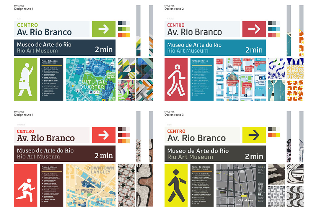
—
As it happens, a bit of one route and bit of another formed the final visual language
—
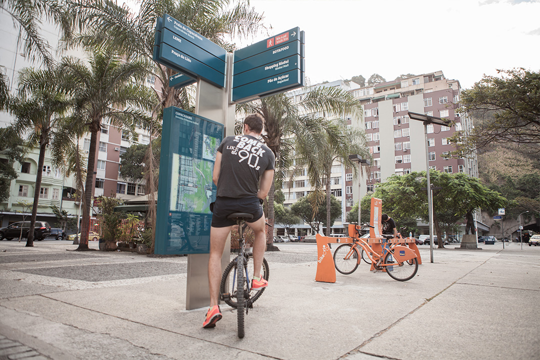
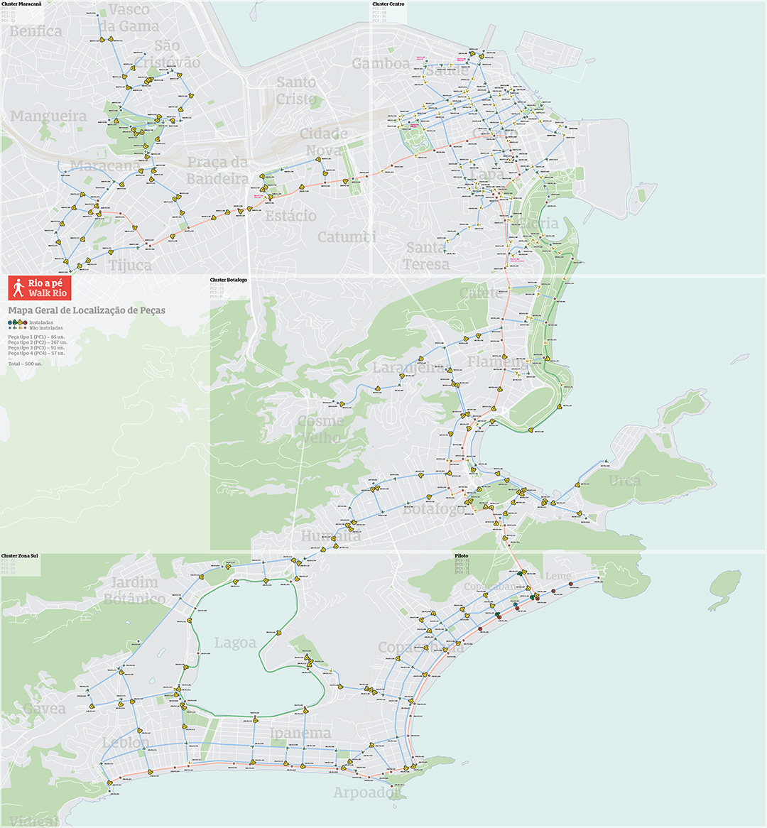
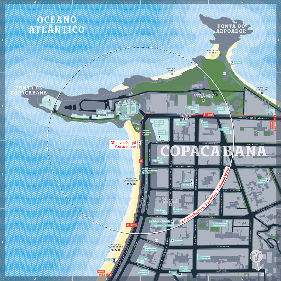
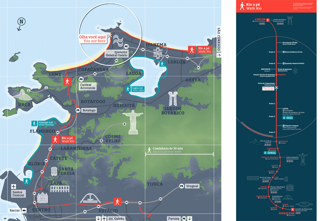
MAPPING
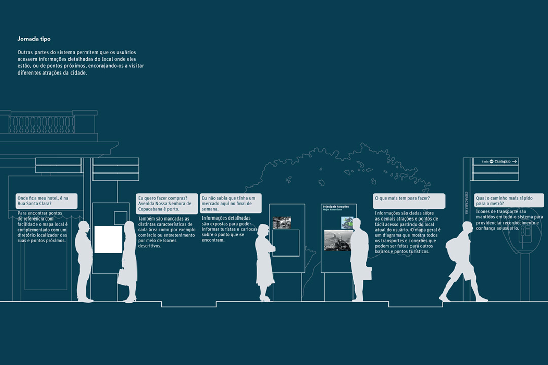
It's a map-based solution, so maps play a huge part. Two types were implemented, the famous walker's (finder) map with the 5min radius; and the overview map, that provides city context. Reaching this level of work involves as much art and design sensibility as technology. All selected assets were geo-referenced, checked on street when needed and fed into Illustrator turning it into a GIS beast. This, and the aesthetics and guidelines for the icons, were all orchestrated by map guru Andy Bolton.
—
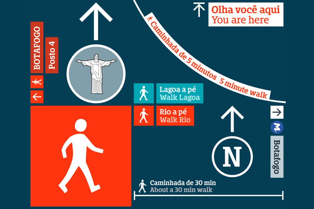
MAIN ROUTE DIAGRAM
It is worth mentioning the main route diagram (bottom right). It only exists on one sign type, the biggest, along the main route and provides context to all neighborhoods and main points of interest in strip map fashion.
—
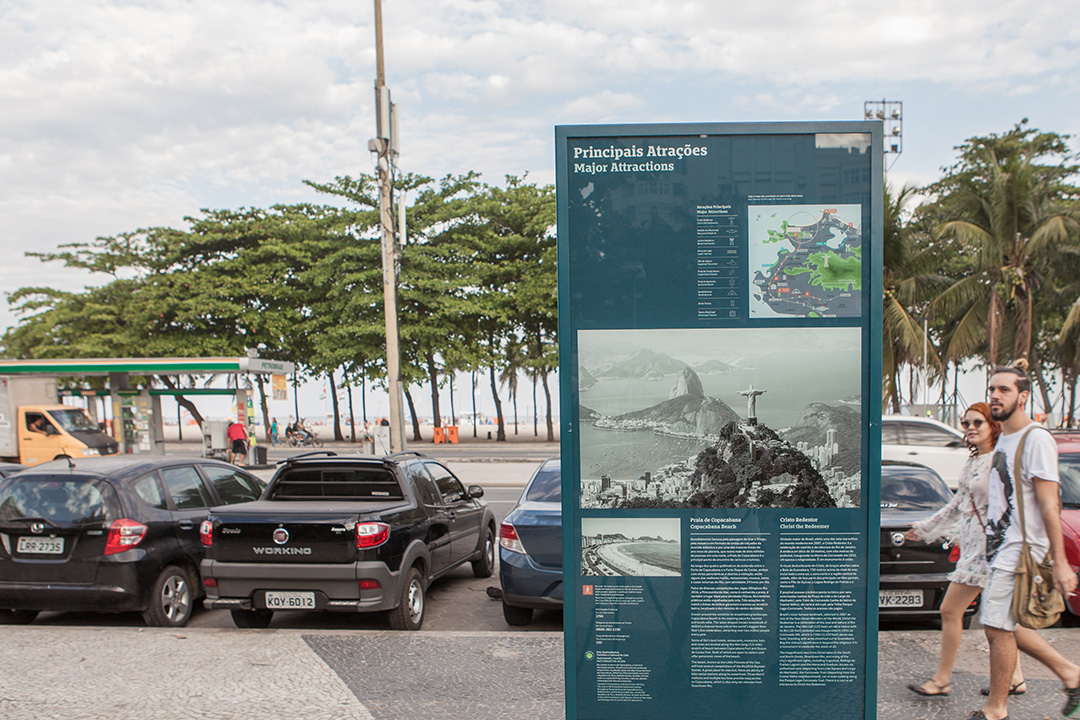
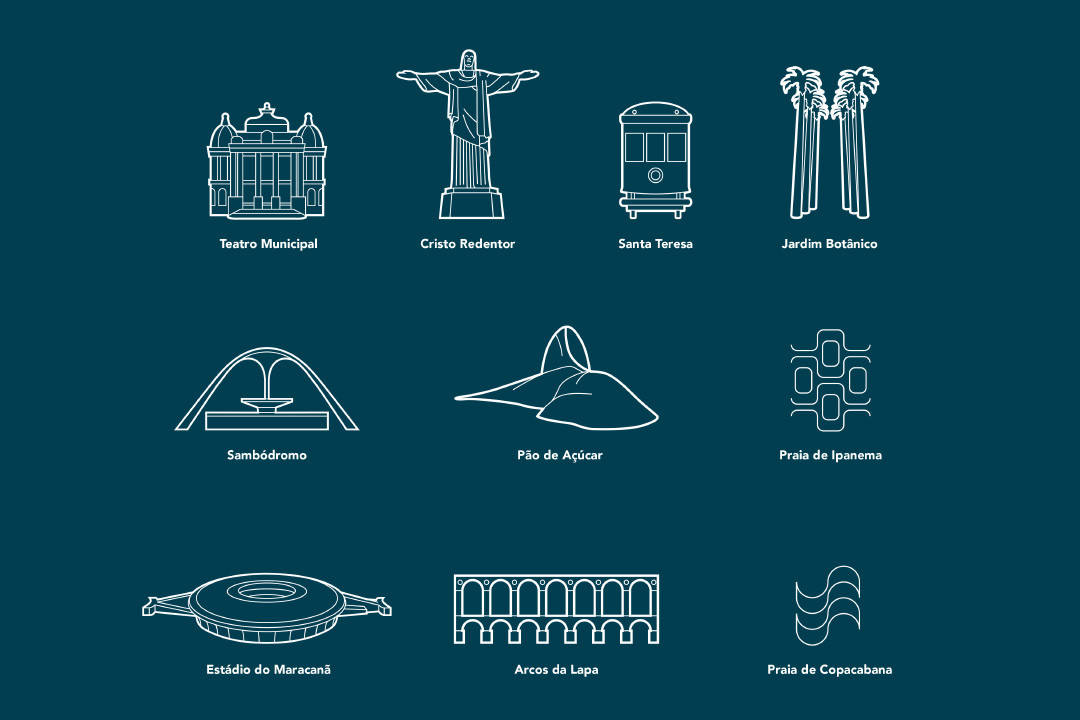
MAP ICONS
The two types of maps are served by two different sets of icons. For the overview map, only the top 10 attractions are shown in a more straightforward and clean way...
—
... for the finder map, on the other hand, we used the 3/4 fake 3D approach. This illustrates the most prominent façades of relevant buildings which helps the user identify and recognize them on the street.

—
CONTENT MANAGEMENT & ARTWORK WORKFLOW
Our responsibility to produce the content, layout and generate more than 1.000 complex artworks provided a great opportunity for an automated and streamlined workflow. Strict content validation, Excel, and scripting is not something that will get a graphic designer excited, but let him hit 'play' in InDesign and see about half an hour of his workload reduced to seconds. These babies will make even the tougher artworker thank you like a child with an ice cream.
—
Wow, the least I can do is thank you for staying with me until the end! Best,


