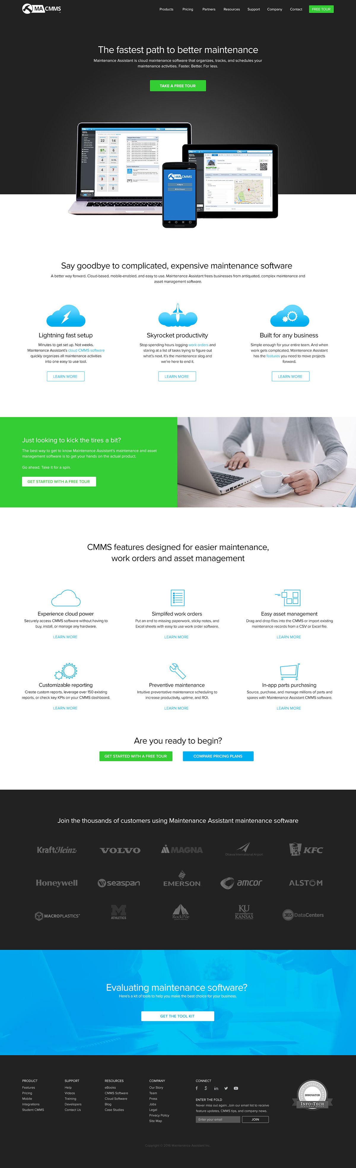
A mockup of an updated home page and the overall look-and-feel for Maintenance Assistant's website. This was not commissioned and is simply an explorative piece. Most of their content is the same as their current home page (as of this writing), all graphics and icons (except product screenshots) were redesigned from scratch. And the layout of certain items were adjusted for variety and to break up the page a bit more.
The top section was made dark to help the product screenshot, heading text, and green Demo button stand out a lot better. I also made the green colour exclusive to the mention of the product demo for consistency. This would have applied throughout the entire website. Also introduced imagery of people, instead of only having the blue gradient everywhere. The main navigation was also slightly tweaked - the "Contact" link was brought out from inside of a dropdown menu and into the main nav list for easier discoverability.
Overall, the UX is much more streamlined and focuses on what the user would find more important. The home page is much more focused on teaser info, and the product demo.
See below for the "Before" screenshot of their current site.
BEFORE