
This project was special to me as this is a family business and I had the responsibility to make a strong solid brand new image that would give the place a personality and a touch of class as well as a modern feel to it. The restaurant is named after my brother nickname and the initial idea was to make a fluent lettering for the logo, something readable but with a strong rhythm that would sink in people's memory the first time they see it. So I started with the sketching process as I always do and I came up with the following samples.

After we studyed the options we chose this sketch and I went on to trace the sketch refining the details, the spacing and overall shape.

This is the final sketch filled in with pencil, usually I ink the sketches to define blacks and whites better but this time the pencil sketch was clean enough to work with it so I scanned it and I place it on illustrator for the vector work.
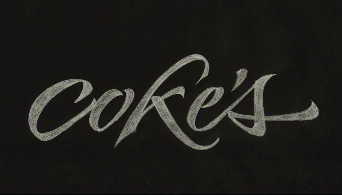

Here is the final vector file, I kept it simple with a white fill on a black background 100% contrast.

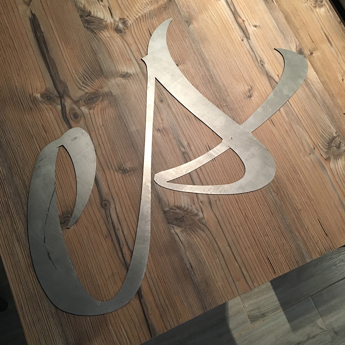
Next thing we did was to cut it off a wood piece in a large size with a laser cutter as you can see in the video below.
We sticked it in the center of the main wall behind the bar.
You can see the outcome in these next pictures.


Once we had the center piece in its placed I did the rest of the illustrations and lettering in the bar area. Here you can see what I came up with.


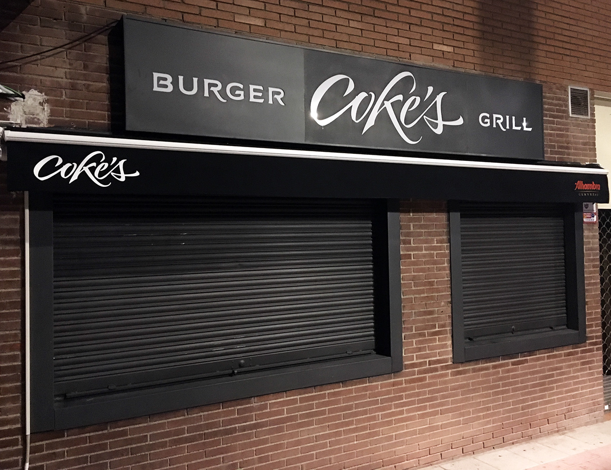
After the inside area was finished we worked on the front sign outside, we cut the logo again but this time on a metal panel which we painted on black and placed a white piece methacrylate behind it with some led lights inside.


Finally I designed the menus and the website which you can visit here:
Thanks for watching, I hope you enjoyed it.


