
This is a recent branding for an electronic music project I’m involved in. The brand is designed to reflect the sonic qualities of the project through typography, photography, digital painting, and motion graphics.

Given the industrial and digital nature of the sound, creating a “logo” for Corporate was ditched in favor of just designing a custom typeface.
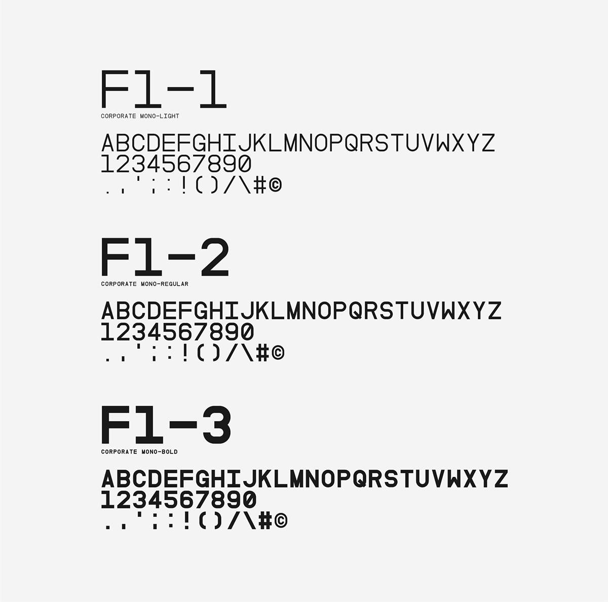

Naming each new track at the beginning of its creation was difficult. A standardized naming convention gave every track a consistent name before an alternative name was chosen later on.


T13 (Single) - Simplify Recordings Jan/2016

Collateral (EP) - Adapted Records Feb/2016

A5 (EP) - Play Me Records Apr/2016

Speak (Single) - Play Me Records Sep/2016

A6 (EP) - Muti Music Oct/2016
Releases featured a teaser video that was designed to encompass the emotional qualities of the
typography and layout.
See the project at http://corporate.fm


