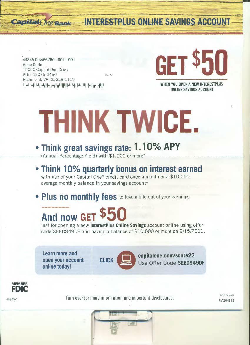
I served as creative director on this project. This product was a key part of the portfolio of accounts that could be considered "branch-less." In this first concept, we took a more straightforward, direct approach with the copy. Also key here were the uses of texture, and images as texture, which were a fundamental expression of the brand.

We experimented with the "non-letter" approach in these concepts after this format achieved lift with other products.

The use of texture and cleverness were a priority in this next concept.

This concept took the idea of the "non-letter" a little further.