Aaltonaut Summer Project 2016
Janne Pärssinen
Joakim Isoaho
Design Factory, Aalto University
BRIEF
The initial brief came from an upcoming company with an unique product idea. The planned product is an smartlight bulb which also at the same time serves as a ”bright light”. The bright light function means the light has enough power to imitate the sun light and can be used to cure Seasonal Affective Disorder. SAD is common in the northern countries where in the winter time sunlight is rare.
Our task in this process was not to develop the product (even though my studies so far have mainly been about product and service design), but rather create a brand for the product. We had to begin the process all the way from the name of the product and company, continuing with the visual identity and packaging for the product.
NAMING
After initial market research we could begin the naming process. We quickly realized how difficult as well as crucial the naming was.
We started with broad and open brainstorming coming up with as many names and themes as possible. Quantity was over quality at this point.
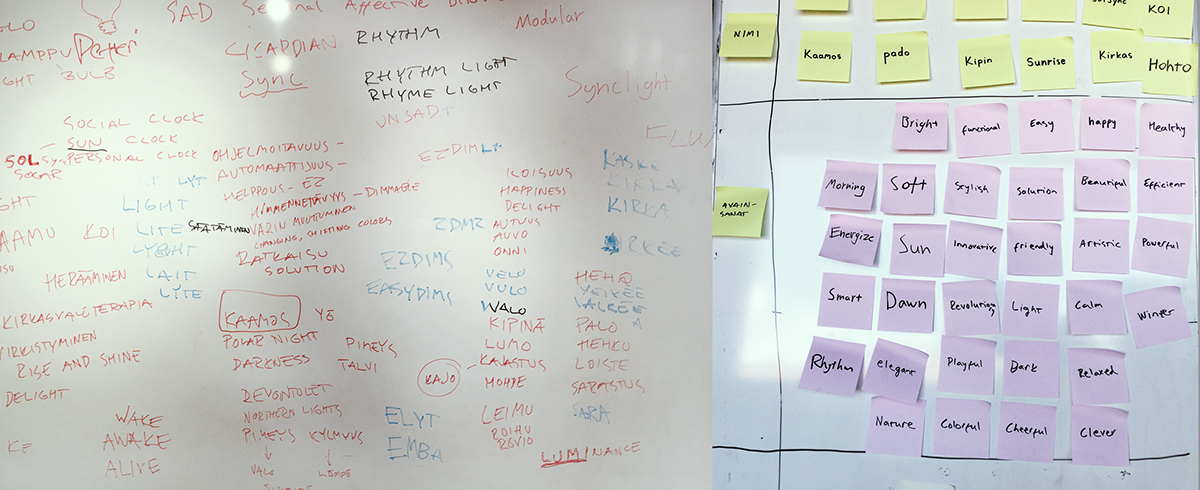
Some of the initial brainstorming of names and company keywords.
We came up with three different approaches to the name; technical, emotional and health based. We also thought that these could be good generalizations of the possible target groups of the product.
The approach that worked the best for us and our clients was the emotional approach which included for example many Finnish words for light and sunrise. These words also evoked positive emotions in our little surveys even with people who don’t speak Finnish.
The final name comes from the rare Finnish word kajo, which means the soft light just before sunrise. Similar word in English is dawn. We decided to twist it into kaio to make the english pronounciation easier and actually sound more like the Finnish word.
kajastus --> kajo --> kaio
LOGO
After we had the name locked the visual identity thinking and logo creation could properly begin.
After some sketching the idea for the kaio-logo was agreed to with the company suprisingly quickly. It was going to be an wordmark with a simplified sunrise as negative space inside the word.

The logo was refined with proportions of the famous fibonacci sequence, which is an approximation of the sizes of the squares in the golden spiral.
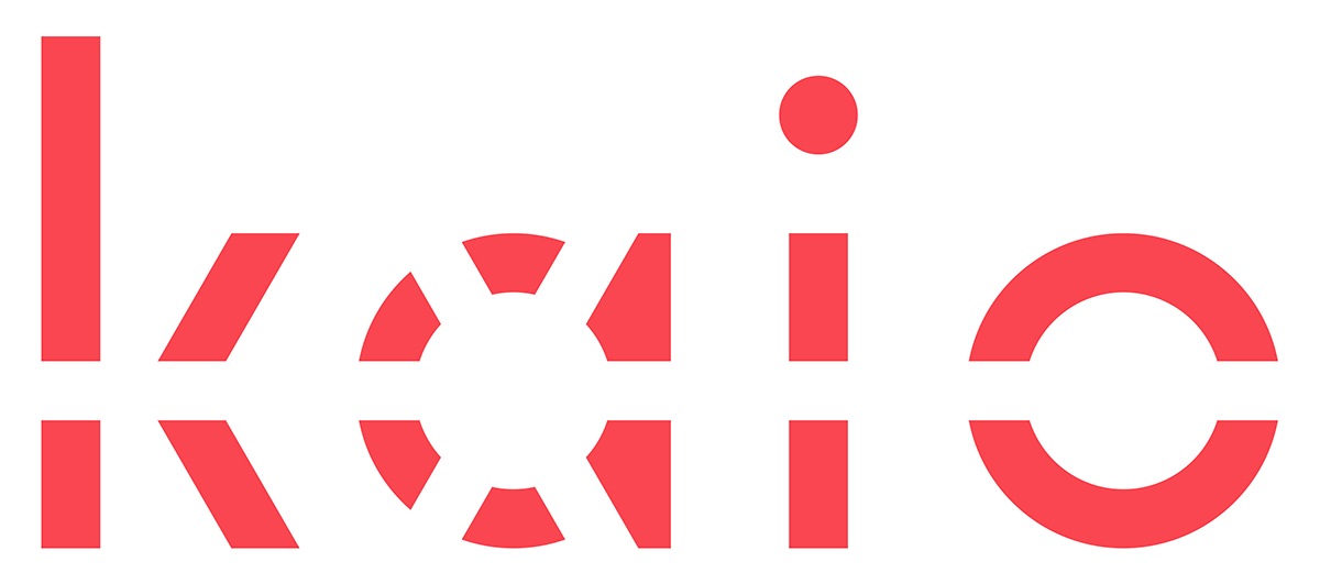
The final logo
VISUAL IDENTITY
The importance of colors for a company is indeniable, but how to pick good colors? And how to know you picked good colors? These are questions that were still left a bit open after we came up with our color scheme.
The method we used derived our colors from a set of keywords that represent the company identity. (for example ”energizing”, ”easy”, ”dawn”, ”happy”) The nature and sunrise theme of the name Kaio can be seen in the colors also, as we used photographs of various sunrises as inspiration.
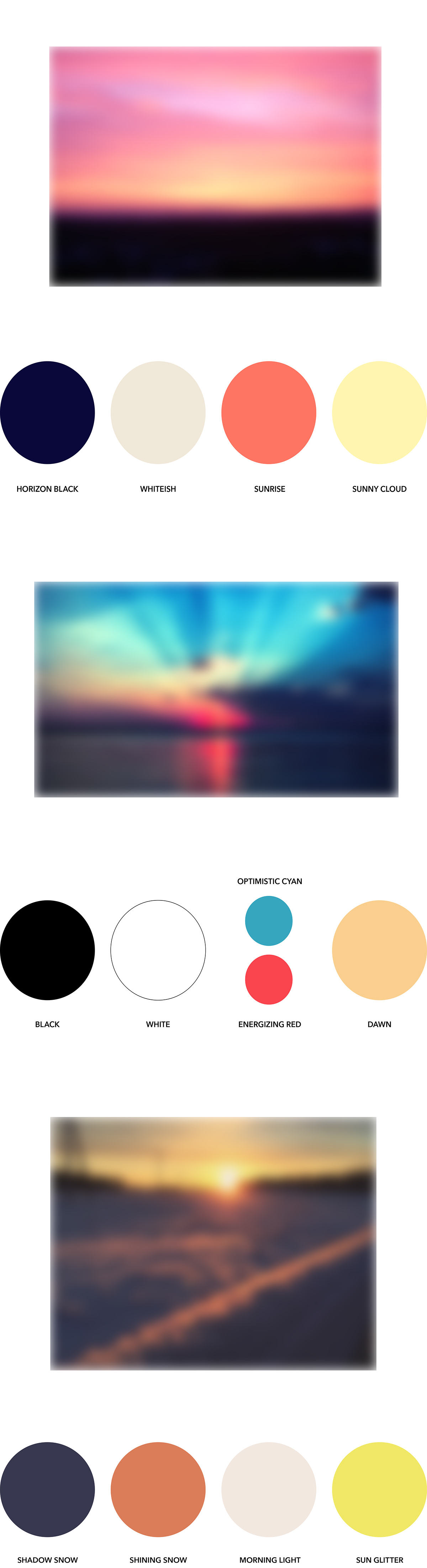
Some of the color suggestions, the middle one was picked because of the energetic colors.
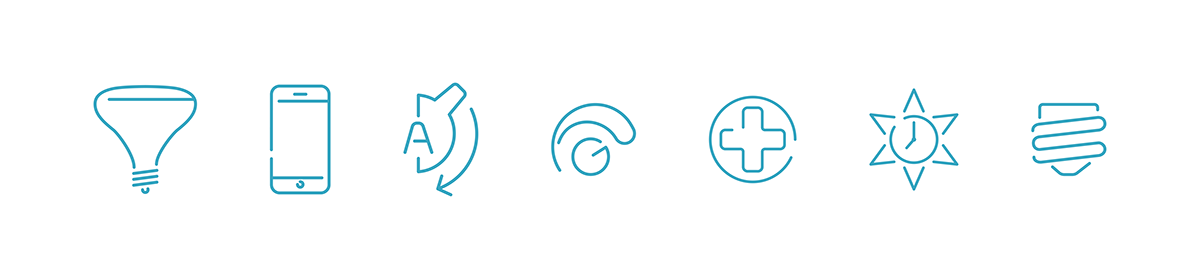
Another part of the Kaio visual identity is the iconset we created. These icons can be used anywhere from website to package to represent different functions of the product.
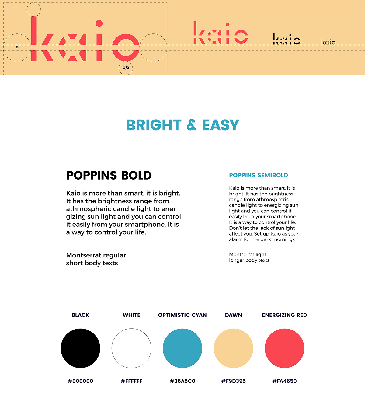
Final brand guidelines
The brand guidelines can be seen in use in the package we designed:

More on the package design coming up in Kaio Branding Part 2


