After over a century of being the heart of the city, Downtown Cairo does not only embody a past history, it also represents a pulsating present, and in its heart, the future of this great city is taking shape ahead of its eventual unfolding. Downtown Cairo has always been the focal point of change in the social, and cultural fabric of the city. Throughout its history, Downtown has always been home to artists, thinkers, intellects, philosophers, and authors: the catalysts of social change.
Fonts, like buildings, and theatre, and songs are a reflection of the social cultures that have created them. Calligraphy is a substantial art that is an essential component of our visual environment and of our public spaces. The fonts of Downtown Cairo are no exception; they tell the story of Cairo through the facades of this great neighborhood. A project to document the fonts of Downtown Cairo and to recreate them is not only needed but also falls at the core of what Al Ismaelia is about; the restoration and preservation of the old neighborhood and its revival in contemporary times.
The project captures fonts from different eras, their various uses and how they integrated into the daily lives of the societies they addressed. As importantly, this initiative recreates these fonts in a contemporary setting and makes them available for use by today’s artists, businesses and retailers. There is not a more honest celebration of our history than by taking it with us into our future.
For more information, visit the project's website:

As a team, we chose to work on two different fonts with different visual appeals and contrasting
sources of inspiration to challenge ourselves further throughout the project.
-
1 // N E F E R T A R I


Nefertari is a geometric typeface inspired by the signage of a tourism company called Nefertari
located in Downtown Cairo; the typeface was derived from Kufic script geometrical letterforms.
Nefertari’s strongest characteristic is a condensed width, which a relatively rare characteristic in Arabic Fonts.
Nefertari’s strongest characteristic is a condensed width, which a relatively rare characteristic in Arabic Fonts.
The width of the font comes as a solid solution for potential small shop signages which are commonly found
in Downtown Cairo; the condensed letterforms would save space and adapt to small shop signages while
maintaining a strong visual presence as a logotypes or storefronts.


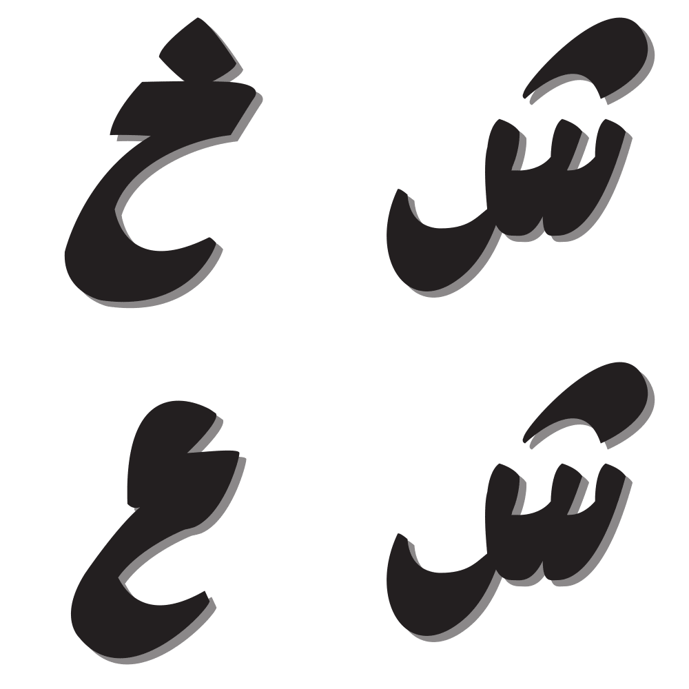
Kabab is a display type family inspired by the fluidity and spontaneity of the signage often used
around the streets of downtown Cairo. Kabab was initially generated from the experimental process
of brush lettering which later on was carefully digitalized into a more consistent set of forms, based on a
hybrid between Riqaa & Naskh. However, still one can easily recognize the dynamics
behind the fonts fluid strokes.
Kabab typeface family comes in a regular style and two decorative styles that
Kabab typeface family comes in a regular style and two decorative styles that
interprets and complements the street influenced nature of the font.


Project's case film, produced by J. Walter Thompson Cairo
-
Awards & Recognition:
Design, Use of Craft: Typography
Nefertari, Crafts for Design, Typefaces
NEW YORK FESTIVALS — FINALIST AWARD
Design: Craft, Typography
Design: Craft, Typography
Creative Interactive Craft

