2016
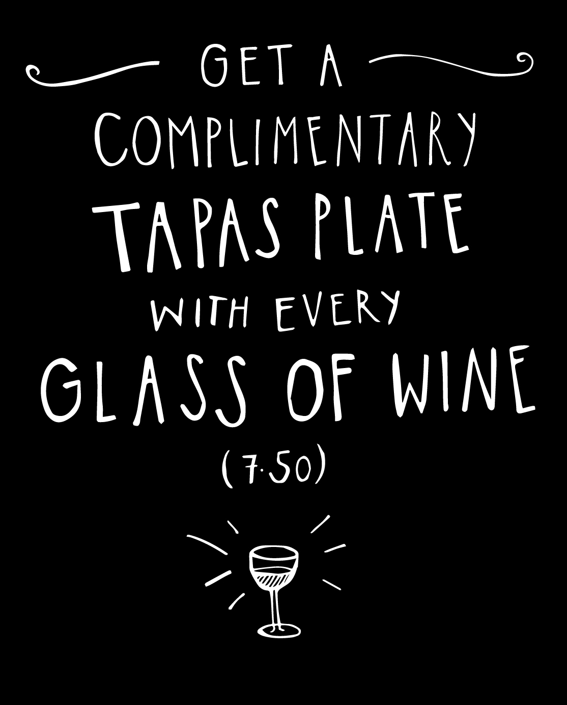
I was commissioned to do some hand painting work at a local café. These font designs and basic blackboard layouts where the start of my inspiration for the final organic-authentic, quirky look and feel. My most important goal was to create text that was readable as well as visually interesting.
My work started with pen and paper and then lead to tracing and adding finishing touches in Illustrator to finalise spacing calculations. The painting itself was simple but I found it challenging to work in a physical space after being used to working digitally.
My work started with pen and paper and then lead to tracing and adding finishing touches in Illustrator to finalise spacing calculations. The painting itself was simple but I found it challenging to work in a physical space after being used to working digitally.