S'Oil
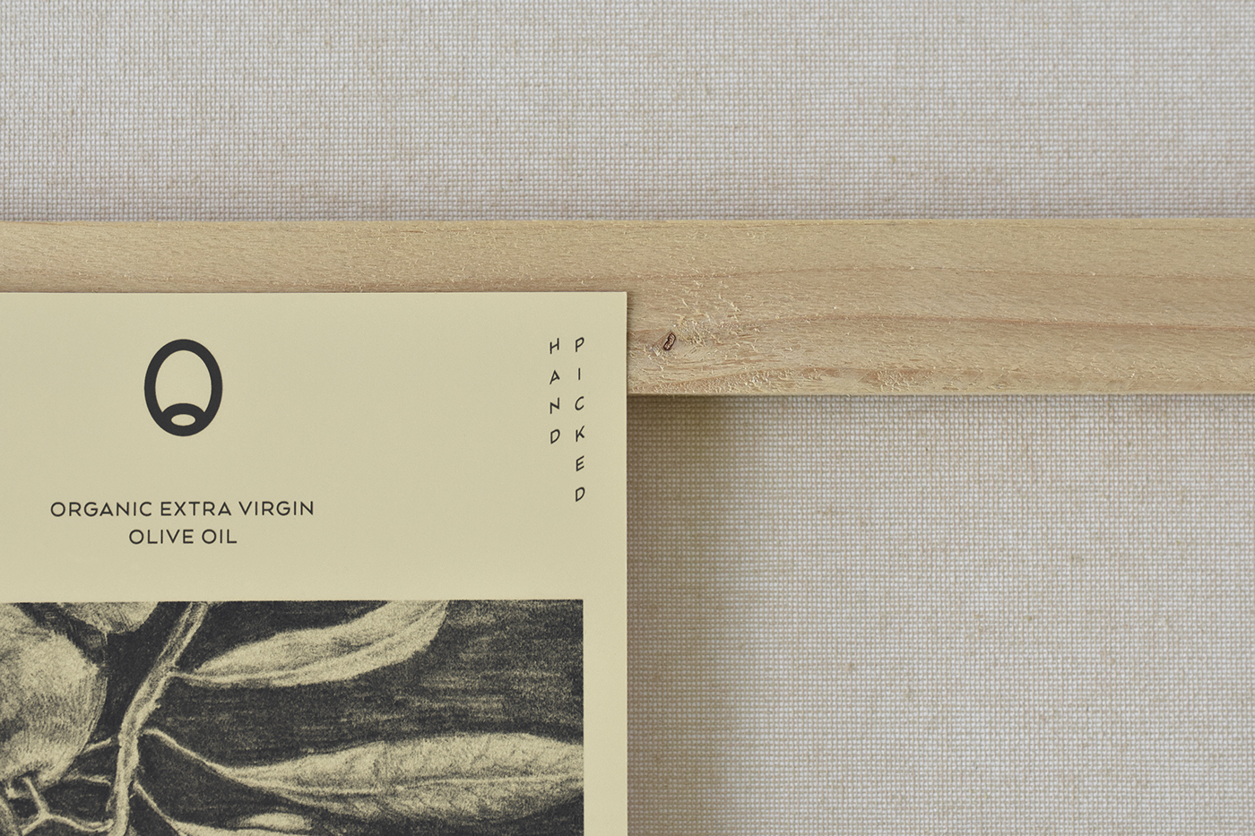
S'Oil is an identity concept for a traditional olive oil producer standing for values of crafted quality and heritage, reproduced with contemporary technology and knowledge. The identity consists of some carefully designed and selected elements – a series of monochrome illustrations, dark grey and pastel colors, a minimalist symbol and a modernized coat of arms tying the brand to its origins.
Photo Credits
The packaging design is centered around the brand name and utilizes a structural layout and dark grey colors. The most dominant visual element is an almost over-sized illustration encompassing the bottle, which gives a crafty, rich and hand-made personality to the product.
Photo Credits
Krisztián Lakosi, Péter Orbán