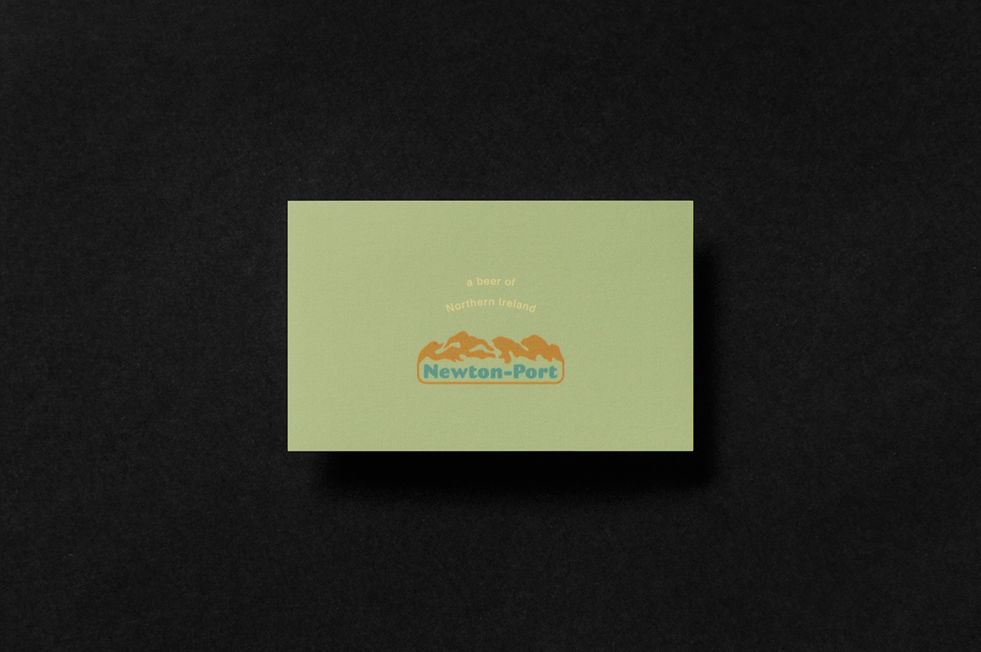
Newton-Port Brewery
Golden age for beer lovers. Nowadays, we witness the well-deserved, continued growth of the craft beer sector, and the rise of local microbreweries. Every beer-fanatic designer must smile big when it comes to work on a new label and identity design for a brewery. Especially, if it shares a quality-focused and environmentally concious philosophy, as the Northern Irish Newton-Port brewery definitely does.
The concept is built around a variety of visual assets based on regional iconography, and strongly rooted in its region's natural beauty, with stormy weather, seashore cliffs, and iconic animals. The labels are intentionally full of details and a couple of neat additions reflecting at natural and industrial qualities.
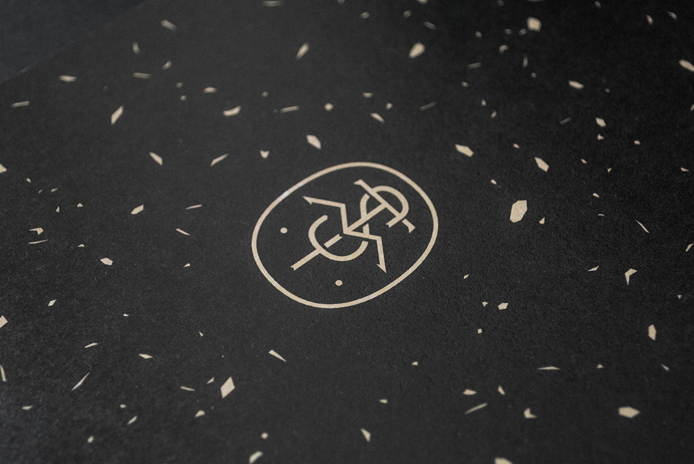
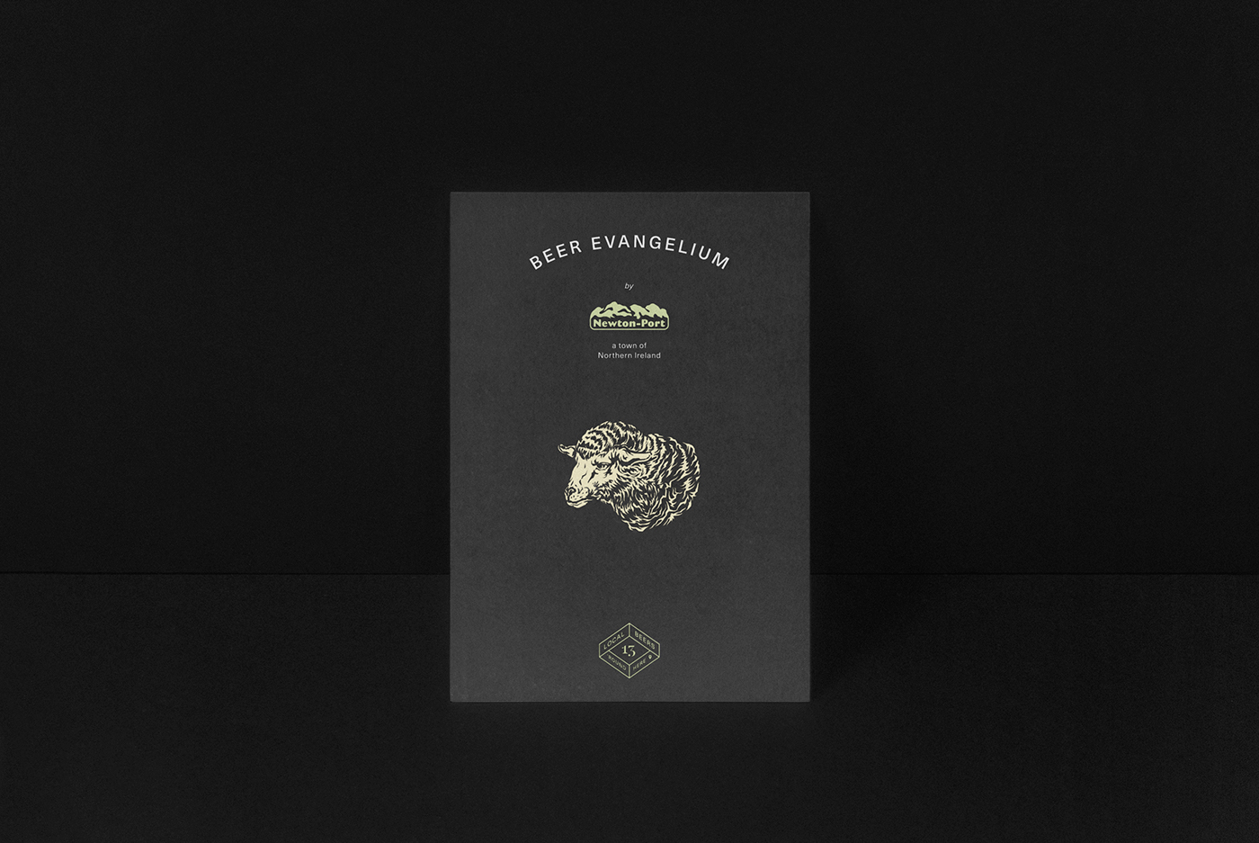
A series of animals — indigenous to the area — was drawn in a bit fierce, but detailed way to give a distinctive personality to the products, but succesfully unite each beer variety under one clearly defined brand. Abstract shapes rendered in a very similar style appearing as broken glass fragments expanded into patterns, coherently set across the labels and other printed materials, giving a bit decadent feeling to the overall look, that can be associated with local pub millieu. Colours were kept to minimum, on the packaging, using only white ink on uncoated black paper to mix well with the very simple dark bottle. An additional earthy colour palette, used on other communication devices, speak of significantly natural and tradititional craft values.
Photography: Krisztián Lakosi, Péter Orbán