


Paw Pals
Branding System | Visual Language | Mechanical | Package Design
Developing a cohesive visual identity system.
When Hosung first approached us, they had a variety of interactive Paw Pals products. The toys were fun and unique, and I could see children everywhere wanting to play with them. But each package looked completely different. Nothing communicated that they belonged together. As a result, Hosung was unable to convince any US toy stores to carry the product line. Unable to bring them to market, the toys literally sat on warehouse shelves.
Unified Branding System
I then crafted a unified branding system with a distinct visual language, including typographic treatments, color palette, and background artwork that was half common-area and half product-specific patterns. This transformed the seemingly separate toys into a cohesive product line.
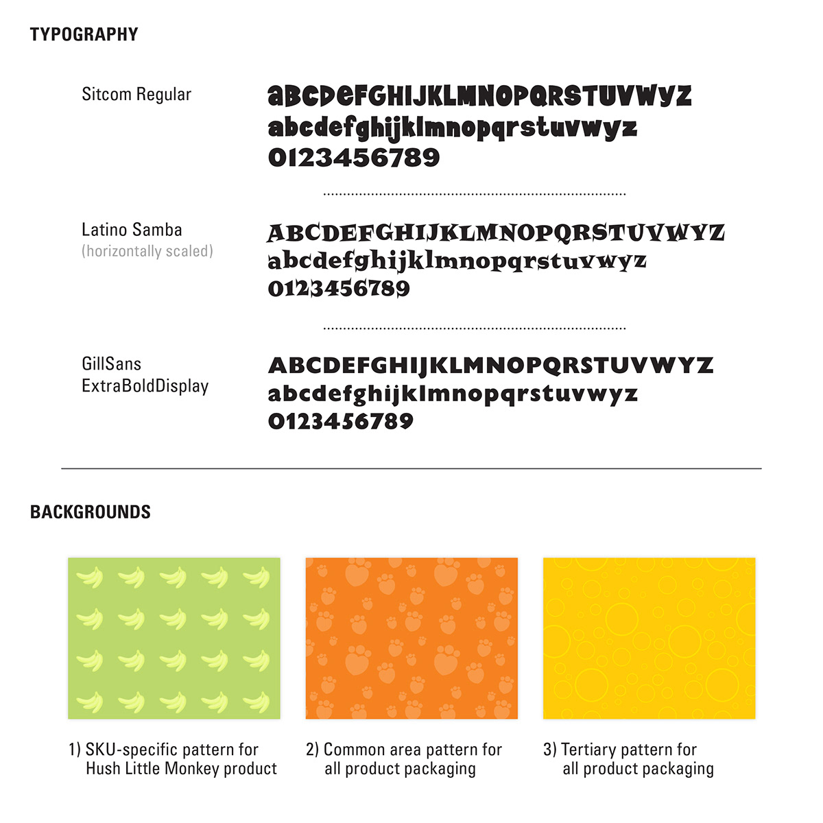

Brand style sheet.
Beginning with Hush Little Monkey
The project began with Hush Little Monkey, which then became the template for the other products. I selected the typefaces and created ownable type treatments.
Next, I built unique product-specific backgrounds (such as the banana pattern for Hush Little Monkey and the dog bone pattern for My Curious Puppy), plus common-area backgrounds (such as the orange paw print pattern), which would be used on all packages to help bring them together visually.
I also designed treatments for the holding devices that would house product photos, as well as other graphic elements, such as the front swoosh that separates the different background patterns.
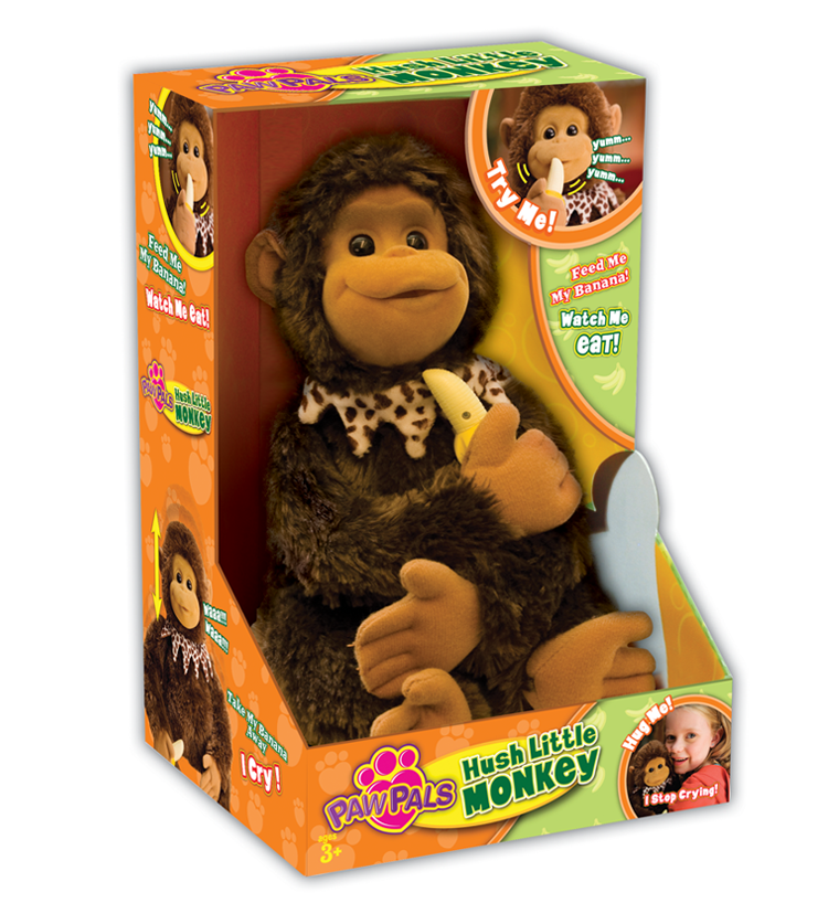
Hush Little Monkey product packaging.
Branding System Visual Plan
The final step was to adapt the design system to the individual product packages, by carrying over the common treatments, but using unique color palettes and graphics for each. Combined with the common-area backgrounds and colors, the goal was for each product to stand out visually as its own complete package, but also clearly belong to the full family of Paw Pals products.
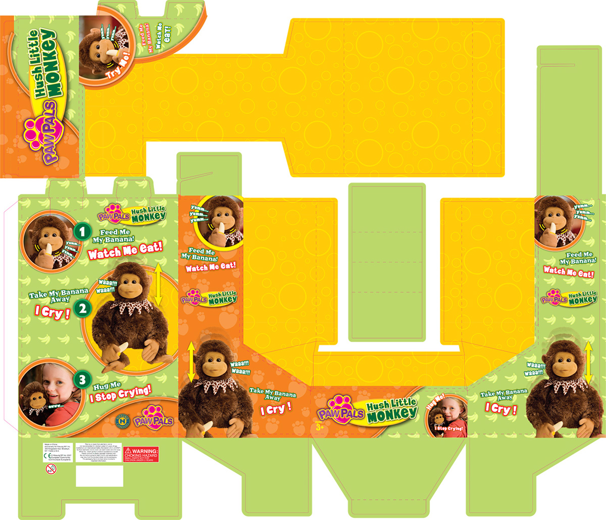
Hush Little Monkey flat packaging mechanical.

In-store end-cap display at Toys"R"Us.
Product Line Expansion and Sales Increase
On Display in Toy Stores
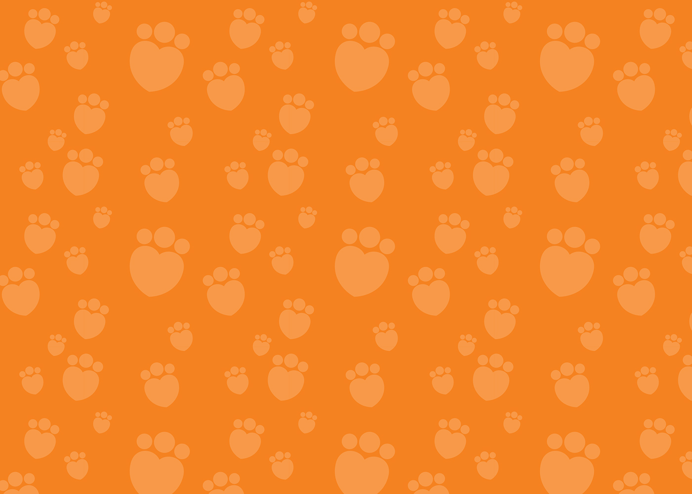
Brand pattern for common area background on all Paw Pals product packaging.

My Curious Puppy product packaging.
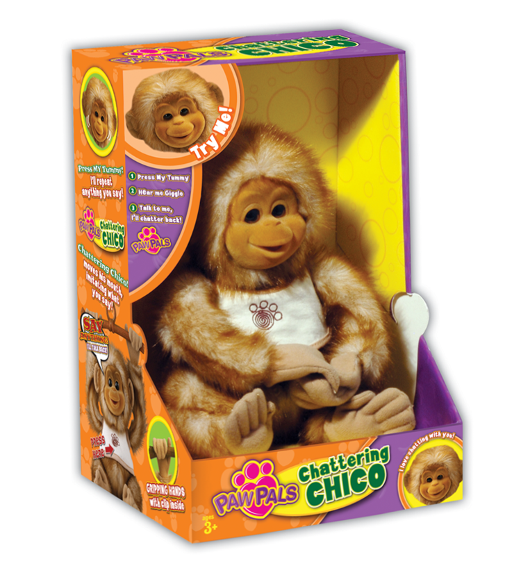
Chattering Chico product packaging.

Tertiary brand pattern for common area background on all Paw Pals product packaging.
. . .


