Visual identity | Branding | Environmental | Website | Creative Direction
The Venice Biennale has for over a century been one of the most prestigious cultural institutions in the world. Ever since its foundation in 1895, it has been in the avant-garde, promoting new artistic trends and organising international events in the contemporary arts in accordance with a multi-disciplinary model, which characterises its unique nature. Every two years, dozens of countries display the work of one artist at each permanent national pavilions in the Giardini and at temporary exhibition spaces.
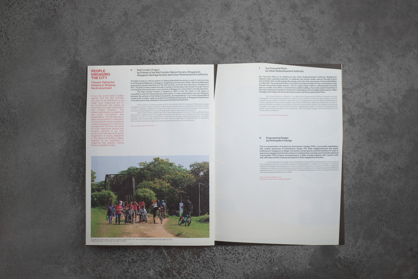
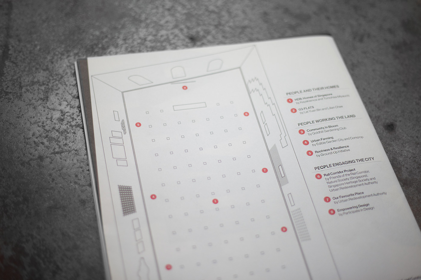
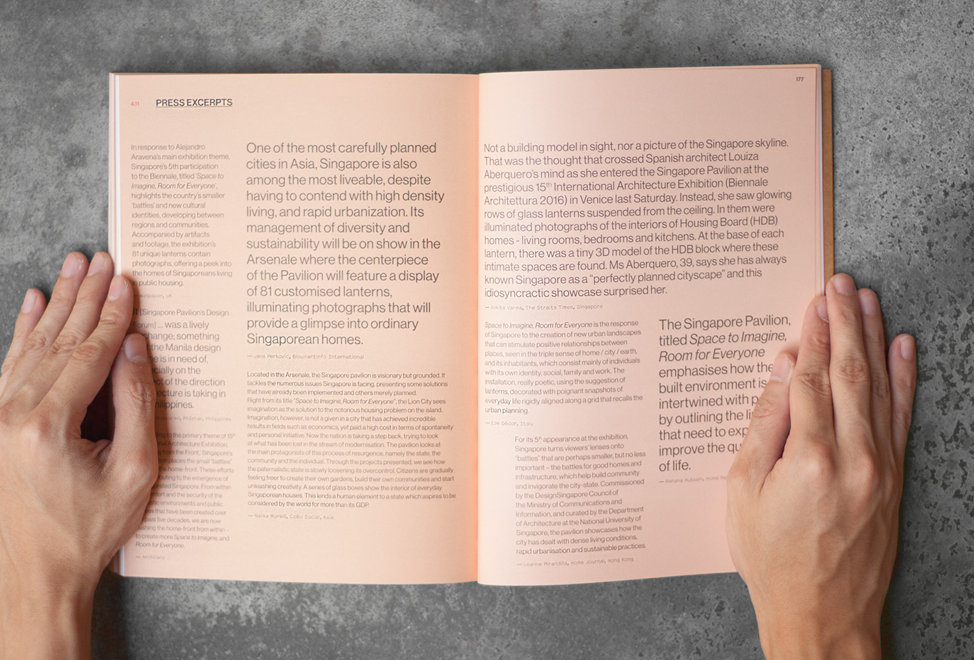
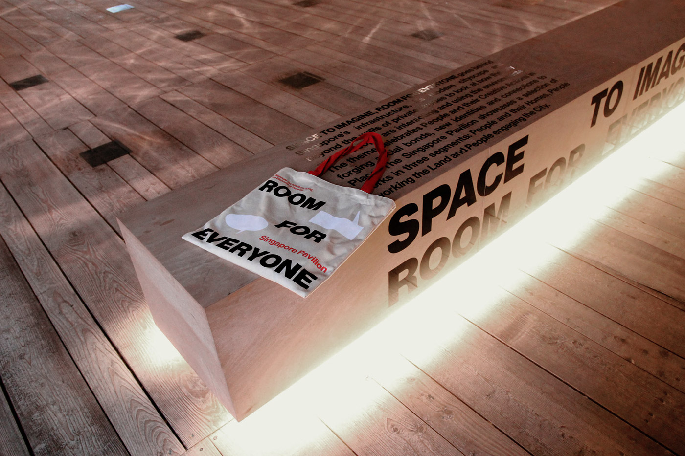
The Biennale’s 15th International Architecture Exhibition puts forth the theme Reporting from the Front. The Singapore Pavilion provokes thinking, questioning, and communicating with Space to Imagine, Room for Everyone; the various segments explore three archetypal spatial domains: people’s homes (Their Homes), the land (Working the Land), and the city (Engaging the City). The exhibition explores the connections between people and Place by underlining how the people and the built environment are irrevocably enmeshed, and noting that improving quality of life requires going beyond infrastructure.
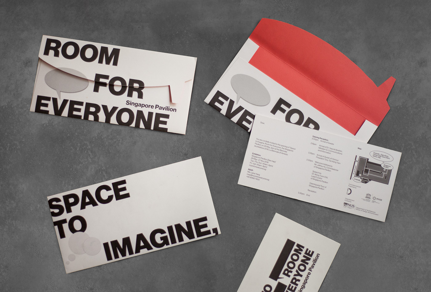
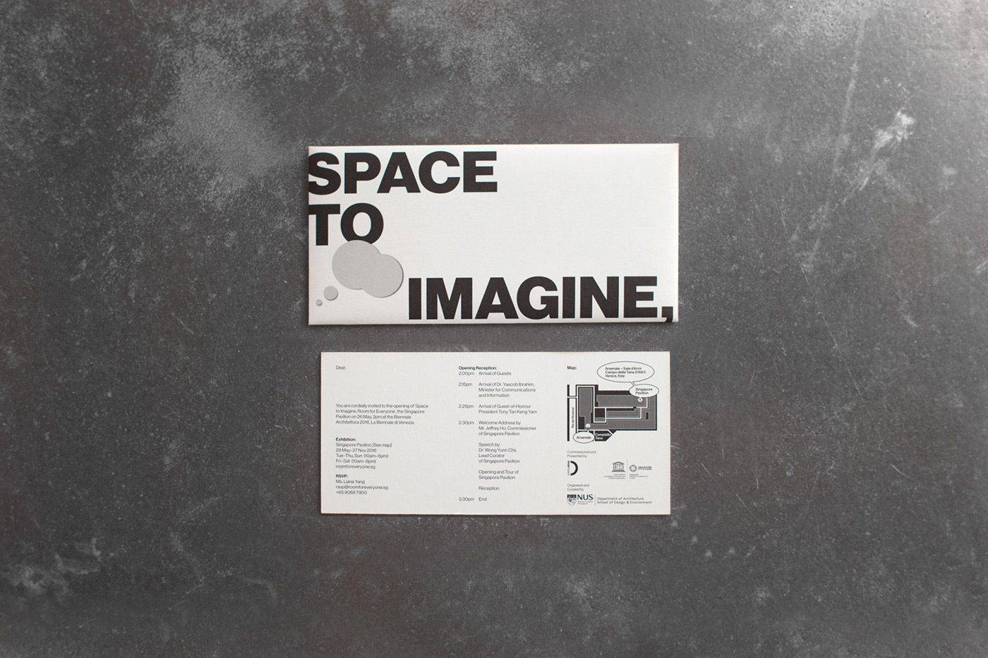
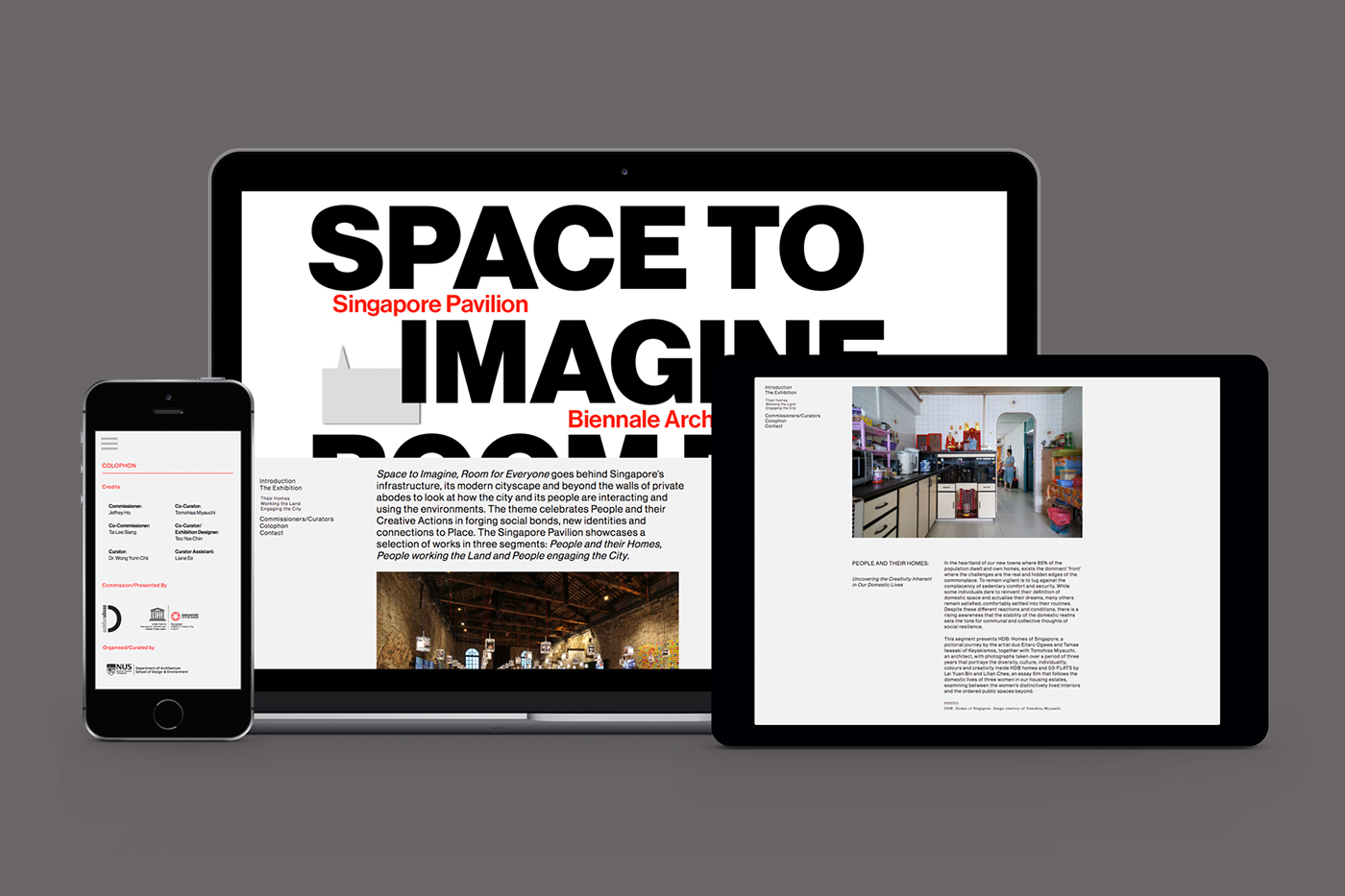
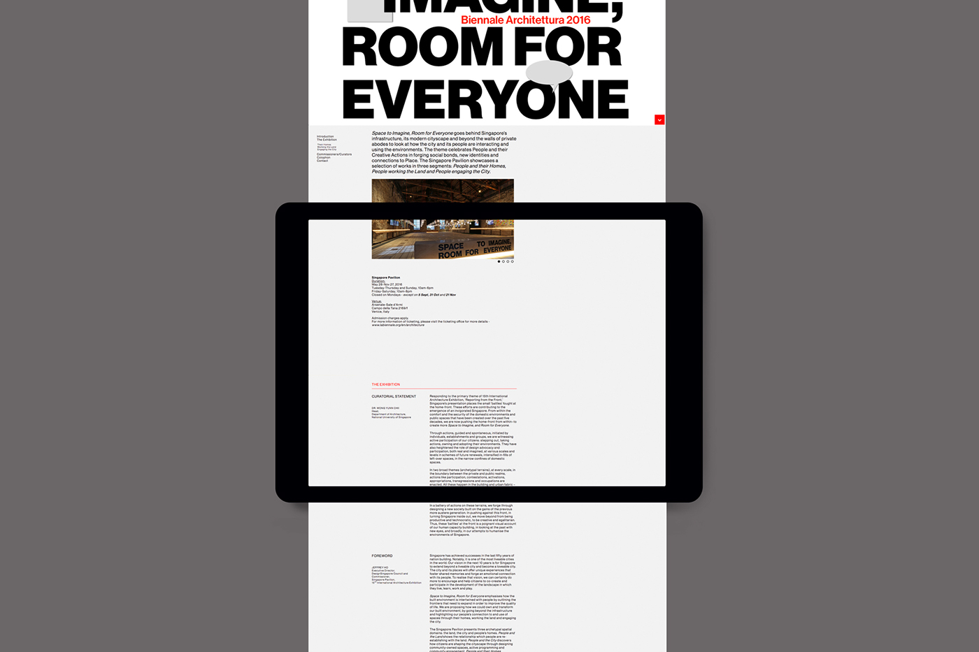
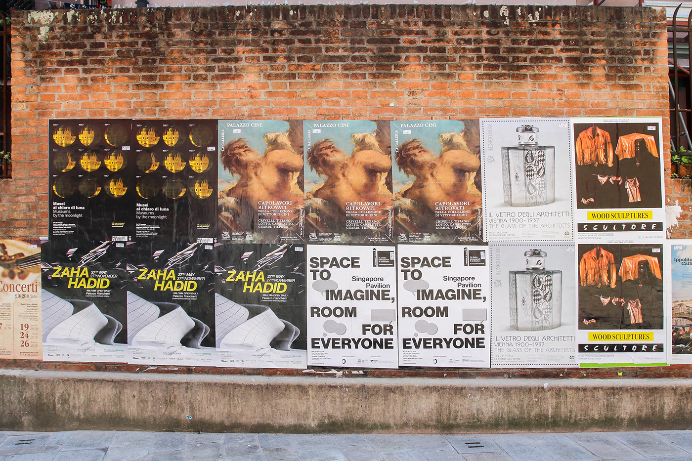
Commissioned by DesignSingapore Council, curated by the NUS Department of Architecture, and designed by Teo Yee Chin of Red Bean Architects, the design philosophy of the Singapore Pavilion is to present the inspiring stories in an honest and transparent manner. Do Not Design took on the branding and visual communications of the Pavilion, which ranged from print—exhibition poster and catalogue, marketing collaterals, opening reception invitation—to online, with a website and electronic mailer.


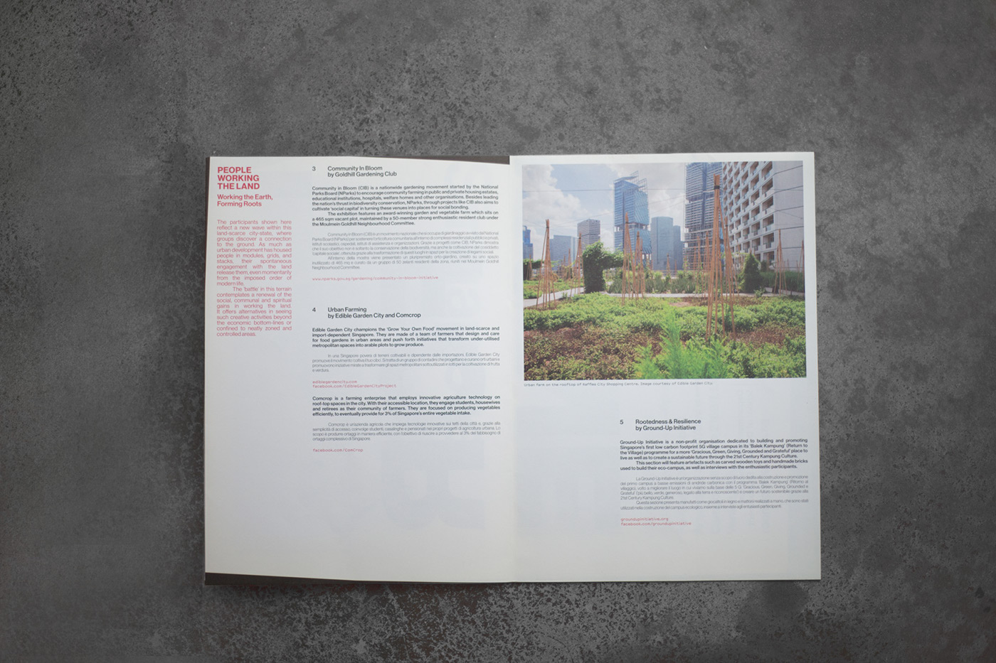
That Venice is often bustling with travellers and positively bursting with architectural history was taken into consideration. Furthermore, the Singapore Pavilion is located not at the delicate French garden Giardini, but at the Arsenale, the complex of shipyards and armouries that propelled Venice to become the naval power it was. We asked ourselves if we could created something that did not look overly designed and was also able to meld into a place of such history and culture. Taking cues from the Biennale’s theme and the exhibition’s approach of undesigning, we took the opportunity to reflect the spirit of the exhibition: raw materials, minimal form, and direct communications.
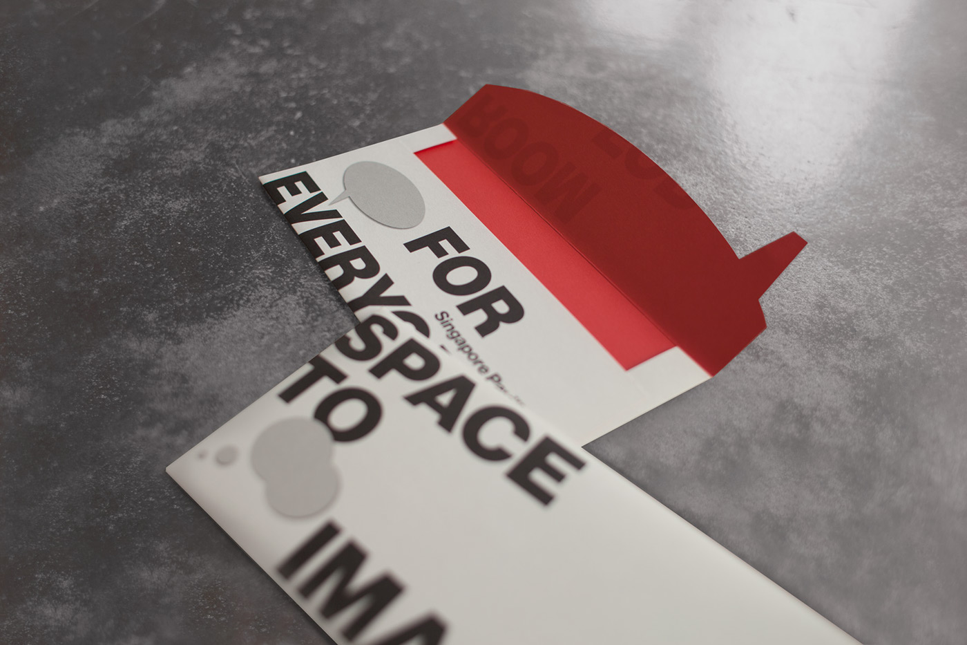
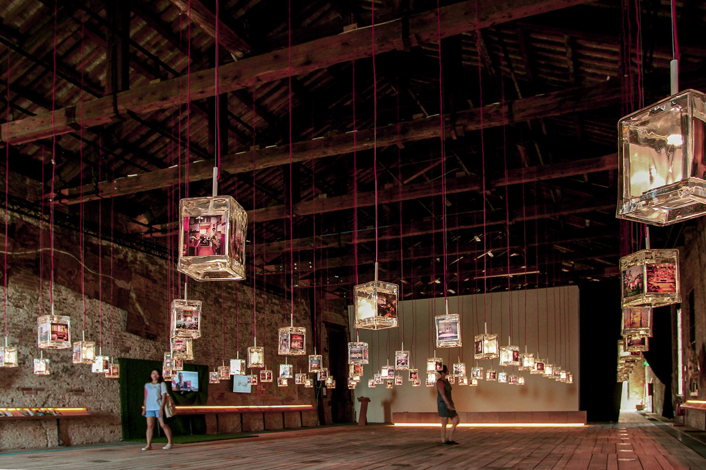
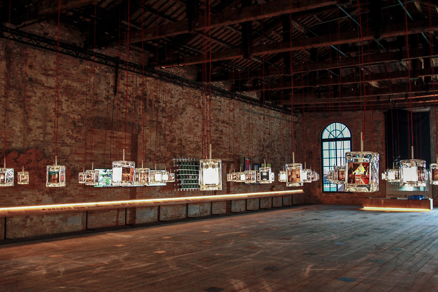
The key identity explores speech bubbles as a touchpoint to contemplations on the purpose of architecture and people’s connections to places. The speech bubbles are adapted through various collaterals to invite spontaneous responses from the visitors. The exhibition catalogue is designed such that it unfolds to become the publicity poster. As such the overall identity echoes the theme of Space to Imagine, Room for Everyone: remaining honest and transparent while also being people-centric, reusable, and functional.
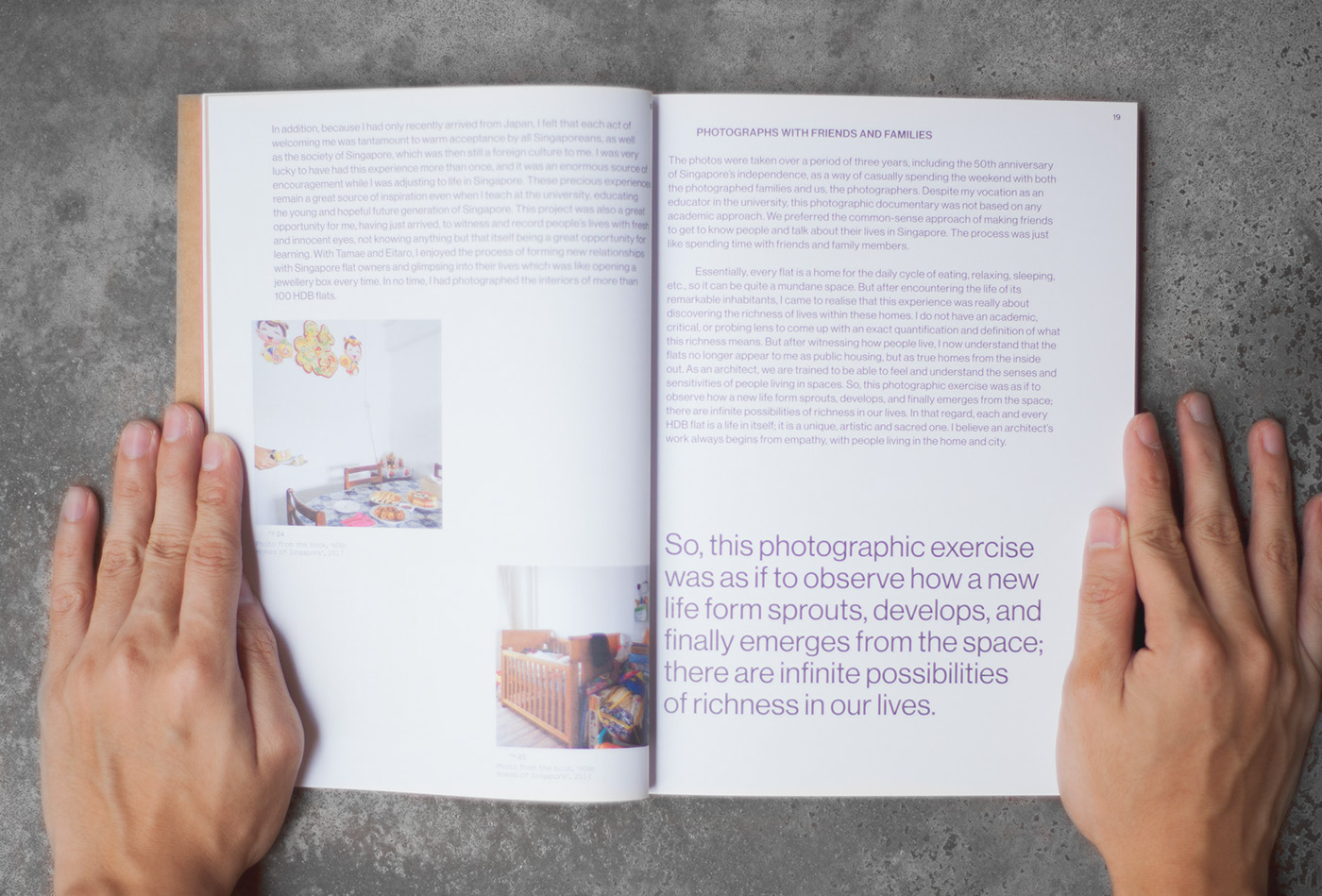
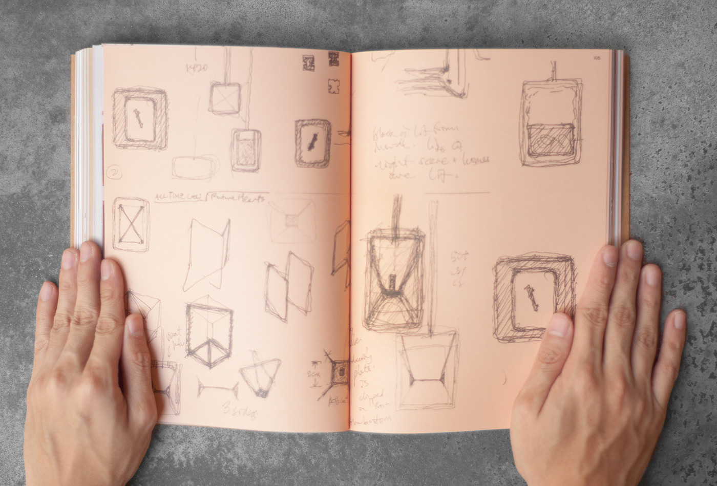
This book traces the development of the exhibition, from detailing the various projects to cataloguing sketches and the making of the hand-blown glass image lanterns. It also includes essays on the theme, with discussions on the connections between people and Place.