Samovar
Premium Russian tea. Conсept.
Step by step workflow visualization.
The project started in December 2014 at WTP
The project started in December 2014 at WTP
http://wtpack.ru/special-projects/love-me-tender/packaging-for-free/
Самовар
Премиальный русский чай. Концепт.
Пошаговая визуализация работы над упаковкой.
Проект стартовал в декабре 2014 на WTP
http://wtpack.ru/special-projects/love-me-tender/packaging-for-free/

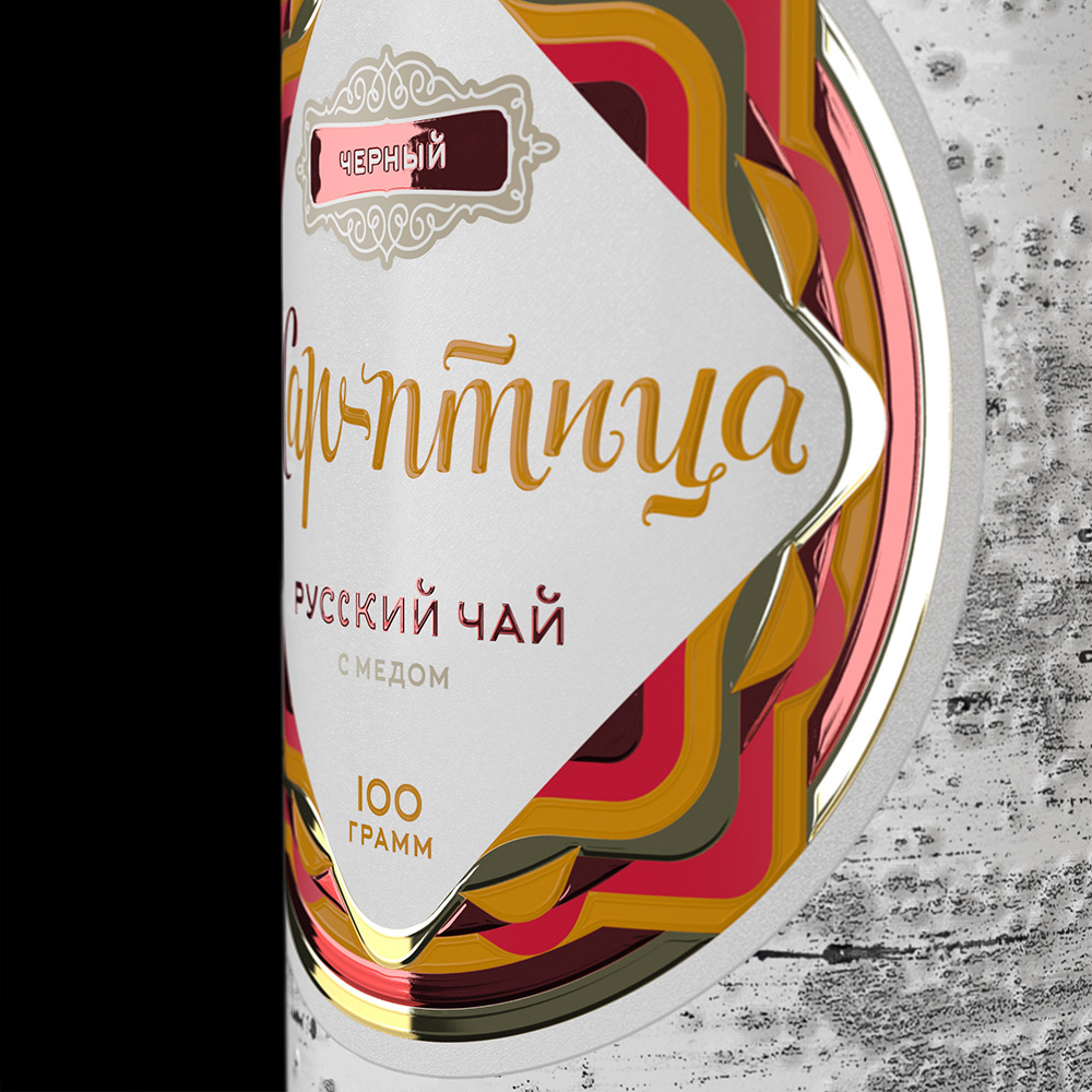
Packaging is a tube, a stylized birch log, at the upper face of which the circular bar code that simulates the annual rings on the end of the barrel is located. While creating the package a vectorized copy of a calligrapher sketch of the logo (the customer bought it while planning business) must be made. Specification for the design includes 3 SKU of black teas: Chernomor, Krasno Solnyshko (with herbs) and Zhar Ptitsa (with honey).
Упаковка представляет собой тубус, стилизованный под березовое полено, на верхнем торце которого нанесен круговой штрих-код, имитирующий годовые кольца на спиле ствола. В процессе создания упаковки необходимо отрисовать созданный каллиграфом эскиз логотипа компании (заказчик приобрел его, когда планировал бизнес). Техзадание на разработку включает 3 SKU черных чаев: Черномор, Красно Солнышко (с травами) и Жар-птица (с медом).

Day 1.
Armed with the camera I headed to the small birch grove in the suburbs to gather the facts (texture). Slavic myths narrate birch branches are known to be the sanctuary of mermaids at the borderline between spring and summer. Therefore any man (especially with the camera) they encounter has nothing good to rely on.
День 1.
Рядом с городом есть небольшая березовая роща. Я взял камеру и поехал собирать фактуру. В славянской мифологии в ветвях березы на рубеже весны и лета прячутся русалки. И встретившегося на их пути мужчину (особенно с камерой) ничего хорошего не ждет.


Day 2
Having made several attempts to convey the diversity of birch bark pattern, with its various inclusions, cracks and roughs, I came up with the following method: an application of horizontal stripes simulating so called lenticels (through which, by the way, birch takes its "breathe"); simulation of bumps, knots, and other elements as well; And a final merging of the results of the first two stages in single file, color processing, etc.
To complete the first stage I applied a calligraphy pen, high density paper for watercolor painting and a plastic ruler. It all resulted in randomly scattered strokes of different thickness and length. Secondly, I sprinkled a pinch of sugar under the white drawing paper and scattered the dry leaves, which after pressing on the sheet with a blunt pencil left a pattern similar to the textured "defects" and swirls in the bark of the tree. It only remained to bring the results together in Photoshop and process.
День 2
Березовая кора неоднородна, имеет различные вкрапления, трещины и неровности, в попытках передать которые я остановился на такой методике: создание имитации горизонтальных полосок, так называемых чечевичек (через которые, кстати, береза «дышит»); создание имитации неровностей, сучков и прочих элементов; соединение результатов первых двух этапов в одном файле, цветовая обработка и тому подобное. Для первого этапа мне понадобились ручка для каллиграфии, плотная бумага для рисования акварелью и линейка. Штрихи получились хаотично разбросанными, различной толщины и длины. На втором этапе под белую бумагу для рисования я насыпал сахар, подбрасывал сухие чайные листы, которые после продавливания затупленным карандашом оставляли на бумаге следы, похожие на фактурные «браки» и сучки на коре дерева. Оставалось только свести результаты в Photoshop и обработать.


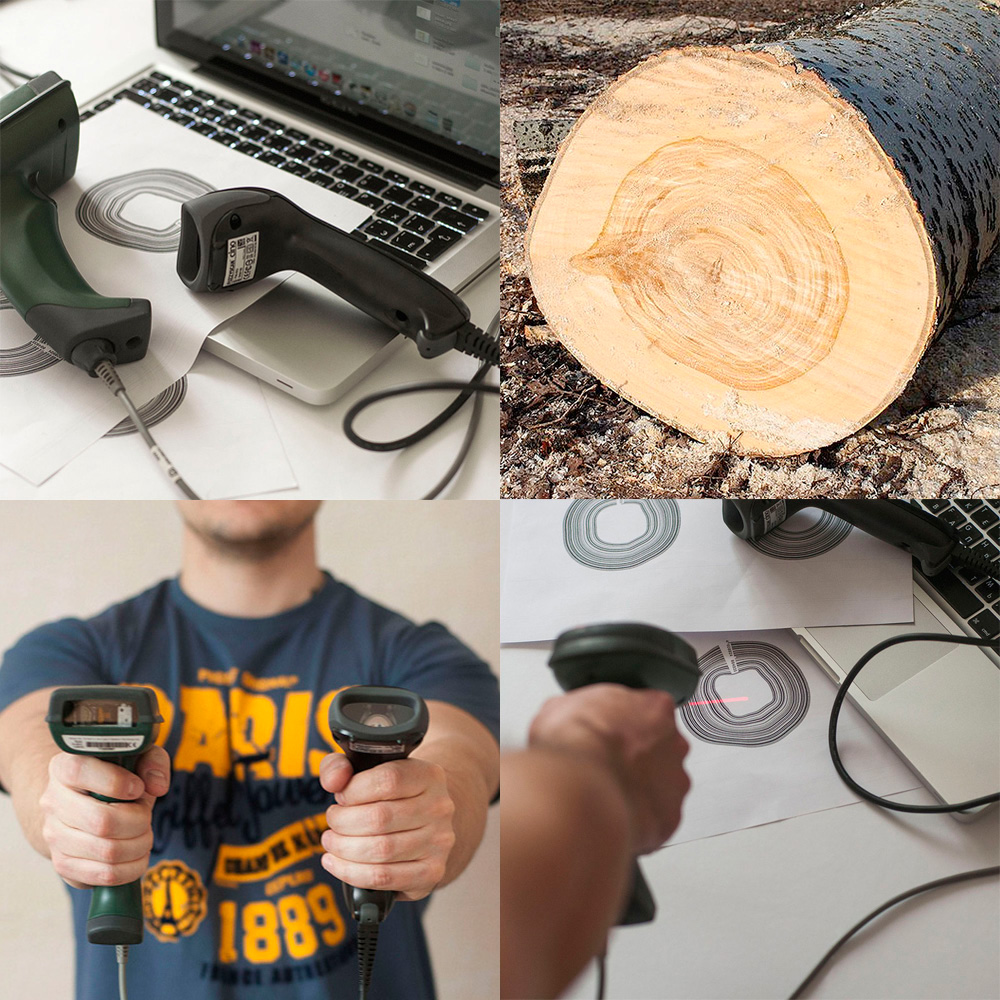
Day 3
At this stage the ability of a bar-code scanner to recognize the circular bar-codes (simulating annual rings on the end of the barrel) was to be checked.
I took several different bar-code scanners (did not dare to use mobile apps for the same purpose because of possible unreliability of results) and conducted an experience. The result was positive. As a matter of fact, in its first versions barcode, invented in 1948 by Woodland and Silver was exactly circular. And has not been modified up till 1972 when attempts of introduction were first made.
День 3
На этом этапе необходимо было проверить, как круговой штрих-код (он будет имитировать годовые кольца на спиле ствола) с изменяющейся шириной будет считываться устройством. Я взял несколько различных сканеров штрих-кодов (не рискнул пользоваться мобильными приложениями для тех же целей ввиду возможной недостоверности результатов) и провел эксперимент. Результат положительный. Кстати, в первых версиях в 1948 году изобретатели Вудленд и Сильвер делали штрих-код именно круговым. Он оставался таким и в 72-м — во время первой попытки внедрения.
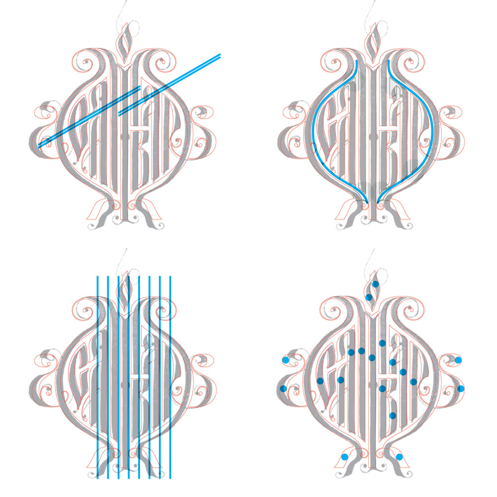
Day 4
A version of calligraphic spelling of the company name is of a pretty good quality. Besides, it's very handy taking into account a stylized Russian lettering, having been maintaining a semantic and aesthetic value since the 15th century. But the source-file regardless of being sent in good quality, abounds with inaccuracies. One should correct them while creating a logo.
Keeping an original in mind I'd drawned my own version. I've depicted both sides of the «Samovar» symmetrically, tailored the edges of the letters to fit the contour, made strokes of the letters the same width, after which I standardized the distance between them, shortened "legs of the samovar" and so on.
День 4
Каллиграфический вариант написания названия компании хорош, стилизация под русскую вязь, носившую с 15-го века как смысловую, так и эстетическую ценность, здесь как нельзя кстати. Но исходник прислан в недостаточно хорошем качестве, изобилует «рукотворными неточностями», от которых необходимо избавиться при создании логотипа.
Отрисовывал, поглядывая на оригинал, не копируя рукотворный вариант. Сделал «бока» самовара симметричными относительно центра, подогнал края букв под получившийся абрис, сделал штрихи букв одинаковой ширины, стандартизировал расстояния между ними, укоротил «ножки самовара» и так далее.


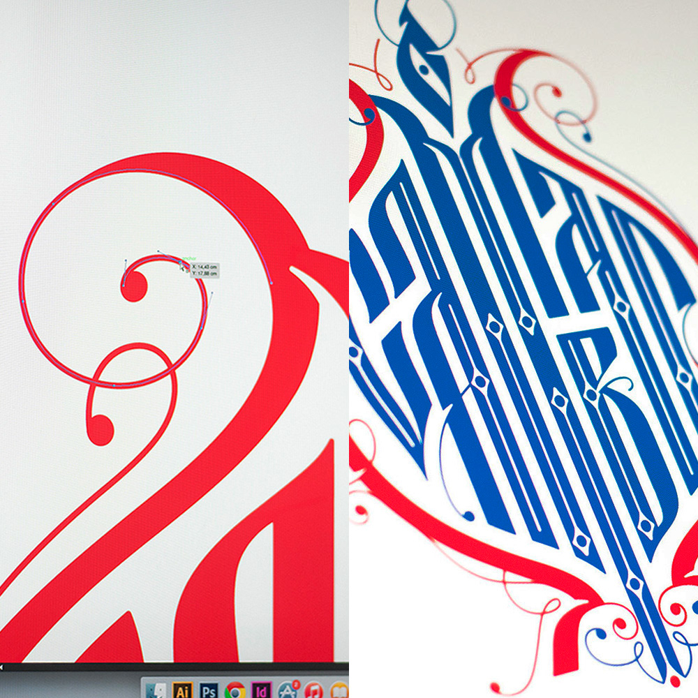
Day 5
I also added more details and colour to the logo, made it more compact, and smoothened its shape. The logo is to be positioned at the top of the label, which at the same time was the end part of the "birch log." Furthermore, I decided to make a SKU differentiation not only by colour, but also to play with the form of the die cut stamp. That's how I explored the diamond-shaped label in order to find a spot to place a logo on it. For other SKUs the form will be different.
День 5
Дополнил лого деталями и цветом, пригладил форму, сделал более компактным. На этикетке логотип будет располагаться на верхней, торцовой части «березового полена». Решил сделать дифференциацию по SKU не только по цвету, но еще и поиграть формой вырубного штампа. Таким образом, поискал место логотипа на ромбовидной этикетке. Для других SKU форма будет другой.


Day 6
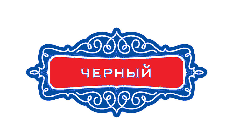
Поглядывая на гжель, «расписал» готовый лого градиентами, используя Mesh tool в Illustrator. Между прочим выяснил, что гжель рисуют черным, а сине-голубые оттенки рисунок принимает после обжига.
День 6
Slightly imitating the Gzhel manner, I painted the logo with gradient colours using the Mesh tool in Adobe Illustrator. By the way, I discovered that Gzhel originally is painted in black, whereas the bluish shades and gradients occur only after the crafts are being fired in a kiln.


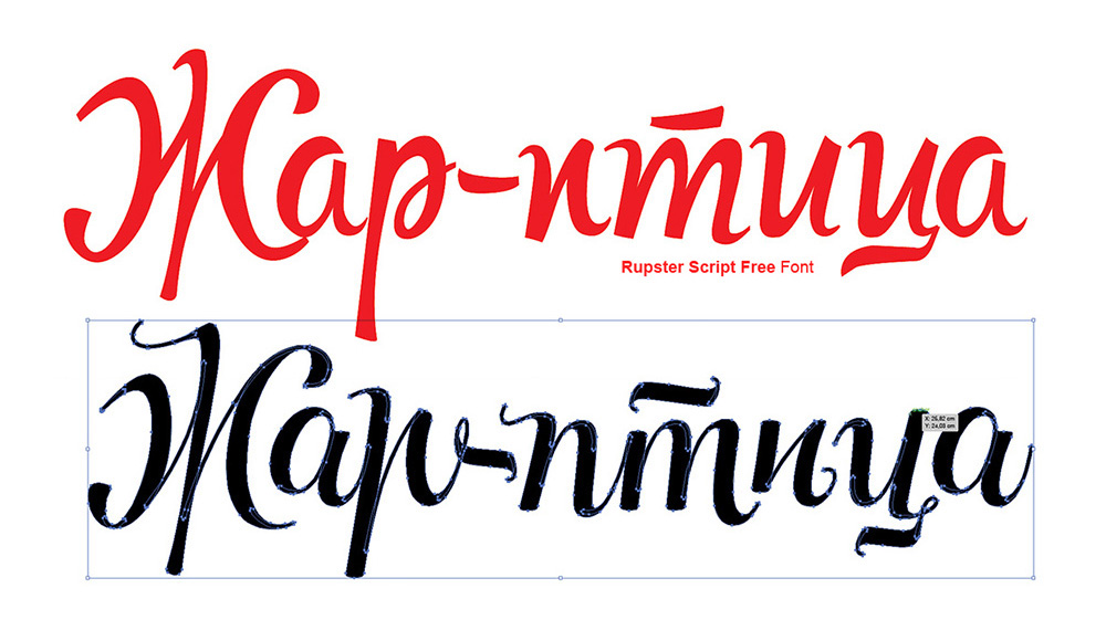
Day 7
To fulfill the SKU names I applied a Rupster font Script Free Font. Despite its outstanding particularity, obviously, it was created pretty sloppy. Taking as a basis individual elements of the font while alternating thin strokes with thick ones, I redesigned the name. The result was quite far from the original, but I managed to keep the main essence of the font.
День 7
Для написания названий SKU взял шрифт Rupster Script Free Font. Однако, несмотря на понравившуюся мне харàктерность, сделан он весьма небрежно. Беря за основу отдельные элементы шрифта, чередуя тонкие штрихи с толстыми, заново переписал название. Получилось достаточно далеко от оригинала, но характер сохранился.


Day 8
Another Gzhel simulation, but with the name of the SKU at this time. I made an attempt to give it more depth and volume.
День 8
Снова стилизация под гжель, но уже с названием SKU. Попытка придать глубину и объем.


Day 9
The same work on the font, as in the case with the "Zhar Ptitsa" project. The point was to make similar characters within the same SKU name, slightly differing from each other in shape.
День 9
Работа со шрифтом, как и в случае с «Жар-птицей». Старался, чтоб одинаковые буквы в названии SKU немного отличались друг от друга по начертанию.


Day 10
After that I again applied «Gzhel», Mesh tool and Adobe Illustrator effects.
In fact, Gzhel peasants were never serfs, since a charter of a Tsar, acknowledged their craft as the matter of national importance.
День 10
Снова гжель, Mesh tool и Illustrator.
Кстати, гжельские крестьяне никогда не были крепостными, царская грамота признавала их ремесло делом государственной важности


Day 11
Working with the font of the third SKU name again.
День 11
Ставшие уже привычными манипуляции со шрифтом названия третьего SKU.


Day 12
It turned out that the traditional Gzhel combination of blue and white is not our Russian invention, and borrowed from the Dutch.
День 12
Выяснил, что традиционное для гжели сочетание голубого и белого вовсе не наша русская находка, а заимствование у голландцев.


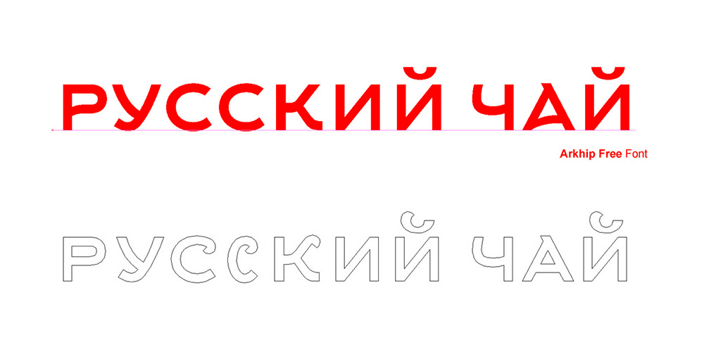
Day 13
I chose Arkhip Free font for texts. Nevertheless some modification must be made, a little type correction made it better.
День 13
Для набора сопроводительных текстов выбрал Arkhip Free font. Хотя и тут без внесения изменений не обошлось — немного подправил рисунок.

Day 14
The final touches wil be choosing the labels form and making a single layout assembled from parts. "Birch log" of package is almost monochrome and handmade, so to make a contrast the label must be extremely bright and geometric. Labels of various SKU will differ from each other not only by
the color but also by the geometry and the shape.
the color but also by the geometry and the shape.
День 14
Финальные штрихи — продумывание формы этикетки и сбор всех частей единый в макет. «Березовое полено» упаковки почти монохромно и художественно, потому для контраста этикетку можно сделать нарочито яркой и геометричной. SKU будут отличаться друг от друга не только цветом, но и геометрией, формой вырубного ножа.


Day 15
Some part of work with logo and SKU is not handy - no gzhel, no bright colors of logo (it was planned at the beginning) will be used in package.
День 15
Часть работы с логотипом и названиями SKU не пригодилась — ни гжель, ни яркие цвета лого (планированные мной вначале) в упаковке использованы не будут.


Day 16
All the work is done.
День 16
Все эскизы готовы.


