It is widely acknowledged that the beauty industry has been known to
stereotype gender on packaging. The research identified a gap within the
cosmetics market for a naturally medicinal product range, targeted at
everyone that participates in a sport or exercise.
stereotype gender on packaging. The research identified a gap within the
cosmetics market for a naturally medicinal product range, targeted at
everyone that participates in a sport or exercise.


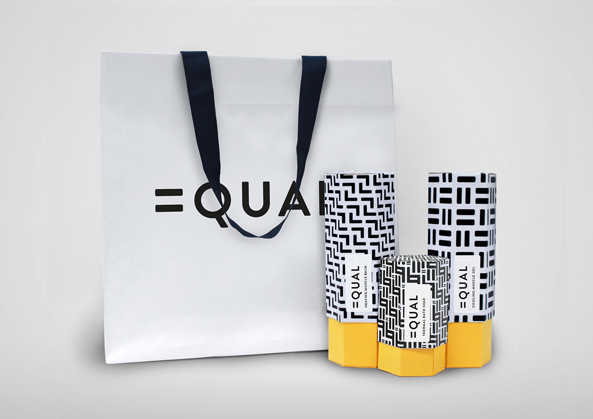
The brand ethos is to promote gender equality in the beauty industry
and within the sports industry. The name Equal establishes that the
product is for everyone and we are all the same. The contemporary
simple logo encompasses everything it is as a brand.
and within the sports industry. The name Equal establishes that the
product is for everyone and we are all the same. The contemporary
simple logo encompasses everything it is as a brand.
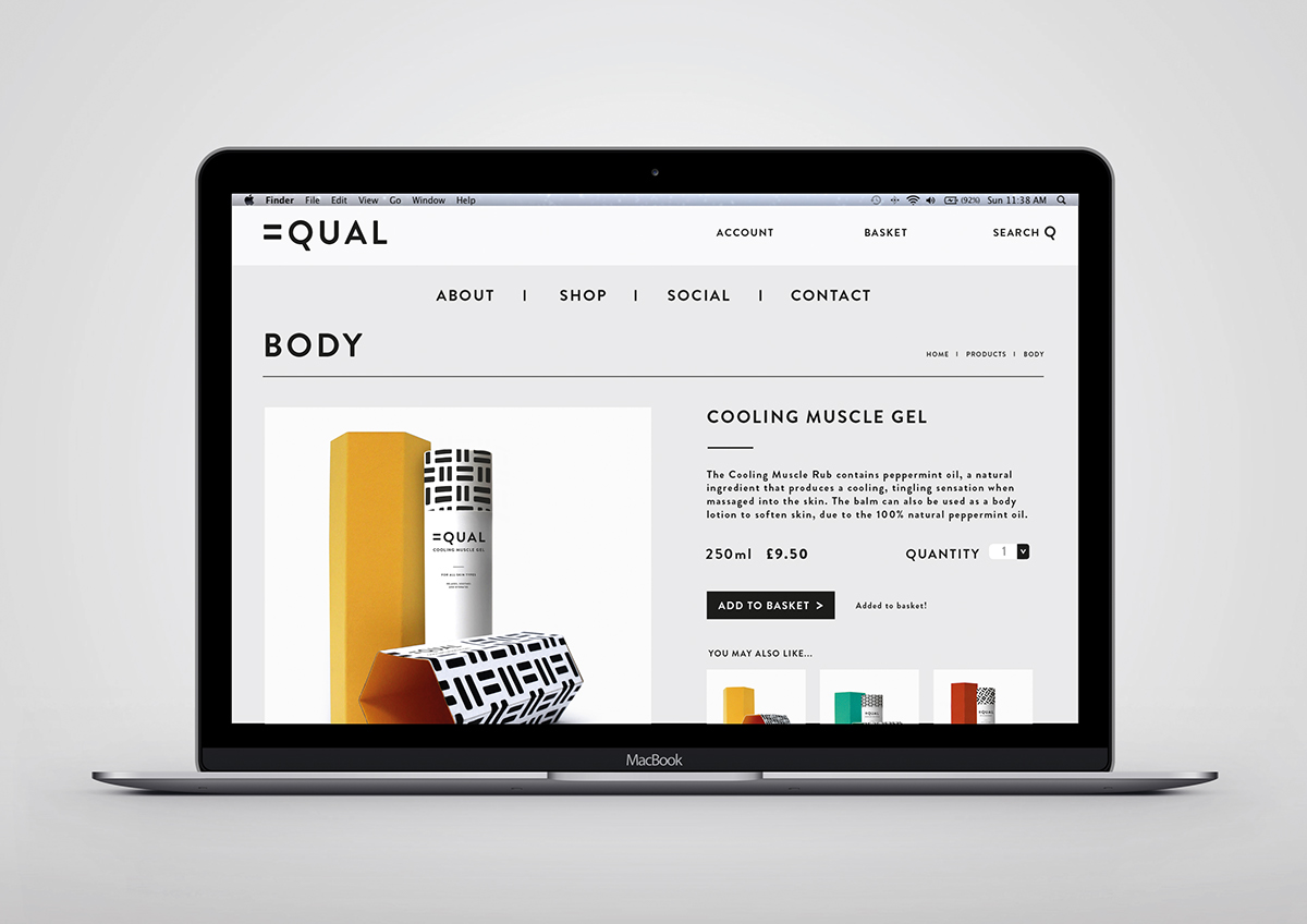
The brand is dealing with current trends and issue. This is showcased
through the use of minimal typography, vibrant colours and bold patterns,
which makes it original from other unisex products on the market.
through the use of minimal typography, vibrant colours and bold patterns,
which makes it original from other unisex products on the market.
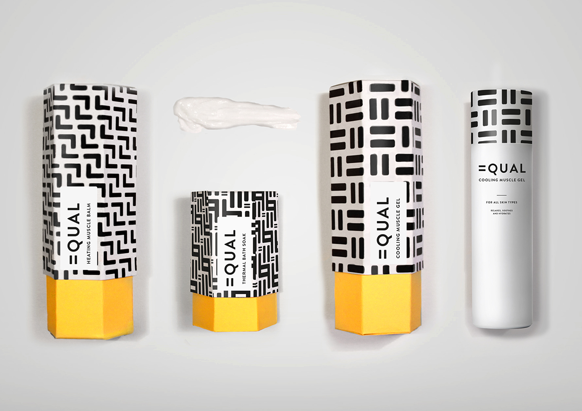
The patterns all originate from the equal symbol, in order to reinforce the
brand message. This has enabled a vast variety of patterns to be created.
brand message. This has enabled a vast variety of patterns to be created.
The patterns are product specific, so that each product within the range
has a unique pattern. This identifies a point of difference for each product,
and makes it distinguishable for repeat purchasing.
has a unique pattern. This identifies a point of difference for each product,
and makes it distinguishable for repeat purchasing.