Corporate Identity design for Caroma cafe. This was done during my Advance Dip. days where we have to do branding and a set of advertising campaigns to launched the brand and it's identity to the target audience.
The inspiration for the logo was taken from Cubism Art, where it is about looking at things from a
different perspective, by using geometric shapes, dark and light shades and forceful lines.
The logo design uses a pictogram in which a coffee cup is used to denote the core business of the company. The coffee cup represents an organic, modern yet sophisticated cafe where creativity is
limitless. This is because Caroma is a place where thoughts and ideas are unconventional. Strokes of
yellow and brown were used as the outline of the coffee cup to symbolize the free-spirited character
of the cafe.
Yellow & Brown are the corporate colors used for Caroma as it is a complimentary color and these colors
are often associated to coffee and cafe's. Yellow was used as it is the first color that the human eye notices for it is brighter than white. It also symbolizes optimism and helps speed metabolism, which is
ideal for a food and beverage business.
Whereas, Brown bring to mind the feeling of warmth and comfort. It is often described as natural and
down-to-earth.
The logo is then applied to various corporate identity applications such as letterheads, name cards, envelope and uniform design etc.

Logo

Corporate identity, Stationary set of Caroma

Employee's Uniform (Digital)

Employee's uniform (actual)

Badges

Coffee card which works on customer's loyalty point

Membership card

Menu Design (Exterior Design)
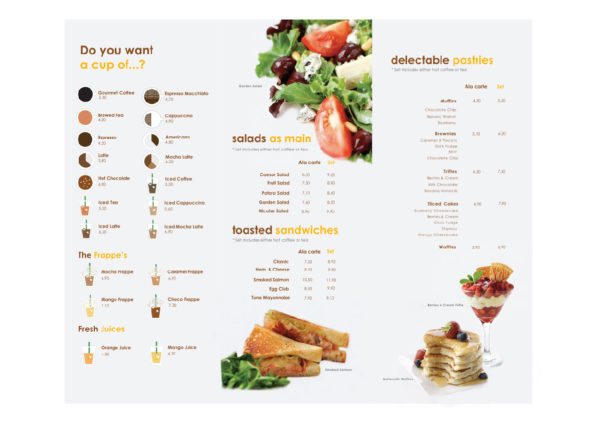
Menu Design (Interior Design)

