


Reasons why
The theme of visual identity
Today the theme of visual identity is very present and heard from most of the administrations of public institutions, be they museums, municipalities, transport companies.
The evidence of this necessity arises from the need, on the part of institutions, to communicate themselves. The meaning of the word “communicate”, implies a relationship between the issuer, or the one who wants to convey a message, and a receiver, or those to whom the message is addressed. The aforementioned message has to pass through one or more channels and subsequently to undergo an operation of encoding, in order to reach the receiver.
This definition, although it is approximate and simplistic, derived from mathematical theory of information developed by Shannon and Weaver, and allows us to understand how the act of communicating should follow the principles, agreements, which allow it to be functional. So just like a phone call or conversation, the visual identity of an institution must be clear and effective, it has not to be designed for the customer, in this case the city administration, but for the user, whether it is the citizen resident or tourist, of any age and with any level of education.
User centered visual identity
We should take into account factors which fall within the field of visual perception, taking into account every possible situation: you have to carry out a study, research, without being misled by fads, in order to create a graphic in which the shape is a function of the content. However, the authorities often do not understand, especially in the case of small towns, the importance that visual communication can have not only in the increase of tourism, but also in improving the daily life of a resident citizen.
Approaches
In the developing an identity they can be followed various institutional approaches, you can think of a redesign of the emblem for example, rather than a brand image, but the heart of the matter remains the same, the choice should not be made according to the personal taste of the designer which can also possess a mindset different from those that really will benefit the project, which is calibrated and weighted in order to create a brand, a symbol, an emblem that can be accepted and recognized by the users and at the same time responds the criteria, relatively modern, of good shape (Gute Form), namely that can communicate the information concisely and in the shortest possible time.
Case study
The town of Cesarò, although owning an emblem, has not the slightest trace of institutional identity: the affixing of the emblem is not regulated, official stationery has nothing that identifies the town as a broadcaster, and communications, although transmitted on institutional channels also including new media, they are expressed in a confused way, often using a broken English; finally the web site, of fundamental importance in the current century, is so disorganized as does not allow the understanding of the slightest information. On this basis, it will be created a visual identity project that tends to make things clear, to look into the history and the common life, the key elements that characterize it, that make it what it is, and to create an effective communication system and especially usable. Through this visual identity system we try to tell the story of Cesarò using a new language, the language of information design.
Research
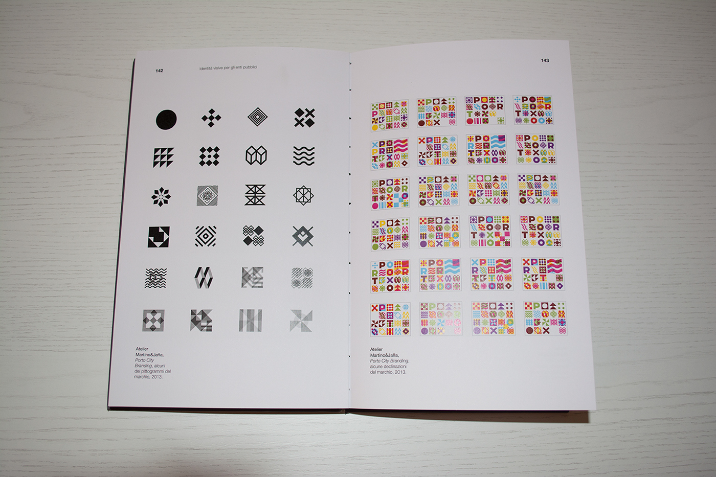
First of all, I studied several cases of visual identities projects, such as those of museums, public transport and cities. The first part of the book is all about projects that inspired me, made by great designers. Here are some examples.


Case study
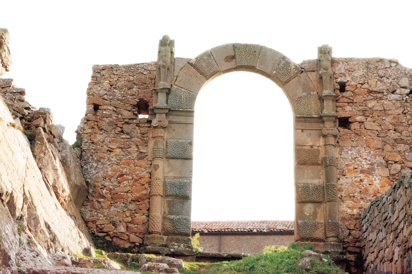
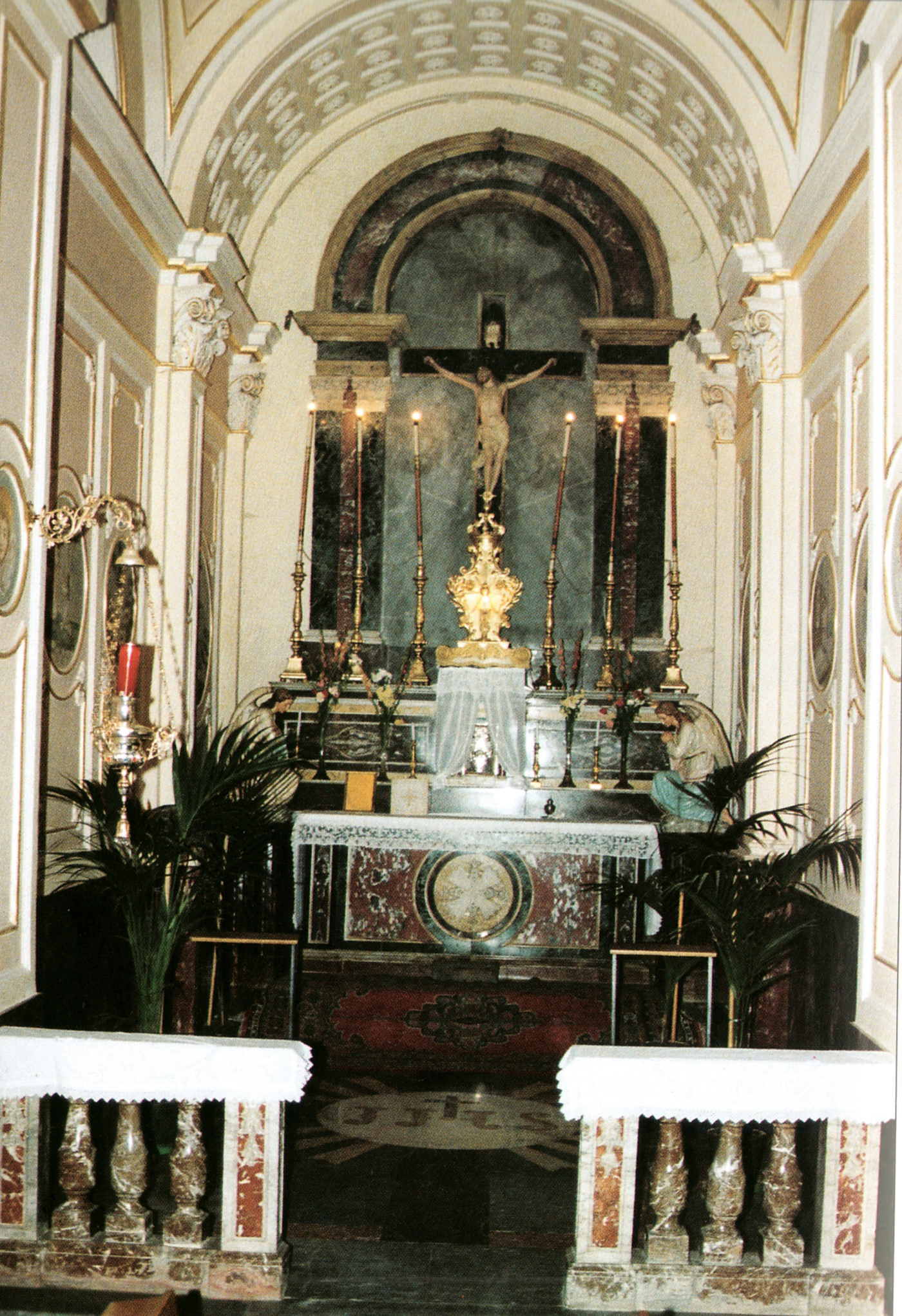
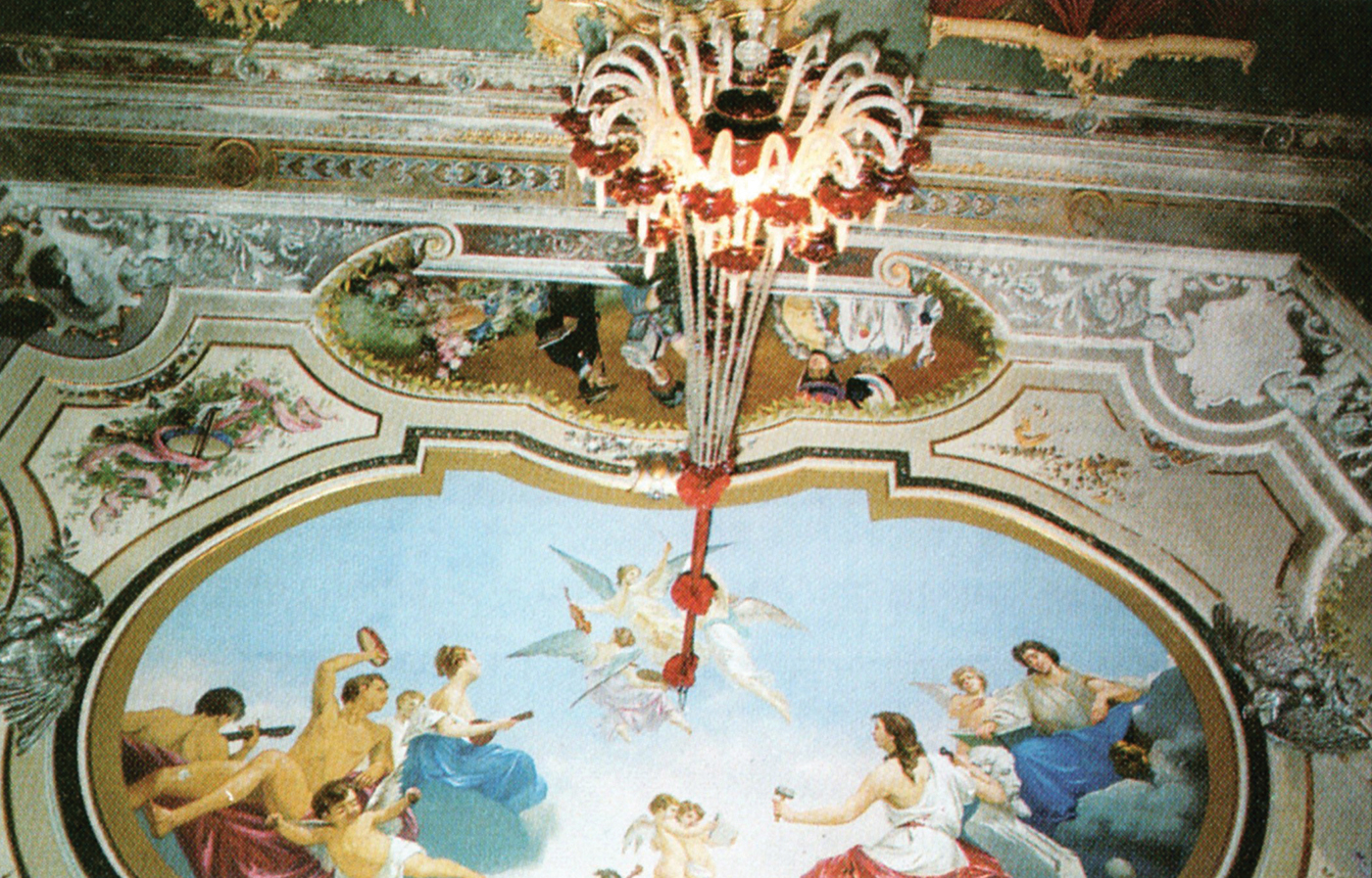
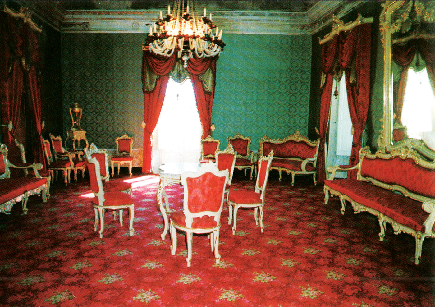
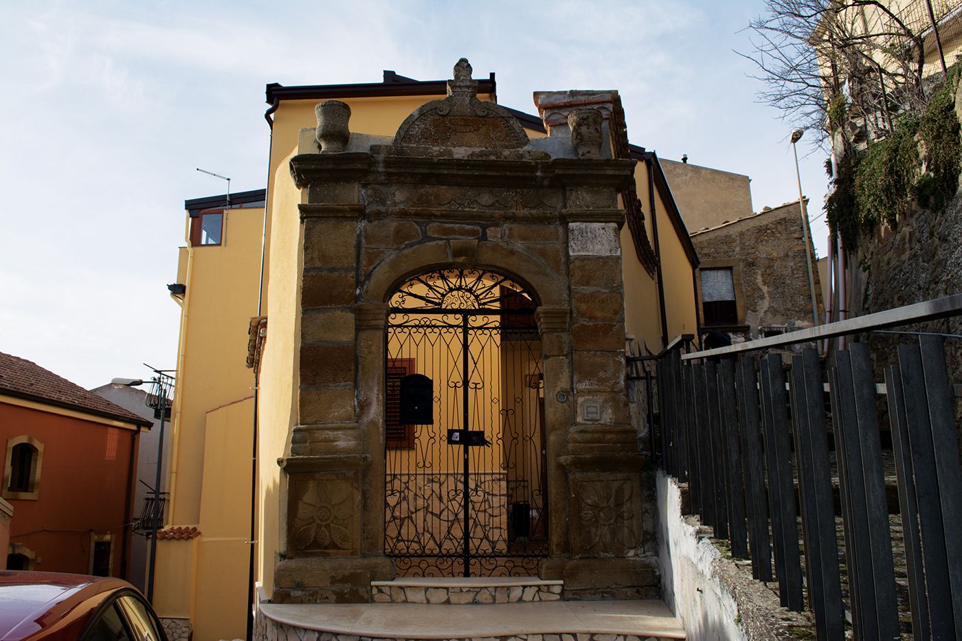
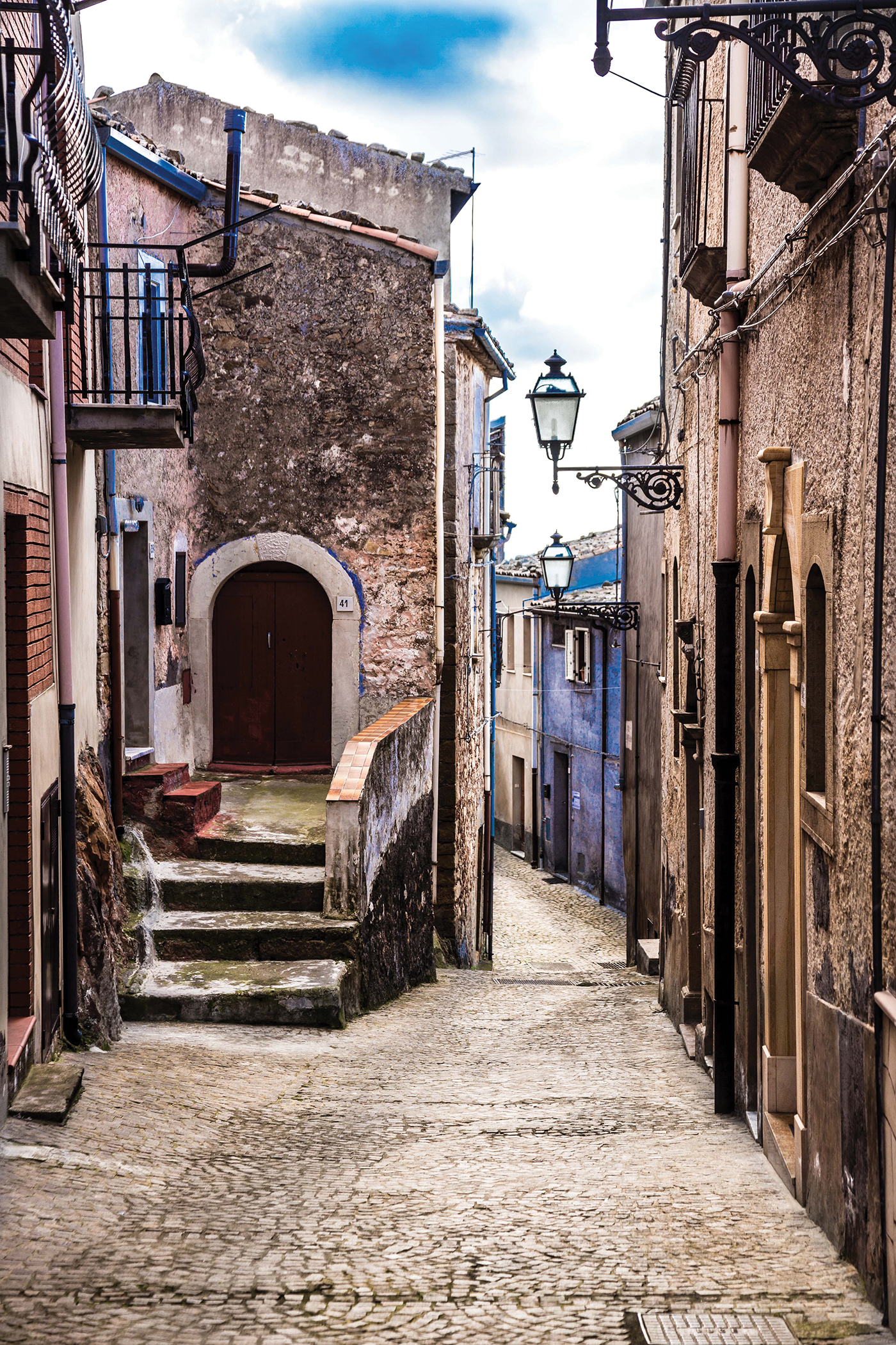
Cesarò is a small town in the province of Messina, in Sicily. It is located on the Nebrodi mountains and it is the perfect place where to spend a lot of time among nature: it is such a paradise with all its woods, the panorama, the hospitality of the citizens, and the excellent food. Furthermore it has a lot of history, and its origin could actually be dated in the 2000 before Christ. It has many monuments of many different ages, but the most important and characteristic is the Colonna Castle that is recognized as the only symbol of the town
Cesarò today


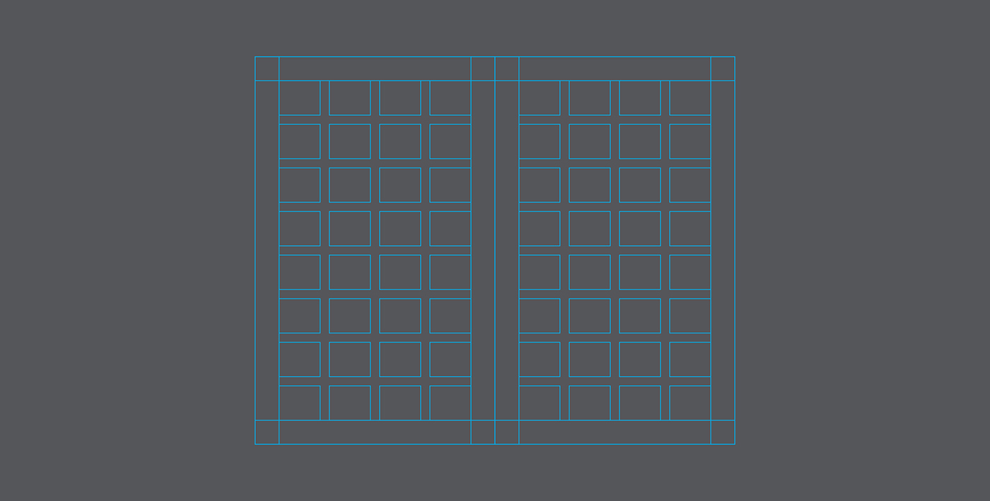
Page size and layout
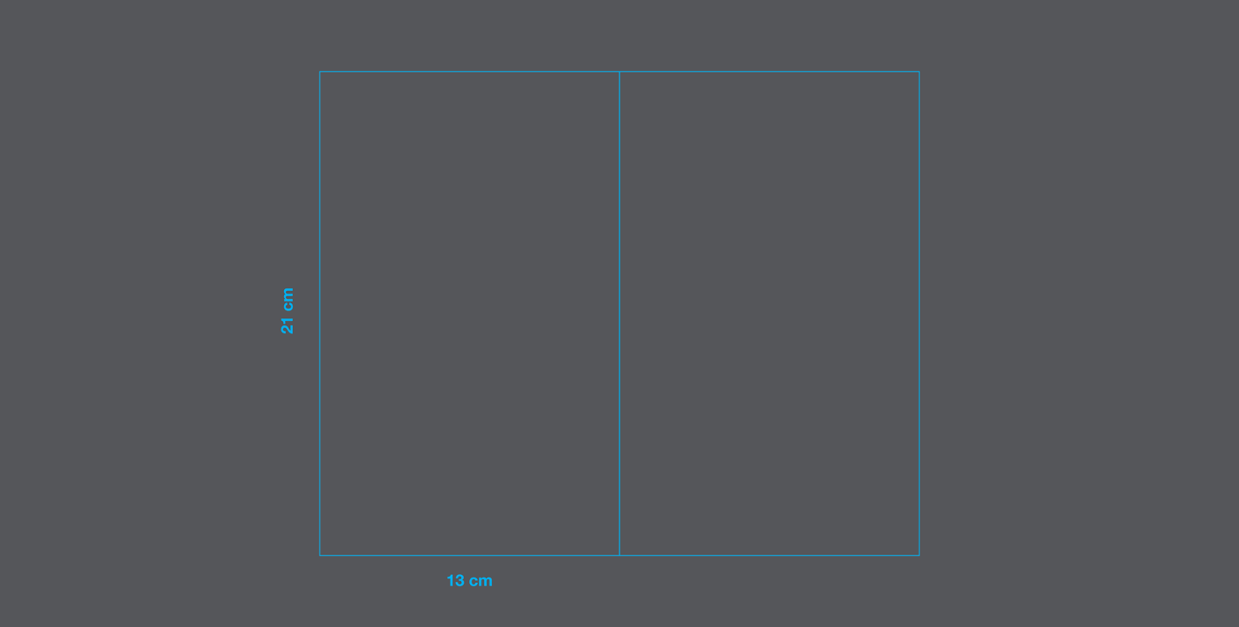

The page size was based on the Fibonacci serie, a serie of numbers linked to each other by the golden section.

It was chosen an asymmetrical layout, with 13 mm margins and a 4x8 modular grid with 5 mm gutter.
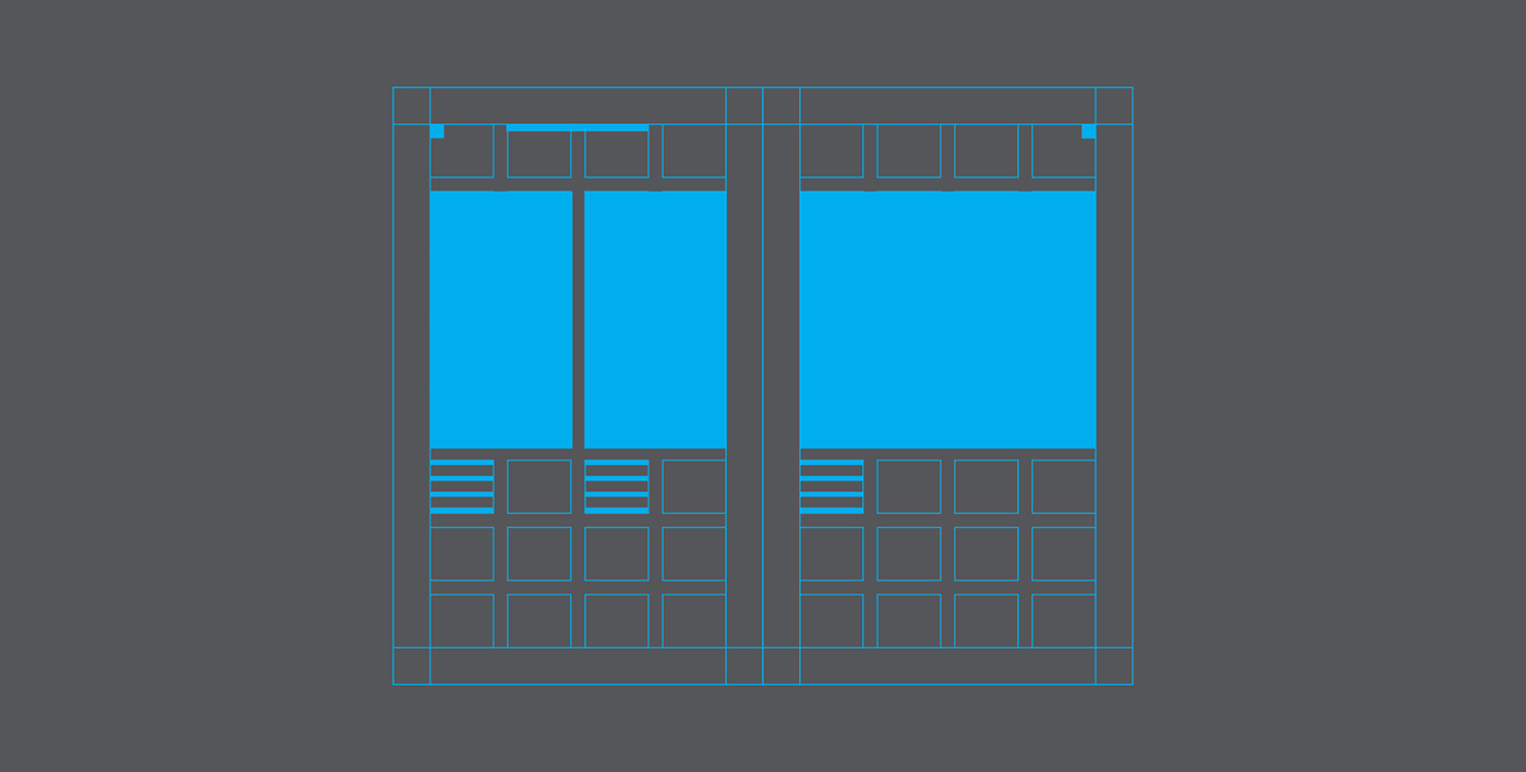
Some examples of pagination


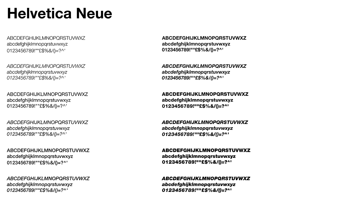
Typography
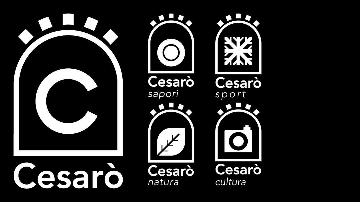
Mark and logotype
Concept
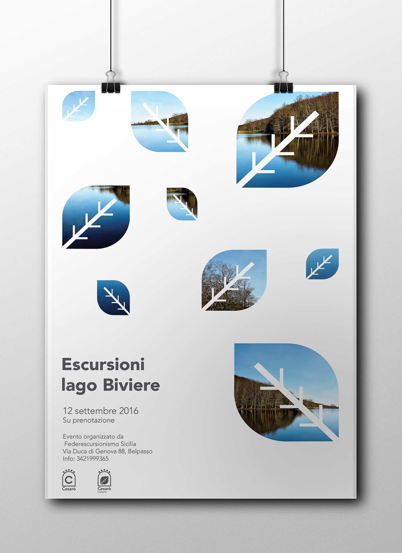
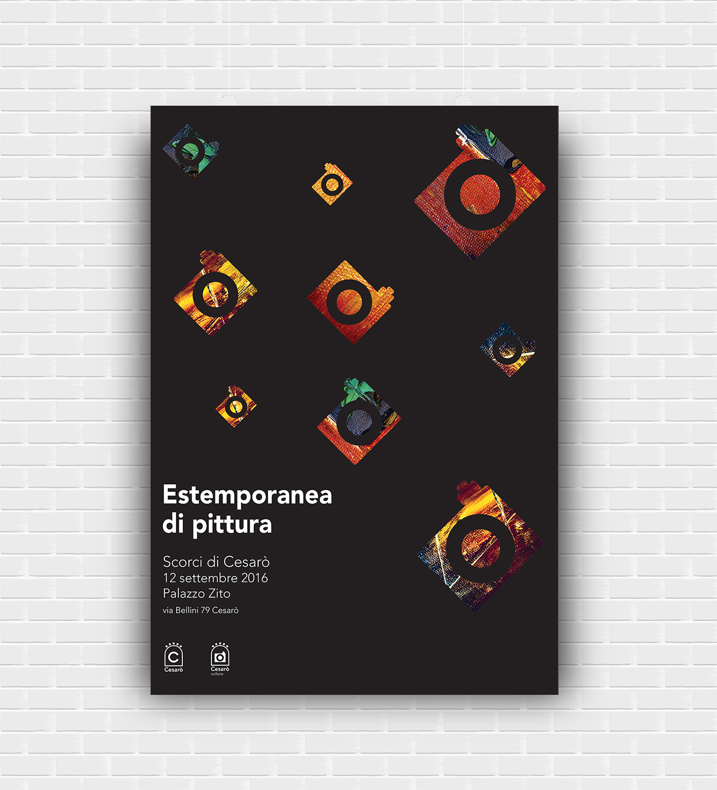
The logo was inspired by the door of the Colonna Castle, regarded by 87% of the citizens as the most iconic symbol of the town. Because of the variety of the town's touristic offer, they have been created five variations of the logo including food, culture, nature and sport, which are the main attractions for tourists who visit Cesarò.


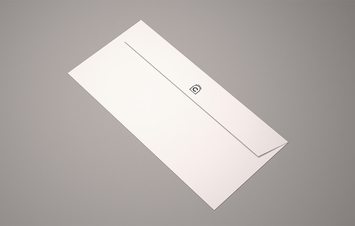
Stationery/advertising


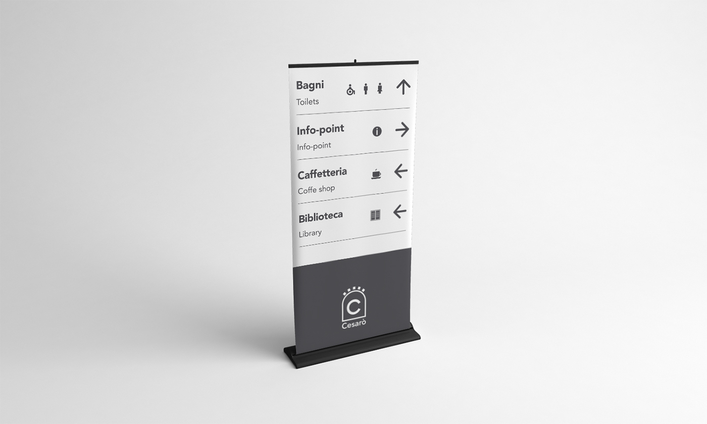
Wayfinding


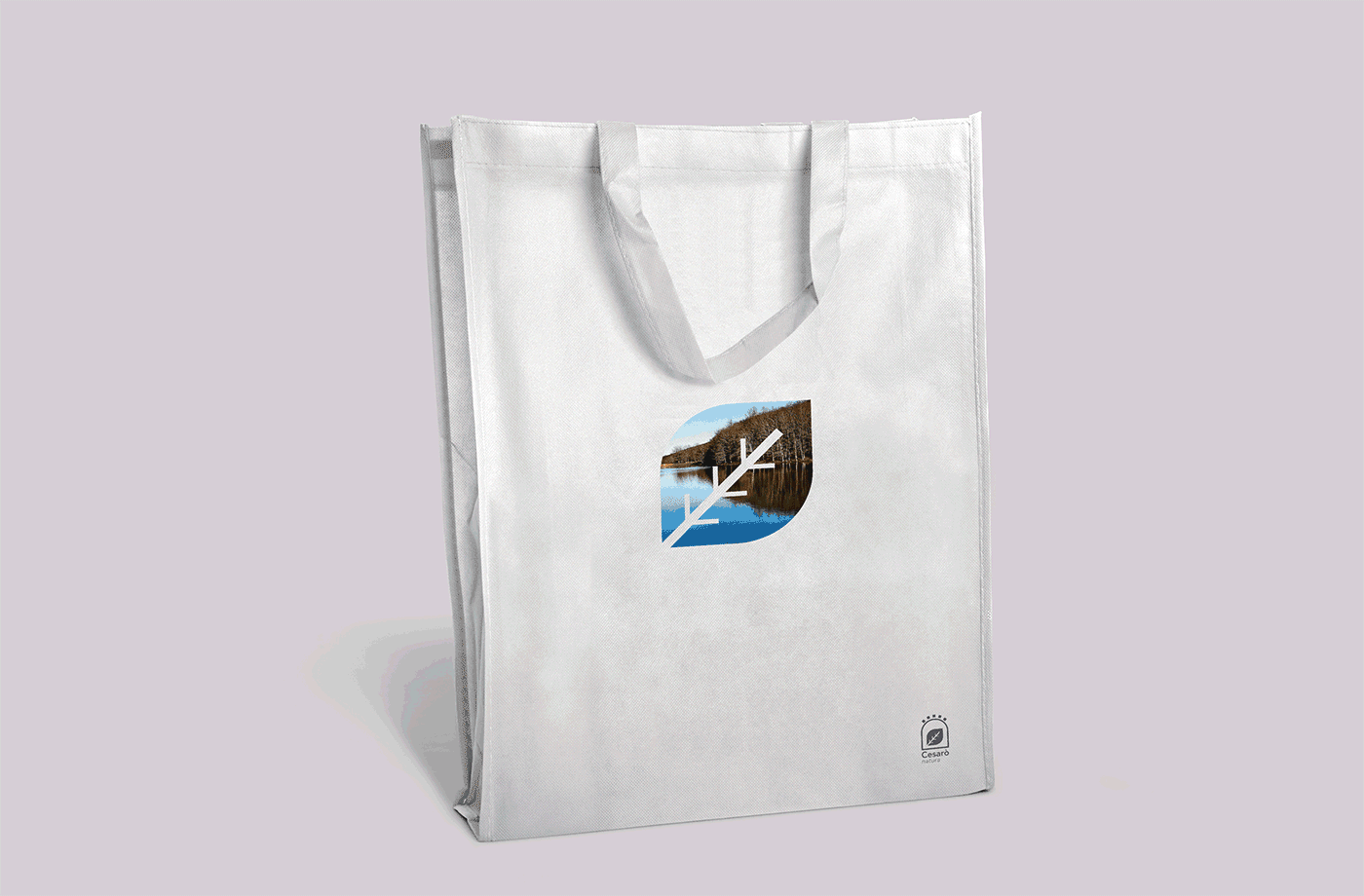
Merchandising


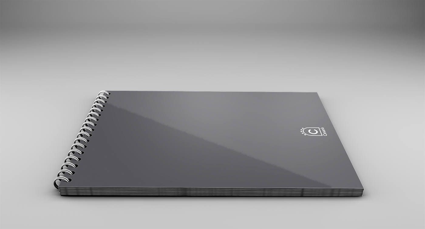
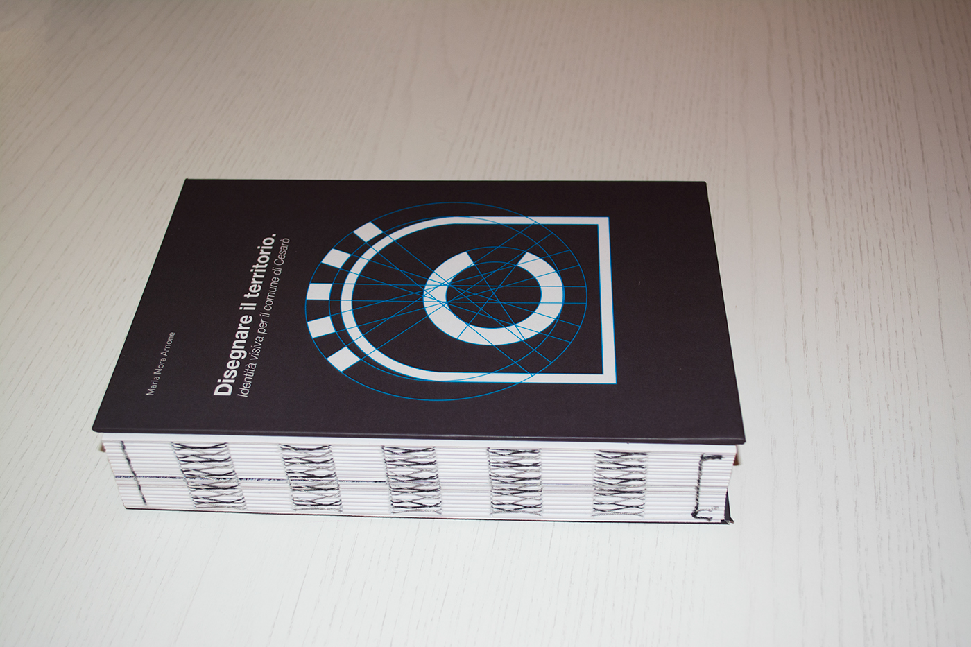
Printing and bookbinding


Many thanks to
Gianni Latino/supervisor
Giuseppe Famiani/photography
Arti Grafiche Leonardi/printing
Ludovica Privitera/bookbinding
Thanks for watching :)


