

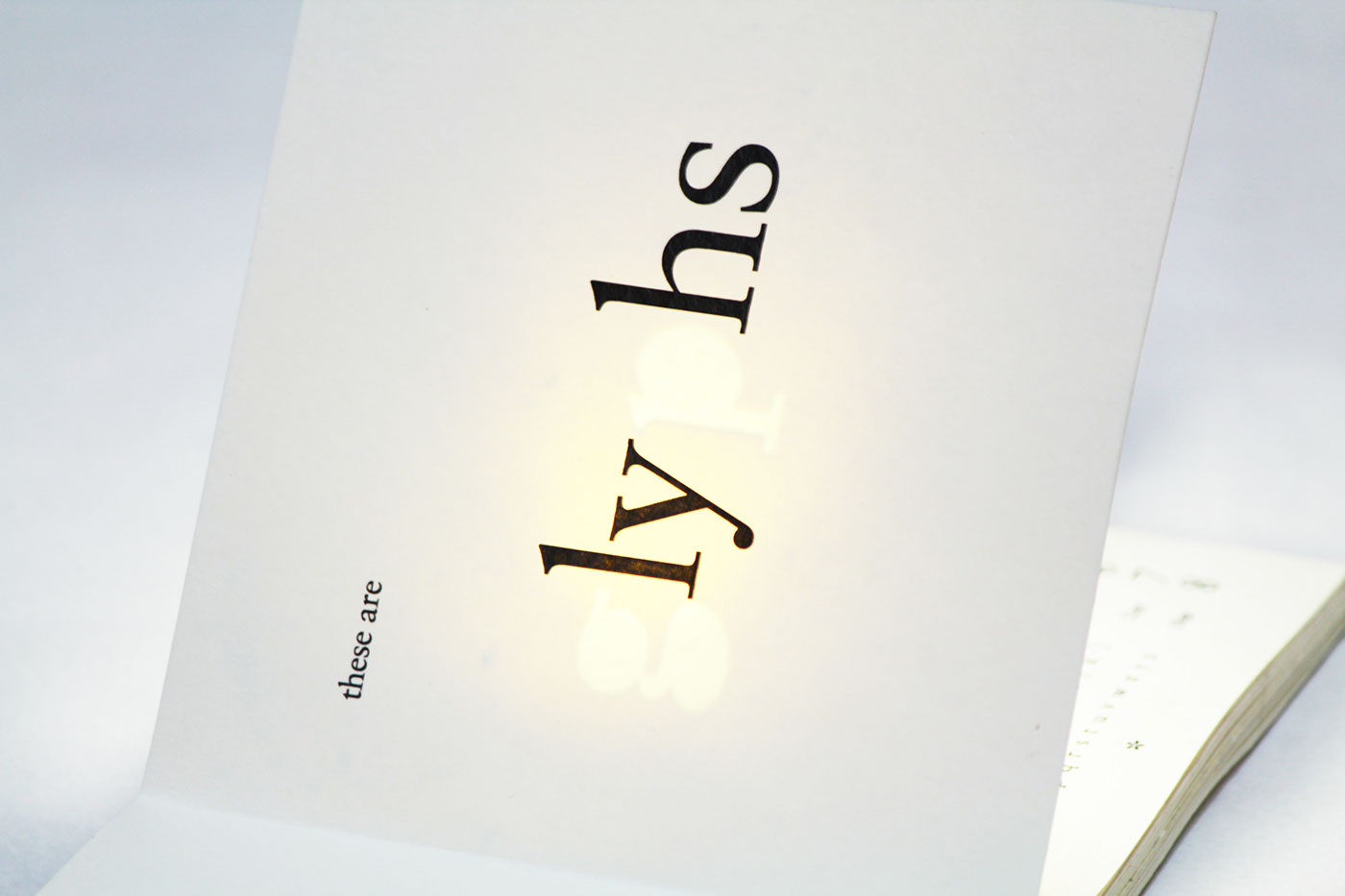
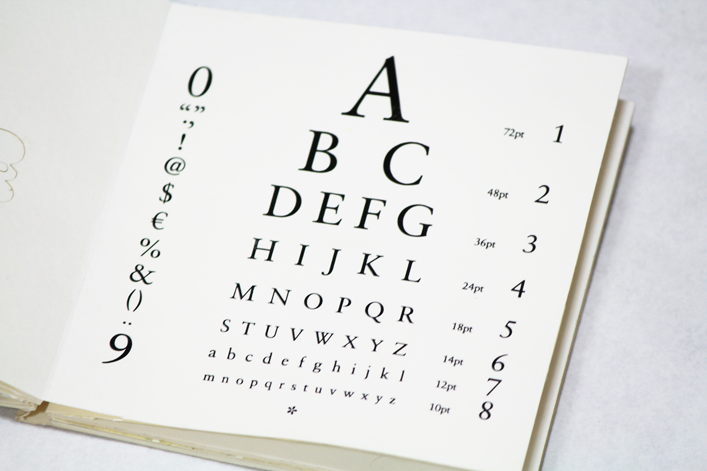
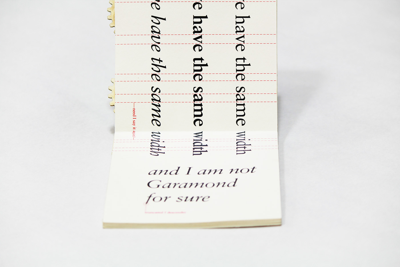
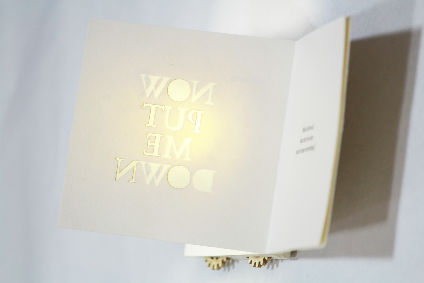
Since Sabon is described as a highly legible typeface, I decided to play with its legibility and readability. There are many factors affecting legibility and readability in typography: from curves, counter, x-height, etc. to kerning, tracking, leading, shapes of words, etc. and I've chosen some to put in my booklet.
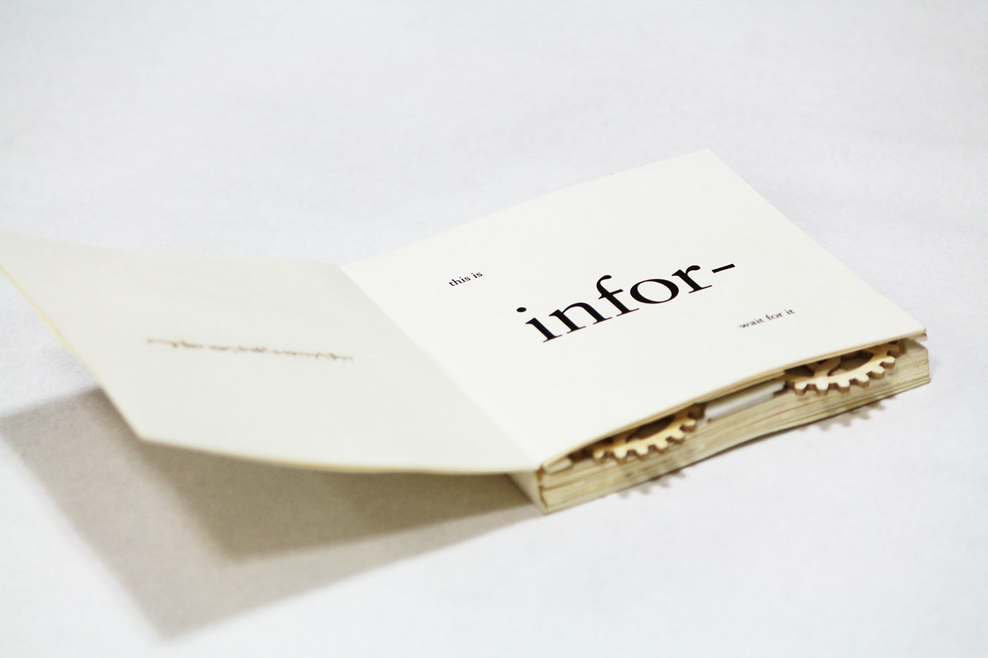
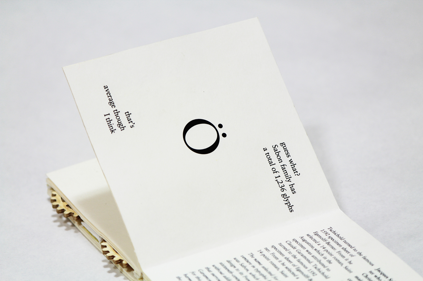
Other than that, I want the book to be interesting and people can spend time with it so I tried to put in interesting bits of information (extracted from Sabon article in Anatomy of a Typeface) and surprises. For Sabon is an old style serif typeface, I chose to use only black and white (and a bit of red) on slightly cream colored paper. I felt a minimalistic style (with lots of space) would suit the concept and let the quiet Sabon stand out better.
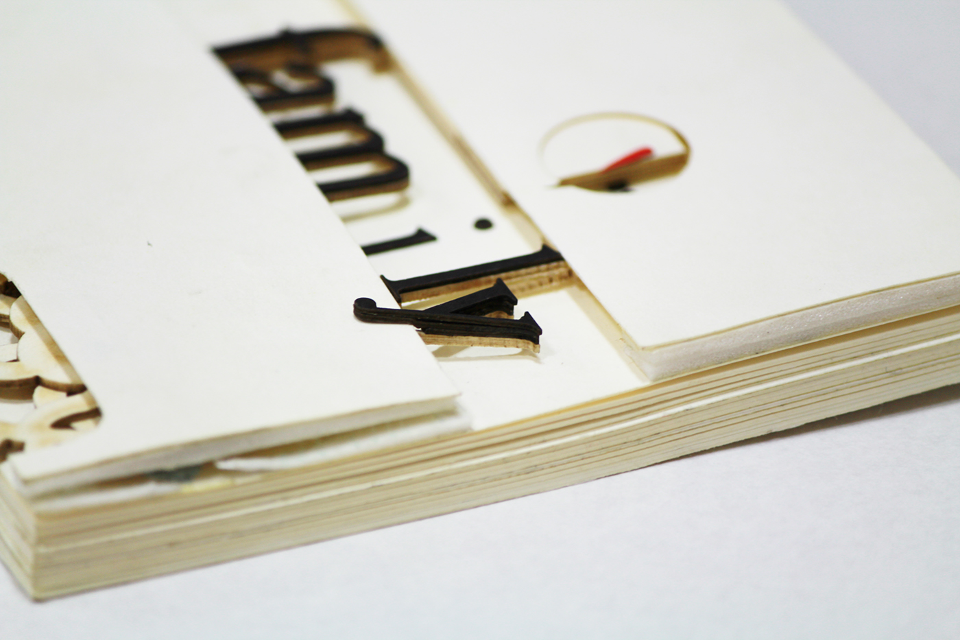
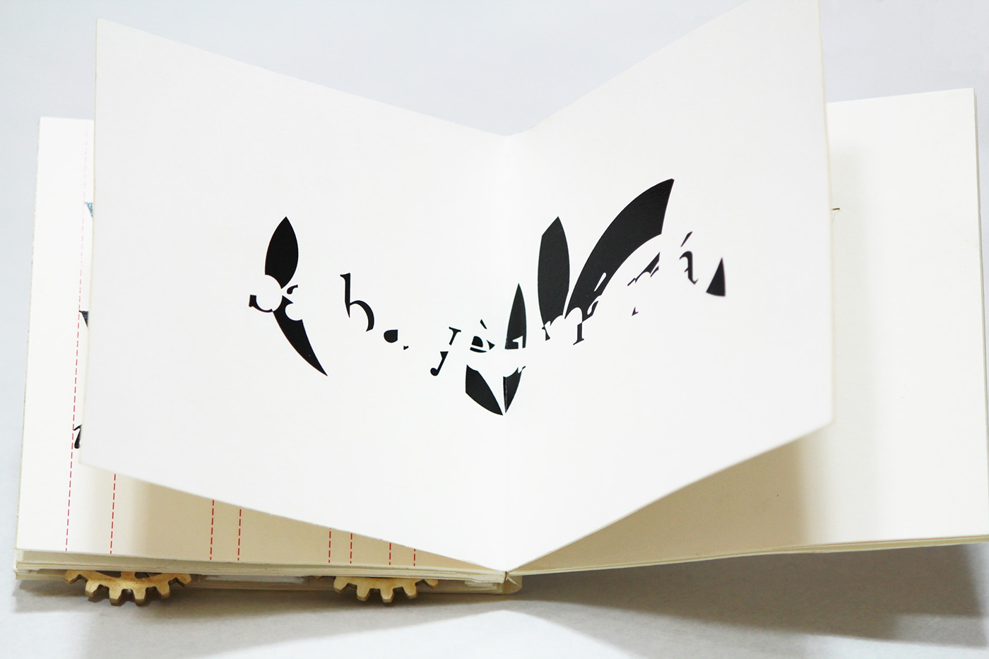
I used lasercutting to make precise letterforms to serve the purpose in some pages.
The cogs of the physical copy are turnable, simulating kerning of the word "family".
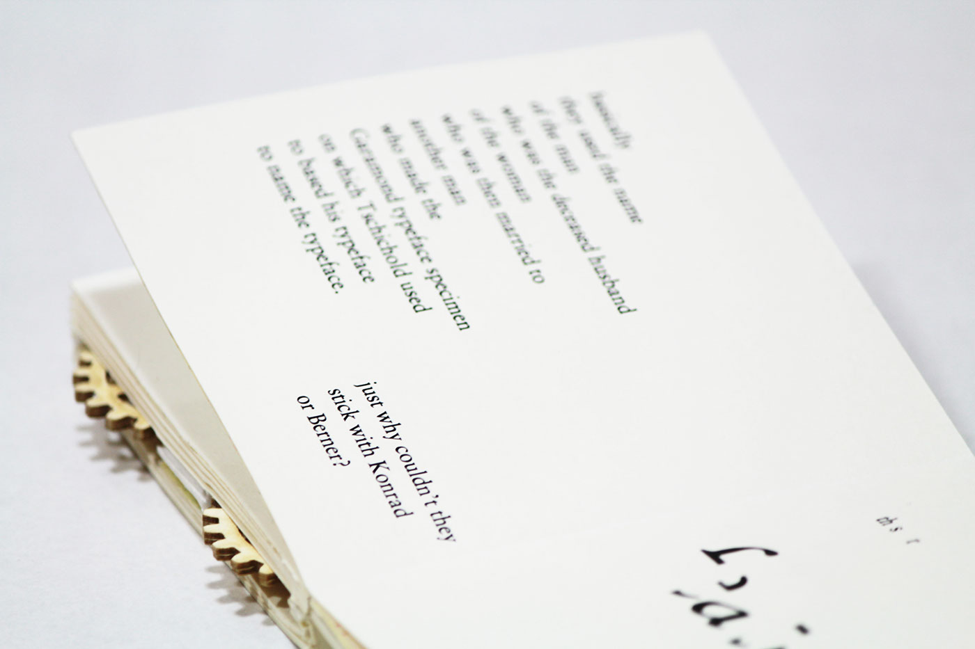
This bit is a bit personal: to me Sabon feels like a guy who is quiet but when he speaks it should be words from a wise man, sarcastic and firm so I tried to make the rest of the copy in the booklet have that feeling too. I don't know if I succeeded though.

Thanks for viewing my Sabon, have a nice day.


