REFURE
I got to see the construction of reFure's new website, and what I saw shocked me. That logo!? Yes, that logo. I explained to the them that I really didn't approve their previous logo, to me it was hideous, wrong weights, sizes and the overall impression of what this company really is, and their nor cheap or unprofessional. So I took it to as my virtue to make a new more compelling and attractive brand identity to show off who they really are.
I had several talks with the company about the finished result, they were all ears. I even went to stay in London with them complemented with discussions about fragments and details in the identity, "should there be a "TM" or not?". In the end, to me, it really paid off. Now I believe reFure could stand out as the gaming company they really are, with the right identity. reFure has created games like "Longhorn", which could now see justice and a proper release. And they were very pleased with the result, I guess all the liters of water we bought in London at night was worth it in the end.
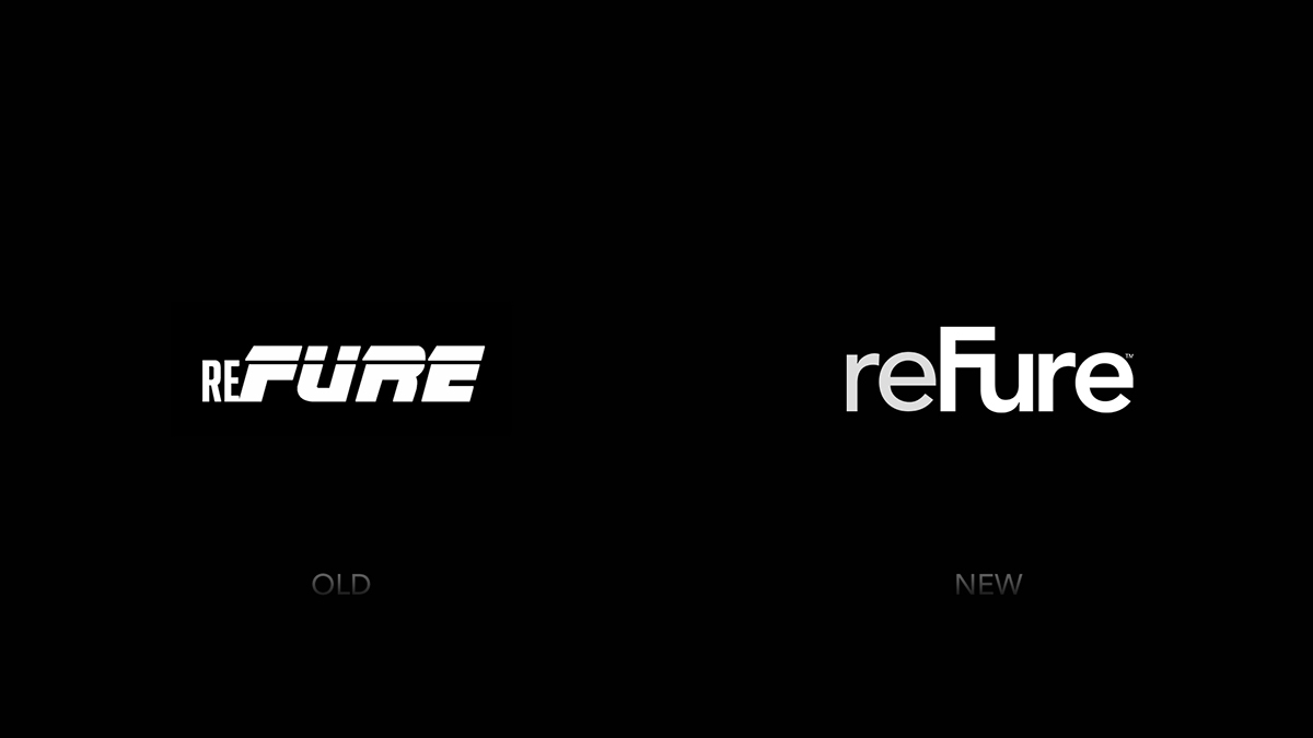
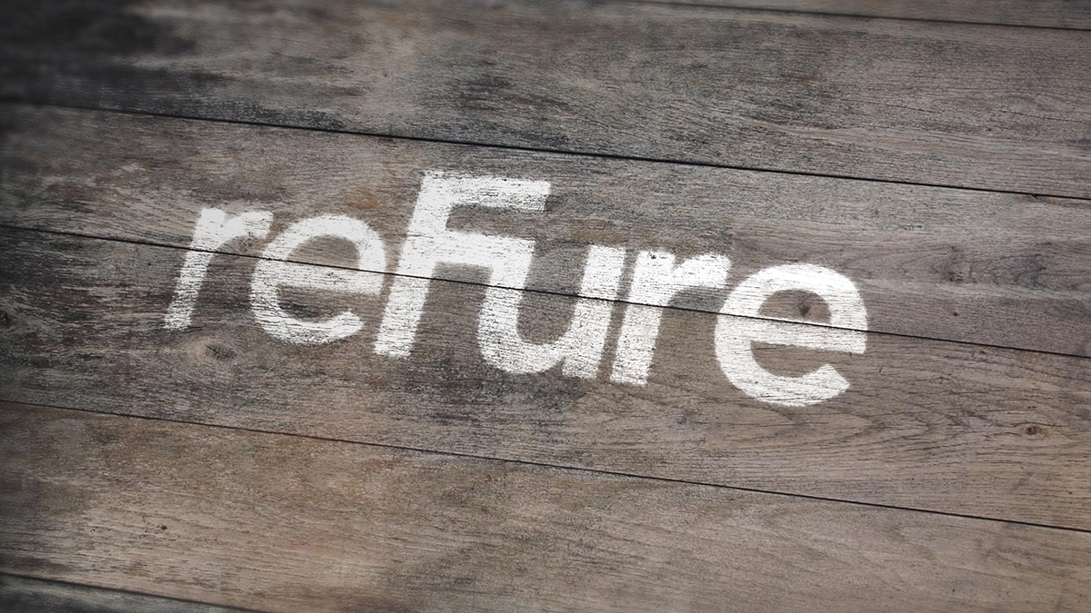
This is their previous logo. It's unbalanced and not properly weighted. I did understand the idea of a small "re" in front of a big "FURE", but that ain't their name. Since they are a game making company I understood the "rushed" kind of look on "FURE" to make it seem more action-like, but to me it didn't work, it needed a more solid and rounded look.
The new logo looks more professional in my eyes. To differentiate the "re" from the "Fure", I took to slowly grade "re" in a darker color. This pattern is also done with the other color ways of the logo. This is to make it stand out even more when you compare it to other logos, "re" is also stylized in another weight to kind of separate it from the wordmark.

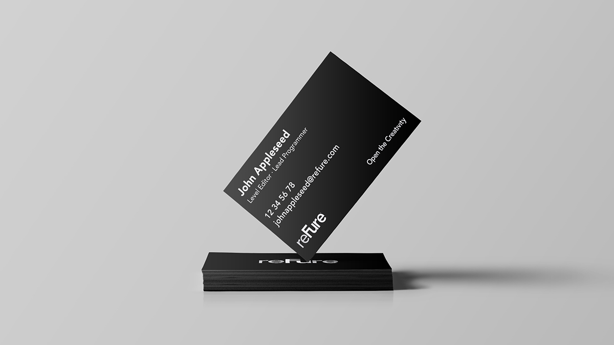

One aspect we really focused on was the slogan. It was important from the beginning to make reFure's new identity stand out as professional, so many hours were put in to the slogan. It didn't feel morally right to use the kind of "Tomorrows Innovation. Today" like style approach, it couldn't be too simple either, such as "We Play". In the end I came up with "Open the Creativity" and I just went with it, I think it does well to illustrate all the thoughts going in to create new games.
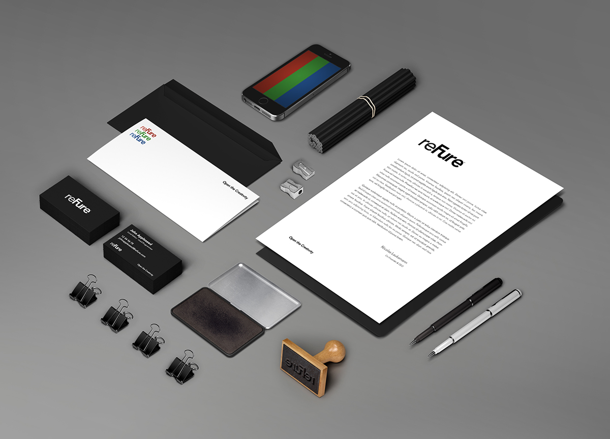
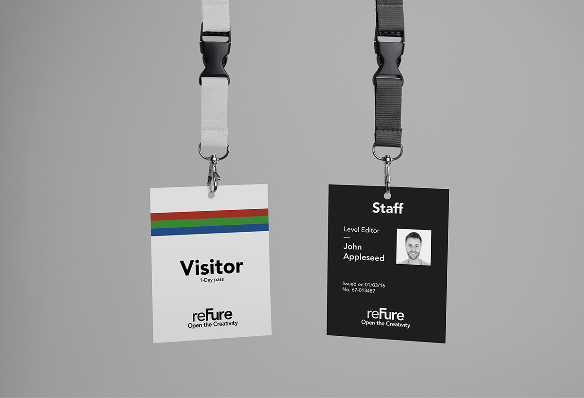
Even though I wanted to keep the color scheme to the simplistic, I quickly realized that it would need more color than just black and white. Whenever I create a brand identity's colors it's important for me to base the colors on something, either inspired or visual. Never random colors that looks creative and good. reFure themselves were open to pretty much anything, so I chose the first thing that came to mind, an LCD screen. I took inspiration from a Computer screen's pixels. A pixel, the screen type though, is constructed of the colors Red, Blue and Green, so I just went with it for the logos, slogan and other places the colors could fit. Such as a stripe on the visitor pass. Since this identity didn't include an icon, being able to create something similar, the wordmark is sometimes shown three at once on a vertical line in the RGB colors.