

GOURMET RESTAURANT GALLERIA
Location
RUSSIA
Service
Branding / Packaging / HoReCa
Date
17/02/2016
"GALLERIA" - a modern interpretation of centuries of history.
Restaurant "GALLERIA" is located in the historical part of Astrakhan. The building itself, where the institution is located, has a long and interesting history. Once this house belonged to the Svirilin family - well-known entrepreneurs engaged in the production and supply of artificial mineral water throughout Russia and even abroad.
Produced under the trademark "Ivan Svirilin and sons" soft drinks were known to everyone. In Paris, the products were awarded a silver medal at one of the international exhibitions.
As a result, the building has a special cultural and historical significance. As a designer,
I am always interested in working with such projects. After all, the restaurant is part of a large-scale building. And the architecture of those times often fascinates with its sophistication. These are not typical buildings, almost everything was done by hand. Interesting design moves are still the standard for creating modern projects.


How it all started
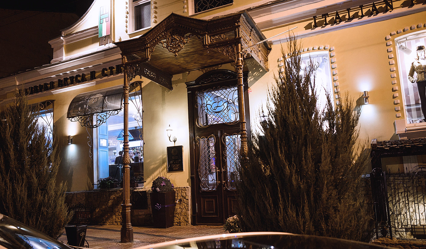
The building itself was very interesting to me. Despite the apparent conciseness, an experienced eye will be able to see several unusual details. At first glance, I was struck by the facade, namely the arch with a forged ensemble, in the center of which there is a coat of arms with floral motifs. If the rest of the building and the interior decoration were modernized to some extent, then this part directly speaks of historical significance, involvement in high society.
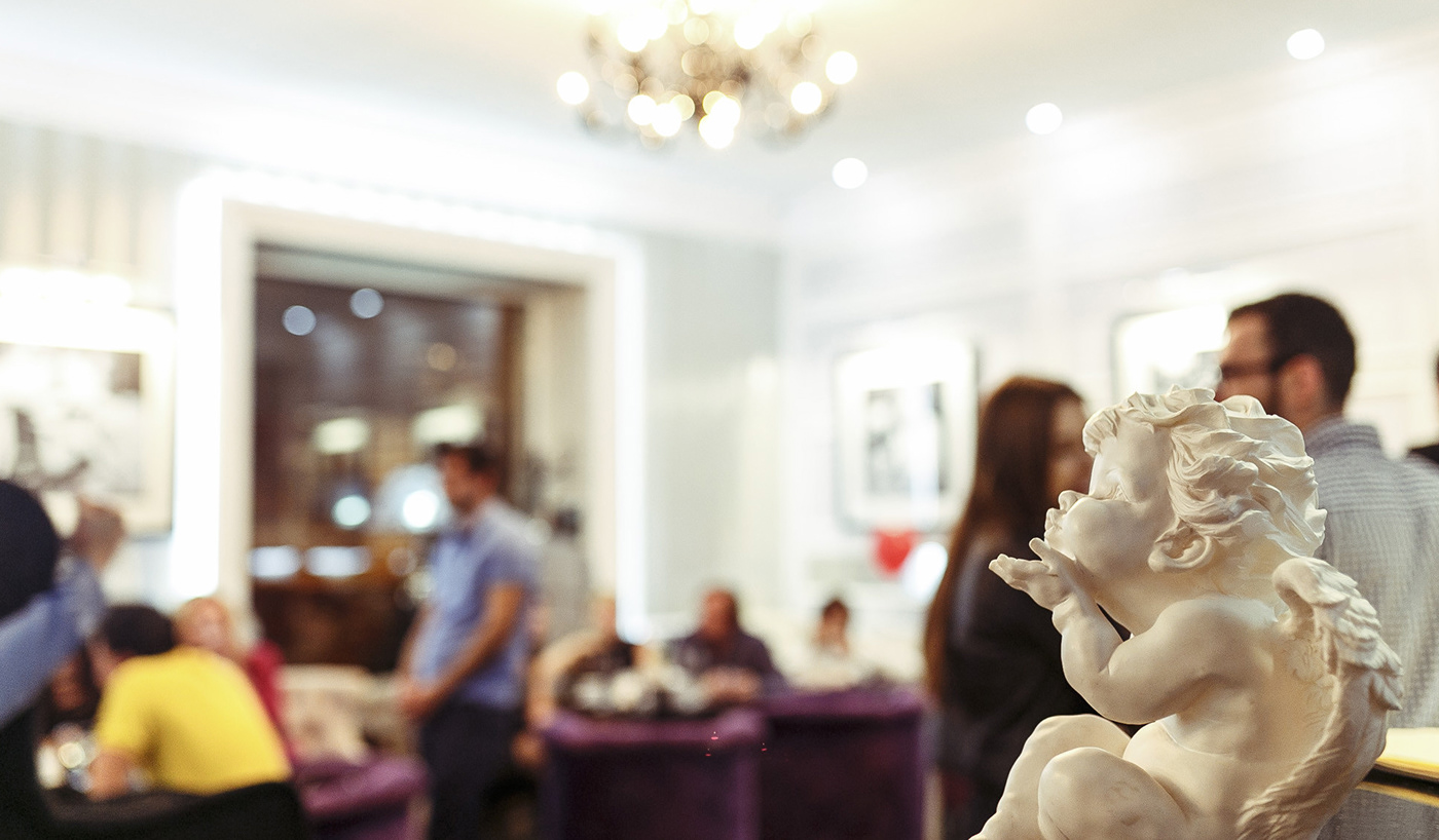
I was familiar with the interior and concept of the restaurant. The owners tried to keep the aristocratic, pretentious spirit inside the establishment. But several innovations were also introduced, thanks to which the GALLERIA received a new, recognizable look.
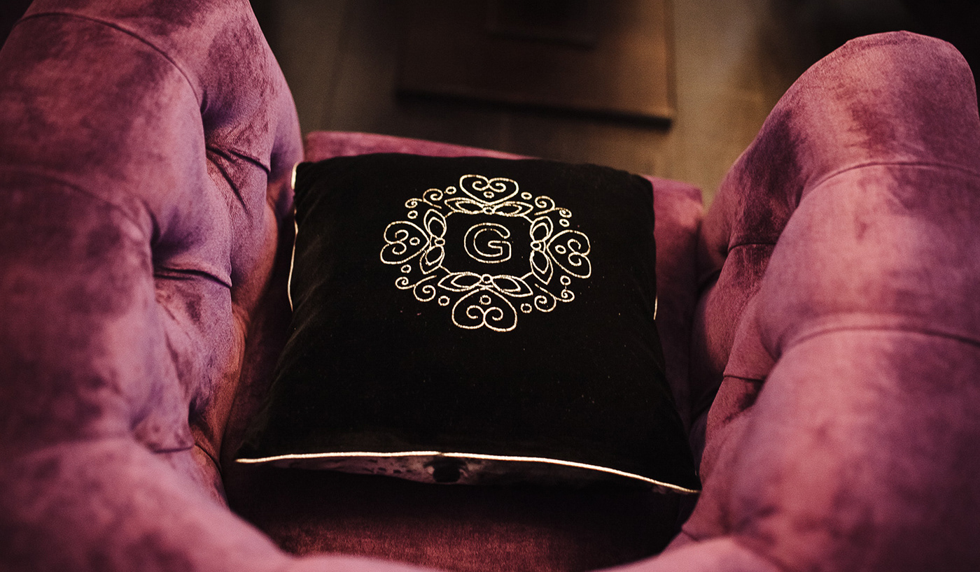
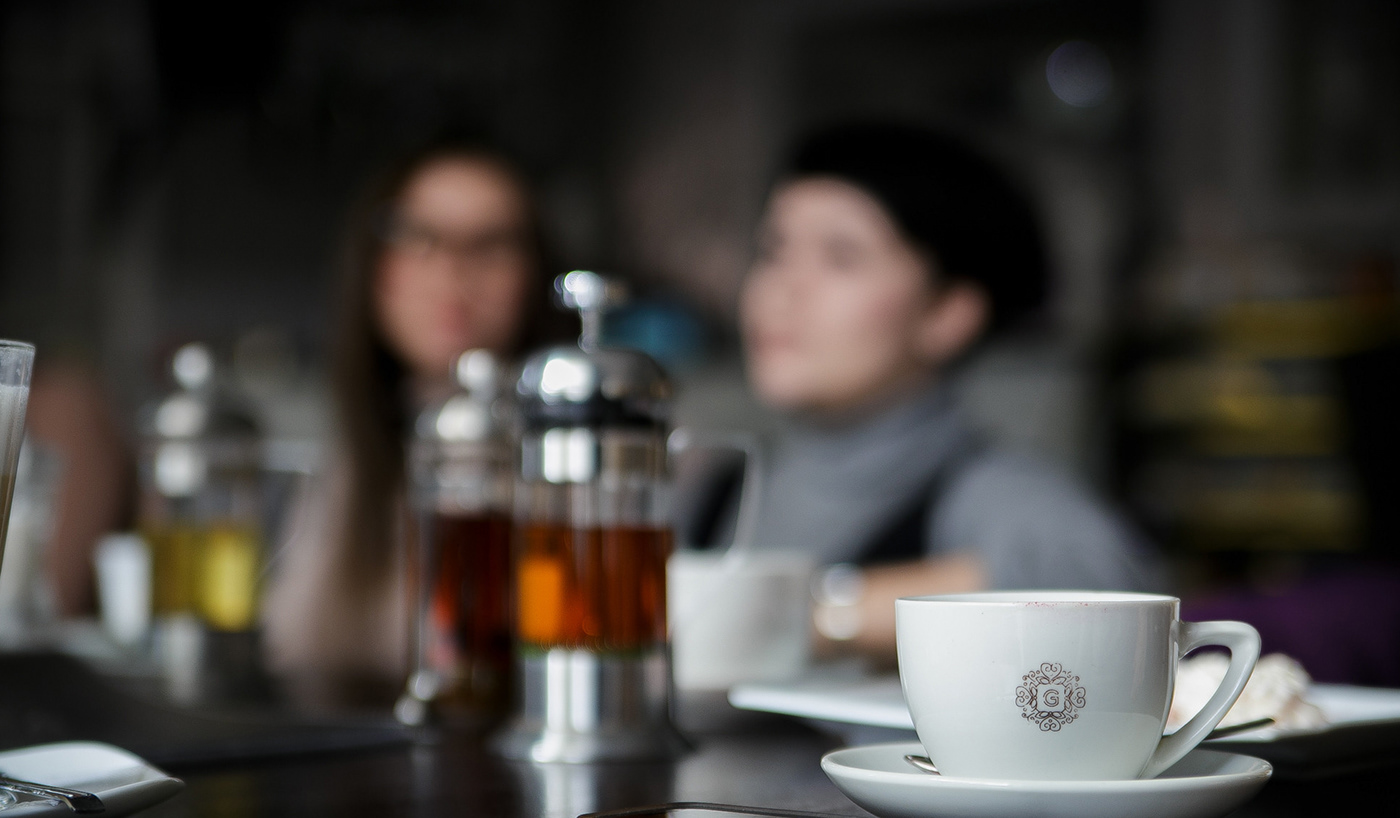
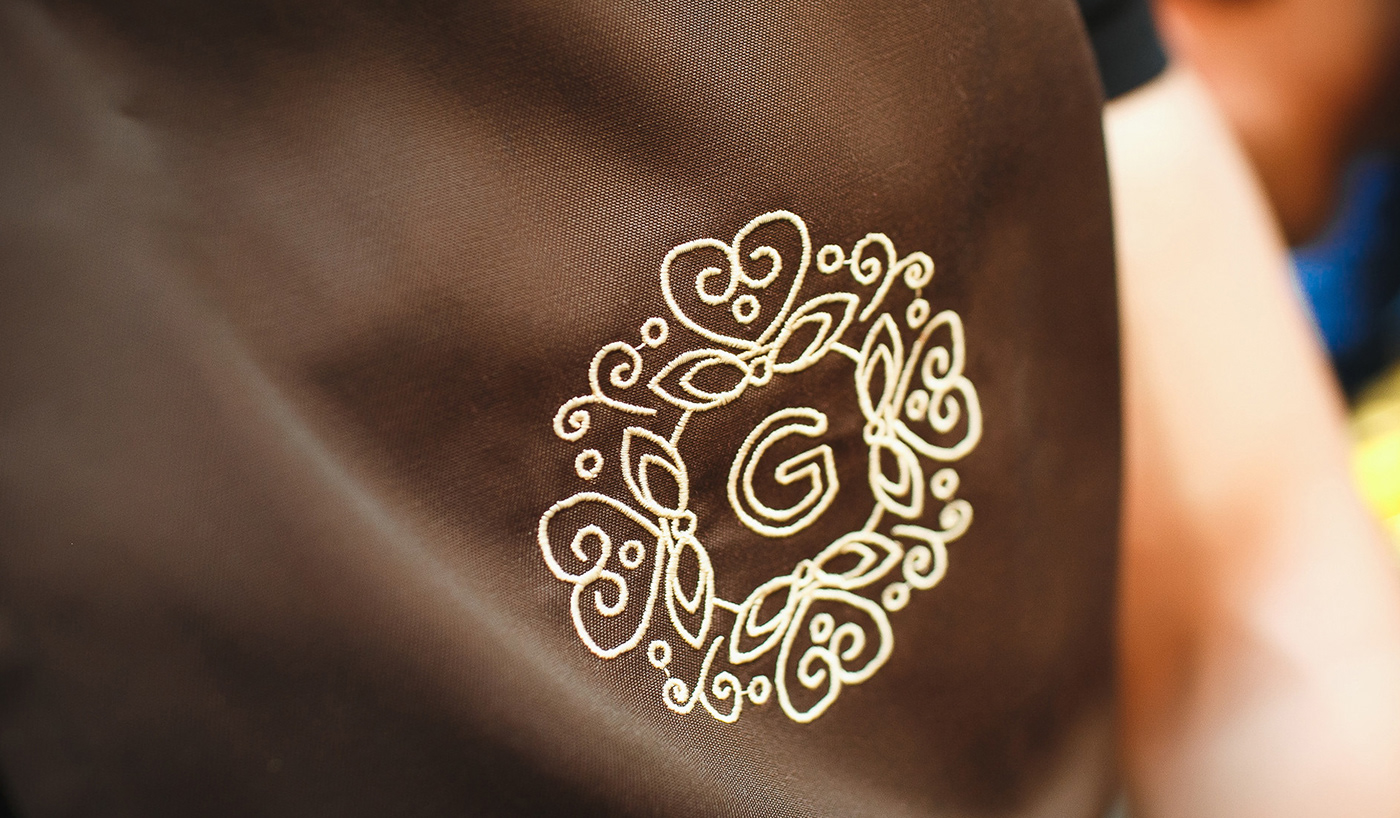
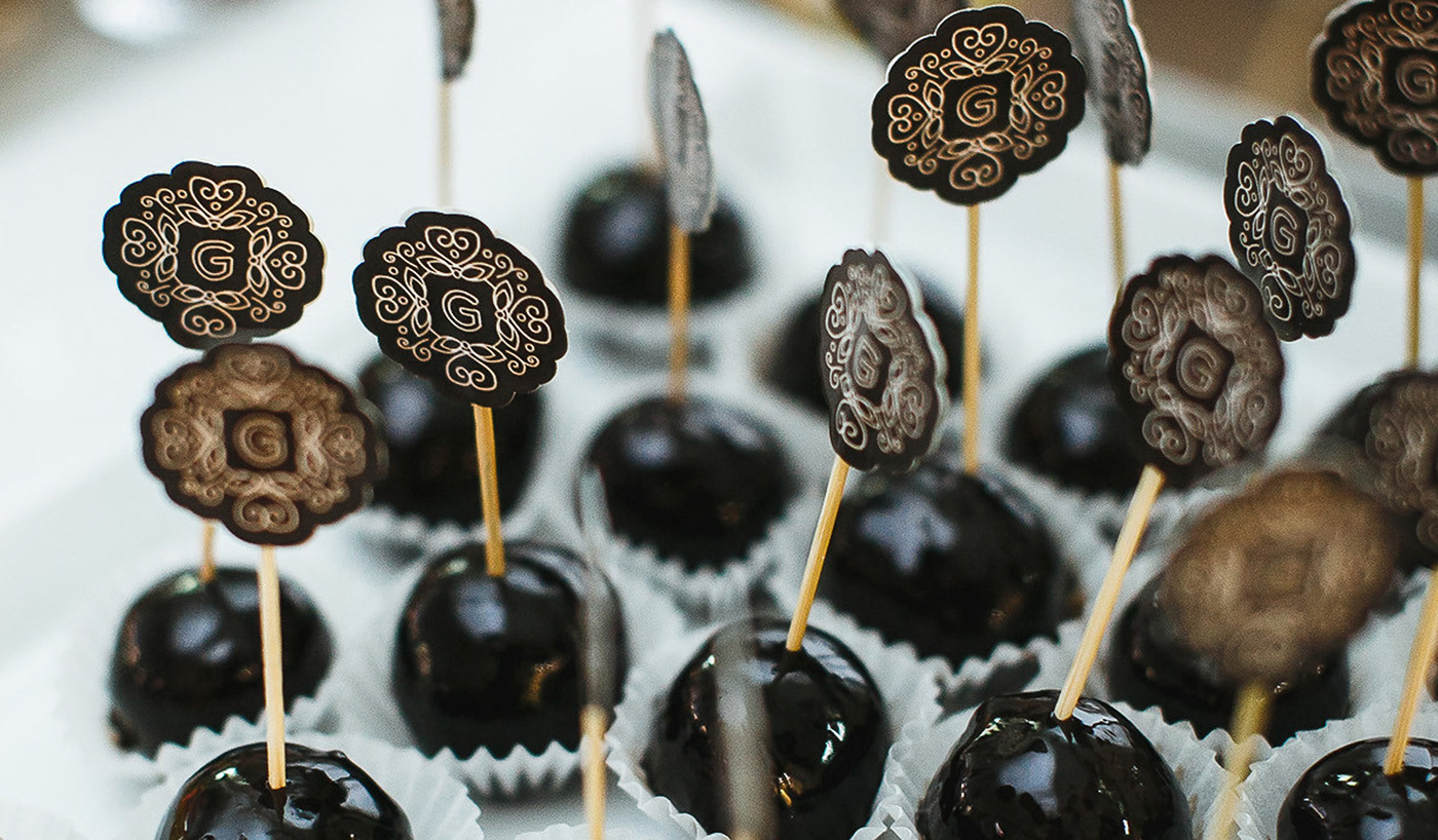
As a basis, I took the front part, which welcomes guests. Additional brand analytics was carried out and a decision was made not to change everything completely, but to develop a unique corporate identity. Based on the exquisite forged coat of arms, a new logo was created - a printed letter "G", framed by a frame of floral and plant motifs.
This graphic element has been carried over to almost everything inside the restaurant: sofa cushions, coffee cups, even toothpick decor. Changed outdoor advertising, which has become more appropriate for the historical significance of the object. The menu has also been worked out, aesthetic elements have been added.

More and more I like working with HoReCa projects, where it is necessary to combine the comfort of hotels, the prestige of the best restaurants and the convenience of coffee houses. I thought of video production to attract new visitors. All work was carried out under strict supervision. I got carried away with this project and personally participated at every stage up to the presentation of the new corporate identity to the guests and further evaluation of the work done.


