We were tasked with having a look at the Springboks logo lockup because of multiple versions being in use at the time. Upon closer inspection we found that there actually were dozens of variations:

We took drastic measures to cut away some of the “weeds” that had grown over time in the form of multiple options that diluted the brand. The intended result was never a “Oh my god, what have you done to the Springboks logo?!” from fans & sponsors but rather a consistently strong branding.
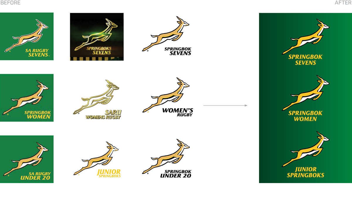

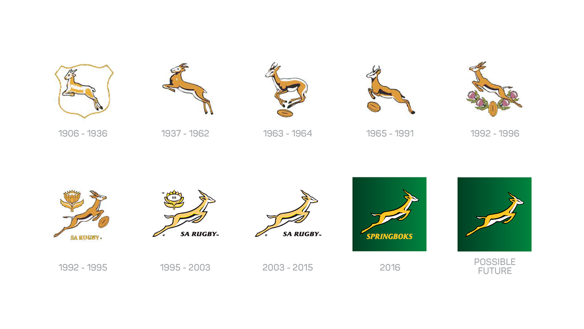
The changes, even though subtle went from micro- to macro-level. Here are some of them:
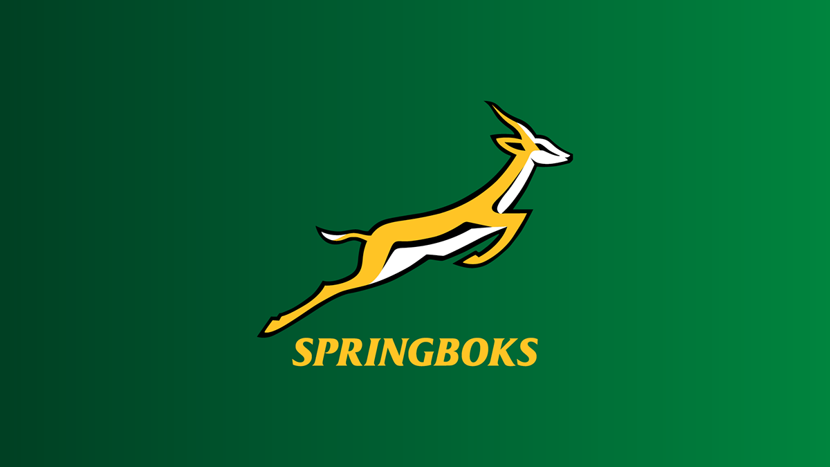
The Springboks gradient that went from dark to light and symbolises a bright future was introduced.


On a microlevel, we redrew some of the Springbok’s curves and corners to make the graphic smooth and well-crafted.

We laid down the law and decided on one Springboks Gold where there were previously 2 yellows and a tan in use that got lost in most applications.

Possibly the biggest change was that we defined “Sa Rugby” as the Federation and the Springboks as the Brand. This way fans can now proudly wear Springboks merchandise and support the team they love.

The Springboks emblem is so well-known and loved that is could even stand by itself without designation in the future.


Social Media

2016 logo on a plane

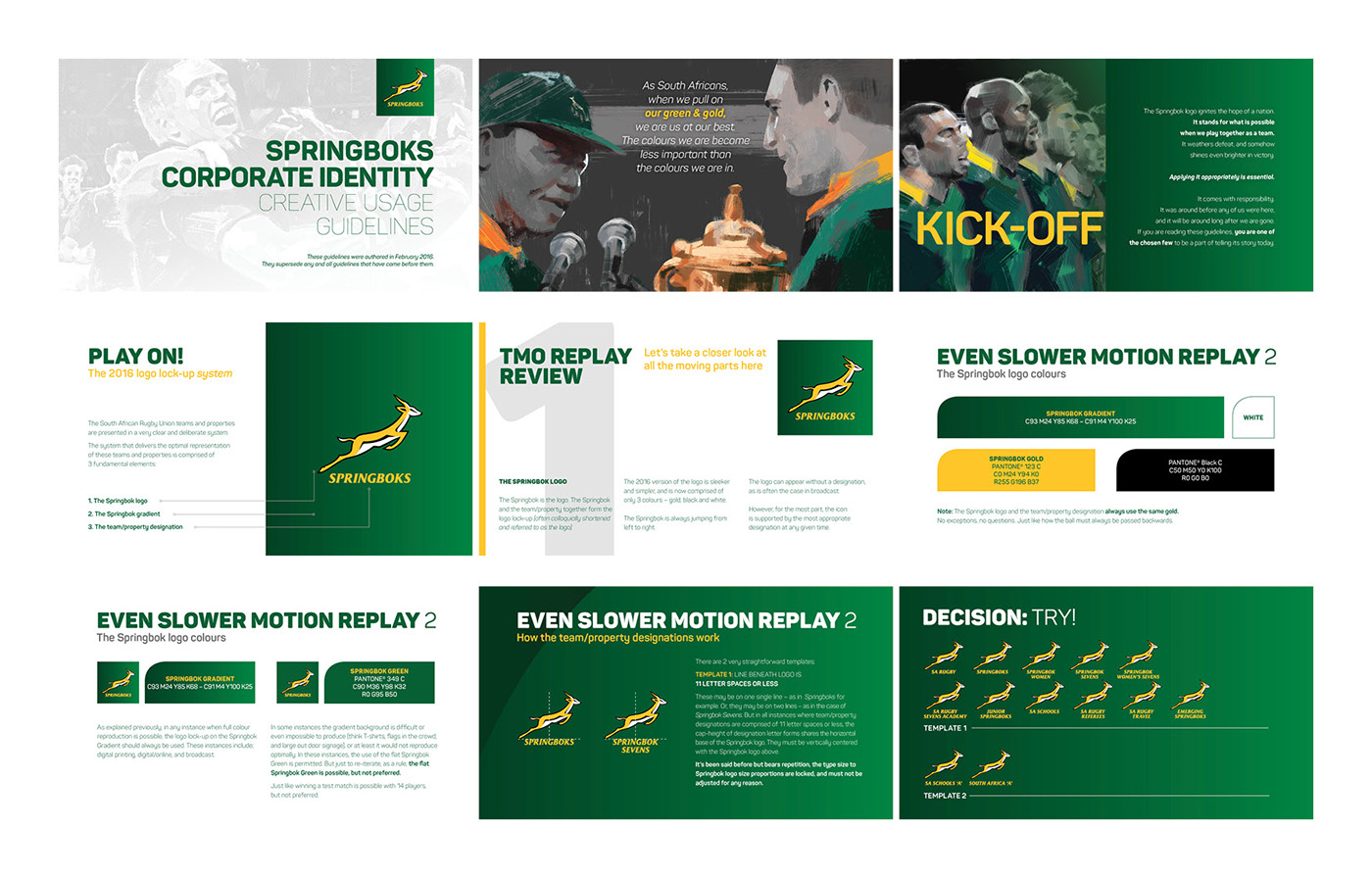
Springboks CI Guide


Sa Rugby Under 19/20/21 Championship


